24 December 2011

Merry Christmas, Karen--the process

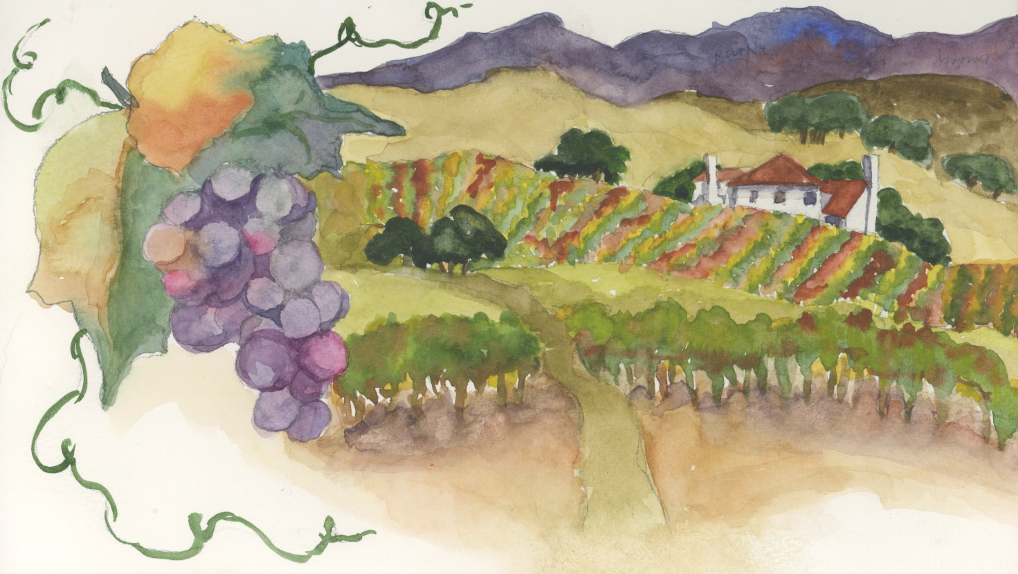
This is the one I ended up painting for my cousin Karen for Christmas. She has recently started a vegetable garden installation business, so I did something evocative of that.

I've never done this before when I was working on a painting, but since this one had so much detail in it and I had to stop in between layers to let them dry, I decided to document my watercolor process. It made me feel a little disjointed, since I usually work without thinking about why I'm doing what I'm doing and in what order, but it was good to see the steps and realize why I sometimes mess things up by not thinking through what I need to do before putting brush to paper.

I didn't think of documenting until I'd already laid down the first layer, so the raw drawing isn't featured, but here's the rest. I took a photo every time I had to stop for things to dry. This is the undercoat. The tiles are gold, and the wood is dark brown, so I washed everything with the pale gold except for the Italian parsley, which I gave a light coat of green, and the seed packets, which all had white backgrounds. I could have washed the pot gold too, since it was darker, but I was afraid of mixing up my drawing lines.

I put in some darks, here, and the things that were more of a flat color (as opposed to something shaded and nuanced). I apologize for the quality of this photo and the next one--for some reason my cell phone camera shot these two small and the others much larger. Oh, well--too late now!


Continuing on with the seed packets, getting the details added...


Pretty much finished with the packets here, starting to paint the pot and the trowel. The trowel was difficult, because it was a really old one, so rather than looking like new painted wood and metallic blade, it all looked one color--dirty bare wood and dirty/rusty blade. I tried to keep a few highlights where the original metal shone through, but wasn't too successful at that.


I added the background wash for the two strips of wood here--the one along the back and the one on the same level as the tile. I'm not sure that one reads as upright and the other as flat--maybe it will be better when the painting is done. This piece of furniture is a wonderful old British washstand that I inherited from my mom. It's been in my dining room for just a couple of months now, and I decided it would be fun to include it in a painting.


Here's where I went for all the detail in the tile, and I kept working it for quite awhile. It's shiny, there is some shadow, and there is an illusion that the flat tile has white grout while the vertical tile has dark grout, so it's pretty challenging. I also had to do those decorative tiles in the background--I tried not to go too crazy, just giving the sense of them instead of perfect detail, because they are, after all, BACKGROUND. Looking at paintings as photographs is quite humbling sometimes--it looks good on paper to me, when my eye goes from one detail to another, but the photo gives an overview and I can see that the way I have painted the tiles makes them look uneven, like the surface is rippling a bit!


And here below is the finished piece (scanned, not photographed with my cell phone, so pretty accurate). I put in the wood grain, and went for the darks. I left the parsley until last and put in lots of mediums and darks, and then did shadows under everything.

I'm off to the framer's Saturday morning to get it framed (ideally) or at least matted nicely, so I can wrap it up for my cousin Karen to open on Christmas. Nothing like waiting until the last possible minute! But...that's the way it goes when A. you work full time, and B. you're indecisive!

Thanks for looking...

Christmas Practice

I posted this before, and then had to take it down. I forgot I had blogged here about painting a picture for Karen for Christmas, and when I posted the pictures of the new Teen Scene, I sent the url to Karen so she could see the photos, and then her sister Heidi reminded me that Karen's secret Santa Pal (and her gift) would be revealed if she looked at the blog, so I deleted this post in a hurry.

Anyway, this was my initial idea of a garden painting for Karen, but then her other sister, Kirsten, said it should have to do with vegetables, so I did the painting in my next post (parsley, seed packets and a trowel) instead. But this one was good practice!

22 December 2011

Teen Scene is here!

Our new teen area at the Burbank Central Library is open! Not officially--we'll be having an open house to show it off the second week of January--but it's all ready for teens to use. A few of them have already, although since school is out for the holidays, it's kind of a ghost town around here. Here are pictures:

The view from outside the section, with the new sign above.
That's my office, at the far end.

This sign welcomes the teens and lets others know restrictions of use for the area.

Here is a long-shot of the area--three tables down the middle,
fiction collection on the left, computers on the right.
Aren't the chair colors gorgeous?


Here's the new book list and flyer rack, at the end of the manga section.
Two of us spent an entire day installing the wall quotes above the shelves,
and then I spent another day stenciling paisleys on the ends of the
(very old) bookshelves.

Here are the computers--there are four.

Here is the lounge section. They are called "Blob" chairs.
I keyed the entire color scheme and decor based on this little
paisley area rug. You can see the wall quotes above.

This was a long time coming--it was this time LAST year
that I had just submitted the grant application to the
California State Library. It took a lot of thought and
planning, and collaboration with a lot of people,
but it's finally done!


27 November 2011

Solvang

I had my doubts about Solvang as a destination for a painting trip--I have always thought the town was, frankly, kinda cheesy, a shameless tourist destination that is fun once and then you're done. But I really enjoyed my trip there, and especially the place where we stayed--the Solvang Gardens Boutique Country Inn. Every room was different--some were basic hotel rooms (but with posh bathrooms!), some had kitchenettes, and some were full-blown accomodations, with a sitting room, kitchen, and two bedrooms. There were gardens front and back, with fountains, roses and herbs--a feast for the eyes, nose and ears.

We spent a lovely sunny morning painting in the front garden; our instructor Cindy made a picture of this dormer window above the entryway, and I took a photo of the same view so I could do one of my own later. She did hers without the roof, just as a vignette, and I think I preferred it; I also got into trouble with the rose, below, but another thing I discovered on my trip that is if you make a mess of a painting, you can always come in with an inkpen to pull out some details and make it look more quirky than messy, so that's what I did here. Not the best painting ever, but a sketchy reminder of a lovely trip.

20 November 2011

Speaking of cranberries...

Discovered a great cake recipe in my mom's recipe box for Thanksgiving/Christmas-time, so I thought I'd share:


CRANBERRY CAKE
3 eggs
2 cups sugar (I use raw sugar)
3/4 cup butter, softened (I use Earth Balance buttery spread from Trader Joe's)
1 tsp. almond extract
2 cups all-purpose flour (I use unbleached)
2.5 cups whole fresh cranberries (you can also use frozen, thawed, but fresh is better)
2/3 cup chopped pecans
Beat eggs with sugar until slightly thickened, about 5 minutes. Add butter and almond extract, beat 2 minutes. Stir in flour just until combined. Stir in the cranberries and pecans. Spread in a greased pan (13x9 or a largish springform), bake at 350 degrees for 45 minutes to an hour. (Stick a toothpick in it--if it's clean, it's done. I let it brown a bit longer.)


The perfect combination of tart and sweet. Enjoy!

Los Olivos

Lunchtime in Los Olivos: On the last day of my trip, I went with the rest of the gang up to Los Olivos, where they were going to paint in the afternoon, and had a farewell lunch with them before I drove back to Los Angeles. (I had to go to work the next day, so I cut the trip a day short.) For an appetizer, Karen treated us to a big flat bowl full of all different kinds (and colors) of olives, and I thought it was so beautiful, I took a photo before we devoured them, so I could paint it when I got home (which I did, today). I was inspired by Jennifer Lawson's beautiful cranberry paintings. http://jenniferlawson.blogspot.com/2010/12/good-intentions.html Thanks, Jennifer! You reminded me to save those highlights. This one counts for EDM challenges #306 (draw a snack), #116 (draw something green) and #111 (draw a bowl).

Forgot this one

This was from our first day, at "La Arcada," a small shopping arcade off of State Street in Santa Barbara. We parked ourselves there to do vignettes of various architectural elements, and I just stuck all of mine into one piece, which wasn't really the assignment, but meant I didn't have to keep moving around. I was happy with elements of this--the shadow on the large pot, the water coming from the dolphin's mouth--but I seem to have suffered from tipsiness all day that day (even though the winery tour came later in the trip!)--my courthouse tower leaned to the right in the day's first picture, and in this one the fountain has a definite list to the left! Well, that's why it's in a sketchbook and isn't a finished work destined for framing, another valuable lesson I attempted to learn on this trip--not every painting has to be perfectly executed and shared, some are for practice, which is to say FUN. I have to work on that. It sounds like two mutually exclusive things--work at having fun--but learning to release judgment is a big deal. Someday...?

19 November 2011

Vineyard painting

On the first day of our stay in Solvang, we went on a wine tasting / painting "crawl," to three wineries in the Santa Ynez Valley. We didn't have a lot of time to paint at each location, so after messing up a painting at the first place, I re-thought my methods, and at the second winery I decided to do a finished sketch to come back and paint later, and took a photo or two to remind me of colors. Since I was using my Droid as a camera, the colors weren't the greatest on this one (though some of my pictures came out better), but it was enough to remind me of the things I liked about it--the house, the stripes of the grape arbors, the perspective from far away to close up.

I also wrote the colors directly into the drawing, erasing as I painted, but on Tuesday morning back in the garden at our B&B, where I actually painted the picture, I forgot to remove a few; if you look really closely, you can find the word "purple" embedded in the mountains.

It was Theresa's suggestion to us to do the close-up of the grapes at the side of our paintings and use that as a framework, and it reminded me that painting isn't just about duplicating what you see, it's also about design and layout and the thought processes leading up to making something more. Other people on Every Day Matters have also illustrated that, with their borders  through which parts of their paintings intrude, and I love the effect. Thanks, everyone!

This is my last post for my watercolor trip (although I have some photos that I hope to use to paint more scenes from it). It was great--I would encourage others to take one. What a wonderful treat to sit outdoors all day long and capture color on paper.

17 November 2011

Quotes for the Teen Scene

I mostly don't talk about work here (I like to keep this blog separate for art), but I was so excited by the day's events, I just had to share. The new furniture for my teen section at the library is finally arriving next week, so I'm scurrying around trying to get ready. One thing left undone was to apply the wall quotes I ordered from http://www.wallwritten.com. This company is fantastic--on the website, they provide a design function so you can create your own quotes, and I really went to town. The colors of the front sides of our new chairs are going to be teal, purple, and lime green (the backs are blonde wood with chrome legs--very trendy), so I went for an overall color scheme of the same with the quotes, with orange accents. Being the typeface maven that I am (my former career was movie title designer), I was excited to get to be artistic in selecting typefaces, colors, and layouts.

The package of quotes arrived awhile ago, but I haven't made the time to do the work--it's difficult to do it when the library is open, which it is 9:30 to 9:00 daily. Also, I knew I probably couldn't do it by myself (too right). I finally decided today was the day, and told my friend Patrice (head of the reference dept.), who promptly volunteered to help me put them up. She is the best combination of calm, resourceful, and practical, and I knew she would be the perfect collaborator, so I gratefully accepted. It took us all day, but we did it! Here are photos:

This is the prep work. The quotes come as three layers: backing grid on heavy paper, the vinyl letters, and then a thin sticky layer to which the letters adhere. You first hang everything up, as we did here, to find placement and get them level. Then you take them down, burnish them thoroughly from the grid side, then peel that off (which takes a long time and a lot of patience) and stick them to the wall (a harrowing experience of trying to get them straight without ruining them!). Then you burnish again, and peel away the sticky layer to leave the vinyl letters on the wall.

Some of the quotes were in two or even three parts, and WallWritten obligingly puts diamond shapes on each layer so you can apply one and then match diamonds to place the other parts. Here are all the quotes. (Sorry, some are a bit blurry--I took these with my Droid.) I surveyed the teens by sending out a list of about 30 quotes and asking them to pick their top three; we ended up choosing five quotes (getting permission from the authors to use them). Three are from young adult authors (Diane Duane, Cornelia Funke and Stephen Chbosky), and the other two from people who just said something clever about reading.


In two weeks or so, the new furniture will be installed, the rest of the art will be done (I still have some stenciling to do--there will be an area rug with a paisley pattern, so I got some paisley stencils to put a pattern on the walls and the bookshelves), the poster hangers will be mounted, the computers will be there, and it will be a real teen section at last!

16 November 2011

Dion Dior and More!

An online friend from the Every Day Matters group has had her blog nominated in a contest for Top Blog of the Year. She makes beautiful artwork and writes wonderfully about it--here is her blog:

http://diondior.blogspot.com/

And you can vote for her here:

http://www.blogguidebook.com/2010/11/round-one-vote-now-elimination-round.html

First elimination round ends THIS FRIDAY, so don't hesitate--VOTE!

15 November 2011

State Street Casual

Sunday was our "transition" day--we moved from our hotel on the beach at Santa Barbara to a B&B in Solvang. We had no plans until a 5:30 gathering at the new place, so I had a brisk walk and a leisurely breakfast at the beach, then packed up, checked out, and went wandering around State Street looking in the shops. Along about lunchtime, I parked myself at an outside cafe table next to this arbor entrance to a shopping alley, and spent an hour or so painting bougainvillea before driving the 35 picturesque minutes through the San Marcos Pass to Solvang.

Painting like this day after day really tunes you in to everything from an artist's perspective, and made me realize that I live in a city (Los Angeles) with a wealth of "views" begging to be documented. Instead of waiting years to go on a week-long vacation somewhere else, I have made myself a promise to spend at least one weekend a month finding and painting the many aspects--both beautiful and mundane--of my own home town.

14 November 2011

Painting at the Mission

Our third day in Santa Barbara, we met bright and early in the rose garden out in front of the Santa Barbara mission, and started doing value sketches to decide what to paint. I have to admit I was somewhat disappointed by the block-work facade of the mission, and so I turned my attention to the surrounding neighborhood from the vantage point of the garden. I loved these tall eucalyptus trees, and thought that the combination of those, the palms, and the Spanish tile roof of the house peeking out of the foliage said Santa Barbara every bit as much as would a view of the mission. Palm trees were a constant frustration on this trip--they are surprisingly difficult to capture!--and I am now determined to keep painting them until I get the likeness I want. So far, my results have been either overworked (muddy) or understated (flat), but I hope to get the hang of them soon!

NOTE regarding "Another Trick" (below)

The painting I posted as an illustration of spatter is not mine, it was painted by CINDY BRIGGS, one of the instructors from Make Every Day A Painting. I posted it because it is a GOOD example of spatter (which I have just learned to do and so do poorly!) and also because it had a glimpse of the needlework grid material peeking out of the upper left corner of the photo as an example. Several people commented positively on the work, and I wholeheartedly agree that it's lovely, but it's not mine. Just to be clear.

Our friend the seagull

On the second day of our trip to Santa Barbara, it was dark, stormy, cold and cloudy. After freezing while we painted all morning at the East Beach Cafe, we went to the pier (Stearn's Wharf) for lunch (hot soup being very popular), and then Cindy and Theresa found us a somewhat protected and quite scenic place to paint, on the upstairs balcony (lee side) of a wine bar out on the pier.


So, we drew him in various attitudes, turning him into a flock of seagulls, and painted him. A fun technique with the drips and spatters (this is when we first discovered the genius of the squares of needlework canvas, although it took me awhile to get my spatters even--not in evidence here!).


Another Trick

Some watercolor artists seem to spatter with aplomb--their paintings have wonderful speckles and dots seemingly sprayed at random across them and yet falling in all the right places. The first time I tried to spatter (by flicking towards my painting with a loaded brush), it came out more like arterial spray, and I hastily backed off of that plan for ruining my art. But I learned a trick from Cindy and Theresa while on my vacation painting trip, and I'm going to share it with you.


This is a photo of one of Cindy's luminous demo paintings she did for us, during our wine tasting day in the Santa Ynez Valley. See up in the left-hand corner that little bit of red grid sticking out from behind the picture? It's a piece of plastic needlepoint canvas. You paint the colors on it that you wish to spatter, and then you hold it above your painting and blow through it, and all the paint goes beautifully in a nice even spatter. You can do multiple colors at once, or layer them by doing first one, then adding another, until you have enough spatter. You can use different sizes of canvas (they come very fine to quite large) to achieve different sizes of spatter. Genius! When you are finished, just dunk the piece of canvas into your water to clean it, then wipe it down and put it back in your pack for re-use.

09 November 2011

Vacation photos and studies

Here is a photo of the East Beach Café, in Santa Barbara on the beach, and below are three small, rather quick paintings done there.

This trip was a new experience for me on a couple of fronts, and I was somewhat frustrated with both my productivity and the quality of my work. First, I have never painted "en plein air" before--my usual spot is my patio table, and my usual subject is either a made-up one from research photos, or something sitting still on the table in front of me, so painting things that don't stay still or constant was different.

Second, I am used to painting large (11x15, 18x24), but when you're working outdoors on the fly AND lugging all your materials and tools with you all day, it pays to downsize; so I bought myself my first small watercolor sketchbook and tried to scale everything to fit it, with mixed success. A couple of days in, I went to the local art store and bought a smaller paintbrush with a good tip, which helped a lot!


The wires on the top of the umbrellas are meant to keep seagulls from perching on them and messing them up.

As you can see, we had a chilly, stormy day for our beach scenes.

08 November 2011

Tips and Tricks

I picked up a few new and useful pieces of information on my watercolor vacation (see post below), and a couple of them were AWESOME so I'm going to share them here.

1. Mr. Clean Magic Eraser--buy the one without the added chemicals. Cut a small piece (easier to work with), dip it in water and then squeeze/wring it out well. Use it to ERASE paint from your page. You know that dark streak in the shadow that I wailed about in my lamp painting? With Mr. Clean, I can take it out! You have to stroke the paper GENTLY with the sponge, so that you don't abrade the paper so much you can't go back in and paint; but if you use a soft touch and a gradual approach, you can remove things completely or just lighten up muddy areas by bringing in some highlights. For the latter, you can overlay/use a STENCIL so that you can remove just the small bit of paint you want to. Quite a trick!

2. Some of you may already know this one, but it was a revelation to me. All these years I have been applying masking fluid with a brush (messy and inexact), but at this workshop I discovered you can buy it in a little bottle with a tiny spout that you can simply squeeze it onto your page with a controlled flow. Duh.

3. Speedball Lino Cutter Assortment, and Softcut (also made by Speedball): Ever have the yen to do a linoleum carving? or make your own rubber stamps? Frustrated by doing it the old-fashioned way (with wood, linoleum, or erasers)? Carving in Softcut (which is about the thickness of foamcore but carves like a soft, malleable eraser) with lino cutters is SO much easier. Takes awhile to get the hang of it and figure out the positive/negative design, but it's really fun. Here's one I cut on the fly, in about five minutes. I messed up and accidentally cut out one of the petals on the left, but I still like the lino-cut feel to it. Fun to incorporate into a painting! I'm putting these on my Christmas list.

Thanks, Cindy and Theresa!

Watercolor Vacation

I just got back from a six-day, multi-location watercoloring holiday with Make Every Day A Painting, taught by Cindy Briggs and Theresa Goesling (http://www.makeeverydayapainting.com/). Nearly a dozen of us spent three days in Santa Barbara (one at the beach and two in town), and then moved 30 miles inland to Solvang for three more days, with side trips to various local wineries in the Santa Ynez Valley, and an afternoon in Los Olivos. It was a great break (and much needed, after the year I've had!). We painted, we ate, we drank, we made new friends.... I'll post some pictures and some paintings over the next few days, as I get them scanned. Some I was happy with, some completely frustrated me, but all were instructional.

This was my first painting on the first day. I liked this one pretty well (esp. the colors), aside from the leaning-tower-of-Pisa quality of the clock tower! I had hoped to go back and do another angle, but there were so many other things to paint that I never made it. This is a view of the Santa Barbara Courthouse building, from the back lawn. Yes, there were clock faces on all four sides, they each showed a different time, and none of them was working. (Just in case you were going to point that out...)

05 October 2011

Here's the reveal

Here's what I couldn't cover up except by electronic means...see the gray streak in the shadow?

04 October 2011

EDM Challenges 2, 14, 32, ???

Trying to work in a bunch of challenges in one pic. This is "what I see in the morning when I get up" (#14), which is my bedside table; "a lamp" (#2), "something metallic" (parts of the lamp and the top of the table, though I couldn't make the table top look like metal) (#32), and also #27 ("draw a book"), though I've already done that a bunch of times!

This one broke my heart--I was 90 percent done, and pretty happy with it. I decided to put some shadows on my (white) walls behind the lamp, made one hasty and too-dark stroke of gray onto dry paper, and couldn't lift it. So I made the walls turquoise and accentuated the light-fall to camouflage it, but it didn't work all that well. I Photoshopped this a bit to get rid of the worst of it. Guess I won't be framing the real one.

03 October 2011

Draw something "October"--my birthday bouquet

Five years ago, I planted a five gallon can of asters, sort of like this one, in the flower bed along the side of my garage:
Five years later, with lots of natural reseeding, the picture below shows what the flower bed looks like!

Asters are long-legged, weedy plants when you let them go wild like this, and must be cordoned off so they don't completely cover the sidewalk. Until they bloom, they are not particularly attractive, since the leaves at the bottom turn brown and fall off while the top half is getting ready to blossom, but oh, when they do bloom!

My neighbors kindly put up with the sidewalk (which we share) being out of commission for the last two months of the asters' growth cycle, just to arrive at that all-important month, October, when the stalks are covered with the small, daisy-like purple flowers (and with many ecstatic bees, june-bugs and butterflies).

Since the asters always oblige me by coming out just in time for my birthday on October 4, I decided to cut a few this morning (they're barely started, not in full glory) and combine them with some Mexican sage, some orange double marigolds, and a crimpy little scented geranium in a white transfer-ware pitcher that was my mom's. I added in a couple of tubes of (appropriately colored) paint just for interest. Unfortunately, I didn't notice until I finished that not only had I placed the horizon line at an awkward height in relation to the pitcher, but that it was at exact dead center across the page--deadly! Oh, well...
This satisfies Challenge #245--draw something "October." Asters.


02 October 2011

Slightly creepy books for October

I'm indulging myself in a reading marathon this weekend (although I'm combining this indulgence with work, since I need to keep up with my young adult novels), and these two are to recommend on the library blog for teens.
The Midnight Twins is by Jacquelyn Mitchard, who wrote The Deep End of the Ocean (and a lot of other books, of course), and it's the first of a series about sisters named Meredith and Mallory, who come from a long line of psychic twins. Born two minutes before midnight and two minutes after on New Year's Eve, one sees the past and one the future. In this book, they discover their powers and have to solve a mystery and foil a bad guy.

The Replacement falls into a category with a lot of recent teen fiction about the world of faerie, but is quite superior to many of those. It's the first novel by Brenna Yovanoff, and after reading this, I look forward to seeing what she comes up with next. The protagonist is one of those changelings left behind when the faeries steal the human child from the cradle. This changeling, however, has parents and a loving sister who know what he is and raise him as if he was their real child anyway. The book opens when Malcolm is a teenager, struggling with his health in a world full of iron and blood. A little girl has just died in their town, but her older sister, a classmate of Malcolm's, insists that the child they buried wasn't her sister Natalie, and Malcolm, who has a good idea who (or what) the child was, struggles with his emotions as he tries to stay under the radar of the suspicious townsfolk while helping the girl he likes get her sister back before it's too late.

These were kind of a cheat, artistically, because I was in a hurry and because I was working against the light on my patio (I keep forgetting that it gets dark now at 6:15 instead of at 8:00!). I propped the book on the left up against my coffee mug, so they are not on the same plain, but the background doesn't reflect that, which it should. I also went in after with a pen and tweaked a bunch of stuff because I was so sloppy when I painted. So, not the greatest illustration, but enough to use to feature these two entertaining and slightly creepy books.

19 September 2011

Sharp Teeth again

Well, I darkened up some elements, and then I tried the spatter, but because I've never done it before, it came out more like arterial spray, which was a little too graphic (despite the fact that there probably IS some somewhere in the book), so I painted most of it out and added in a deep yellow background, as well as some shadow elements. I'm going to crop it tightly and give it as a gift to the girl who suggested the book for six months in a row, finally got it voted in as our choice, and then was disappointed. Maybe it will make up for it a bit.

Thanks for the suggestions, everyone!

A master watercolorist

Frank Eber mentioned Joseph Zbukvic with great admiration, so I decided to have a look. You should too...truly a master.

http://www.jzbukvic.com/

17 September 2011

Saturday workshop with Frank Eber

Today, I went to an all-day workshop at my local art store (Continental Art Supply, in Reseda--if you live in Los Angeles and don't know it, go there immediately!) with watercolor artist Frank Eber. His work is really gorgeous--I put his blog link in my "favorite blogs" list, but here it is as well: http://frankeber.wordpress.com/

It was an enjoyable yet extremely humbling experience for me. When I paint, it is very tightly, usually quite planned out, and I guess not very characteristic of watercolor technique. It is my own style, and I enjoy it, but I also want to expand and try other things, and I so love watercolor that actually reflects the medium in its beautiful slapdash-looking swashiness.

Frank works wet, layers his washes, and does just enough but no more to barely indicate what he's painting--a boat, a cow, a taxi, a tree--and yet when he's done, it is arresting, evocative, and looks exactly how he intended it to look. I know (because he said so and also because you can see it in his work) that he has pushed himself hard for years to achieve the ease with which he works; but we all want to think that we can do something once or twice and master it, don't we? Sadly...no.

This is the second of two paintings we worked on for the day. (The first one was too embarrassing to show, and I'm not thrilled with this one either, but this blog is about showing efforts as well as successes, so....) He had a great teaching method--he would demonstrate step one (a graduated wash, for instance), we would return to our desks and execute it, then he would show us step two, and we'd do it, and so on. It was an effective way of learning a lot of information in a short period of time. It was also interesting to watch the other students and see the 10 different renditions that originated from the same source material and instructions.

A well-spent Saturday.

15 September 2011

Another book painting

The Alex Awards are given every year by the American Library Association to 10 books written for adults that have special appeal for teens. One of 2009’s Alex Award-winners was Sharp Teeth, by Toby Barlow.

You hear the word “werewolf” these days, and if you are teen-friendly (or movie-savvy), your thoughts immediately jump to the Twilight franchise (Team Jacob). But that’s not this book at all. Although many of the characters in the book are lycanthropes—shapeshifters—it is not the most important part of the story. While it is significant that the characters are able to turn into wolf-dogs, the story is about so much more than physical identity. Set in the streets and hills of Los Angeles and roaming down into Mexico, it follows a meandering trail amongst such characters as a kindly dogcatcher, a battered wife, a pair of bridge-playing bully boys, a curious cop, and some distinctly unsavory drug dealers. It explores the complexities of loyalty, loss and love in a truly poetic fashion. And Sharp Teeth
is written in free verse, with a broad, epic feel to it reminiscent of Homer. I always hesitate to use the word “unique,” but I can’t think of another book like it. It’s dark and violent, humorous, sweet and touching.

I painted this because the teens in our high school book club chose it for next month's book; then we couldn't get it, so we had to choose something else. I'm hoping we read it later in the year.

This painting feels unfinished, but I'm not sure what else it needs. Background? spatter? more details? I may go back in and tweak it some more--I did it on a day I didn't have to be at work until noon, but the 11 a.m. deadline to get ready to go put a time limit on what I could accomplish. But I decided to go ahead and post it, and go back to it later with some distance.

11 September 2011

EDM Challenge #224: Draw a jug or pitcher

I collect odd pitchers, and I particularly like anything that fits in with my chosen decor, which is Arts and Crafts-inspired as to furniture, dishes, etc. I found this one in a junk store, and was captivated by it. It's made in Japan, and has the quirky personality that I like from many of the Japanese pottery wares from the 1940s and '50s. (I collect wall pockets from both American and Japanese potteries from that era--I'll paint one of those sometime soon!) I particularly like that it has a lid, so that if you don't use up all the milk or juice at breakfast, it can go right in the refrigerator; and that the little fruits are 3-D, like majolica. Also, the artist picked a color scheme, and then decided to throw in an extra color at the last minute when it came to the handle and knob, which is fun. I drew this first in pencil, then outlined in ink and painted in watercolor, on Canson XL watercolor paper, 140 lb.

28 August 2011

EDM Challenge #75

Draw the ingredients and/or process of a favorite recipe:

This one is distinguished by being both tasty and EASY. If you have the ingredients on hand, takes about 5 minutes to get into the oven, then go do something else for awhile et voilá!

I decided to mimic some of you on the EDM list who work in pen first and then watercolor afterwards. I've never done this before (don't know why), but it's fun! I sketched lightly in pencil first, then went over it in pen. The thing I notice is that it encourages you (well, it encourages ME anyway) to be minimalist about line and also to simplify my watercolor technique. I won't work this way all the time, but nice to know it's an option I enjoy!

Hope you try and enjoy the recipe...