07 August 2021

LFI #31, Modified

I didn't initially plan to do this week's lesson for Let's Face It 2021 with Jenny Manno, for several reasons: First, she was doing the whole thing using pan pastels, and I neither own them nor wish to acquire facility with yet another medium—moving from watercolors to acrylics is plenty right now, thanks! and second, I feel inundated by the wide-faced, big-eyed, button-nosed, luscious-lipped, long-necked baby doll girls that are a Manno trademark. Don't get me wrong—they obviously have their appeal—but Jenny has such a huge following who all do her three weekly challenges that my Facebook feed is overwhelmed with them. Finally, my goal as a portraitist is always to find a likeness.

It's interesting to me that Emma Petitt, whose work I am currently following, also shies away from trying to capture a specific likeness in favor of making a more universal female image; Emma still accentuates things like bone structure and planes of the face, but doesn't look at her model as an individual (usually).

Jenny has a wonderful facility for putting together colors, and that's what intrigued me about her project this week, particularly the underpainting. I love the effect of having a base color peeking out from underneath everything on the page, but have never tried  that, and this seemed like a good project to undertake to practice that method. So I decided to do it, but using an actual model whose likeness I attempted to convey, and also doing the whole thing in acrylics rather than the pan pastels.

The model just happened to be a reference photo provided by Jenny a week or two ago, and she was one that not many people painted, which suited me, as well as being a redhead!

I started out by simply mixing up a light blue from cobalt and white gesso (I'm out of white paint!) and coating the entire page. Jenny didn't do it that way, but I thought it would be much easier to cover that with acrylics than to go in between each flower and stem to put it in afterwards.

My design is of necessity not quite as graphic and congruent as was Jenny's; she used the long neck of her girl to provide insets for flowers; additionally, the "skyline" formed by the model's updo and the top flowers is a pleasing detail that I don't achieve in the same way with my model's messy loose hair. In fact, the recognition of the graphic quality of Jenny's design is making me think maybe I shouldn't have attempted the combination of a more realistic portrait with the stylized quality of the surrounding "shrubbery"—but that's what experimentation is all about, right?

I'm including a process picture, just for the fun of it, since this was a different method to how I have worked before. It shows the blue background plus the preliminary painting of the model before I added all the shrubbery.

I have a much harder time achieving a likeness with acrylic than I do with my watercolors, particularly the fine work around the eyes and mouth. I caught something of the quality of this girl, but she isn't nearly as delicately pretty; and freckles in acrylic are beyond me! Perhaps Emma has the right idea and I should stick to exact likenesses in watercolor but go for a more general look in acrylics.

I'm also still not used to the acrylics regarding blending. I don't want to blend excessively like I do in watercolor, and yet the chunks of color here and there are distracting to me. Right at this point I feel like I'm either too blendy or not blendy enough!

I would seriously like to try painting one like an early Kara Bullock, or the way Mark Lague paints his landscapes, which is to say, individual square brush strokes stacked up all over the canvas until they convey an approximate blurry vision of the object.

Anyway, here is my redhead with poppies. Quite different to what Jenny did, but definitely inspired and guided by hers. I wish I had left more of the blue background showing—in the end, I covered it too enthusiastically.


"Redhead with Poppies"—acrylic, gesso, charcoal, Stabilo, on Fluid 140-lb watercolor paper, 9x12 inches.


06 August 2021

Ethereal

This young woman is Rachel, a member of my library book clubs for several years about a decade ago. In high school her greatest love was cosplay, and she actually taught a cosplay workshop (complete with costumes, makeup, wigs, and props) as a library program during her senior year. I had lost track of her since graduation, but recently reconnected on Facebook, only to discover that she has embraced a career as a voiceover artist! Having done a little voiceover work in my misty past, I know what a challenge this can be, but she appears to be thriving. Her demo reel is quite impressive, as is her list of past clients.

I don't know this for sure, but I imagine part of her success is due to her constantly changing appearance and fabulous fashion sense! Last time I checked in, she was rocking kelly green hair, but yesterday she posted a new I.D. photo with a wispy pale blonde cut and an angelic vibe, wearing a white dress. I instantly wanted to paint this incarnation of Rachel, so here she is: Ethereal.

I have a nagging sense that this painting is either underdone or overdone. I wanted her hair to kind of disappear into the background, but I think I should have also let parts of her face and neck do so as well, instead of outlining them so thoroughly. I also thought about painting one side a dark green, but I didn't want to lose the hair effect. I'll come back and look at it again later, I guess.


"Ethereal"—Charcoal, acrylics, Stabilo, on Fluid coldpress watercolor paper,
9x12 inches.

05 August 2021

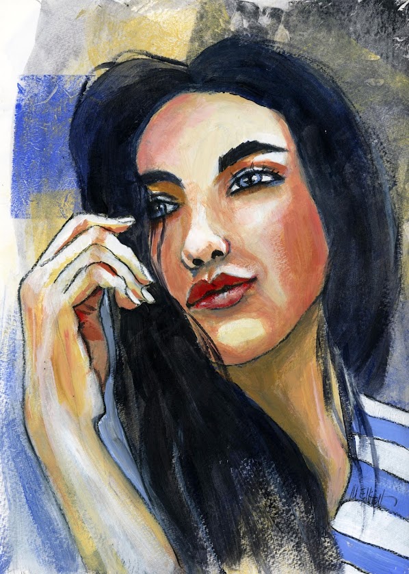
Merle

I found this model on Unsplash. She had brown eyes, but I was so enamored of this blue that I decided to turn her Welsh and call her Merle (Blackbird).

I chose her because I liked her slightly pouty expression and sexy hair, and the inclusion of her hand; but somehow she just wouldn't do what I wanted. I repainted her pupils twice and changed the highlights three times, but I simply couldn't get her to look at me, although in the photo the model is staring straight at the viewer and I did my best to exactly mimic placement of pupils and highlights. This is an ongoing frustration when doing portraits, and it would drive me crazier if I didn't know that it happens to even the best portraitists (like my FB friend Sassa, who painted 100 portraits in 100 days last year and says that occasionally she, too, just can't get her model's attention, no matter what).

I also had a lot of trouble with the paint today, which I blame on the heat. It has been 100+ degrees for what seems like aeons now, although it can only have been a couple of weeks? Anyway, stuff dried before it was blended, paint developed ridges that wouldn't smooth out when painted over...basically a somewhat frustrating day to paint. Looking at the scan, I think I also should have added more of the pinky color into the arm. Well, maybe later—it's time for dinner!

I do like the color combo on this one, and how the background ended up working. And bottom line, every one is practice.


"Merle"—charcoal, acrylics, Stabilo All, on Fluid 140-lb. coldpress watercolor paper, 9x12 inches.


02 August 2021

Weird hybrid

I'm almost out of white acrylic paint, which is the essential color when making a portrait, both for mixing and for highlighting; so while I wait for my order from Dick Blick to arrive, I decided to do a weird hybrid picture that is part ink and part paint and not a portrait. World Watercolor Group is doing an August challenge and, while I'm not doing it, today's prompt was "vase" and I just happened to have one with some of my zinnias and marigolds and coreopsis and lemon verbena stuffed in it, so here it is.

I did the background by rolling and then dribbling all the colors of the flowers into the background; I let it dry, then I did my drawing, and painted the flowers with ink while I did the vase in acrylics. The acrylics suit the slightly powdery glazed ceramic of the vase, while the ink goes better with the ephemeral nature of cut flowers. Or some such existential shit like that. If it has to be a practical failure, at least it can be a philosophical success, right? Ha ha ha!


"Zinnias in a vase"—Daler Rowney inks, pencil, Uniball pen, acrylics, Stabilo, on Fluid 140-lb. coldpress watercolor paper, 9x12 inches.