05 June 2021

Lesson Two

And yet another post today! Lots of painting going on...

For our second lesson in the "Find Your Joy" exercise, we were supposed to pick something we usually/normally paint (i.e., portraits for me, landscapes or still life for others), and first we were to do it using unfamiliar materials and tools, noticing what we enjoyed about that process and what we didn't.

So, for my first painting I used toned paper because I usually like a light-filled background instead, and then I painted the entire thing in fairly thick acrylics using only a palette knife. I was able to define some things but not others, and she looks kind of like Robin Williams in Mrs. Doubtfire when he covers his face in a whipped cream disguise! The thing I did enjoy, amidst all the awkwardness, was the strokes I made for her hair—there was something more spontaneous about them than I sometimes pull off in watercolor. In fact, although I wasn't too pleased with the outcome, the tension of being somewhat out of control of my materials was a good experience.


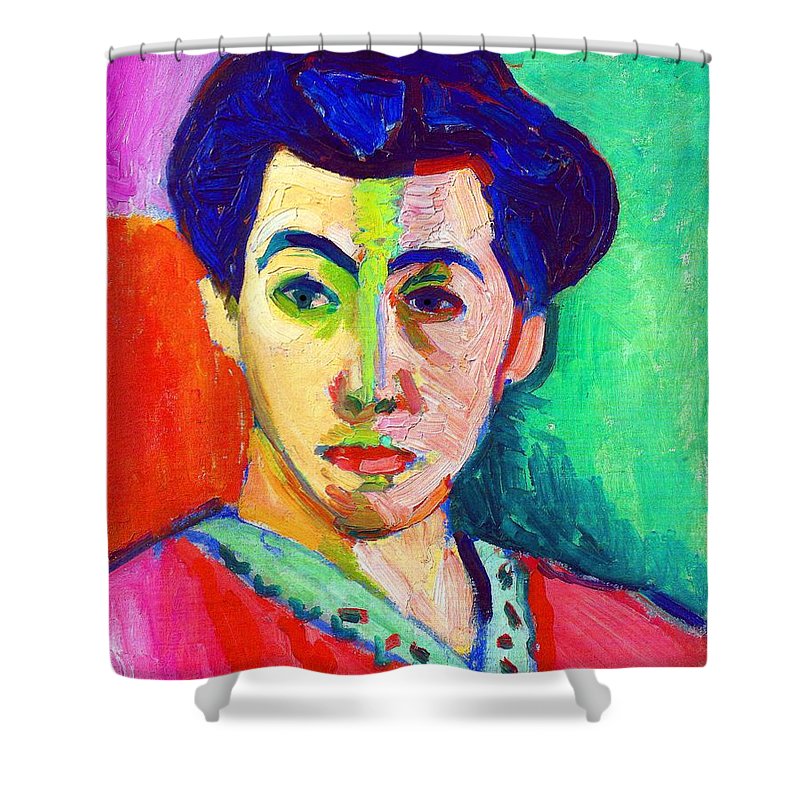
So, for my second painting, I used white paper and gave it a pink base coat to suit my model's complexion, but when it came time to start painting, instead of using my Escoda brushes, which are fairly stiff and give me a lot of control, I picked up a #12 Silver Black Velvet brush, which has both a huge amount of flexibility and a capacity for holding water or pigment that probably exceeds the Escodas by two to one. I have never previously enjoyed painting with this brush, saving it mostly for applying spatter, since it is so flexible; but today I purposely put things a bit out of control and painted exclusively with it. And while it was difficult in some ways, in others it gave a more blended and spontaneous feel to things like shading on the face and neck and yes, in painting those wispy bangs. I also sought out some colors that are a bit more nuanced than I would normally use. The final effect is softer and more delicate than my usual style, with a more watery feel.


It's good to test yourself. I don't know if I'll keep doing it, but it's enlightening.


Day 5

As usual, I have taken on too many things at once and am spending more time sitting at my art table than the rest of my responsibilities warrant. But...I'm enjoying the variety of challenges. I did my abstract assignment last night and this morning, painted this study below for day 5 of 30x30 Direct, and have two portraits to paint for the second assignment in the abstract class. Oh, and I just signed up to sell art at a one-day auction at the end of July, for which I have to come up with five original works that aren't in response to a class or demo or reference. Also in July I am taking a class at Otis Art Institute (still virtually, unfortunately). So I guess I'm going to be posting a lot!

Here is Day 5 of direct watercolor painting—my favorite acrylic inks, in three of my favorite colors. And no, I never have figured out why the initials of the company are D-R but the initials on the bottles are F-W. 


"30x21_Daler Rowney"—PJ watercolors in Bee mixed media sketchbook.


Something completely different

 Although I have never aspired to be a painter of abstracts (nor do I think I have the gift to be), I have enjoyed going a little crazy with splashes and drips and swipes of colors to act as background to some of my portraits, as in these:

So when I saw my friend Dindy (also a portraitist) making an eight-pack of pretty cool abstract paintings, I asked her what's up? and she turned me on to a free one-week "taster" class called Find Your Joy, which is all about allowing yourself to make spontaneous marks and shapes on the paper as you are moved to. Honestly, I'm not usually "moved" to do that, so it's a challenge for me, but I decided to take advantage of the free promo class and see what's what.

The first exercise was to section off a piece of paper into two, four, six, or eight segments (depending on the size of your paper) with artist tape, and then paint the entire paper as if it's one piece. Then, once you're done and it's dry, you peel off the tape and end up with separate small pieces, some of which may be something you like. But the idea is not to TRY to make a pretty painting, it's to allow impulse to reign, make marks that feel good to your hand, brush, palette knife, pencil, or whatever tool you're using, and see what emerges.

The first time I tried it, I was completely at a loss, and it shows. There is not much variety of mark-making, and it's honestly a little bland. I used a bit of collage, a Posca pen, and some watercolor, and wasn't terribly imaginative. I do like the color palette.

It also definitely didn't look like one painting.

So, this morning I looked over what some others had done, checked back in with the teacher's example as well as some of her remarks, and tried again, with different colors and this time really focusing on spontaneous enjoyment of the marks. I had a lot more fun this time, worked with more surety, and used more tools, from a pencil and charcoal to my new rigger brush and a palette knife. Again I had a hard time seeing it as a unified whole instead of four separate paintings, and that shows; but it was a lot more fun and, I think, more successful as well. 


Sorry for the poor quality pics, they are too big to scan (12x16).

There is a new assignment set for today that will be a bit time-consuming, so I may not share it until tomorrow, but I think this paint play is exciting and will lead to some unexpected ideas.

If anyone is interested to play catch-up, HERE is where you can get started. And thanks, Dindy, for turning me on to this!


04 June 2021

Old challenges made new


I'm terrible at landscapes. I don't have the patience to do them realistically, because who wants to paint all those individual leaves? and I don't have the skill to convey them impressionistically, they always come out awkward and amateur. So I mostly don't paint them. But so many people are having fun with them in the 30x30 Direct exercises that I decided, what the heck, I'll try one this way, with no underdrawing, and see how it goes.

Well...so much for that. There are little bits here and there that I like, but most of it was not conveyed either realistically or intuitively. It's a brook running between white rocks, with cast shadows from large and small trees on its banks. It doesn't feel like water, although I tried to duplicate the colors I saw as it moved from light to shadow. The rocks are distressingly one-dimensional. The green areas of bush, plant, grass, and trees are fairly indistinguishable one from another. But...I spent 30 minutes and learned something, which is that either I need to do this every day until I get better, or I need to give it up as a lost cause and focus on my strengths (portraits and still life).

"30x21_BadLandscape"—PJ watercolors in Bee mixed media sketchbook, about 8x12 inches.


03 June 2021

Mme. Matisse

On Jenny Manno's Next JENeration Art page, there is a challenge that uses old masters' paintings as inspiration for fairies. (You may recall my Van Gogh-inspired gal with wings a few weeks back.) This week it was Matisse, and although some did fairies, others were just inspired by the master to do something in a similar vein. There were a lot of portraits that mimicked his portrait of his wife, Amelie.

The thing to know about Matisse is that he painted in the Fauve style, which substituted colors, warm and cold, for shadow. So you will find flat planes of color rather than nuanced light and shade in most of his paintings. Here is his rendition of the Missus, and although he used warm colors on one side of the face and cool on the other, that is the extent of the direct or reflected light, except for a few darker shades in her hair and the scribble of blue behind her shoulder. The portrait is well known for "the green line" down her nose, which divided light from shade.

The photograph from which he worked, however, had a lot of light and shadow reflected in Amelie's face, and I decided to make a more realistic painting of her, but using only my black Uniball pen and the water-soluble shadows I created from that for her face. Then I gave her hair and dress some nuance and color by bleeding the Elegant Writer around to extract its pinks, purples, and greens from the applied black line.

Some of the Elegant Writer intruded perforce upon her forehead, so then I carried it through the shadow under her chin that merges with her dress, just for continuity. 

I gave one nod to Matisse by giving her a tri-colored background reflecting the Elegant Writer colors, although I might have liked it better plain. Too late!

Here's my portrait of Mme. Amelie Matisse. She looks perhaps a tiny bit younger, and not quite so glum, but I think I captured her.


"Mme Matisse"—pencil, Uniball pen, Elegant Writer, watercolor, gel pen, on Fluid 140-lb. coldpress watercolor paper, 8.25x11 inches.


Day Three

Since portraits have dominated my artwork over the past nine months or so, I decided I needed to find out if I could paint one without any underdrawing of pencil or overdrawing of ink, for the 30x30 challenge. I found a beautiful photo of a redhead lifting her face to the sun that was all shades of orange and almost nothing else, and took it on.

I didn't get the extreme tilt of her head into the sun, although I made the features consistent enough with this tilt that you wouldn't know it unless you looked at the reference photo. I did my best to capture it by doing minimal pale orange around the outline of the face, but didn't quite make it. But she still has the feel of a face bathed in sunlight, and I managed to save most of the white highlights for once. I used a deep red-purple to emphasize the darks and paint in the shadows, and everything else is two shades of orange plus a little burnt sienna in the hair. The background is Naples yellow on the left and whatever the sludge mix was in my palette on the right.

I'll try some more portraits as the month progresses.


"30x21_Sunny Redhead"—PJ watercolors in Bee mixed media sketchbook, approx. 8x11 inches.


02 June 2021

Day Two

 This is from a photo of a barn in Sequim, Washington. I saw it on the Sequim Outdoors FB page, but now that I'm looking, I can't find who took it to attribute it, so my apologies for no credit!

I liked this one for several reasons:

1. Foreground/background challenge of trees, barn, grasses, fence.

2. I like barns. This one was all weathered gray except for that one patch of faded red. It looks like somebody thought to paint it and then reconsidered. A long time ago!

3. I just bought a tiny "rigger" brush and wanted to try it out on something like this metal fence or some phone lines or something. It's pretty cool!

4. Clouds. I need to paint some.

It's obvious from this that I know next to nothing about painting clouds, and completely overworked them, leaving not enough white nor highlights nor enough darks. But...practice.

"30x21_Barn"—PJ watercolors in Bee mixed media sketchbook, about 7x9 inches.


01 June 2021

30x30 Begins

 June each year is the month for an unusual challenge: 30x30 Direct. What it asks is that you do a painting a day, using only a brush and watercolors—no underdrawing or sketch, no pencil or pen, just you and the paintbrush on the paper. It's a great exercise to train your eye to see without using your hand and mind to pre-delineate all the lines. It asks you to see shapes rather than outlines, and that's harder than you would think.

I don't know that I'll make it through 30 in 30 days, but I thought I'd start today and see what happens. I did a quick and somewhat "dirty" little paintbrush sketch of a photo I took this morning in my garden—the first nasturtiums of the season, in sun and shadow. It's a bit of a mess, since I didn't let things dry before going into other areas, but I think it conveys the feeling of nasturtiums, at least.

I got a little carried away with the spatter, and am kind of sorry I went there at all, but it's the first day, so mistakes are okay! Ha!

"30x21_Nasties"—Paul Jackson watercolors in Bee mixed media sketchbook, approx. 7x7 inches.