18 June 2021

Week 24 with Meg Yates

In two weeks we will be halfway through this year of art, and although I haven't done every assignment, so far the investment in this class has been worth it, both for introducing me to new ideas and for simply keeping me painting.

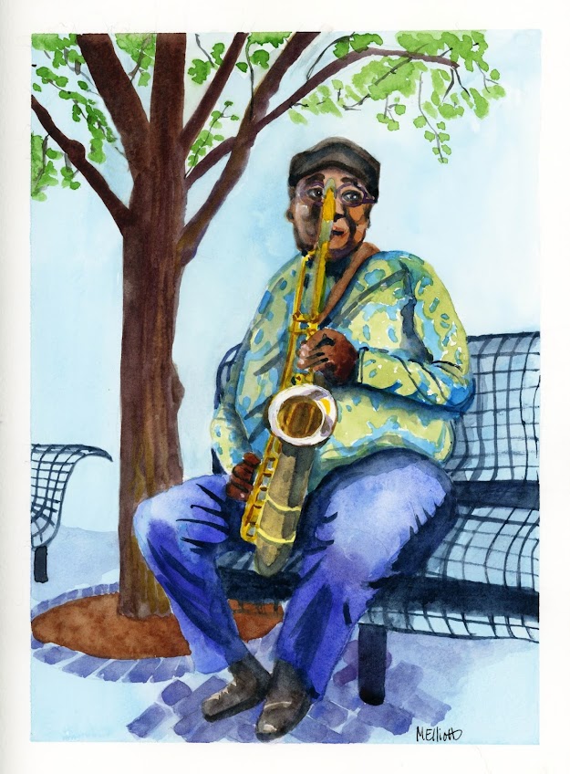
This week's class was with a woman who is both artist and musician, and her painting was of she and her partner holding their guitars. I didn't want to paint the identical picture, so I decided to find a photo of a musician who spoke to me somehow, and went searching through unsplash.com, a great online resource for copyright-free photos provided as reference. 

I found this fellow, sitting on a bench in an unnamed city playing his saxophone, and was drawn to his pose, his setting, and the expression on his face, which it proved almost impossible to duplicate here in this small format. But I did my best, and considering that I know almost nothing about the basic structure of a saxophone, I think I at least did the idea of it justice as well.

I had hoped that this would be a bit looser and more evocative, but that's just not my style, no matter how much I may wish. I was pretty happy with the way the figure came out; less happy with the bench and tree, both of which I gave too much prominence for background objects. I didn't even try to include the building full of windows on the other side of the street—I know my limits. Someday, with practice, I will learn how to back things off properly so that I can balance the foreground and background.

"Sax Player"—pencil, Paul Jackson watercolors, on Fluid 140-lb. coldpress watercolor paper, 9x12. 


16 June 2021

Expectations vs. reality

Today I decided to draw and paint from a black and white photo of a girl with an extremely delicate complexion, almost without either lines or shadows. I decided I would paint her as I have done a few others, by using only Payne's Grey for the shadows of her face, and possibly adding a little blush to the cheeks and lips.

What I didn't take into account is that the hair I designed based on her ringlets was too harsh in color(s) and too segmented to go with the delicate facial features. The hair simply overwhelmed the effect I was going for in the face—it needed to be paler, or at least less defined.

I then decided to add collage by using some polka-dotted tissue paper as material for her dress. I liked it; but the contrast with her hair was, again, all wrong, and the white and red fabric would have looked better on someone with darker (i.e., not stark white) skin. I attempted to bring it all together by adding in some reds and pinks in the rest of her features, but the result was still fairly pallid. Also, the fact that she has her eyes closed meant that I couldn't make those the focus of the picture, as I usually would, and so I had to rely on the other features for interest.

After adding a mix of Crimson and Payne's Grey in the background, I decided I was done and set it aside to dry, but I kept feeling dissatisfied with it. It lacked depth, it lacked character, it lacked pizzazz. So, I decided to mess about with it.

First, I added some Stabilo All pencil around the outside. The characteristic of this pencil is that if you wet it, it darkens and bleeds a little, so you can get a nice dark outline with it. But in this case, it didn't do much of anything for my picture. Also, while I had inked over the edges of the collaged dress, the edges were looking messy. So I ended up pulling out a black Elegant Writer pen, and going around the entire figure and also around the dress edges, then bleeding that out with water to give the figure and dress a nice dark outline and to give the hair a kind of halo.

It's not what I was planning; but I think I like it a little better with the changes I made. And experiments are how you find out what you like!


"Dottie"—Daler Rowney inks, Uniball pen, Stabilo All, Elegant Writer, on Fluid 140-lb. coldpress watercolor paper, 9x12 inches.


15 June 2021

30x Vista

 I was attracted to the reference photo because of the graduated layers of background—grass, road, more grass, sand, hill, sky—and the trees that pulled it all together.

The paper didn't like the amount of water I used in my Silver Black Velvet brush—it's happier with a tight, illustration-level painting—and as usual I had trouble conveying what I wanted to with the foliage. Trees are ridiculously hard to paint...at least for me. I never have gotten a feel for how much foliage should be defined and how much left amorphous and cloudy. But...I gave it a shot.

"30x21_Vista"—PJ watercolors in Bee mixed media sketchbook, 9x12 inches.

13 June 2021

Back to 30x30

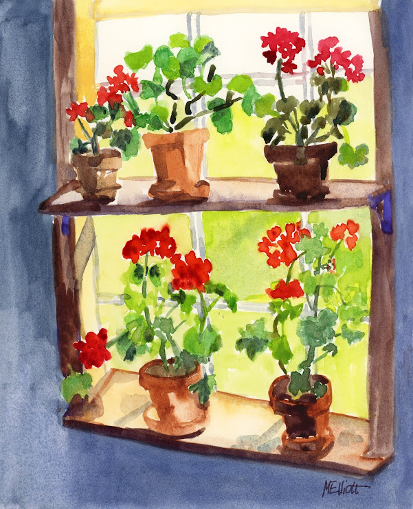
I decided to attempt a direct-to-paint picture of these geraniums highlighted against a window today. I didn't want to totally give up on the month's commitment so soon, and I was intrigued by the white light coming through the window vs. the darkness in the room, and how it made the flowers stand out.

The background was a little bit more defined than I painted it here, but I didn't want to get so fussy that it would detract from the shapes the geraniums make against the green background. I started too high on the page, so I couldn't include the dark of the room around the top. I was pretty happy with how I rendered the pots, but less happy with the variations in the leaves of the plants. And as usual, I had a few perspective problems with those shelves. But over all, I'm satisfied with it.


30x21_Geraniums, PJ watercolors in Bee mixed media sketchbook, 9x11 inches.

(Doesn't it seem like the plural of geranium ought to be gerania instead of geraniums?)