13 February 2021

Mood

Today the Congress acquitted Donald Trump for the second time, despite the clear evidence of his culpability. That invasion of the Capitol can be laid directly at his door. He incited it, and then he sat back and enjoyed it while people ran for their lives and some lost them. And he isn't even made to feel sorry for it. The impeachment just becomes one more vendetta against him by the evil Democratic Party, and he's out there right now, gloating and continuing to insist that he won the election and is our rightful president.

I despair. If, in the face of such damning evidence, we can't even make HIM pay, then how the hell are we supposed to purge the Congress of his venal, lickspittle accomplices and toadies? Voting against them in TWO YEARS is not enough. Two years in which they do further damage. Two years in which they collect their generous salaries and enjoy their all-encompassing health care, while they meet for lunch at their clubs and play golf and send their children to expensive private schools—as a good percentage of the rest of the country goes hungry and dies. Our country has turned into France before the Revolution. But the only revolution we have seen was in favor of the dictators.

My art today expresses my mood. To respect everyone's finer feelings, I will just call it "Mad." It started out as kind of a joke, but after the verdict arrived, it was all too real. I am disgusted, demoralized, depressed...MAD.


Pencil, Uniball, Daler Rowney inks, gesso, on 140-lb. Fluid coldpress watercolor paper, about 8.5x10 inches.


12 February 2021

Reading-based art

I just finished reading a book called The Marsh King's Daughter, by Karen Dionne. Although the story itself isn't based on the Hans Christian Andersen story, the author uses it as a sort of running metaphor and opens each paragraph of the book with a further excerpt until you come to the end of the fairy tale and the real story both in the last chapter.

After writing a book review last night (publishing Sunday), I woke up this morning with an idea for artwork to go with the story, and spent most of the day playing around with it. The fairy tale features a child who is beautiful by day but with a horrid disposition, and then when night falls she turns into a huge ugly frog with a sweet, affectionate manner and sorrowful eyes. Her adoptive mother (the stork brought her) must keep her secret night-time identity from her Viking husband, who she believes would kill the child if he knew; the mother wouldn't mourn the loss of the child so much as she would the frog, since it is the frog with whom she has bonded. (There's more to it, but that's the opening premise.)

I tried to accomplish something in this illustration that didn't quite come off: I wanted the frog to be completely present in the foreground, and for the girl and the background of the marsh to be ethereal and not quite so real seeming. I tried to achieve it by putting a water-like wash of blue over the girl and background, which helped. but I went too dark for some of it to drop back. I thought using indigo for her shirt would make the frog pop, but instead I think it made her too tangible.

She's also a little more generic looking than I intended, and her left eye seems to be wandering off her face a bit. I guess a fish-eyed look for a girl who spends her nights as a frog is okay!

I got a shipment from Dick Blick today, and one item in the box was "Semi-Moist Metallic Watercolor" (sorry, Kirsti) in gold. (I also ordered bronze and pink.) I couldn't wait to use it, so I highlighted her hair, the cat-tails, and parts of the frog with it. It doesn't show up so much while wet, but once it dries it really pops, so I should have been less enthusiastic about splashing it around, especially on the background elements. But hey—experiment and learn.


Here's my illustration—"The Marsh King's Daughter"—Pencil, Daler Rowney Inks, watercolors, Micron pen, white gel pen, gold paint, on 140-lb. Fluid coldpress watercolor paper, approximately 7x11 inches. You can see it again on my book review blog, https://bookadept.com/blog, on Sunday morning.

10 February 2021

Combining class techniques

The real reason to take art classes—not to slavishly mimic whatever the teacher is doing (at least, not after the first learning-curve time), but to find techniques you like and that work for you, and combine them in a new way.

I did the LFI2021 class with Tiare Smith Woods yesterday, in which we layered gesso and acrylic paint underneath our image, and really liked the effect, although the image wasn't exactly my cup of tea.

Meanwhile, over in my challenge at Olga Furman Art, our week's theme is to paint nurses, and Pamela Vosseler did a great demo of painting quickly and loosely on a brown paper bag, using charcoal as the underdrawing and blocking in the painting with a palette knife before putting in finishing touches with a brush. So this morning, I decided to "put my hands together" and combine techniques.

The background colors had significance—I did my best to mix the ubiquitous mint green color you find on most hospital walls, and then added in red and yellow for the stress and trauma you find there. I drew the reference nurse in a medium charcoal pencil, then blocked in the headscarf and apron with a palette knife and white gesso. I decided not to fill in the face with color, but rather to layer and indicate features over the top of the background colors, and had great fun combining thinned-out colors to delineate her face without obscuring the details behind.

I used slightly thinned-out Payne's Grey to accentuate some shadows and to block in the dark dress under the apron. In the reference photo, the collar is a print, but after trying out a few things I decided to leave that, too, untouched.

I'm honestly quite happy with my results—maybe there are media other than watercolors in which I will learn to feel at home!


"Nurse, 1930s"—gesso, acrylic paints, charcoal pencil, on 140-lb. Fluid hotpress watercolor paper, approx. 7x12 inches.


09 February 2021

Layering

This week's teacher was a doll, and therefore I hate to say that her lesson result was just a little "twee" for my taste. But what I did like was her sense of adventure and play.


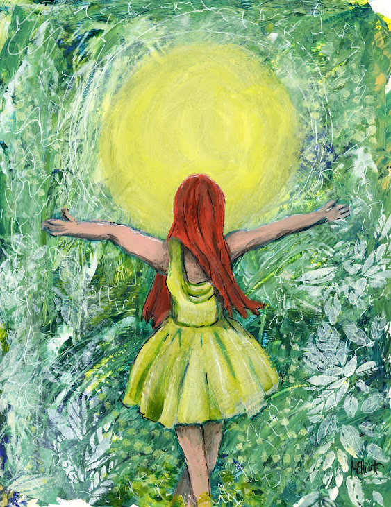
This painting has a layer of gesso, rolled on with a brayer; a layer of five or six different colors of acrylics, spread around with a palette knife and then scratched into each other; then the sun (or in the original, the moon) and the picture of the girl are drawn and painted on the top; then we came back in with some more gesso, both free-hand smudging and also some stencil work; and to finish it up, we simply took a white gel pen and scribbled all over it! So even if the girl and sun are not necessarily what I would do on my own, all the techniques to go under whatever I do end up doing are really cool!


"Sun Worship"—gesso, acrylic paints, flow-aid, charcoal pencil, gel pen, on Fluid 140-lb. hotpress (smooth) watercolor paper, about 8.5x11 inches.

08 February 2021

Seeking inspiration...

...from YOU! I found out today that the 30-day challenge from Olga Furman consists of only four themes, and we will only receive those once a week for the month. Furthermore, the theme is consistent, so the one we received yesterday, rather than being a one-day challenge with alternates among which we could choose, was instead seven photographs that we were supposed to paint from for seven days. But the first theme was "nurses," and even though I highly value them (especially now), I don't really want to paint a bunch of anonymous nurses for a week! I did Florence Nightingale and might do one other, but that leaves me at loose ends for material for at least three days a week (I still have my weekly lesson with Kara Bullock, plus some other resources).

SO: I'm going to open this up! If you have a mentor or muse out there who you think deserves to be painted, put their name in the comments below, or hit me up on Facebook or via email if you have it, and I will consider painting that person sometime during the next 30 days.

Please note that this is NOT about you getting me to paint your mother or your dog for free; it's about seeing a painting of someone you think is an interesting subject for me to take on!

07 February 2021

Ode to Women

Olga Furman Art is sponsoring a 30-day portrait challenge (one a day for a month) in honor of Women's History Month. Deb Weiers posted it on her page, and I thought it looked intriguing. We start today and finish on March 8th, which is International Women's Day. Olga is providing one theme plus five possible reference photos per day, some with complete demos by guest artists, some with "WIP" photos, and some just the reference. I didn't think I had enough to do with my weekly class, so I signed on for this challenge as well (HA!). #AnOdeToWomenChallenge

The first day's theme is "nurses," and we had five photos, some old, some new, some black and white or sepia-tone, some in color, and some different styles were demonstrated. I chose to paint from the Florence Nightingale reference, since she IS the mother of organized nursing.

The photo was in black and white, so I decided on a monochromatic treatment. But I didn't want to use black/gray, so I gave the paper a wash of pale turquoise, and then painted her portrait in indigo blue ink, following up with shadows and contours in purple. You would think that purple would be the darkest, but the indigo is actually more dense, so I went back in with some indigo for the heaviest shadows as well.

I'm pretty pleased with this, both as a likeness capture and as a piece of art. I thought afterwards about going back with a part-purple wash for the background, coming in from the corners with the purple and then shading into turquoise again to keep it light around the figure, but I didn't think of this until after I did the lettering, and although the black is water-resistant, the white accents are not, so I left it as is.

Pencil, Daler Rowney inks, Uniball Vision pen, white Signo gel pen, on 140-lb. Fluid coldpress (rough) watercolor paper, about 8.5x11 inches.