30 December 2021

The electronic critic

Something I have recently discovered is that once you scan something and put it up on the computer screen, all is revealed! What is it about the electronic eye that sees every flaw when the human eye can't? It's frustrating.

I painted a portrait today for a Secret Santa exchange (yes, I know I'm late, but we have until Jan. 11th to get it there), and was completely satisfied with it...until I scanned it and saw that one side of her face was noticeeably flatter/thinner than the other, that her mouth wasn't at quite the right angle, and that I needed to reshape a couple of teeth to look like her actual smile. So, I picked it back up off the scanner, and filled in the cheek, re-slanted the top lip a little, and fixed her teeth, and now, at last, I think I have a good likeness.

It was supposed to be a $15 value, but it was also supposed to encompass "what you do" as a "creative," and this is what I do...so Angie's getting a portrait.

No worries about her seeing this unless I call it to her attention; it was a random draw-a-name exchange on Instagram, and I don't know her from Adam. And I used a screenshot from a video she posted as my source photo. But I hope that when she receives it she is pleased with her little Christmas portrait.


"Angie"—pencil and acrylics and Stabilo (brown) on watercolor paper, 8.5x11 inches. I used one of my abstract backgrounds because she is already quite a pink young lady, from Toledo, Ohio!


28 December 2021

Pensive

I was looking up some poetry for someone today and came across a photo of Anaïs Nin in an uncharacteristically pensive pose, with face propped on hand. It was black and white, but based on a few color photos of her I was able to get a general idea of her hair color at this point in her life (earlier and later she must have dyed it dark/black, I think, because it was so radically different), and I extrapolated the rest based on the light in the photo.

I also, of course, used my leftover-paint background as a basis for the color palette. These paintings are a little pale and a little pink sometimes, but for this particular painting the colors seemed appropriate. I'm enjoying this sort of scrubby painting method I'm using on these.

I thought about breaking out some gold/gilt paint for the necklace, but decided it would take away from the otherwise extremely matte feel of this, so I stuck with paint. Naples Yellow is an extremely versatile color, working for blonde hair, gold jewelry, and some skin tones as well. 


"Anaïs"—pencil, acrylic paints, and a little Stabilo All pencil in brown, on Fluid 140-lb. coldpress watercolor paper, 9x12 inches.

26 December 2021

The power of suggestion

I am enjoying the employment of random backgrounds to suggest the subject matter for each next painting. I don't know how much longer I will pursue this trend, but it's fun to use the leftover paint from the previous work to create a new background that in turn dictates the kind of painting that will be made next.

After I painted Leonor Fini, the colors I mostly had left over were all the ones used for her skin tones—Naples Yellow, Titan Mars Pale, and some Magenta. I used them to make a new background, but wondered what I would do with one so relentlessly, well, PINK. Today, though, I browsed my saved reference photos and found one of a wonderful old lady with bright blue eyes, wrapped up in a hat and fur coat and standing in front of a gray coastline. Her face was such a beautiful combination of white, pink, and a little pale blue/lavender that I knew I had found today's subject. Here's an early "process" photo to show how I started.

As I did with the others, I almost used the paint more as a stain than as an opaque coating, allowing the background to show through or at least to dictate what I used on top of it so as to preserve its effect.

I didn't reproduce the cold gray background because I liked keeping this one, but I did incorporate a little turquoise (after I used it to mix her eye color) to drop it back a bit and give it a more delicate sunrise feel.

I also didn't paint in all of her many wrinkles, but rather tried to convey their presence by both the face shapes and the directionality of some of the paintbrush strokes. I could have done more detail, but I think the idea of age is sufficiently conveyed here by the depth of the eyelids, the gently sagging cheeks and jaws, and some of the facial creases.

I wish I had thought ahead to give a better impression of the hat and coat as fur, but I was primarily focused on them as a frame for her face, so they are fairly matte.


"Pink Lady"—pencil, acrylics, and a little Stabilo All, on Fluid 140-lb. coldpress watercolor paper, 9x12 inches.

And I have another background made from her leftovers for another day.

20 December 2021

Overlooked artists

Today's subject, painted over yesterday's leftover substrate, is a young Leonor Fini, photos of whom I found on the internet without knowing who she was. Turns out she was a powerful surrealist artist who painted some really interesting stuff. She also designed costumes and sets for the Paris Opera, and dressed herself as dramatically as if she were a part of one of those productions; she wrote three novels in later life, as well as illustrating many works by the great authors and poets, including Poe, Baudelaire, and Shakespeare, as well as texts by new writers. She painted many portraits of the famous and socially prominent, her last being a portrait of Paul and Linda McCartney, which was rejected by their agent as being "too precise and too sad."

She was born in Buenos Aires in 1907 of Argentinian/Italian ancestry, but spent much of her life and career in Paris. When she was a teenager she had an eye disease that forced her to wear bandages on both eyes; when she recovered, she decided she would become an artist and moved to Milan at age 17 and then to Paris in her 20s, in pursuit of that.

She had many lovers, for some of whom she served as a muse, and steadfastly avoided marriage and motherhood, living for much of her life in Paris and in the Loire Valley with two lovers (one artist, one writer), two assistants (who also acted as concierge and housekeeper), and up to 23 Persian cats. She actively worked through her art to subvert the roles imposed upon women by society, abandoning images of women who were fragile and innocent in favor of female figures who couldn't be categorized or sexually defined.


Despite her successes and exhibitions, Salvador Dali dismissed her work as "better than most, perhaps, but creativity is in the testicles." (One wonders if Dali's was the body on the table depicted by her in "The Anatomy Lesson." All the girls and women are looking at him with a degree of disgust surely deserved by that remark!)

Leonor Fini died in 1996. Despite her prolific career, the Centre Pompidou Collection du Musee d'art Moderne in Paris contains just one painting by Fini, a portrait from 1932. It also contains a dozen photographic portraits of her by Man Ray. This is a final slap in the face for yet another marvelous artist who happened to be a woman. It makes me want to paint her over and over, to extend the memory of her life and career!


As I did with yesterday's portrait, I let the background show through this, and dictate most of the colors I used. (I think her eyes were probably brown in life.) "Leonor Fini"—Posca pen and acrylic paints on Fluid 140-lb. coldpress watercolor paper, 9x12 inches.


19 December 2021

Don't waste paint

I haven't posted any art for 10 days because I haven't been able to paint. I went in a week ago last Wednesday to the podiatrist to get him to remove a small piece of glass from the bottom of my foot (in the arch right in front of the heel). I had broken a drinking glass in the kitchen about a year ago and, walking around barefoot in the summer, managed to pick up a stray piece in my foot that the broom didn't find. I immediately went to Urgent Care, where they numbed the foot, tweezed out the piece of glass, put on a Bandaid, and that was an end of it. Except that over the past few months I discovered there was still some glass in there. Perhaps it was deeper and had gradually migrated back up to the surface? but now I was feeling it when I pressed down on the spot or set my foot down unwarily, so I wanted to get it out of there.

Turns out, though, that there was no glass; instead, my foot had created a "plantar keratosis" in the spot where the previous piece of glass had been removed. So the doctor cut it open a lot wider than he had planned and removed the keratosis, and then he gave me six stitches, a bandage, a wrap, a sock, a boot, and a prescription for antibiotics, and told me it would take three to four weeks to heal! Talk about throwing a wrench into the Christmas season—not only has it been difficult to get around on it, but if I don't keep it elevated for a good part of the day, it hurts. So sitting at my desk painting for a few hours at a time hasn't been an option.

I have had one bandage change now, however, and taken all the antibiotics, and it's doing better. So I decided yesterday that I would paint a picture as a gift for someone. I painstakingly laid down a grid on the page so that the drawing would be accurate, then did the base drawing and started to paint, but after more than two hours' work it was turning into the most dreadful thing I have ever attempted, and I decided not to waste any more time on it.

That is a really long explanation to get me to the title of this blog post, which is  about not wasting paint.

The one thing that Emma Petitt says at least once and usually several times during every lesson is "don't waste paint." If you have a little white paint left, go back and hit your highlights one more time. If you have another color that goes with something in your painting—hair, background, clothing, whatever—then take your paintbrush and slap it in there. Leave that palette bare by the end!

Since I just started painting with acrylics this year, however, I haven't yet got good judgment about how much paint it takes. I inevitably either run out and have to add more, or overestimate from the beginning and have a bunch left of at least one but usually three or more colors. So since one of the tricks I have also picked up from Emma is creating interesting abstract backgrounds over which to paint my portraits, I am now making it a habit to pick up a pad of paper and my brayer (roller) at the end of the current painting and use the remaining paint on my palette to create the next background. Sometimes they turn out well, and sometimes they sit for a while before I can figure out how to use them, but either way, I feel relief that I'm not throwing away expensive art supplies!

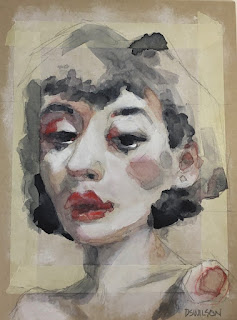
So last night, when I gave up on that painting, I had paint left on my palette, and I used it for a new background. There were a lot of colors, and it came out pretty dark and intense; but there were some nice combinations and juxtapositions. This morning I gave up on sleep at 5 a.m. and got onto the computer to write a review of the book I finished at 1:00 before going to sleep; then I made myself some breakfast, did a few light chores, and thought about what to do for the rest of the day. The chores made sitting down for a while a necessity, and my eye was drawn to that new background. 

The other thing I have learned with the abstract backgrounds (this from Deb Weiers) is to look and see if there is already a "picture" contained within them, just waiting to be released. Sure enough, this one had a face and a couple of pseudo-Princess-Leia buns (that ended up translating to giant blossoms) staring out at me. So I looked around for a reference photo that would work, and found a dark-visaged girl with her features at the appropriate angle who was begging to be my model.

This is a little different from most I have done, in that I was so reluctant to cover up the interesting background that I did minimal coverage with the paint. Instead of using a big brush with broad strokes, I used a fairly tiny one and did almost a dry-brush effect on the face, using small dabs of paint and scrubbing them into the surface so that the underlayer wouldn't be completely obscured. Then I did the opposite on the clothing, by using a large brush with a thinned-out coat of paint that would darken without blotting out the underlayer. Between the two, I'm happy with her emergence from but lack of contrast with the background.

I also wanted a more definitive line than my usual Uniball, given the dark and challenging background, so I used a black Posca pen, which I think worked well. I'm pretty happy with her—and yes, I used the leftover paint for my next background!

Posca Pen and acrylic paints on Fluid 140-lb. coldpress watercolor paper, 9x12 inches.


07 December 2021

Last LFI2021

It's been quite a year, doing Let's Face It 2021, and now it's over! I haven't done all of the lessons (maybe half?), partly because some were charcoal or pencil only, which didn't interest me, and partly because I got distracted by other classes and went off on those tangents for a good part of the year. But it was worth it, even doing just 25 of the 49 lessons, and I have signed up for 2022. I have also signed up for Paint Your Heart and Soul 2022, likewise a year-long class, so that I can choose whether to do one or the other or both lessons per week and discover yet more teachers with whom I would love to study! And of course I have a few leftover lessons from more in-depth classes that I need to go back and complete, and a few I haven't even looked at yet, and a couple of commissions... I think 2022 will be another busy art year!

Anyway, our last lesson this week for LFI 2021 was with Danielle Mack, and was an exercise to paint two women together in one frame, supposedly combining them from separate, individual photos. I didn't exactly adhere to that plan, because I was reading a review this morning of the new Paul Verhoeven film, Benedetta, and when I saw the picture of the two nuns, one peeking from behind the shoulder of the other, I had to paint them. Danielle was making a statement about woman power, and I'm not sure these lesbian nuns fit the description, but they were definitely risk-takers, given that it was the 17th century!

I did fulfill the assignment as far as drawing and watercolor went, and I abstained from adding any additional mixed media details with the exception of the rosary, for which I used my silver gel pen. But otherwise all watercolor, and mostly done with my loose and sloppy brush, somewhat in the mode of Fiona di Pinto, putting in the darks first and coming back in with the lighter colors. I'm pretty happy with it, although as usual I forgot to allow for borders. The faces are a little long, compared to the originals, but not horribly out of proportion. I just failed to get the slightly up-tilted chin on the front nun. Otherwise, not bad.


"Benedetta"—pencil and watercolor on Fluid coldpress watercolor paper, 12x9 inches.


06 December 2021

The beauty of substrate

Ever since taking Emma Pettit's class, I am super conscious of paint usage. Her continuing mantra throughout her painting process is "Don't waste paint!" to the point where she will say, "Just take whatever is left on your brush and scrub it over the surface to give you some nice texture—use it all up!"

So, when I finished a painting session on the recent large figure portrait of Johnny and George and had a bunch of colors left sitting on my palette, instead of balling up the page and throwing it out, I got out a 9x12 piece of watercolor paper and my brayer (roller) and made a background (substrate) to use for a future painting.

The problem with these backgrounds Emma teaches is that sometimes they are so pretty that you don't want to cover them up! I didn't expect the combination of Naples Yellow, Burnt Sienna, Lemon Yellow, and a little bit of Payne's Grey to mix so agreeably, but when I was done, I thought Ooh! What can I paint on this without covering it all up?

My solution was to impose an image taken from a black-and-white photo, and only paint the lights and darks, leaving the substrate to show through for all the neutral parts.

I'm not sure whether I feel like this is a success; for one thing, since the light was coming from behind her, the biggest highlight in the entire photo was the neck, which is always an awkward place to put such definitive white strokes and leave them unblended! It probably would have been better painted in inks or watercolor, but I wasn't sure I could even do that, over the top of an acrylic background, so...white and Payne's Grey acrylics, and a dark blue Stabilo All pencil for a few defining strokes.


"Substrate Woman," 9x12 inches.

And then, of course, I had white and Payne's Grey left over, so now I have a new substrate...

04 December 2021

It's done...I think?

Once I got started painting on this project, it seemed like I couldn't put down the brush. I did 2.5 hours the first afternoon and then had to get out of the chair, stretch, and move around a bit; but after dinner and a couple hours of TV, I found myself distracted from what I was watching, and thinking about what I would do next on the painting. So I went and did two more hours before bed! Same story the day after, and this morning I got up and put in the bulk of the background.

It's not exactly what I was planning...but I think it works. I put in a wall-like structure to anchor the bottom without being too specific, and the rest of it feels to me like an out-of-focus rolling moor in the background. I had fun fuzzing out their hair so that it felt like it moved into the background a tiny bit, and invading her arm with some faintly foliage-like shapes.

Ironically, the thing I was least worried about—capturing their likenesses—came out the best. I was going for a light-and-shadow sort of abstract effect, but they still look like themselves, I think.

Here is a colorized version of the black-and-white photo:

I started out making his shirt dark green, but quickly realized that it would be way too much green if I was going to mimic the background foliage in any way, so it became shades of raw umber instead. I love how umber mixes with other colors to give you various shades, from mushroom to rust.

I knew I wanted her dress to be pale blue, but I wanted to give it a little pizzazz, so it has some turquoise in the mix with the cobalt and white, and although her belt didn't look this white in the b&w version, I liked it as another counterpoint to pick up the light, along with their faces and arms.

I kind of wanted to paint those feet in the bobby socks, but the "client" specified a three-quarter view rather than the whole length of the figures, so that's what I did. I do wish I had started a little lower on the canvas so there was some air above his head; and their heads feel a little big for their bodies, too. But over all, I'm pretty happy with my first foray into full-figure, double-figure, and in acrylic!


These are "George and Aunt Johnny," pencil and acrylics on canvas, 18x24 inches.    

We'll see what Aunt Johnny's niece has to say about it. My friend Phoebe likes it, and that's more than enough for me!


02 December 2021

Getting my nerve up

Today I finally went back to my first real "canvas" painting, which is also my first with full figure, and actually with two of them. I ended up imposing a grid over the photo and then duplicating it on the canvas so as to locate everything properly, although the proportions were not identical and I fear that the vertical boxes on the painting will be a bit elongated. But since I am not going for an entirely literal portrait but rather doing a more abstract study of light and shadow, I don't think there will be any harm done.

So far, I have put in the preliminary drawing, which has already gone through multiple changes and I'm sure will evolve further as I get out the paintbrushes. In fact, just the act of photographing it and looking at the photo shows me where I need to make adjustments—funny how different things look once they're in a still shot.

I'm a little nervous about the whole thing, but it's also exciting to try something new. I'm taking a lunch break and then breaking out the paints.

Oh, and as a bonus...a rare photo of the uncooperative model Gidget, in her perch on the patio in front of my prolific lemon tree.


20 November 2021

A new substrate

I did an interesting lesson with Deanna Strachan-Wilson of LFI2022 (a preview bonus session) today. I thought I knew most of the permutations of working with watercolor, but Deanna introduced me to a new idea—using some form of partial "resist" to slow down and loosen up the application.

We used toned mixed-media paper, and put a thinned-out coat of gesso on it. Yes, gesso, as the base for a watercolor. Considering the frustrations I have had with gesso as an undercoating for acrylic inks, I would have said no thanks, but her watercolors are soft and hazy, a little smeary, and completely appealing, and I wanted to learn, so I went along.

This is an example of Deanna's.
(She's also doing some kind of
thing with masking tape, but
we didn't do that part.)
The effect of the gesso is to make the watercolor at least partially bead up on the surface and be slow to dry. So you can blob it on all over the place, and still go back with a damp, clean brush to push it around, remove some, smooth it out into the creases of the gesso, and finally let it dry while sitting on the surface, and thus get all kinds of soft, fun effects.

You do have to have patience to let each layer dry, once you get it where you want it, before trying to apply the next; with normal watercolor paper, the color is going to sink in and be immovable pretty quickly, but with the gesso running interference, it's a gradual and kind of random process. But once you start layering it up, you get some beautiful soft shadows using just a few colors; Deanna encouraged us to also be vague about such outlines and structures as hair and clothing, and indicate rather than define.

The other thing that makes her faces pop is going back in with the gesso after to brighten up all the whites, which stand out beautifully on the toned paper and vague background. And you can sort of push the gesso into the color and blend them.

I don't think I would choose this as my preferred method; I enjoy too many other techniques to be exclusive. But I will certain try this again and see what I can do with it!

I picked my own reference photo from which to work, so it wouldn't be a duplicate of everyone else's. This is...


"Dani"—gesso, pencil, and watercolor on Strathmore toned gray 184-lb. mixed media paper, 9x12 inches.


Canvas

I finally got up my nerve to start a canvas this week; up to now, I've been painting all these acrylics on watercolor paper. But this one is a sort of commission; I was intrigued by the project and told the person whose reference photo it is that I would attempt to do it in the style we both admired and, if she likes it, she can buy it from me. If not, hopefully someone else will want it. Or, it will have simply been a good experiment.

The subjects are 3/4 figures of a man and woman standing outdoors in front of foliage. But the objective is not a realistic portrait—the photo is black and white and the contrasts (light and shadow) in it are extreme. We agreed that I would try to paint it sort of in the style of artist Michael Carson. This means the background will be color blocks that suggest rather than specifically convey the atmosphere, and a figure (or two in this case) made up of contrasts, with likeness not being as important as mood.

I got a bit literal with my color blocks on this, since I wanted to have both a light and a dark green and a khaki color for the foliage, some blue for the sky, some orange/yellow for sunlight, etc., and they are way too discrete and solid. But I have taken the initial step of going over them with a thinned-out mix of Naples yellow/green (a sort of green-tinted pale cream color) mixed with a little Cobalt blue and thinned out with Acrylic medium. I did one coat and let it dry, and will probably go back in with more, and then add some dry-brush paint for a "scumbled" effect in certain areas.

Also, once the two figures are in, they will cover up about 85 percent of the background, and then I can play around with whatever remains around the edges, until it is "edgier," ha ha.

Anyway, here are a couple of shots of my prep work so far:

The raw background squares...


The glaze...


And with the first layer of the "knock-back" color applied...


More to come as this progresses...


18 November 2021

Challenges

The thing I enjoy most is finding a reference photo that challenges me—an odd perspective or angle, extremes in light and shadow, quirky expression, or whatever. I picked this one because of the hands, the mouth, and the task of making it look like somebody was home behind those sunglasses. I've been contemplating it for a couple of days, and finally decided to jump in.

I can't say I'm completely satisfied—the hands were difficult, the way they are bunched up, and look distorted to my eyes. They are especially interesting because on one hand she is sticking out her pinky finger like she's holding a cup of tea, while on the other she is sticking out her index finger instead, so they are opposite but it was hard to make them look that way. I think I got the pinky too large/long and the index finger too short/small, and it doesn't help that I started drawing about two inches farther to the left than I should have if I were going to include that entire right hand, so there's that. I'm still not the best at placement!

I feel I did better on both the eyes and the mouth; but what I'm really happy with on this is the use of the background colors to determine a lot of the foreground colors, without having them blend into one another too much. I introduced a few random colors that didn't appear in the background, such as a light olive green in some of her skintones and the pale raw sienna that I combined with other colors for some shadows; it got a little muddy, but mostly I think it worked. I'm also happy with the hair color—I love a redhead!

I introduced some outlining with a black Stabilo All to selected areas, not outlining everything but using it to emphasize certain things; and then I went back in with a damp brush and activated some of it so that it would make parts (like the sunglasses) pop.

Despite the placement error that put the hand partly out of frame, I do enjoy painting portraits in which the person seems to be looking in from another room, rather than being the central focus.


"Glamour Glasses"—pencil, acrylic paints, and Stabilo All on Fluid 140-lb. coldpress watercolor paper, 16x12 inches.

12 November 2021

The Mighty Quinn

No, this isn't Quinn the Eskimo, although her fur wrap might lead you to think so. This is Quinn the Cleveland bookseller. I previously "immortalized" her by painting a sweet moment between her and her dog, Cha Cha, but over the course of time I have discovered that Quinn is a mighty advocate for the downtrodden, in addition to being a poet, a storyteller, a deep thinker about ethics and equity, and a lover of costumery, for both her and her "supervisor," who owns more tutus than any little canine could wear in one lifetime. And despite some health and immune system issues, she has ridden out the pandemic by using grant money to employ a crew of 15 remote workers, taking them off the jobless roles and teaching them to catalog books. In short, Quinn is a badass.

At some point someone sufficiently recognized that as to do a photo shoot of an intense and somewhat barbaric-looking Quinn dressed in furs and staring out from the depths of the forest; I decided today to try taking that image into watercolor with the looser method I have lately cultivated, and here is the result. My only regret is that she had a cool nature-themed "fascinator" on her head, but I drew her too large on the page to have room to fit it in. I have to remember to use bigger paper than I think I will need!


"Mighty Quinn"—pencil and Paul Jackson watercolors on 140-lb. Strathmore coldpress watercolor paper, 9x12 inches.

06 November 2021

Random

This is not the painting I was planning for today! I had a particular vision and, after prepping a piece of paper with a rough coat of white gesso, I opened up my reference folder on my desktop and started clicking through photos, looking for the perfect face to work with my plan, which entailed inclusion of a chrysanthemum and some collage.

Then I came across this model, who I painted a year or so ago, and I thought to myself, Hm, she would be cool in acrylic, especially because she has some intriguing shadows and colors in her face, and suddenly there was a whole new plan.

Here is the old painting, in watercolor (or maybe it was acrylic inks?). I painted her "straight," and then decided to futz around with Stabilo to make a "halo" around her, and with an Elegant Writer for the background. I may have thrown some salt in there, too?

So far all my acrylic paintings have followed the formula I learned from Emma Pettit, which is to create a colorful background first and then paint over it, so that I start with whites and move through to darks; but with this one, I started with a white background, which involved some reverse thinking. When I finally got done with the figure, I decided that I did need a color in the background, and chose the lavender to make both the shadows and the contrasting colors pop. I was intentional about the direction of the paint, which all radiates out from her head and allowed me to use my flat brush to give a soft edge to the peach fuzz hair she has on her head; I'm not sure whether I should give it another coat, since it's kinda sketchy looking. I'll think about it and come back later.

I did a better job last time of capturing the slightly exotic tilt of her eyes—they are a little too big and round this time—but otherwise I am happier with the likeness; the nose isn't too long as it was before, and the entire head and face are in better proportion. So I guess I have learned something about facial structure, at any rate!


Here is "Bald Girl #2"—white gesso underpainting, charcoal drawing, acrylic paints, and a little bit of Stabilo here and there. 9x12 on 140-lb. coldpress Strathmore paper.

05 November 2021

Fitting it in

Between doing annoying (but apparently necessary according to the Franchise Tax Board!) back taxes and coping with plumbing problems, I haven't been able to take the time to focus on making a painting these past few days. I split my time between searching for paperwork and plunging the kitchen sink, calling people for errant W4s, trying to understand the questions in TurboTax, boiling water to dump down the sink in the hopes it would loosen whatever was clogging things up...not conducive at all to creativity. But after yesterday's debacle with the initial plumber I contacted (he showed up three hours late and then didn't have a pipe wrench with him!), followed by seeking out a legitimate guy and getting him to come look at the problem and give me a quote, I also had to spend today waiting for him to arrive and then trying not to hover while he did the work.

I hesitated to start something at first, but then decided that I could at least lay down the base drawing and then maybe, once he arrived and started dismantling the pipes, I would have time to make the painting (also preventing me from hovering). This plan proved doable (although I did the second half of the painting after he left, he was so quick!).

I decided to go back to a "loose" watercolor style—the kind I refined through taking Fiona Di Pinto's mini lesson on Etchr—but this time with a reference photo chosen by me, and in richer tones and colors. Her pose turned out looking a bit awkward, since in the photo she is leaning forward with her forearms crossed on a table but in this format I only had room to show her shoulders and upper arms. I should have either drawn smaller or used larger paper! But I'm mostly happy with the bloominess around her features and the intensity of her gaze. Her hair was much darker than this, but I ran out of my dark sepia and had to mix ultramarine and burnt sienna to get this lighter shade of brown.


"Ella"—pencil and Paul Jackson watercolors on Strathmore 140-lb. coldpress watercolor paper, 9x12 inches.

30 October 2021

Wrapping up the prompts

Today's gardening prompt from they_draw.com was "zinnias," and I just happen to have a long border of zinnias up against one wall of my yard, beginning to fade a bit but still quite colorful and full.

That particular wall has been completely obscured by my neighbor's vine—it was planted to crawl up the wall on their side about 15 years ago, and has now grown up and over to carpet my side with dense leafiness, dark in the shadows and bright where the sun strikes it at the top. I'm thrilled—apart from the look of it, which I love, it's probably the only thing still holding up that section of wall, which was installed in 1948 and has become increasingly wobbly over the years as it has survived several large earthquakes. My dad had to shore up the portion of the wall on the other side of the yard with a couple of posts after the Northridge quake, but the vine on this side kept everything standing nicely.

I was going to just pick a handful of zinnias, stick them in an attractive vase, and paint a watercolor still life; but after my experience on Tuesday with the Van Gogh immersive experience, I had the impulse to try painting a landscape with acrylics, which I have yet to do since taking them up this year. So I taped off a piece of watercolor paper and gave it a shot.

I'm actually pretty happy with it—the hedge-covered wall has a nice solidity enlivened by its highlights, and the zinnias feel authentic. The tree in my neighbor's yard that peeks over the wall was initially too prominent as a mere background, so I washed over it with a blue-white glaze to back it down, and now it feels like about the right intensity. The brown at the bottom is the color of my lawn after a mostly rainless summer, but it provides a nice space to throw in a few shadows from the overhanging bits of zinnia border.


"Zinnia Border"—Vincent it's not, but I thank him for the inspiration to try, and it makes for a big finish for the month's prompts. Acrylics on Fluid 140-lb. coldpress watercolor paper, 16x12 inches.

28 October 2021

Tiny lesson doodles

A lot of groups are putting little mini live sessions online as part of their offerings lately, and I attended two in the past two days. I didn't do any major work as a result of them, but I did take good notes and will get back into them later.

The first was with Salli and Nate of they_draw.com, also responsible for illustratorsforhire. I joined their "Illustrators' Circle," which includes lots of draw-alongs and contests and other features. Yesterday we did a draw-along called "Abstraction Distraction—Inserting abstraction into your drawing practice." The idea is a five-step process that consists basically of thinking of an event, a place, or an experience, and making shapes that bring it back to you, in kind of a quilt-like assemblage, with an evocative color palette. Salli gave a few examples of some she had done, and I took a couple of screenshots:


The first is about a weekend in Miami, while the second is Salli's take on the winter solstice. You can see how the color palette in the first, and the curving and square lines, evoke the whole atmosphere of Miami, while the second has some specific references (moon, stars, trees, village) that, along with the colors, nicely reproduce the feel of the longest night.

This whole idea/process really appeals to me, and I plan to try some with color and shapes soon. All I had in front of me during the draw-along (without scrambling to drag stuff out) was my sketchbook and the Uniball I was using to take notes, so I did a doodle of my checkerboard herb garden, attempting to make basic shapes and lines that would convey plants without actually drawing stems and leaves. Here are my "Abstract Herbs."


Today's lesson was to play with line to make "curly" faces, which is to say a mostly continuous contour drawing of a face where all your lines are moving and defining the contours without lifting your pencil much, and varying the weight of the line for emphasis.

The teacher, Dina Wakley, used a Stabilo All pencil and then, since those are water-soluble, went back in with a wet brush to use the medium for shading. She also did a bunch of messy finger-painting with white acrylic paint mixed in, which appealed less to me, but I did enjoy doing the portrait and then using the wetted pencil to make the contours, and will, again, practice this more. Here is my version of a "Curly Face."
 

No impressive art made, but some interesting techniques to play with—a nice use of a morning hour in the studio!


25 October 2021

Phillis

As part of the upcoming Let's Face It 2022, Kara Bullock Studios is providing a series of live, short how-to lessons from various artists. Today's was a portrait with Angela Kennedy. I liked the look of the methods she was using, but didn't want to use yet another old-fashioned Gibson Girl as the reference, so I decided to use the technique to make a portrait of Phillis Wheatley, enslaved person and one of the best-known poets in 19th-century America.

Phillis was seized from Senegal, West Africa, at about the age of seven and, due to her frail appearance, was spared from shipment to the Southern colonies. Instead, she was purchased by John and Susan Wheatley, a prominent Boston tailor and his wife, as a domestic. The Wheatleys soon discovered that Phillis was a precocious child, and they and their children taught her to read and write. In 1770, at about the age of 16, she wrote An Elegiac Poem, on the Death of that Celebrated Divine, and Eminent Servant of Jesus Christ, the Reverend and Learned George Whitefield, which was published in conjunction with Ebenezer Pemberton's funeral sermon for Whitefield in London in 1771, and the poem brought her international renown.

By the time she was 18, Wheatley had gathered a collection of 28 poems for which she, with the help of Mrs. Wheatley, ran advertisements for subscribers in Boston newspapers in February 1772. When the colonists were apparently unwilling to support literature by an African, she and the Wheatleys turned in frustration to London for a publisher and, in 1773, the first edition of Poems on Various Subjects, Religious and Moral, the first volume of poetry by an African American published in modern times, was released by book publisher Archibald Bell.

Sadly, though she continued to write poetry throughout her life, her subsequent history was not a happy one. She was manumitted shortly before the death of Mrs. Wheatley and married a free black, John Peters; but both the general economy and specific hardships visited upon free blacks, who were unable to compete with whites in a stringent job market, led to a life of increasing hardship. Although she continued to write her poems and to keep up a correspondence with some of the great figures she had met in her early career, she ended sick and destitute, unable to convince anyone to publish a second volume of her poetry. She died in 1784; her poems were published two years later.


This portrait was drawn and shaded with a hard charcoal pencil, and then painted over with a coat of Daler Rowney acrylic ink in burnt umber, which was then selectively blotted and thinned out with water. After that dried a bit, I went back in with the ink and did some subtle shading of the darkest areas; after the whole was dried, I added some more charcoal, both black and white, just to make certain areas pop a little more. I'm not great with either charcoal or pencil, being too impatient to ever learn proper shading techniques when I could instead just paint the thing! But it was fun to explore it again after many years. It would have been better with a slightly softer charcoal pencil.

"Phillis"—charcoal, acrylic ink on 140-lb. Fluid coldpress watercolor paper, 9x12 inches.

22 October 2021

Empathy

I couldn't decide what to call this one. I wanted it to convey sympathy, compassion, fellow feeling,  and finally that comes down to empathy, "the ability to understand and share the feelings of another." I painted this while thinking of my cousins Cos and Kirsten, who are really going through it right now. Some of the things they are feeling I can completely share, while others, since I haven't experienced them directly, are a little harder. I just knew I wanted to make some art to express that they are in my thoughts and my heart goes out to them.


"Empathy"—charcoal pencil, acrylic paints, and Stabilo All on Fluid 140-lb. coldpress watercolor paper, approx. 8x11 inches.

It's surprisingly difficult to paint someone with only part of their face showing and get all the angles right. I redrew this three times, and can still see a few things I should have fixed. But I wanted the effect of someone standing back out of the center of attention, so I gave it a try.

20 October 2021

I love portraits

Do I enjoy doing little urban sketches, or illustrating some food to go with a recipe, or painting a brochure or a map? Yeah, I do. But...these past two years of quarantine, portrait painting has taken precedence—mostly because of the classes I took and am still taking. And I have to admit that, when the portrait goes right and I do what I wanted to do, which is to capture a likeness but also express an emotion and make a connection with the face on the page, there is nothing more satisfying—and I feel like I have barely scratched the surface in two years of painting people.

I have a painting I want to make, but I'm a little afraid of it—it's more ambitious than anything I have previously undertaken, since it is a full-figure painting (or at least 3/4) rather than just head and shoulders, and includes two people. So I bought a canvas (part of what is probably making me afraid, since previous to this I have only painted on paper), and mapped out in a sketch on paper what I want to do and how, and that's as far as I've made it.

When I don't show any major new work for a few days, some of it is that when I do a portrait that takes a lot out of me (like "Strong Light" did a few days ago), it can take a few days to get out from under its spell so I can contemplate another; some of it is also that when I release tiny bits of creativity doing these October prompts every day, it's not as satisfying but it's enough to make me feel like I did something, so I don't do anything else. But yesterday I looked at a reference that had such sweetness and personality in it that I just had to paint the subject, and I had to do it as closely as possible to the manner in which she would do it. So, last night I got out my brayer and my acrylics, carefully selected my colors, and slopped them all over a piece of 12x16 paper, with scrapes and drips and runs and swashes of color mixed over the top of one another, and today I painted the portrait.

This is taken from a photo of my teacher, Emma Petitt, and uses her favorite palette of red, orangey-pink, and turquoise (I added the lavender because I love it). Her smile in the photo was so quirky and engaging, and her crinkled-up eyes expressed such joy that I needed to capture it all.

I did some process photos (I'm trying to remember to do that!). Sometimes when I look back at them, I regret some of the stuff I have covered up and wish I had left it a little more raw, but...paint and learn. Or don't paint and learn.


I think I have made her look maybe a decade younger than she is, by getting the eyes a little too big and the face a little sharper than it should be, but it's still a good likeness. More important, I feel like it captures every ounce of that expression of good will she puts out to the world.


"Emma"—charcoal pencil, acrylic paints, and Stabilo All pencils on 140-lb. Fluid coldpress watercolor paper, 12x16 inches.

19 October 2021

Time for tea

Today's prompt in the 31 Flavors was "chai tea." That sounded so appealing, sitting in my chilly house, that I decided to take a little break from my chores (this is never a hard decision to make!) to do a sketch. My teapot is actually pink to go with my kitchen, but the orange seemed so much more autumnal, and blended nicely with the warm milky color of the tea and "biscuits," as the Brits would call them. A little spatter also seemed to fit with the theme, since making loose tea always results in some scattered on the counter. My shapes got a little wonky, but that's what contour drawing is all about—perfection is not the goal!

I'm going to have to pick up some ginger and cardamom next time I'm at the store and indulge myself!


Uniball pen and watercolor in Bee sketchbook, about 8x8 inches.

17 October 2021

Yummy

I couldn't get out with my local group today for International Urban Sketchers Day (knees are currently too sketchy for long walks, ha!), so instead I did double duty, making an urban sketch of my local doughnut shop, and also fulfilling today's prompt from #theydrawtober, which was "donuts."

Uniball pen and watercolors in Bee Sketchbook.


15 October 2021

Combining prompts

Yesterday's prompt from #theydrawtober (the foodie list) was "Autumn Salad," and today's was "Acorn Squash." Yesterday I didn't feel much like painting (I went and got a couple of vaccinations and had to sleep off the effects), but today I thought I would at least do the acorn squash. But I was interested in what the internet had to say about autumn salads, and when I looked them up there was one incorporating acorn squash! So, serendipity and a combo post.

The squash is sliced thin and roasted with a glaze of maple syrup, cumin, paprika, salt, and cayenne pepper; once it's cooled you toss it together with all the other ingredients: mixed greens, thinly sliced red onion (I would leave that out, can't tolerate it!), dried cranberries, toasted pecans, goat cheese, and a liberal garnish of pomegranate seeds. (If you're vegan, substitute avocado for the goat cheese. Better yet, just add avocado, since we all know that everything is better with avocado!)

The vinaigrette is apple cider vinegar with either maple syrup or honey as a sweetener, combined with olive oil, minced garlic, fresh lemon juice, a little salt, and some dijon mustard. Yeah!


"Acorn Squash Salad"—Uniball pen and watercolors in Bee sketchbook, about 9x8 inches.

If you're interested in the entire recipe (which sounds pretty yummy), here's the link:
https://www.adashofmegnut.com/roasted-acorn-squash-fall-salad/

Perhaps this will appear on the Thanksgiving dinner table...if we have Thanksgiving this year! If not, I'll make it for myself and tantalize other people with photos on Facebook.


13 October 2021

Affirmation

I'm so touched that I wanted to share this. I finally, after more than six months, sold a portrait off my Etsy site. It was the pen-and-acrylic-inks portrait of Rachel Maddow, titled "Rachel tells it like it is," and has a quote from the subject about honesty (see below).

I painted it during my first flush of frantic activity after taking Deb Weiers's class and finding out about the versatility and brightness of acrylic inks. It was one of a number of public figures whose faces and quotes I wanted to share, but no one seemed to want to buy one and put it in their home...until now.

I hadn't looked on Etsy again since I made the sale and shipped the piece, but it was time to update, so I went there last night, and found this remark from the person who bought it:

"Perfectly perfect! What a wonderful work of art! BUY FROM THIS ARTIST!

"The work itself arrived in perfect condition! It was exactly as advertised and made a wonderful gift for my wife!

"To the artist: Simply put, this belongs in a museum. Do you know that? I hope you do. But while I don’t own any museums to display your work in, I CAN do the next best thing…

"I have a young daughter. She will grow up in a home with this piece, among others, framed on the walls of our home for years to come. Rachel’s words, through YOUR art, will be there to help influence her always. Tupac Shakur said, and I’m paraphrasing, I may not change the world but I will shape the mind of the one who WILL. This work of art, in the presence of a young girl, may be able to do exactly that! Thank you for the opportunity to own this!"

How great is THAT?

12 October 2021

Strong Light

You never know where messing about will take you. I prepared this background last night for an assignment given last week on Let's Face It 2021. After it dried, I tried several times to draw the figure that was supposed to appear on it—it was a head-to-toe picture of a pensive woman in a long dress. I kept getting the head too small and the figure too tall, and after erasing it in frustration a few times I concluded that the real problem was that I was not invested at all in painting that picture! So I erased the pencil as best I could, and then painted several more layers of color over where I had drawn, figuring I would use the background someday, for something-or-other. Never waste good paint and expensive watercolor paper!

I have had a reference photo I liked sitting on my desktop for a couple of weeks now, except that the subject was wearing a flat cap and had a pony tail, and I didn't like either of those features. Today, I was once again looking at the photo, and realized two things: 1. This background, while not what I originally had in mind for that photo at all, would actually work nicely if I chose my colors properly; and 2. I could just find a model with a similar hairline and paint the hair I wanted onto this model! So I did a search, found the hair, and set to work.

Unlike last night's abortive attempt, I was able to draw this all in one go, in charcoal, with only a couple of small erasures. Amazing what happens when you really want to do something...

For once, I remembered to take some process pictures, so I have the charcoal drawing on the background, the palette, and a couple of WIP photos. I particularly wanted the photo of the palette, so that I could remember what colors I put out and used for this, since it was a new experience for me, painting a woman with dark skin color in acrylic. I'm well able to paint, overlay, and blend in watercolor to get just the perfect tints, but I didn't know whether I could translate that into acrylic.


I am really pleased with this portrait. Sometimes you paint something and realize that you have crossed a barrier of some kind, and this one took me across a couple. The main one was letting go of the compulsive need to blend everything and allowing it to be "painterly." The other, lesser one was realizing that I now have sufficient skill to combine reference photos to get the model I want, instead of relying on someone else's photographs.


"Strong Light"—charcoal pencil, acrylic paints, Stabilo All brown pencil, on 140-lb. Fluid coldpress watercolor paper, 12x16 inches.

I owe a lot to Emma Petitt, including how to make an interesting background and allow show-through to make the portrait more interesting as well; and also for showing me how to start with highlights and keep coming back round to them, selectively darkening up some and leaving the rest to show. It's tricky, and I'm beginning to get the hang of it. Thank you, Emma.


10 October 2021

Spicy!

Today's food prompt was "spicy cocktail," and while I'm not a drinker I am always fascinated at the ideas people come up with for mixed drinks. I would never think to combine all the things that are in the "Tropical Burn," especially the jalapeño and the cilantro, but I can (barely) imagine that they mix together to create a unique flavor! I mainly tackled this because I thought rendering the ingredients would be fun, which it was. I wish I had paid a little more attention when creating the written list of ingredients and fit them in a little better around the illustrated items, but oh well, sometimes it's just spontaneous and that's how it is.

Now, some adventurous soul make this, taste it, and tell me if it works!

"Spicy Cocktail"—pencil, Uniball pen, watercolors, in Bee sketchbook. 


09 October 2021

31 Islands

Today's sketch comes from the "31 Islands in 31 Days" list from theydrawtober. There are a lot of obscure islands on this list, and this one is no exception—have you ever heard of the island of Holbox (pronounced Hole-bosh)? I hadn't either until I looked it up, and now I want to go!

Holbox is a small island just off the north coast of Mexico's Yucatan Peninsula, about two hours north of Cancun. There are no cars on the island, and the only access is via ferry from the town of Chiquila. The average temperature is about 82 degrees and, aside from a hurricane season in September and October, the weather is consistently temperate. The main occupations (of tourists) are swimming with whale sharks (they eat plankton, not people), wind-surfing, kayaking, and (my favorite) occupying a hammock strung up over the water. If you're feeling really energetic, there is a three-hour tour of street art (murals). And the food of the Yucatan sounds scrumptious.

Apparently there is also a large population of flamingos, as depicted in my little sketch.


"Holbox"—pencil, Uniball, watercolor, in Bee sketchbook.

08 October 2021

31 flavors

Nope, not ice cream—it's one of the three themes for theydrawtober, and today's prompt was "chestnuts." Do you know how boring chestnuts are? I mean, if you want to really show off your ability to imitate lifelike light and shadow, you can grab a handful, put a light on them, and try to copy the shine, but...hm. I finally decided to do just one, and do it cracked open but mostly inside its outer shell, which is prickly and in my favorite lime green.

In the process of looking for a reference photo, I picked up a few facts: Chestnuts are more like fruit than they are like nuts, with a high water content and little or no protein or fat. They are mostly carbohydrates and sugars, comparing with wheat or rice, and have twice as much starch as potatoes. We don't grow many in the States because of chestnut blight, but import a lot from other countries. Various delicacies are made with chestnuts, typically by the French (marrons glacée) and Italians but also by the Hungarians and Swiss, and a liqueur in Portugal. Other cultures mill chestnuts into flour for baking, use them as stuffing for poultry, ferment them for beer, and roast them as a coffee substitute. They are well-used, therefore, despite their repelling outer shell!

"Chestnut"—Uniball and watercolor in Bee Sketchbook.


07 October 2021

31 Flowers

Whoever made the gardening list was clever enough to mix it up a little so that you're not necessarily drawing flowers every single day. Today's prompt was "garden gloves," which was a fun one to do, given the choice between all the many structures and patterns of gloves out there. I like the ones with the tiny rubber dots on the palms that give you some traction when it comes to handling your garden tools, but they are a bit of a challenge to draw! The palms make for a nice contrast with the fresh cotton fabric used for the tops. I thought about creating a whole background of dirt, but decided to just go with some shadow to give them weight.


"Garden Gloves"—Uniball and watercolor in Bee sketchbook, about 7x7 inches.

06 October 2021

Yesterday and today

I took yesterday's prompt from the food list, although rather than presenting "figs" as first occurred to me (an hors d'oeuvre plate featuring sliced fruit, cheese and crackers), I instead depicted them being devoured by green June bugs before I can get them off the tree and into my mouth! When I pull a fig, miraculously still intact, off my tree, a swarm of these bandits rise up from the fruit they are in the process of hollowing out and circle my head with a loud buzzing sound like tiny battery-operated airplanes! I try first to scope out where the beetles are on the tree and duck to one side as I attempt to salvage my figs, but sometimes the June bugs end up in my hair. You have to really love figs to argue with these guys!


Today's prompt is from the flowers list, although it's definitely not what the list-maker had in mind when including it with butterflies, gardening gloves, and zinnias! The vision was probably of a stray bluebird's feather fallen to earth, not this flapper girl with bee-stung lips and a pink feather boa. But what can I say? I like to paint people, and I saw a way to incorporate feathers, so...


"Feathers"—Uniball and watercolors in Bee sketchbook, 9x9 inches.