30 December 2023

Decisions

My FB friend Lynn Como published a photo of her two great-grandkids posing for a picture by sticking their tongues out, and it inspired me to make a painting in which that stuck-out tongue made sense. I initially painted the child against the plain/stark peachy-pink/orange background, and I really liked the rather surreal way the figure popped against that non-background, but then I thought, Oh! The tongue could be sticking out to catch a snowflake! and did a search of my stencils for something that could stand in for snow. It was a big decision to invade that pristine field with the stencil images, though. These are flowers, but they were stylized enough to work, I think. (Do you?) (I hope Lynn will forgive me "borrowing" her great-grandchild's image!)

This was a fun one to paint, and surprisingly didn't take a whole lot of time. I just laid in the base colors, and then advanced pretty quickly to details.  Admittedly, I could have done a better job if I had painstakingly mimicked the knitting of the sweater and cap, but I chose to merely suggest some form to it and spend my time, instead, on the wonderful little face. The colors are so pure in children, and the peach background perfectly reflected the rather hectic color in the cheeks, brightened from being outdoors in the cold.

I'm trying to decide what to call it: Snow Day? First Snow? Taste the Weather? Or should I just call it by name (Nerai)?


For right now..."Snow"—pencil, acrylics, and stencil, painted on a 12x16-inch thin birch board.

20 December 2023

Another quickie

Who could resist painting somebody with the name Kelly Bonelli? Especially if she is wide-eyed, is giving a sill grin, and has pompoms on wires sticking out of her head?! I was afraid of overdoing the wideness of the eyes but actually ended up not quite capturing the true pop-eyed quality of them, but otherwise I think I caught her.

Another quick Uniball sketch and sloppy paint job. Just a little fun to keep me from spending the entire day on the sofa watching TV!


"Kelly Bonelli"—Uniball pen and Paul Jackson watercolors on Strathmore 140-lb. coldpress, 9x12 inches.

Quick selfie

My furnace isn't working. This isn't the disaster in Los Angeles that it would be in Michigan, but it still gets damn cold inside my poorly insulated little bungalow when temps drop. So I'm currently doing my best impression of the Madonna, having read somewhere that you lose a huge amount of body heat (possibly as much as 40%!) out of your head (presumably out your ears?) and that if you keep it covered/wrapped up, you will be warmer all over. I'm keeping small beach towels, afghans, and throws in all the rooms, and wrapping up my head and shoulders while working at my computer, or sitting up in bed reading, or lounging on the sofa. Since it's the Christmas season, and also since I haven't done a selfie in a while, I decided to capture bundled-up me in a quick ink and watercolor portrait.


"MEmadonna"—drawn with a Uniball pen and then watercolored (Paul Jackson signature paints) on 140-lb. Strathmore coldpress, 9x12 inches. Merry Freezing Christmas.

07 December 2023

Conveying emotion

I wanted, no, needed to paint this week. Most of the time I use my paintings to express fairly sunny subjects (or at least neutral), but even so, they sometimes help me work out my emotions, and with the somewhat abrupt loss of my cousin this weekend I needed to find a way to get those feelings down on paper.

I did an ink underlayer first, using Prussian Blue, Turquoise, and Payne's Grey. It came out way too dark (the inks are getting old and sludgy), so I had to repeatedly wash the paper with water. That both buckled it and overworked it, so that when I went to make the painting over the top it was hard to get definition without further ruining the paper. But the soft edges probably work with the subject.

Not a great painting, but it says what I wanted it to.


"Grief"—Daler Rowney inks, pencil, watercolor, on 140-lb. Fluid cold-press watercolor paper, 16x12 inches.

18 November 2023

Another Venus

I keep coming across these models who remind me of the Botticelli Venus. The previous two were these:


The left one is in acrylic with a stencil background on thin birch board, while the right one was done on paper using Daler Rowney inks for the background, skin, and dress, with watercolors incorporated for the features. And today, I did another, again using the Daler Rowney inks as the base, but mixing them to get a much pinker tone. I washed the paper with water and then squeezed eye droppers full of Flesh Tint and Fluorescent Rose inks and painted the entire page by combining them and adding water until I got it to the proper tones. Then I used the Daler Rowney Red Earth for the hair (mostly), and painted in the shading and details with watercolors.

There's a lot of pencil showing in this one, because I kept redrawing it to get the hands right. They were really difficult! So the outlines are not terribly solid in some places, but I feel like I conveyed the pose fairly well. The only problem with using the inks as base is that it's hard to save whites—the back of her shoulder, the top of her arm, and the left side of her face were much lighter in the photo. But I do love the variation on flesh and pink tones I managed to create.

I drew this about eight days ago and just today found the time, energy, and concentration to paint her. Not great output lately!


"Venus Variation"—Daler Rowney inks and watercolors on 140-lb. Fluid coldpress paper, 12x16 inches.


02 November 2023

Style switching

This one was big fun! The week's LFI 2023 lesson was with Kara Bullock her ownself, and I got to try painting loosely, with a big brush, and backwards to whatever I usually do. I wasn't sure I could pull it off, but I actually enjoyed it and was fairly pleased with my result, considering that it was completely foreign territory.

That probably sounds funny to a non-painter, because after all, you're using the same materials you always do, and how different can the application be? But it is, significantly.

I draw a fairly intricate base portrait before I ever start a painting, while Kara roughs things in, using a grid to get the outlines in the right places, and then sketches an outline with a brush and some burnt umber liquid acrylic. I do the base color first and sometimes the highlights, and then add the darks, whereas Kara starts by putting in the darks so she can see her "map" for the portrait. I premix colors specifically, while she tries out different colors and tones and paints over them if she doesn't like them. I blend a lot, while she lets things be a little more raw and strokey (this part I didn't quite pull off). And her objective isn't a perfect likeness, it's a pleasing painting, while I am still pretty hung up on getting that resemblance down.

This was a really limited palette, with a few mixed colors, and I like the dramatic contrasts she encouraged (the reference photo was much more monochromatic). It was also a pretty quick painting to pull off, taking me under two hours start to finish (and I could have—and maybe should have—stopped even sooner!). I'll try some more like this.

I should note that the background wasn't part of the "Kara experience," but was rather a sheet on which I used leftover colors to make a substrate per Emma Petitt's admonishment not to waste paint!


There was no name listed on the photo, so I called her "Ingrid"—pencil, Stabilo, and acrylics on Fluid 140-lb. watercolor paper, 9x12 inches.

22 October 2023

My favorite model

I was excited when I checked out the lesson for yesterday, the 21st, and discovered that the reference photo was of my favorite model, Jenell Del Cid. I was not so excited by the time I had redrawn her not one but three times, going so far as to superimpose my drawing over the top of the reference photo to try to figure out where I was going wrong.

I'm quite pleased with the delicacy of the painting and some of the effects; I liked Lee Grest's soft approach and the way she worked from dark to light and then went back in to strengthen certain areas of the portrait. But what stymied me, weirdly, was the likeness. It was a challenging pose, looking up and over her shoulder as she is, and that's the only way I can account for not being able to get it to look that much like Jenell. The other portraits of her I have done have been face on, or nearly so, and came out very like her, in my opinion, but I'm not sure one of her friends or followers would see this and say "Oh, look, it's Jenell!" It's a portrait of a pretty woman, but the likeness isn't exact.


"Sy2123_Jenell", pencil and watercolor on Strathmore 140-lb. coldpress, 9x12 inches.

Here are some of the others I have painted of Jenell, just for comparison:


12, 16, and 17

As you can tell, I'm not keeping up very well with the daily paintings, but I did a few more this past week so I thought I'd post them.

This first, Shannon, was under the tutelage of Ellie Kerr-Smiley, and I wasn't particularly satisfied with it. It had some challenges: First of all, the angle of the face (I'm terrible with profiles), and second, the flowers, which I haven't the patience to master.


Next we have Amelia, painting with Elena Mahoney Sánchez, who was a crazy exercise in extreme uplighting (not to mention some interesting makeup choices that I haven't seen since the '70s), and then Tom, also painted with Elena using an interesting red and green color palette.


Amelia made me kinda crazy but turned out to be weirdly wonderful, while Tom was a great exercise in using alternate colors to reality and also leaving parts of the painting untouched in order to spotlight other parts.

I'm definitely learning some stuff doing this, even if it's not been a daily process.


11 October 2023

Day 11

I made an oops with the date yesterday, which was the 10th, so today is actually Day 11. This model is from Day 9; I loved how weird she is with her strange chiffon clothing and flower-pot hat and her sadsack expression, but I didn't love what the artist-in-residence on Sketchy decided to do with it—she focused on the background and clothing colors and painted the face and hair all in black and white—so I did my own rendering instead, maximizing the pinks and purples and browns but letting her keep her black hair (for which I used Payne's Grey, because I don't like stark black in watercolor!).

I just found out that the model's name is Emily (the photographer is Judith), but I see her being happier going through life as a Roxane, or maybe a Lilith? Emily is Jane Austen. This gal is more Daphne du Maurier from Don't Look Now. Anyway, I had fun with her, and decided to forego the giant flowers in the background for a faint stencil pattern of diamond shapes reminiscent of harlequin, which is how she comes across to me. I painted them on in white gesso; my intention was to then use a deep color, maybe an ultramarine, to make them pop, but instead I switched off and coated the background with a layer of metallic gold medium. I like the resulting color all right, but it didn't  do justice to the stencil pattern, which is barely discernible in person and not at all in the scan! But this is how we learn...


"Sy1123_Emily"—pencil, watercolor, gesso, a little Uniball pen, and stencil on 90-lb. Strathmore coldpress, 9x12 inches.

10 October 2023

Day 10

I finally got back to the "drawing board," i.e., making a new portrait painting from Sktchy. I had a health "oops" that set me back about a week in the excellent recovery I've been having lately (read all about it here), and haven't felt up to painting, but today's symptoms are much milder, and I needed to pass the time until I had my healthcare visitor—yes, they're back—so this is Day 10, even though this is the model from Day 8. I loved her quizzical, upward-gazing expression, and the somewhat casual but nonetheless calculated way the artist, Wayne Smith, painted her, so I gave it a shot myself.

The downlighting was fun, and I liked the pastel palette with just hints of stronger color here and there. I didn't quite capture her fey quality, but I daresay Bronwyn would be able to recognize herself from this portrait, so it's all good.


"Sy1123_Bronwyn"—Pencil and Paul Jackson watercolors on 140-lb. Fluid coldpress, 8x11 inches.

06 October 2023

Day 6

This is the model/lesson from Day 4, but since I'm doing it on the 6th, we'll call it that. I don't think I'm going to catch up with the previous couple, but will go onward and do as many as I can. I'm letting myself pick and choose, because some of the models and methods simply don't appeal. Maybe that's not kosher, but I don't care!

I liked this one because it was a young boy, and children are notoriously harder to paint than are adults, since their faces are still in different proportion. I can't explain exactly what I mean by that, but if you have tried it, you will know.

Dritan Duro is another loose painter, somewhat wet in wet, which is not my usual style, but I feel like my rendering of his lesson was fairly successful—at least more so than my last blurry effort! I liked the challenge of keeping the light on the side of the face and the hair—I had to forcibly make myself stop instead of painting it in. It looks a fair bit like the child, though from a little more extreme angle than the photo, somehow. A good exercise.


"Sy623_Jess"—pencil and watercolor, on 140-lb. Fluid coldpress, approx. 8x11.5 inches.

02 October 2023

Day 2

These Sktchy artists seem to be dedicated to keeping things, well, sketchy, or at least the watercolor equivalent. It's called loose, as regards both strokes and adherence to actual vs. interesting colors. Which is fine with me for a while, although I tend to enjoy working a little tighter than this.

This guy was a challenge from a couple of standpoints: His brows and parts of his beard were a very pale ginger color, that red hair color that's almost yellow but with a pinkish cast, and I didn't manage to save the eyebrows from being a bit sludgy or the beard from being darker in some spots than it should have been. I did have fun with the deep shadows around his eyes and under his nose, and I did enjoy introducing a lot of counter-intuitive colors to his complexion, but he got kinda smudgy towards the end. Overwork!


This is "Castor," aka SY23_Castor in my files. Pencil and watercolor on 140-lb. fluid coldpress, about 8x10 inches.

01 October 2023

30 Faces/30 Days and a birthday

I have been painting so infrequently lately (because of all my extenuating health issues) that I scarcely remember what I'm doing with a paintbrush in my hand! But things are beginning to be resolved (stone gone, stent out, AFib under control with pills, legs decreasing in girth a bit with new Beltwells), so I ambitiously decided to sign up for Sktchy's 30 Faces/30 Days challenge in watercolor. And of course messed it up from Day One! I didn't look at which year I was on, and ended up doing Day 23 from 2021 instead of Day 1 from 2023. Oh, well, I enjoyed it, which is the main point. I'll get back on track tomorrow.

It's a looser, wet-in-wet kind of painting that I don't often employ, mostly because I'm kind of a control freak, but I do like it when it turns out well. This one's not bad, but I've done better. I'll have to work on this technique some more. I tend to go too far and over-work it, and that's the death knell to the spontaneous look.

SY123_Leeza: pencil and watercolor on Fluid 140-lb. coldpress paper, about 8x12 inches.

Yesterday I did something in a style more typical to me: Kara Bullock had a birthday, and I decided to do a birthday portrait based on a cute photo she had taken of herself in her studio. This is Uniball pen, in Deb Weiers's double-line style, painted in watercolor, about 8.5x10 inches.


I purposely made space next to her face so I could add birthday greetings in type in Photoshop Express when I was finished.

Hopefully there will be 30 more faces to follow—we'll see how it goes!


23 August 2023

Do-over

Well, I got impatient with my own cowardice (and also the first one was pretty much unredeemable) and re-drew my girl, did another draw-check photo in Elements, and then did the wash. I risked the ink again, because I don't have anything else exactly that color, but this time I put a pre-wash of water on the paper and used much less ink, then spread it quickly, and it came out better. It's still a little blotchy here and there, but it's right at the edges, so I can crop that out in framing, if I ever do that.

I did this exact same technique of pre-washing the paper in acrylic inks for almost a year during and after Deb Weiers's class, so I don't know why it's suddenly being contrary, but there it is; things work, and then they don't. It may be also that there was too much erasing of the paper before I did the coat of ink? Or I got a bad batch of paper (which has happened more than once in my painting career). Anyway, this one is acceptable.

I'm really glad I persisted and did this over, because I'm pretty pleased with the way it turned out. I sort of melded my own style with Angela's, so I copied, for instance, the sold shape of the hair rather than making individual strands, except for those signature pincurls above the temples, which I couldn't resist including. I didn't use any colored pencil like she did, but I did put in some sketchy outlining, use white gesso for the ruffle and highlights on the shirt, and drop in some white Signo glints in the eyes and here and there on the skin.

I may paint this one again sometime—the reference photo woman has these incredible bedroom eyes that I didn't quite capture here, and I'd like to give it another shot. But for now...done!


"Angelic"—pencil, acrylic ink, watercolors, Uniball pen, Signo gel pen, on 140-lb. Fluid watercolor paper, 12x16 inches.


Doubts, laziness, and superstition!


I decided I would do my own variation on this week's LFI lesson with Angela Kennedy (Angela's finished exercise, pictured, right). The first step was to make the base drawing; my reference photo person's head is at a somewhat difficult angle, so, after I drew it, I took a photo of the drawing, brought it into Photoshop Elements, and superimposed it at 70 percent opacity over the original photo, checking my accuracy (which wasn't bad, considering) and adjusting my drawing to match the photo more closely.

The next step was to put acrylic ink on the paper and then wash it down with water so that it would make a thin film of color over the entire image and background. Angela did a mix of burnt umber and black, but I wanted mine to be a slightly warmer sepia tone, so I went with the straight burnt umber. I don't know what happened; perhaps the ink had congealed a bit since I bought it a couple of years ago, because it was a little thick, and the color was pretty intense. I washed it, but had to use a lot of water to get it to the proper tone, and something happened that never has before—my Fluid paper didn't stand up to the wash!

The surface of the paper started to lift in little dots all over—it sort of pilled up like fabric that has been over-used—and also covered unevenly. So I'm sitting here waiting for the page to dry and shrink back to its original dimensions, and wondering if I'm going to have to start from scratch, i.e., do the drawing over again. And I find myself justifying why I should go ahead and use what I have instead of starting over!

"The speckles will give it an interesting texture."
"It will look better once it's dried."
"It's only an exercise, it doesn't have to be perfect."

It would make the most sense to start again, redoing the drawing and then using less ink and therefore less water, or maybe switching to paint instead of the obviously compromised ink for this undercoat; but I'm feeling doubtful that I can get the drawing right again. You would think that redoing one I had already done would mean that I would do a better job the second time, but I have a superstition that I'll never manage the same result twice, and also a reluctance to start over when I just want to move on with the rest of the process!

I'm going to let it dry and see what's what. So we may or may not see finished art today!

12 August 2023

Eloquence

When I took Deb Weiers's "Wonky Friends and Critters" course, I discovered her penchant for pairing images with words, wonky faces with a wonky alphabet she developed. Deb mostly chooses to find random faces in her paint and use sometimes random or individual words, but I soon began a practice of illustrating artists and writers (and others) whose deeds and words I admired.

I haven't done one for a while, but I've been saving a bunch of reference photos, and today I chose the simple eloquence of poet and writer Maya Angelou. She has made lengthier statements of principle and practice, but for me, the brevity of this accentuates its importance: "When you know better, do better." How many times have we wailed "But I didn't know!" or "I didn't mean it!" when confronted with bad behavior? Maya's answer is simple: Now you do, so change your intentions and your behavior, both.

I had a bit of a struggle to capture the likeness, and although I do think it looks like her, her expression is dour and without sparkle compared with the reference photo from which I worked. Serious is good—but she looks a little cheesed off! I also once again had to knock back the stencil pattern I incorporated by dimming it with white paint, because it fought with the image when at full strength. And, as usual, some of the bottom is cut off because of my scanner page depth.


"Do Better"—Uniball pen, watercolor, stencil, acrylics (background), gold pen, and gesso, on Strathmore 140-lb. watercolor paper, 9x12 inches.

10 August 2023

Emma's Hair

It's no secret that Emma Petitt has been one of my biggest influences for the past several years as I have evolved a portrait style. She's the one who got me to take up acrylics again after a very brief and somewhat unsuccessful few months way back in my 40s; she then introduced me to the idea of creating a dynamic substrate of bright colors and stenciled patterns that I love so much; she showed me a new way to paint, starting with the lights and adding the darks rather than vice versa; and she had a big hand in causing me to be (a bit) more spontaneous with my painting.

She's also a favorite human being of mine. In addition to making fabulous, colorful, quirky paintings of women and, lately, dogs, she also works constantly and tirelessly to save puppies from certain death in the corner of Spain where she lives. Nobody there in the countryside seems big on spaying and neutering, with the result that unwanted litters arrive on the regular, only to be left abandoned in fields and beside roads, dumped in trash bins and (horrifyingly) thrown over walls by the people who own the dogs but don't want any more. Emma and her friend Rachel have taken on a mission to retrieve, nurse, raise, and place as many of these puppies as their homes and resources can handle, with the help of part-time foster parents they have recruited, and it is a big and never-ending job. I have unending respect for them, and also, it's a good thing I don't live on the same continent, because if I did I'm sure I would have about 12 dogs by now!


I had big fun a couple of years ago painting Emma in her own approximate style (left), although she says I made her look 15 years younger; I have also painted her with Pippin, one of her pups, in acrylic inks, but lately I received new impetus, because she chopped off all her hair into a fun and flattering style that I would adopt myself if I were a little braver. I was all set to make an acrylic portrait when our Facebook friend and portraitist Jane Armstrong beat me to it, so instead I opted for a pen and watercolor portrait from the same reference photo.

This photo had her posed in front of a tiled wall, so I picked out a stencil that reflected sort of the same feel to use as backdrop; but it ended up being way too busy, the blue and gold making her look sallow and also fighting for attention, so I dragged a thin dry coat of white acrylic over the top of the background to knock it back. Her shirt was black, but I thought that with those fabulous green eyes, she needed something to make them pop.


"Emma's New Hair"—stencil, Uniball pen, watercolor, and a little acrylic on 140-lb. Strathmore watercolor paper, 9x12 inches. (Working on the Strathmore today made me remember why I so appreciate Fluid coldpress; the Fluid is infinitely more workable and forgiving of multiple coats, lifts, etc. But I couldn't find my pad of Fluid—I think it's in the car with my workshop kit—so Strathmore it is.)

If you would like to know more about their puppies, go to ER Puppy HQ on Facebook. If you would like to make a donation to buy formula, food, and the many veterinary services that most of these poor babies end up needing, there is a Go-Fund-Me here.


25 July 2023

Determined to paint

I have been so focused on my physical health (or lack of it) and all the stuff I'm having to do in order to get the tools I need to try to fix it that I haven't been making any art, which is essential to my mental health. One problem is that sitting still for long periods isn't good for either my lymphatic circulation or my general mobility, but also I just haven't felt inspired, intrigued, or motivated lately. But for some reason today I was determined to paint; maybe it was teaching a draw-and-paint workshop last Saturday that made me realize how out-of-practice I am. So I dragged out a fun reference photo I've been saving, and spritzed my watercolors.

This is a Victorian mug shot, and I liked it for a couple of reasons; she looks so disconcerted, like "What did I do to arrive at this place in my life?" and I kinda feel like that too, lately! Also, these old mug shots are in either black and white or sepia tones, so I can pick my own color combos without any regard to the reference photo. I can do that anyway, but this makes it easier. I think her clothing and hat were actually a rather dusty black, and her eyes were probably hazel, but hey, I'm the artist here!

This is drawn with a Uniball, and is all watercolor except for that poison green background, which is Daler Rowney ink, and the white highlights in her eyes and mouth, which are acrylic paint (because my Signo pens have all dried up and need replacing!) A bit of her is cut off, top and bottom, because of the height of my scanner.

"Victorian Mug"—watercolor on 140-lb. coldpress watercolor paper, 9x12 inches.

03 July 2023

Using color and line

I am forever grateful that in 2020 I signed up for Deb Weiers's "Wonky Friends and Critters" class through Kara Bullock's art studio. This was the best beginning I could ever have had to the whole process of portrait making, as odd as that may seem. It gave me permission to play, to try new media in combination with old favorites, to push outside—far outside—the boundaries that had previously seemed immoveable. 

Every once in a while, I like to venture back to using some of the techniques I learned from Deb. Although I had been a contour drawer for many years, using a pen to do my urban sketching or flyer illustrations for the library, using it for portraits was a step beyond, and also using it in a free and easy way—doing double-line drawings, for instance, to loosen up the precision I expected from myself and have some fun. I also had painted in watercolor for almost all of my art-making years, but had never tried the neon-bright colors of acrylic inks, and those were a revelation. But Deb was the one who taught me to let the colors dictate the painting instead of the other way round, and to use unexpected colors to do the expected things.

So, today, when I wasn't feeling inspired to get dug into a new acrylic painting on a board, I decided to do a lighthearted drawing/painting of my friend Phoebe, who is deliriously happy (despite the political climate) to have moved back from chilly Virginia to warm and balmy Florida. She has been lobbying to return there ever since her husband's job took them up to the Capitol, and he finally got a job transfer back "home." Despite all kinds of issues with the move (their house deal fell through and they had to rent something and put half their belongings in storage for a year), there are nothing but smiles (and beaches and bathing suits) on her Facebook page.

So, in the wonky tradition of the class in which I actually met Phoebe (and so many others of my long-time online artist friends), here is "Phoebe Really Likes Florida!"


Uniball pen, white gesso, white gel pen, Daler Rowney inks, on 140-lb. Fluid coldpress watercolor paper, about 9x12 inches.

25 June 2023

Painting and photography

I returned, this week, to one of my favorite models, who reliably posts wonderful photos of herself on Instagram that are just begging to be painted. But I started reflecting, while halfway through this one, on what it is that I'm doing, and whether it is truly creative or is just sponging off of someone else's creativity.

The portraits I paint are, for the most part, faithful to the reference photos. There's a different background, usually, and I may crop parts out or pick an unusual angle, but I am always attempting to capture a likeness and sometimes also the clothing and accoutrements provided by the model and photographer, so...what, exactly, am I producing that is my own? Yes, I'm showing my skill for faithful copying, and sometimes adding my own color sensibilities to a black and white photo or to one whose colors aren't pleasing, but otherwise...?

It's true that most people who paint people use models of some kind, or photographs, but unless it's a commissioned work meant to look like its subject, often that's just a jumping-off point for an image that the artist then adapts to their own aesthetic to the point where the subject would be unrecognizable to their own mother. Up to this point in my painting "career," I have taken pride in my ability to catch a likeness, but does it go beyond skill and become art simply because I have rendered it in paint? I'm not sure.

I know that I am enjoying making these backgrounds by using a stencil to mimic nature or wallpaper or whatever. I know that I like being able to make the model pop with my use of color. But I'm going to have to think about the rest of it and see whether it's time for a shift in perspective.

This is, once again, Jenell del Cid, dressed up to look (at least to me) sort of like a Spanish flamenco dancer, with her upswept 'do, long beaded earrings, and waist-cinching dress. You have caught her checking her look in her hand mirror before she goes out for the evening. Her dress was odd, and I thought about changing it, but in the end left it vaguely similar—it was a flower print, but it wasn't an all-over pattern; instead, the flowers were scattered here and there on a paler field. It almost felt too busy to add the flowers, against that stencil background, but I went ahead.

This one is a little more "painterly" and not quite as blended. I had a little trouble with the scan (I have to do 12x16s in two parts and Photoshop them together), so the actual painting has more hair at the top and a little breathing room, and the mirror is also not quite so close to the border as it is here.


Acrylics, pencil, stencil, on thin birch board, 12x16 inches.


16 June 2023

Something different

I have workshops at the library coming up during the month of July. They are mostly contour drawing or watercolor, but for one workshop the librarian who hired me asked, Can we do something that somehow relates to summer reading club? You can imagine that those were magic words to utter to me, the former librarian and current readers' advisor who loves nothing better than to paint what I'm reading! So we are going to ask the participants to bring what they're reading (or go out into the library and find something on the day), and we're going to draw and paint the books.

I wanted to show them the kind of thing I have done before so it would inspire them to do something fun, so I made a flyer featuring drawings of single books, books with a scene from the story as background, multiple books in one drawing, made-up book covers for those books whose contents you love but whose cover is wholly inadequate (or downright ugly!), and a portrait of a person reading his book. It's a little busy, but I think it will serve as both flyer beforehand and template during the class. I hope the librarian likes it...


03 June 2023

Rose's hand

As an artist friend pointed out, if you enslave yourself to copying photos, you will get the bad along with the good. That was certainly the case with this painting of "Rose"—I painted her hand exactly as it was, and it looked raw, unfinished, and amateurish next to the rest of the painting, even though I was faithful about copying it. As Phoebe said when I showed her the reference photo and asked for advice, "Well, I'll be! you did paint it exactly as it is. It's just not nice looking!"

I had the option of leaving it and justifying it to myself by saying "that's what was in the reference photo," or making it better—either by painting it out altogether (Phoebe's suggestion, and it was a good one) or by substituting another hand. I was tempted to just paint it out, but my stubborn streak took over, and I decided I wasn't going to be conquered by that hand. It was a "duh!" moment when Pat said, "Um, can't you find a photo of a hand that will work with this pose? I've heard of editing parts that just don't look right...." I don't know why this didn't occur to me, on my third or fourth try, but it didn't.

I went on Google Images and searched for "hand on chest" and "hand on heart" and found three or four, but nothing with the exact angle of the original, so I got a little creative and substituted something entirely different. I put my painting into Photoshop Elements, then pasted in three different arms/hands at 60 percent opacity so I could see through to angle and line them up with what was there, and then used the one that worked the best without extending past her chest.

I painted out the old hand, painted in the portion of chest revealed by moving the hand, and waited for it all to dry. Then I drew in the new hand and arm, and painted them as they appeared, being careful about angles and positioning.

Ninety minutes later, Toni popped up on my Facebook feed and said "You can take a picture of yourself in that pose. It may be easier than finding the perfect reference photo." Visualize me slapping myself in the forehead. It's probably just as well, though; I have my father's giant ham hands and it probably would have looked even more like it didn't belong to Rose.

I can't claim to be a hand pro yet—this one still feels less expert than the surrounding portrait, and doesn't quite feel planted against her chest—but it's exponentially better than what was there before (you can see the old one if you scroll down to my previous post).

Thanks, everybody, for the encouragement (and all the suggestions that should have been obvious but somehow were not!).


"Rose with Roses #2"—with replacement hand! Pencil, acrylics, and stencil on thin birch board, 12x16 inches.

Questionable decisions

This is today's painting—this is Rose. I named her that because she has such a sweet, romantic look to her (the reference photo is an old sepia-tone), and also because I decided before I painted her that she would have a floral background. I ordered some new stencils after the fun I had with the one I used on Janell last week, and one was a cluster of roses, which seemed perfect.

My original plan was to do the background in a darker green and the rose pattern in pink; but after considering that her complexion would be primarily pink and that her simple dress (which I liked and wanted to keep) was a neutral color, I took a risk and made the roses yellow. I liked the combination of the vibrant green and creamy yellow when I painted in the background, but since I painted Rose in the foreground I'm wondering if I made the wrong choice. The background to the photo was extremely dark, and I didn't want that because her hair would disappear into it; but I may have erred too far in the other direction. I wanted the effect of her emerging from a garden, but it's kind of a loud garden!

I thought about redoing the background but the disadvantage with using a stencil is that the texture is there, and hard to cover, even with a thick impasto of paint, and since the portrait itself is relatively smooth, I didn't want a rough-looking border around it. So I'm going to leave it for now and ponder whether it's worth risking the portrait to make the background something more congruent with the figure.

The other challenge with this one was that damn hand. I repainted it four times, and I'm still not happy with it. It is in the exact position as the one in the photo (I made sure, by opening the photo in Photoshop Elements and then overlaying a photo of my painting at 60 percent opacity so I could see both), and the vagueness of the hand is similar to that in the photo, but it looks unfinished and amateurish to me, in comparison to the rest of the portrait. If any of my artist friends have suggestions, I'm listening! But for now, I'm giving up and going with it.


"Rose and Roses"—pencil and acrylics on thin birch board, 12x16 inches.

30 May 2023

New challenges

This week I decided that perhaps, rather than taking on new challenges as regards materials and methods, I would instead switch out the type of subject that I paint. I never realized, until I attempted it, how different it is from painting adults to paint children. I have only painted a few and, admittedly, not small children even yet, but rather those approaching adolescence. But even those have different proportions to adults and require a different kind of focus.

I found a reference photo online on one of those nostalgia pages that put up old quirky black-and-whites of random families; the rest of the family was posed sedately in a line in the driveway next to the family car, but the daughter of the house was out in front of the bumper, clutching her hands together and with her mouth dropped open in an expression of astonishment or dismay, it's hard to know.

I didn't quite capture the look on her face—this girl maybe looks more like she's singing a solo in choir!—but I had fun with it, and also, because it was B&W, I got to decide the approximate colors through which she should be interpreted. I chose to do a "ground included" look, in the manner of my heroine Florence Lee, by leaving the dress largely defined by the background color, in order to make her face stand out that much more.


"Astonishment"—pencil and acrylics on thin birch board, 12x16 inches.

23 May 2023

Being "painterly"

I complimented someone recently on a painting they shared on Facebook and said "it's very painterly." They didn't know what I meant by that. The actual definition is "characterized by color, stroke, and texture rather than of line." What I was attempting to convey was that she had painted in a looser style, with actual strokes showing, which is something to which I have aspired. I tend to get super blendy and make sure there are no hard edges in my paintings, and while it's an acceptable method, it feels less spontaneous and expressive than I would sometimes like.

Last week's lesson in Let's Face It was by Simone Scholes (@simonescholesart), who has evolved her style to a more painterly one by taking her reference photo and pixelating or "posterizing' it, so that the separate areas of color and shadow are more clearly defined, and then painting from that instead of from the regular reference. It's an interesting approach, and does yield a much less specific yet more emotive image. I didn't have the app she was using and didn't want to download it, so I took my photo into Photoshop Elements instead and approximated what she had done (not quite as successfully).

I definitely didn't go to the extremes to which she goes—hers are almost like paint-by-numbers in a way (I don't mean that as an insult!), in that she has definite separate strokes of paint for color changes, with little blending between them. I can't quite make myself do that, but for me this paint is much more brushy and less tight than usual, so I appreciated the lesson and the idea behind it. Ironically, I think this painting took me longer to produce than a "regular" one would, because I was so focused on achieving that painterly look that I had to keep backing up and replacing things to go with that! But I did enjoy this, and will try another with a conscious focus on strokes rather than blends.

This was a fun one for me to attempt, because I just painted it a few weeks ago, with a line drawing in pen and a wild watercolor palette. Jenell Del Cid is a favorite model, and I didn't feel like I quite captured the amount of startlement in her eyes in the watercolor, so I got to try it again here. I'm pretty happy with it! (My scanner cut off the top 1/4 inch, but I couldn't be bothered to re-scan. There's a little more hair and border at the top than shows here.)


"Jenell What?!" — pencil and acrylics (and stencil)
on thin birch board, 12x12 inches.

Here's the previous version in watercolor (and acrylic inks):


20 April 2023

Following in the steps of an idol

I have, for some time, been completely taken with the paintings of Rosso Emerald Crimson (no, I doubt that's her given name, but whatever she wants to be called, I'm fine with it). The combination of perfectly realized portraits with a variety of odd backgrounds that may or may not make sense, and may include clothing and furniture or simply feature a head and shoulders emerging from paint is so beguiling that I return to them again and again.

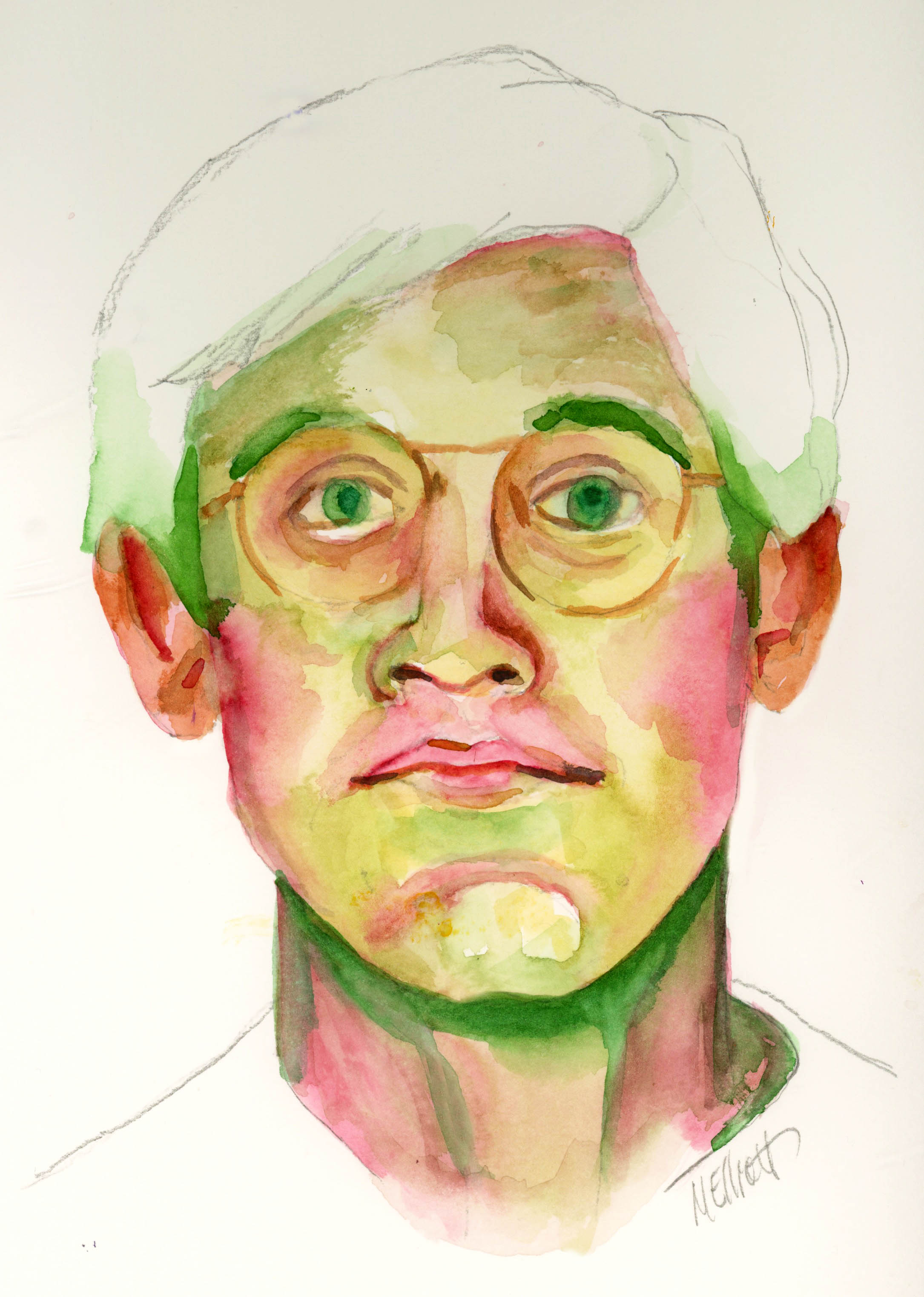
I almost didn't sign up for Let's Face It 2023 this year; I am already registered for three other classes, none of which has been broached yet, and thought I would focus on those. I especially considered skipping it because there's a lot of drawing going on, with pencils, charcoal, and pan pastels, none of which did I want to do! But when I heard that Rosso would be one of the artists furnishing a painting lesson, I couldn't resist.

Since she paints in oils and I in acrylics, it's not all transferable, but enough of it is to make it an interesting exercise, and I knew that at the very least I could learn some solid color theory (which I did). The paint mixing kind of backfired, since with acrylics the stuff you mix only remains viable for maybe an hour, but I absorbed the theory. I also realized, through this process, that there's a reason why Rosso's stuff is so good—she is painstaking in the extreme, which I don't know how she manages, given how spontaneous her work looks, but there were twice as many segments to this lesson as to any other and much of it was Rosso placing one dot of paint here or there to bring up the whole to perfection.

As I frequently do with these lessons, I sought out my own reference photo rather than using the one employed for the lesson, because I don't want to end up with a picture that looks just like everyone else's in the class. So some of the color instruction was lost because the skin tones were being mixed for a specific person, and my person had lighter and more olive tones. I did, however, find someone with a hairdo almost as fun, and with the added advantage (or challenge) of some colorful clothing instead of a simple white slip.

I painted my background yesterday and did the drawing last night; I then photographed it this morning and corrected the drawing to match the reference more closely, and about 11 a.m. I began to paint. I took a lunch break at 1:30 and went back to the portrait at 3:00, finishing up about 6:30 (although I had to give it a couple of hours to dry thoroughly before I tried to scan it). I shouldn't be sitting still for long periods like that, but hey—every once in a while you have to break the rules, even your own.

I went considerably bigger than the lesson painting, and was glad I did, because even so the little fiddly details of eyes and nostrils and ears and mouth were tough. I did the classic Rosso technique of painting my original background a kind of eggshell color and then coming in at the end with blue to make the figure pop. I like the blue with the browns of the figure and the reds of the shirt.


The only thing I'm really not happy with here is that, once again, I can't get my model to look at me. I put the eyes and pupils and highlights all in the exact place they occur in the photograph, and yet somehow she is staring out into space rather than right at the viewer as she should be, given all those constants. I just do not understand why that doesn't work sometimes, but there it is.

"Amelia"—pencil and acrylics on thin birch board, 12x16 inches. (The scan is cut down a bit from 12x16 because of the limits of my flatbed—there is more cream color around the outside of the painting than shows here.)

You can see Rosso's work @rossoartist on Instagram. Have a look.


02 April 2023

Keeping skills sharp

I had a humiliating lesson this past week in what it takes to keep your skills sharp. I did a portrait of a writer I admire (Rebecca Solnit) that will henceforth never see the light of day, either on this blog or elsewhere, it was that bad. From a slight head tilt, she became so angled that she looked like she was about to topple over. I chose nontraditional colors (painted her in blues and purples because I was going to put a political quote on the painting) and rather than quirky and interesting, she looked like a catatonic zombie, and it wasn't just the weird colors, it was the crazed look in her eyes! I managed to paint a really nice mouth, but the rest of the portrait would have frightened Morticia Adams.

On Thursday, I decided to try again. This time I followed a suggestion from friend Phoebe, who said, Maybe slow down your usual gung-ho three-hour process, do the drawing, wait a day to look at it, correct it, and then paint, which is what I did. I have also learned that if I make a scan of my drawing and put it up on my computer screen next to the original, I can somehow immediately see flaws that I just couldn't recognize when confronting me from the surface of the paper. I corrected the tilt of one eye, made the nose the proper width, and played with the hair, and then painted.

The painting part also started out rather disastrously, as I got paint everywhere but where I wanted it and had to do a significant amount of "lifting" to get rid of some of it before I could continue. I started out with a big mop brush, because I wanted it to be loose, but ended up retreating to my Escoda Prada to "mop" up the mess and finish the portrait.

I ended up pretty happy with it, and have, in fact, had an inquiry about buying it, so maybe I still have my mojo...but I need to quit waiting weeks between paintings and get back to a regular schedule in order to keep my skills intact.


"Toni Morrison"—Daler Rowney inks, Jackson watercolors, Uniball and Signo pens on Fluid 140-lb. coldpress watercolor paper, 12x16 inches.


25 March 2023

Evolving work

This didn't turn out quite as I had envisioned it. My initial plan, after gessoing a board, was to paint it in acrylic; then I decided it would be better in watercolor. When I actually began painting, I had thought to do it in a more cartoon-y style and make it more like a Deb Weiers-inspired painting, with a colorful ink background and a wonky quality. But after the ink dried and I started to draw, I found myself making it mostly realistic so, despite the double black line and wonky colors, it became a more traditional rendering.

That's not to say it was entirely successful—for some reason I find Emma particularly hard to capture and even though each element related properly to the others, it somehow didn't become a sum of its parts in the way I would have liked. (And don't get me started on the teeth/mouth, I redid it about six times and should have left the first version!) I had a similar challenge when it came to capturing Pippin; both of their faces turned out too wide and not long enough.

I did have fun deciding where to put in "regular" color and where to let the background either show through or dictate the colors I used.

Anyway, it's not the result for which I was hoping, but it's not so bad I can't show it to people (I don't think?).


"Emma and Pippin"—Daler Rowney inks and watercolors on 140-lb. Fluid coldpress watercolor paper, 12x16 inches.

Here are my process pics:


14 March 2023

Reverting to style

I haven't been painting much (or at all) lately, and I don't know quite why. Some of it is that my legs are giving me trouble, so sitting for long periods isn't good; but if I can sit to watch TV or scroll Facebook, I can sit to paint, so that's not really much of an excuse. I just haven't felt moved to do much. I think maybe the rainy weather has been one component getting me down; although I'm not out in it, the darkness of the day does get to me after a while.

Anyway, I had this reference photo I liked, of Jenell del Cid looking crazed or freaked out or something, not sure what, except that the whites of her eyes were definitely a component! So I decided to journey back to 2019 when I took the class with Deb Weiers that got me started on portrait-mania, and do Jenell's slightly goofy expression in the bright colors of Daler Rowney inks in non-realistic colors.

Although I managed to draw her with a fair amount of accuracy in terms of the shape of her eyes, nose, and mouth and their relation to one another, I completely lost the head-tilt that made the expression more extreme, so she merely looks a little startled, as opposed to the crazed vibe for which I was aiming. I don't know how I managed to actually tilt her head in the opposite direction and yet keep her face shape and all the features in synch, but I did. (This is one of those times when one simple angled pencil line would have made a big difference!)

Anyway, I somewhat made up for the lack of extreme emotion with the neon colors I used to paint her; I started out with pencil marks all over the page, just for some interest and texture, and then followed up with spatter, spray, and wash in pink and orange. I let that dry, and then did the drawing with a Uniball pen. I had forgotten how much I like Deb's technique of double line everywhere, so I did that. I took some white gesso and put in some highlights on the forehead, brow line, cheekbones, nose, and chin, and also filled in the whites of her eyes. Then I painted in the face, using the pink and orange and accenting with shades of turquoise and Prussian blue, and then later with a little Payne's Grey. Her eyes are brown; I did Deb's effect of star lines coming out from the pupils, and put in highlights on those and her nose and lips with a white Signo pen.

I played around with some texture on her scarf by adding lines, put some darker shading into the hair and under her chin, backed off the fluorescent lime green of her jacket with a wash of Payne's, and intensified the background with another wash of pink. Last touch was a double-line border around it all.

I considered some trademark stuff of Deb's, like circles around the eyes, or an extended lip line, or even some random spots here and there, but ultimately decided I liked her as a simpler, less wonky but still distinctive character.


"Startled"—Daler Rowney inks, Uniball pen, gesso, on Fluid 140-lb. coldpress watercolor paper, 9x12 inches.


01 March 2023

Olivia #2

For an assignment two weeks ago, I chose to paint Olivia, a photo reference I had used before, for another class, in another medium.

The assignment on this one was to draw her in pencil, then wash over the whole thing with acrylic inks, and mess with the background in various ways—salt, splashes of water, and so on. I did the pencil drawing, but then decided to diverge from the assignment by using stencils in the background, so I applied them using white gesso. You can't see them at all when it's white on white, but then when you wash over them with the ink, the stenciling partially resists the color wash and shows up lighter against a darker background of ink soaked into paper.

I like the effect, but I messed up a bit on this, because I wasn't careful enough with my stenciling and so got some in the hair area on one side, where I didn't want it. So the hair didn't come out quite like I had planned.

In Angela Kennedy's version, the hair went straight up, as if the model was underwater and her hair was floating. I decided to send mine to the side instead, as if she's standing in a high wind.

The ink effect I achieved was quite subdued, because instead of using an ink color foreign to human faces (purple in Angela's case), I used a flesh-toned ink. It was so pale that I went over the background surrounding the face with a darker brown ink, to provide at least some contrast, and blend better with the hair. Then the rest of the picture was accomplished by painting with a high-water-volume brush in watercolor.

It didn't occur to me, but a friend of mine said she looks like the woman in The Birth of Venus, by Botticelli, and although I initially scoffed, I do see the resemblance. She's 9x12 on Fluid 140-lb. watercolor paper.

I painted Olivia a few years back, for a different class (Emma Pettit's) in a different medium (acrylic). It's sharper and more defined; I like the softness of this one, but I loved the intruding background and rust-colored shadows on that one.


(Botticelli on the left, my acrylic of Olivia on the right.)

I didn't feel like blogging at the time I painted this, but since I haven't been painting since then, I thought I'd toss it up here with some words about the process. Hoping to do another painting soon.


06 February 2023

This week's lesson

I haven't done three or four lessons in a row for Let's Face It 2023 because they were in pencil or charcoal or pan pastels, none of which do I enjoy. But this week was a little painting with a full figure and a bunch of pattern fun, so I decided to get back in the habit of spending my Monday afternoon on art.

I ended up with something quite different from the instructor's piece, for several reasons: She used a gelli plate to print her background onto the paper, and I don't own one or know how to use it (though it looks like fun and I might have to acquire one); and since I had to change the background completely, the rest sort of followed naturally.

Her suggestion for those without a gelli plate was to use a brayer to put some colors on the paper and then to incorporate stenciling or rubber stamping to give texture and interest. So I pulled out my liquid acrylics (I only own five colors) and dripped them all over the page, and then went to work with my brayer. Because I had only used small drops of the paint, and because I was doing it all at once instead of layering, I achieved an interesting effect of overlapping ovals and circles and swashes that immediately looked to me like a mid-century modern pattern, especially in the colors I had inadvertently used. So I went through my stencils and found some geometric things and pounced them on over the colors, using white paint. They didn't stand out a lot, but interrupted the pattern enough to be seen here and there, and also the white shows through paint put on top of it, which is fun for extra texture later.

Given this background, I decided that instead of the overstuffed red velvet couch the instructor had incorporated, I would look for a sofa from the '50s, and pose my sleeping model on that instead. Since it wasn't quite as cushy/smooshy, I had to find a different pose, which I did from Wikimedia Commons, plus brace her up with some strategically placed cushions. The model was nude, but I decided to dress her, initially planning for a dress but somehow ending up with a tank and shorts. She also had short hair, but because the instructor's model had long luscious locks, I went that way too. My last idea was to add in a prototypical lamp from the era, again incorporating the colors I had been using. I threw in a little gold gilt paint here and there, but it's hard to see unless you tip the page.

It's certainly not great art, nor one of my best pieces, but it was something different and I had fun messing with it all afternoon. And I can check off this week's lesson as done!


"Mid-Century Slumber"—pencil and acrylics on coldpress watercolor paper, 16x12 inches.