30 December 2022

Bonus lesson

Kara Bullock Studios, purveyors of great art classes including Let's Face It every year for the past eight, kindly provided a series of 10 bonus lessons as a Christmas gift for their students and, although intended only to last through Christmas Day, yielded to pleading by those of us too busy to take advantage before then and left them up the rest of this week. I finally got around to watching one of them Tuesday and yesterday, and last night I painted the background for the one that occupied most of my day today, following Holly Beals's lesson on figures and collage.

I had, for almost the first time, an experience that apparently my peers in the class have had all too frequently—I posted a question today: "Does anybody here ever start a painting whose subject you initially found compelling, only to lose interest halfway through?" The 25 answers I received were unanimously in the affirmative, the most disturbing one to me being "I have about 40 paintings you can finish off!" I now count myself lucky that this is practically the first time this has happened to me; perhaps it is luck, or perhaps I generally only choose subjects that don't disappoint...or perhaps I need to be more challenged?

That was certainly an element in this one. First of all, it was working small, in the sense that usually when I use an 11x14 board, it gets filled up by one big head, while today I was painting a scene that included two complete figures plus substantial background. I dislike working small, especially when I am painting with acrylics, because I am not the best at manipulating small brushes to get precise strokes, and get easily frustrated by what I'm picturing versus what emerges on my board.

Second, I chose to find my own reference photo instead of copying the one Holly used, but although I liked the scene, it had several challenges not included in Holly's—way more background and full figures instead of partial; plus the view was from the front instead of from the rear, so I had to deal with faces; and then there were the perspective issues, which I am notorious for avoiding because I am so bad at them. I had pinky-purple brick walls with angles, a turquoise metal pleated door set back between the walls, a platform for the figures to sit on, and people whose heads were much further away than their feet, which loom larger in the foreground. I think the "disinterest" may have been a thin disguise for dismay at having to confront all these in one picture!

Having said ALL of that...I am somewhat pleased with the outcome. The faces are not up to my standards, and a couple of the hands look distressingly paw-like, but I like the textures and colors and contrasts I achieved, and I managed to stay somewhat loose and painterly, which was part of the lesson.

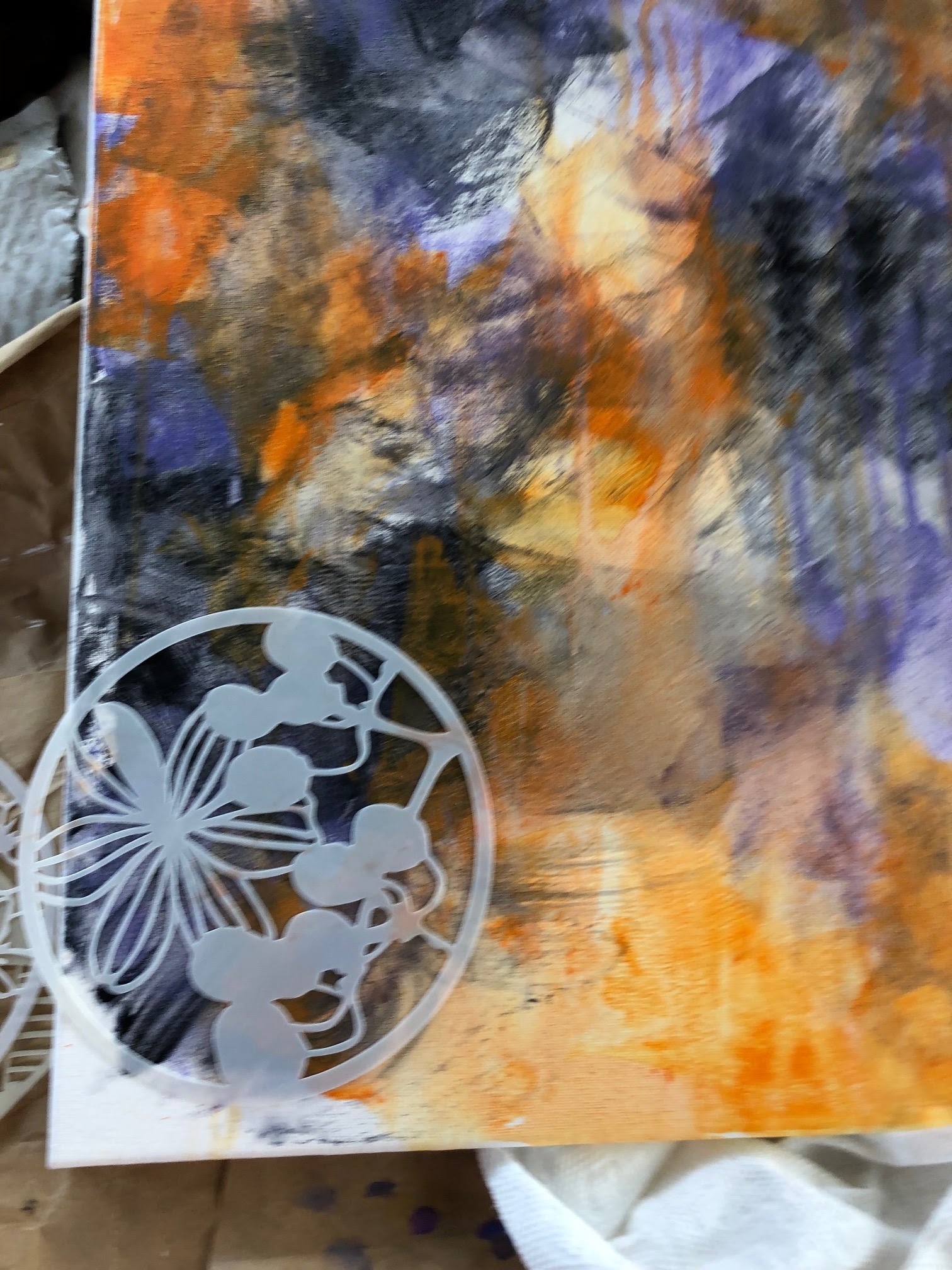
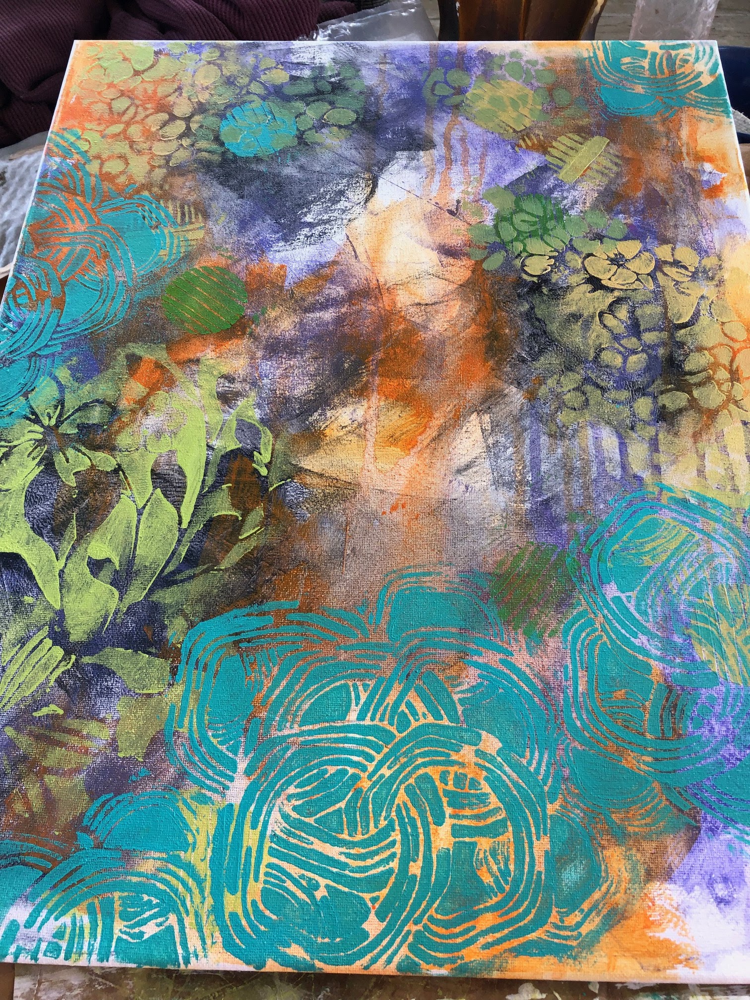
Although I planned to include some collage, ultimately I chose not to fiddle with it. Unless the collage fits integrally into the picture, it seems to me such an artificial kind of thing, and this was no exception; I could choose to rip and tear some bricks, or I could just give an impression of them with paint, and I went with the paint. Part of the problem, also, is that I don't have very many nice collage elements from which to choose, so there's that.

Anyway, enough with the talking. This is on cradleboard, another new experience, and this one I liked. You carry elements of the painting around to the edges of your one-inch-deep board, and you have a finished box you can hang on the wall without a frame. I will be doing more of that!

I'm calling it "Break." It's acrylics on cradleboard, 14x11 inches (plus wraparound).


22 December 2022

Writers

I have a customer and fan on Etsy who admired my Joyce Carol Oates and asked about some other specific writers, so I decided to paint one today (no obligation to buy). I thought I would hark back to a couple of years ago and use some of my Daler Rowney inks for an interesting background, but I have forgotten how I did them / lost the knack. (I need to go back and review my Deb Weiers lessons.) So it's mostly just a wash of purple ink glaze that shows up everywhere in the portrait as an underlayer. The rest is watercolor and Uniball pen, with a few white highlights here and there. I included a quote, since that's what I have done with previous author portraits, and here she is, Virginia Woolf.

I didn't get the angle of the face quite right, so it's a little wide at the temple and cheekbone level—it doesn't quite reflect that long, slightly horsey face. I also struggled with the sizing of the drawing and ended up making it a bit larger than planned. But otherwise I'm pleased with the likeness. I kept staring at her lips and finally realized that her mouth reminds me of actress Geena Davis's. I like this bookish quote.


"Virginia Woolf"—Acrylic ink, watercolor, Uniball, and Signo pens (oh, and gesso and stencil for the collar), on 12x12 Fluid coldpress watercolor paper. Available.

And now I'm starving, because I forgot to eat lunch and it's 4:00! Time to fix that.


18 November 2022

Muse

I wanted to paint today, but I didn't want such a production as it has become since I started painting in acrylics (the gessoing! the ground coat! the layers!), so I decided to paint a watercolor portrait of my new favorite muse, Jenell del Cid, @Duhhcid on Instagram. She is amazingly photogenic, and also posts with fantastic poses and accoutrements—it's no wonder she's a model for Sktchy, among others.

The fabric of her wrap was wildly patterned, but I didn't have either the energy or the patience for that today, so I went with a solid color. The reference photo was black and white, so I was able to choose my own colors.

I'm not sure I completely did her justice—her bedroom eyes came out a little too wide and not quite deep enough. But I think I captured a likeness, at least.


"Blue Scarf"—pencil and watercolor on 140-lb. Fluid watercolor paper, 12x12 inches.

12 November 2022

A reader

I haven't painted anyone in the act of reading for a good long while, but I want to keep doing that and building up my collection of avid readers in art, so I found a reference photo I'd been saving and went to work tonight. I was only going to do the drawing, but the rest of my house was so cold and my studio was so warm (space heater rotating on 75 degrees!) that I started painting at 9:30 and quit at 12:30 when I felt about 80 percent done, with only the hands to paint and then some tweaking of everything else. Probably needless to say, I spent a lot more time on it this morning than anticipated, with the result that it's way past time for lunch!

I tried to leave this one more loose and painterly—the view out the window, which was mixed blues and greens with some yellow and white highlights, lent itself to a soft focus, so I tried for that in the foreground as well. I painted the board sky blue as an underpainting, and initially intended to do this one as a Flo Lee, with the ground left in the face, but then decided the theme didn't lend itself to that, so I simply left bits of blue to peek out here and there, in her hair, and robe, and hands. I used a stencil for the wallpaper and was fairly pleased with that, though it's busier than I intended to go.


This one is "Lizzie Reads"—let's see if anyone can figure out why. Pencil, stencil, and acrylics on 1/8th-inch birch board, 12x16 inches.


04 November 2022

Layers

Two months later, and I finally convinced myself to make some art. I don't know what happened—a combination of that dratted heat wave with the beginning of my UCLA Readers' Advisory class on the first of October that necessitated a lot of preparation, before and during, to bring it all up to date after a two-year hiatus and some previously undiscovered research on next-level RA just took me out of the painting mindset, and even though I have had time here and there, I just kept playing Words with Friends and binge-watching series on Netflix.

At first I didn't think I would care to assay this week's lesson; although I greatly admire Maria Pace-Wynters's highly colored and beautifully intricate works, I know myself well enough to know I don't have the patience for all of that eensy-weensy detail. But I was itching to try a few of her techniques, and my friend Phoebe, who did the lesson in a greatly simplified but still gorgeous manner, made me decide to get over myself and give it a shot.

Maria's first layer is collage, and although I didn't have the beautiful scraps of paper she has saved up over decades for this purpose, I did have some fun patterned tissue papers lying around, so I did my best with those, applying them to my birch board with acrylic medium. Then I added some glossy acrylic spray in turquoise and orange, and let the first step dry overnight.

The next step was to draw my image, which I took (with her permission) from @DUHHCID (Jenell Del Cid)'s Instagram page. I thought that I had recently "discovered" her, and asked her permission to paint her, but later found an old Sktchy portrait of her from about 2.5 years ago that I painted for the 30-day challenge (it's so bad I won't even show it here!), so that was funny. Anyway, Maria used a profile reference and incorporated flowers, so I settled on a profile photo of Jenell contemplating a tiger lily, and got to work.

Yesterday I did the pencil sketch and then got caught up in other "life" stuff and didn't get back to it, but this morning I was determined to make some progress, so after medicating Gidget (and parenthetically, why would anyone think it was a good idea to make antibiotic drops for cats look and smell like Bazooka bubble gum?) and eating some oatmeal, I squeezed out a bunch of colors onto my palette and got to work about 10 a.m.

Following Maria's example, I started with her characteristic stark white face and worked outward from there. I usually go for more realistic tones, but I do love the contrast of the white-white skin with the red cheeks and Phthalo Turquoise shadows—rather Renoir-esque. I stopped at this point to take a photo, because I realized I hadn't documented the drawing stage. After that, I got so caught up in the painting that I forgot completely about my camera until I was nearly done, and decided to let it go until I could scan the finished piece.

After doing the face, I followed her example by painting in most of the background so as to get definition around my image, and this is where I ran into trouble. Those pesky pieces of tissue didn't stick to my board with the application of acrylic medium the way Maria's did to her work; I'm wondering if she had a base coat of something underneath, because they just did not want to adhere to the raw board, and kept peeling up. I looked in vain for my bottle of Elmer's to glue it down, so I ended up lifting off and discarding a couple of significant-sized pieces, including all but two of the big gold dots that I thought would look cool shimmering through; but I managed to get the confetti tissue to stick pretty well, so that at least stayed. I like how it comes up out of the top of her head and also surrounds the tiger lily, as if the lily provoked thoughts that are flying out of both of them at once.

I was much happier with the image of Jenell than I was with the tiger lily; I'm not particularly adept at painting flowers. But after doing a rather flat rendering, I was inspired by Maria's exhortation to spread all the colors all around the painting to promote unity, so I picked up some of the Phthalo Turquoise on my brush and used it for the darkest shadows on the lily stem and leaves, which greatly enhanced the contrasts, and then threw some into her hair as well, and darkened the shadows of the blouse.

One of the last things I did was to use a stencil with a nearly dry brush of white paint to create the lace ruffle collar and jabot. It wasn't exactly as I envisioned it, but I like how it turned out, and that the flowers reflect the approximate shape of an open lily, to echo the main feature.

I thought about doing some outlining with white (or black) as Maria does, but ultimately decided to leave this soft and diffuse and not get fussy, since it's not my talent. 

I got so caught up painting that I worked straight through the lunch hour and finished up about 4:00, then picked at tiny details, scanned, and posted. I really enjoyed this lesson! Maybe I won't wait so long between this and the next.

"Jenell with Lily"—pencil, collage, and acrylic on 1/8th-inch birch board, 12x16 inches.


05 September 2022

HEAT

If ever I doubted the whole principle of global warming, this past almost-month of truly horrifying temperatures would have convinced me of its existence.  As a San Fernando Valley dweller, you know you will be in for a couple of weeks in August and maybe one in September of triple-digit weather, but I don't remember ever having such a prolonged, intense, unwavering run of hot weather, and I have lived here for 45 years. As a person who lives in a 1948 bungalow without air conditioning (I have an evaporative cooler on the roof with triple vents into the house), it's been mind-numbing. I have always liked my swamp cooler better than air conditioning, because it infuses a little dampness into the air rather than drying out my sinuses as central air can do, and also it's way more environmentally friendly and way less expensive than central air. But this summer has truly tested my resolve.

So today, after three increasingly hot days that never cooled below 80 degrees at night (meaning my house likewise didn't throw off its accumulated weight of heat during the night), I finally gave in and trekked across the valley to my own personal cooling center, aka the cousins' house in Woodland Hills. They do have central air, and they also set me up in a nice upholstered chair in the living room, with a footstool for my lymphedema-prone legs and a small table nearby furnished with a frequently refilled glass of iced tea, and I can sit in a blissfully temperate clime and read my book, I can nod off if I want, and if I get bored with sitting and reading, I can go hang and visit with one or both of them. Add to that a "catered" lunch and dinner (me being the one catered to), and you can hardly beat it. I try not to take advantage of this option too often, but today it was a lifesaver, and I stayed from 11 a.m. to 8 p.m. I'd be there for the next four days until it "cools down" to 90 degrees if it weren't for my cat at home alone in my stuffy little house! (She's fine.)

Halfway through the afternoon I finished reading my current book and felt too restless to start the next one (although it was waiting on my Kindle); one cousin was napping on the sofa, while the other was working at her remote job on the computer in the den, so I hauled out my sketchbook and did a little "urban sketching" (hey, it may be an interior of a house, but that house is in Los Angeles, so it counts as urban!). I greatly admire the detailed interiors of artist Steven Reddy (and own a couple of his books), so I just sat tight in my comfy chair and sketched what was directly in front of me, including my own image in the big mirror on the wall. Not everything is in the best proportion (I'm too big, as are the lamps, in comparison to the sofa!), but everything was rendered pretty faithfully. I didn't take my paints, so I added the watercolor once I got home.

"House of Cos"—Uniball pen and watercolors in Bee mixed media sketchbook, 8x8 inches.


24 August 2022

Color

I thought I would have a new project to post a lot sooner, but I have spent the past three days trying to mix the proper green for the background of this one, getting closer with each mix but taking three coats of paint to finally find it. It's still not perfect, but it's the closest I'm going to get. Greens are tough! and not even the professionals agree on particular shades. I looked up "spruce," which is the color most accurate to what I wanted, and the variations started at olive and shifted through the green and blue tones to kelly and sage. This is blue spruce, and may be a shade on the teal side of that, but I am finally pleased with it.

I think the reason why I am so fixated on this ground-as-element style of painting that I learned from Flo Lee is that my obsession is and has always been color. I have friends who make gorgeous paintings with white gesso, black charcoal, and maybe a bit of colored pencil and, while I admire them intensely and often say Oh! I wish I had done that! somehow I never manage to stick with even the intention of experimenting with that style, if it has to compete with a full-color rendering.

This one was more complex than some of the "ground" paintings, because the background is a dark, intense color so anything superimposed on it was a big shift in value, and I had to be careful not to either under- or overdo the painting. My tendency is usually the latter (I don't know when to quit), so I sternly admonished myself not to be too fussy before I even started. Yeah, right.

You almost have to use a grid on these paintings, because they are on birch board, which is a lot rougher and more textured, even under a coat of gesso and three of paint, than is a canvas or a piece of paper and, since you're drawing with charcoal, it's hard to rub out when it gets down into the grooves, should you make a mistake. I discovered that gridding with white charcoal is a lot easier to "lose" afterwards; I have erased as much of it as possible, but you can still see some faint white lines. But they are not nearly as intrusive as is black.

I considered skipping one of Flo Lee's steps on this one: She goes in after she has made the charcoal drawing and smudges the parts she wants to show up as dark, using some hairspray (or spray fix) to wet the charcoal and make it spreadable; but there are so many large dark areas in this particular painting that I thought I would just do all of them with paint instead of messing with the charcoal. Although I have made six of these paintings so far, only on two of them did I feel like the charcoal step was effective, and in both cases it was because the subjects had short, choppy hair in a dark hue that showed up nicely against the background. But I went back and looked at some of the others and ultimately decided that there's nothing that looks quite the same as the dark of the charcoal, so I went ahead and smudged a few areas—which I also revisited with paint.

This painting was so challenging. It was too easy to underestimate the effects of a light color on that extremely dark background, and I did a lot of scrubbing off with a finger or a paper towel before getting the mixes just right. I somehow made the eyes too large, but managed to reduce them a bit when I saw my mistake. The glasses went in almost last; I had to complete everything under them before laying them over the top.

The pattern on the dress is a new stencil that saved the day. The reference photo model had on a dark green dress with flowers in shades of peach, rose, and turquoise, and I initially intended to try to duplicate it, but the colors and pattern proved too intrusive, fighting for attention with the face and hand, so I decided to go for this simple brocade look by using a stencil and different shades of darker and lighter green/turquoise.

I thought about lightening up the background behind her, but I liked the emergence of the hand from that dark background too much to mess with it further. I hope the idea that she is leaning against a wall is conveyed by the shadow and the angle of her body!


"Brunette with Specs"—charcoal and acrylic on 1/8th-inch birch board, 12x16 inches.

06 August 2022

Basking

I have wanted to paint this model for some time, but it wasn't until I did a search for her under "Redhead" (I have a bunch of those) that I realized I had actually already painted her, about a year ago—a quick and somewhat crude watercolor for the annual July "30x30 Direct Watercolor" challenge. That challenge is to paint 30 paintings in 30 days that are direct to paper, that is, no underdrawing at all, just painting what you see.


Now that I have started painting with acrylics, I thought it would be fun to try her again, in the ground-as-skintone method I learned from Flo Lee, and since I had just received a shipment of thin birch boards from Dick Blick, this seemed like the time. I was inspired by the light, and by the orange sherbet-colored background from which she emerges.

I realized, in looking at the watercolor, that I didn't do a great job of catching the angle of her head tilt, so I tried to do better at that when I got to the charcoal portrait, with the result that I painted over the face a couple of times—I have as much trouble with these weird face angles as I do with architectural perspective! and even with a grid, it was tough. But I finally got one that satisfied me, and started painting.

It's weird how not painting for even a week hinders your abilities. I was at such a loss for where to start that I went back and re-watched part of Flo's lesson on LFI 2022 to remind me how she went about it. But I was soon back in the groove, and staring at all the small details, deciding which to include. I'm really happy with parts of this and, as usual, it's the parts that weren't intended that are my favorites. I planned an entirely different treatment for her tank top,
but when I put in the highlights with Naples Yellow, it felt both distinct and organic, so I went with it.

I was less sure about the varicolored background behind her—I was afraid it was too busy. But I got positive feedback from two different people to whom I showed it, so I left it. That flat colored background on the "Flo method" is the one thing that occasionally bothers me, because the foreground is so nuanced, so I decided with this one to vary it a bit.


"Basking Redhead"—charcoal and acrylics on 12x16-inch thin birch board.


29 July 2022

Surf the World


I haven't felt much like painting lately, but this week's Let's Face It 2022 lesson was with one of my favorites, Emma Petitt, and it looked like a fun one, so I jumped in. Mine didn't turn out anything like hers; I went much more realistic with my figure, but I did create a gorgeously rich substrate that was a big part of the exercise and what made this special.

The substrate was created by brayering on three different colors (in layers, allowing them to dry in between), and then going over them with stencils. The object was to create one of Emma's "beach babes," this one specifically a surf babe (finished example by Emma at right), so I found a stencil that felt like waves to me and used it liberally with beautiful Amsterdam Turquoise-Green paint.


This was really fun to create, and I was pretty happy with it. Emma and I share a love of color, and my favorite combination is orange, purple, and turquoise. There's some Payne's Grey in there, too, to give a nice dark contrast.

The next task, which I didn't photograph because you couldn't really see it, was to grid my selected reference photo (thanks to @dinoopis for that, and also to Heike Kurtenbach for bringing her to my attention) onto the canvas and do the drawing. I started at 5 a.m., did it once, got the grid too big and ran out of room for her feet, so I erased it and did it over, finishing at about 8:30. Took a break for breakfast, and then started painting.

Emma's babes are much more stylized and exaggerated, and while I did go into this meaning to do the assignment (with my own model) more or less the way she did, I ended up painting a much more realistic interpretation of the figure (although I did use her painting methods), and was so reluctant to cover my pretty background that I ended up leaving most of it as is. I darkened part of the background, and went over the rest of it with some turquoise cut with white to knock back the intensity of the pattern and put water-like swishes and swashes over the top. The colors are slightly lighter than what shows in the photo, but I couldn't get it any closer than this in Photoshop.

I was trying for the idea that she's about to stand up on a surfboard that is partially covered by water, but because her feet and hands are painted over the top of the water, it turned out looking more like she's standing in the middle of a puddle (an ocean?) on the rounded horizon of the earth! But I'm okay with that.


"Surf the World"—acrylic paints and stencils on 16x20-inch canvas.


12 July 2022

Russian resistance

My painting tonight is of Alla Gutnikova, one of four former editors of the publication DOXA, a Russian student-run journal publishing anti-war and anti-government material, currently considered one of the most active, reliable, and popular sources of information about the war in Ukraine. The four editors were put on house arrest in April 2021 for posting a three-minute video expressing support for students threatened with expulsion for participating in anti-government protests; they were sentenced this past April to two years of collective labor.

I was initially attracted to her image (in addition to her work as an editor, she also models), and then read up on her, which made me want to paint her even more. She is only 23, but is astonishingly literate and bravely outspoken; I'd like to quote her entire final speech she made at her trial, in which she both speaks from her own heart and also quotes some amazing people, but it's very long, so I'll just feature these quotes:

Tarkovsky speaks in the words of Lao Tzu:

“The most important thing is that they believe in themselves and become as helpless as children. Because weakness is great and strength is null. At birth people are supple and weak; at death, they are tough and stiff. When trees grow they are soft and flexible, and when they become dry and hard, they die. Stiffness and strength are the concomitants of death; softness and weakness express the freshness of being. Thus what has grown hard will not conquer.”

Mahmoud Darwish says:

As you prepare your breakfast, think of others
(do not forget the pigeon’s food).
As you conduct your wars, think of others
(do not forget those who seek peace).
As you pay your water bill, think of others
(those who are nursed by clouds).
As you return home, to your home, think of others
(do not forget the people of the camps).
As you sleep and count the stars, think of others
(those who have nowhere to sleep).
As you liberate yourself in metaphor, think of others
(those who have lost the right to speak).
As you think of others far away, think of yourself
(say: “If only I were a candle in the dark”).

And in her own words, "Freedom is the process by which you develop a practice for being unavailable for servitude."

If you'd like to read the entire speech, it's here.

She was even paler of complexion than I managed to preserve in this painting, but I got a little carried away with the subtleties of color in her face. My scanner cut off about a half inch at both top and bottom (it scans 9x11 and this is 12x12).


"AllaGutnikova"—gesso, stencil, and Paul Jackson watercolors on Fluid 140-lb. coldpress paper, 12x12 inches.


06 July 2022

Keep going...

Recent events have made me want to bring the political into my art again. No, that's not quite accurate—not politics but civil rights. I foolishly never thought we would have to fight some battles over again but, like many of my friends and colleagues and likeminded believers in government that actually works for people, I underestimated the one-note determination of the fascists (I will no longer call them the"right," since they never are) to burn the house down to get what they want. We should have seen it coming during the fateful confirmation hearings for the so-called Supreme Court. And those of us actually in government, with some kind of power and privilege, should have shut it down when Kavanaugh was revealed as an abuser and a drunkard and Coney-Barrett as a religious nut-job. But no one did, and here we are.

I don't know how long it will take, this time, to right these injustices. Optimists say one election cycle in which only Democrats win their races; pessimists say generations will pass. I am old enough not to expect to see too many more generations, but I am also old enough to know that things do change, eventually—the pendulum swings. So my plan is to stand up, and keep going. Join me, won't you?


"Keep Going"—gesso, acrylics, charcoal, stencils, on birch board, 14x11 inches, again in the method of Florence Lee.

23 June 2022

I can't quit you!

 I don't seem to be able to leave the Florence Lee lesson behind and move on. I am fascinated by the concept/effect of the ground as part of the picture. So I did another one.

I really struggled with her. First of all, after I drew it, smudged it, and used fixer on it, I realized that the eyes were too far apart, so I ended up having to paint over the eyes and one side of the face so I could move them inwards. I ran out of charcoal, so I did it in Stabilo All, and I should have fixed it again before painting, but I was too impatient and it was 9:00 at night and dark out on the patio where I had the spray fixative station set up, so I just went ahead, with the result that I smeared the pencil into the paint in a bunch of places that I then had to go over a few times.

Then, I couldn't find the one color of paint that I really wanted to use on this painting for the lights (Titan Mars Pale). I knew I had bought a tube a few months ago, but it wasn't in my paintbox, so I ended up mixing some pinks that were okay but not as satisfactory.

I worked on the painting for a couple of hours and decided it was done, but when I propped it up to look at it I realized that when I redrew the eyes I had placed one slightly too high, so then I had to tweak that. Since I had to fix that, I did a more thorough search and found my Titan Mars in another box of paints, so I decided to go back in and do a few more brights. Florence's paintings are so much more "painterly" than are mine—I get too obsessed with smoothing and blending, but I love her chunky placement of highlights and incomplete hair. So I tried to introduce a few more random strokes. And oh, that hand....

I'm calling her "Jungle Red," although the red of the nails didn't come out quite so bright with the damn Stabilo All pencil blended into them. Some people will recognize the reference.

"Jungle Red"—clear gesso, acrylic paints, charcoal, fixative, Stabilo All, on thin birch board, 11x14 inches.


05 June 2022

Another Florence Lee

 I wanted to do another painting in the Florence Lee "method," and today was the day. I decided I wanted to do a horizontal rather than a vertical, just to mix things up, and found this reference photo I liked a lot, that included a hand for a little extra challenge. Plus, the hand is sort of stretching the woman's face out of shape where she leans on it, so that was fun too, to relocate the features to accommodate.

I am happy with this as a painting, but not so much as an example of Florence's method. I didn't stop to think that my base color, yellow ochre, was already one of the skin tones of this woman, so it doesn't have the same radical effect leaving the base color showing that it did when the background colors were blue or green. But I do like the technique of suggesting the hair and clothing while leaving some of the background in place instead of filling them in completely, so that worked.

It's a little over-painted in the face, because I didn't leave much of the pure yellow ochre. But like I said, I'm happy with the portrait.


"Jasmine"—gesso, charcoal, fixative, acrylic paints on thin birch board, 14x11 inches.

30 May 2022

Mixed media with Joan

 This was a lesson on LFI2022 with Joan Martin. Her media was way more mixed than was mine, and her mark-making more experimental, incorporating a credit card and a chopstick! I simplified this one, and used the materials I had on hand. But it was fun to mess about.

I have to say this was one of the most challenging face angles ever, and I didn't entirely pull it off! And I even used a grid. Every once in a while there is a face that you look at, and you think you have it, and then you look back later and realize that one eye should be much higher, or the mouth is on the wrong slant, or the nose is too big, and this will definitely be one of them.

"Jocelyn"—gray-toned paper, gesso, Payne's Gray ink (and a little Prussian Blue), a Uniball pen, some Huhu markers, and a Signo white gel pen. Oh, and a dot stencil. On 9x12 Strathmore Toned Gray Mixed Media paper.


28 May 2022

Another ground-based portrait

I was so fascinated by Florence Lee's lesson incorporating the ground color into the painting as an integral part of the skintones that I decided to try another one this week; and I have a third one I want to paint as well, though that one may take a back seat to a couple of other lessons I have missed.

If you are interested in the exact (and exacting) technique, you can scroll back one post and read all about it. I got caught up today and forgot to take process photos; but again, you can see some in my previous post.

This one wasn't quite as successful, I don't think, as my first one; and ironically I think that's because I painted last week's from a black and white photo, while this week's reference was in color. The black and white assisted me to not add too much color but only focus on the darks and lights, with a few accent colors for eyes, cheeks, and lips and some dramatic highlights. I love the photo I used this week, but the model has really specific skintones, and I found myself filling in too much instead of leaving things to be suggested, with the result that I actually had to go back and re-introduce the ground color into the nose, cheeks, and around the eyes, because I had painted too much of it out. The model's red hair also caused me to put too much detail into the hair instead of letting it be a suggestion, with the result that it feels a little fussy to me.

This is, again, gesso, charcoal, and acrylic paints on a birch board, 11x14 inches. "Redhead Bride" is her name.


19 May 2022

Incorporating ground

 I can't believe I haven't made any art for more than two weeks, but...it's been a rather fraught 18 days, and between other responsibilities, health issues, and a darkling mood, well, it just didn't happen. I did start this project more than a week ago, but it required several steps with lengthy drying times in between, and I stalled out before making it past the first few.

This is a study utilizing a ground color (i.e., the background color) as an integral part of the painting, an interesting and unusual lesson from Let's Face It 2022 with Florence Lee, a creative and meticulous artist with a charmingly tiny voice who is truly beguiling (if methodically slow) in her process. So the first step was to get a birch board (I had ordered some and had them on hand, they are 11x14 and about 3/16th of an inch thick), coat it with clear gesso on both sides (doing the back as well prevents warping), and letting that dry; then we mixed up a ground color (a medium to dark blue made up of about five mixed colors), painted the entire board (being sure we mixed enough color to have some left over to use later), and let that dry.

I ended up correcting both the mouth
location and the jawline after this photo,
and also took out some of the shading.
Next, we sectioned off the board with a grid (using light charcoal) and did the same with our reference photo, to make it easier to reproduce the face on the board. I don't usually do this, since I have become increasingly accurate in my drawing, but since this face was larger than life, I decided to do so and it did make features much easier to locate in place. Then it was time to make the drawing, which was supposed to be mostly a basic line drawing using a dark charcoal. I went overboard with the shading, and had to use my ground color to remove some of it after.

As you can see, there is much smudging
to cover up with ground.


After the drawing was made, we took the board outdoors for ventilation, and sprayed it with either fixative or hairspray, using a finger to smudge in whatever areas we wished to either darken or soften. That had to dry, and then we had to fix the fix, so to speak, by coating the board once more with a coat of clear gesso.

Once the gesso was dry, the actual painting began. The first step was to study the painting and decide in what areas we wished to revert the image to the original color, taking out smudges both purposeful and inadvertent (somehow you just can't draw with charcoal without dragging your hand through it at some point). The next step was to mix some darks and paint in the most dramatic shadows and darker areas of the face. Then we went the opposite direction and put in the lightest lights, followed by all the medium tones, and once again correcting anything that didn't "fit" by either mixing in some ground color with it, or flat-out painting it back to the blue.

This was a really interesting, if time-consuming, process, and I like the resulting painting. Rather than using the reference photo provided, I decided to paint Mexican artist, poet, and model Carmen Mondragón (also known as Nahui Olin); you can see why she was in such demand as a model, with her sultry eyes and rather pouty expression. I painted her once before, but using a completely different palette of bright watercolors and incorporating wide eyes, a tinier mouth, and a cartoonish cat that mimicked her own painting style. I feel like I have made great progress in achieving likenesses in my portraits since then (a little more than a year ago). This was made a little more challenging because the photo was black and white, so I had to decide on the colors without reference, knowing only that her eyes were green, and that her hair varied between blonde, red, and brunette!

I will probably try this method again—Flo stood for part of her lesson in front of a wall of paintings she had done in this manner, using various color grounds along with a variety of darker or lighter faces, and they are all beautiful and so different—I especially love the splash of highlights on the dark ground. It has a lot of potential and is inspiring as well, although a lot slower work than I usually enjoy.

"Carmen M."—gesso, acrylics, and charcoal on birch board, 11x14 inches.


01 May 2022

Details, details

After I painted the stencil accents onto my "Akata Witch" portrait the other day, I took the leftover acrylic paint and made a particularly vibrant background for another portrait. So today, it was time to paint something in acrylic. I thought about another book character, but instead settled on that book's author, Nnedi Okorafor, as my subject. She is a genial-looking woman with some super wild hair, and I thought it would be fun to immortalize her alongside her character, Sunny Nwazue.

I found a photo in which I particularly liked her expression, but her hair was down, and the top of her head had been cropped off. Since her characteristic hairdo is with her hair up in a giant twisty beehive, I looked for and found another photo with that hairstyle in which she was holding her head at almost the same angle, and then used the face from the former and the hair from the latter to make what I wanted.

Many people who paint in acrylic don't start with a drawing, like watercolor painters mostly do; since the medium is opaque, you end up painting over a lot of the lines of your drawing as you go along. But I still like to start with a drawing, even if I do have to paint over some of it, just to have a general idea of where I'm going.

I worked hard on this portrait all morning and part of the afternoon; the skin tones and shadows were challenging, as was the 3/4 pose, and I wanted to get it just right. Finally, after a million small tweaks, I decided I was done...but somehow she just didn't look right. I kept looking at the photos: Did I get the angle of the eyes wrong? Are the features too small for the head? Is the body too big for the head? Is it the hairline? I couldn't figure it out. I was about to ball up and throw away the palette page with all my leftover paint on it, when it suddenly came to me: In painting her skin, I had covered over the lines for her eyebrows, and never put them back in! And with a couple of strokes, her whole face came into focus and looked like the person I was painting. Who knew that eyebrows were so crucial to personality?


This is "Nnedi Okorafor"—acrylic paints, stencil, gesso, spray paint, pencil, Stabilo, on 140-lb. Fluid coldpress watercolor paper, approximately 12x16 inches.

25 April 2022

Book illustration

At 2:30 this morning, when it was obvious I wasn't going to sleep, I decided to get up and paint. I had just finished the young adult book Akata Witch, by Nnedi Okorafor, and had an idea to paint a portrait featuring its protagonist, Sunny.

Sunny is a black girl who is albino, and I loved the challenge of achieving that look, with the pale, delicate layers of skin tones. There was a lot going on in the book, and I decided to paint some stuff in the background as "symbolism"—some chili peppers, some morning glories, and Sunny's juju knife with a green blade. Unfortunately, neither the layout nor the rendering of the objects was pleasing, and I ended up three hours later with a figure I loved and a background I hated.

I decided to cover the background with a layer of pale gray gesso, and the portrait looked so much better without the distraction of all the dark, obtrusive junk in the background, but then it felt a little plain. So I pulled colors from her face and hair to do a stencil pattern in acrylics over the gesso, then painted a thin layer of white paint over the top of those, once they were dry, to knock them back a little so that they were an interesting feature but didn't take away from the face. I think it works...? This all took another hour or two, with the result that no sleep was achieved! Maybe a nap is in order, after breakfast.


Here is "Akata Witch"—pencil, watercolors, gesso, acrylic paint, on 140-lb. coldpress watercolor paper. It's about 13 inches wide and about 11.5 inches tall.


21 April 2022

Playing with effects


This week's Let's Face It 2022 lesson was with Angela Kennedy, who always likes to do fun backgrounds and effects. For her reference, she picked two old-fashioned ladies in fancy dresses with "quirky" hairdos, and I liked them well enough; but I decided instead to do a couple of girls from the working class, also with interesting (but different) hair and clothes, and I changed the color scheme from cool to warm, since they were leaning up against a brick wall.

First thing we did was draw our figures onto watercolor paper. Then we applied a very wet layer of watercolor (hers was blue and green, mine was orange and purple), and while it was still wet, we sprinkled the whole thing with table salt—which, if you catch it just right, makes lovely blooms in the paint. Mine were not nearly as bloom-y as hers or those of some others who did the lesson, but I have only done this once or twice before and not in years, so I settled for it.

After this was dry (which was an interminable wait!), we removed the salt, then painted the faces and any other skin that was showing with a couple of thin layers of white gesso to get rid of the bloom effect there and create a ground for detail. Then we outlined the figures with pen (she used Micron, I used Uniball), and when that was dry, we began to paint in the details.

It was a challenge to paint shadows yet still let the pretty dappled background show through as much as possible, but I think I did okay with that, at least on the clothes. I did choose to go with a dramatic dark for the alleyway that receded behind the block wall against which they were posed, and I put in some vague indication of the block shapes in the background—maybe too many, it distracts a little from the figures—and added the one girl's shadow.

The last part was to put the details into the face, which was the most challenging part, since the faces are only about 1.5 inches across and my tiniest brush (except for my rigger) is a #8! But I managed to produce some specific features, and am fairly pleased with my results.

I think these girls were some kind of factory workers. I thank them for leaving a nice pose for me to discover.


"Working Class Friends"—pencil, pen, salt, watercolors, gesso, Uniball, and gel pen on 140-lb. coldpress watercolor paper, 9x12 inches.


16 April 2022

Significant women

It's been a while since I painted someone in the news, someone who signifies a milestone for our country and culture—but what could be a better thing to celebrate right now, in the midst of gerrymandering, book banning, and the erosion of women's rights, than the appointment to the Supreme Court of our land of its first Black woman?

So I reverted to the style I used when I was painting a lot of these, back a couple of years ago—I got out my Uniball and my Daler Rowney acrylic inks, and memorialized one of the victories for which President Biden and the Democrats can be proud. But no one should be prouder than Ketanji Brown Jackson, for an achievement this epic at the tender age of 51! She is the first, but may she not be the last, and may she render fair judgments for a good long career.

The likeness isn't perfect—her nose is a little longer than this, as is her chin, and I think her forehead is a bit narrower—but I do feel like I captured her palpable joy.


"Victorious KBJ"—Uniball Vision, Daler Rowney acrylic inks, on Fluid 140-lb. coldpress watercolor paper, 9x12 (with a 1/2-inch border).

13 April 2022

Attempting the abstract

 Our Let's Face It 2022 lesson this week was with Dina Wakley, who does a lot of abstract multimedia work, sometimes including figures and faces, oftentimes with collage, writing, and random printing/scribbling included. This is a hard one for me, but I gave it a shot.

I decided to add an extra something to her lesson by first employing a stenciled background before putting on the collage, and although it was initially intended as a kind of marbled sky look, it actually worked into my final concept, which was more a cyclone effect.

She suggested using some poses from fashion magazines to come up with the blocked-out painted figure of the person, which was probably a mistake for me, the literalist, because I added in clothing outlines instead of just sticking to the basic form. But I had fun with the collaged words and with the "ischemic" writing, which was a new term to me—it's basically giving the appearance of something written in cursive, but without including discernible words or language.

My final result felt to me like a person caught up in a storm of words, which was perfect considering I was having an extended and somewhat contentious discussion on Facebook at the same time as I was making this piece of "art."

"Cyclone"—stencil, gesso, collage, acrylic paints, Stabilo All, pen, on 140-lb. coldpress watercolor paper, 9x12 inches.


10 April 2022

PHYAS inspiration

I was going to call this "PYHAS assignment," but it's far enough from the example that I figured I'd call it inspiration instead. The one in the lesson was done on canvas with acrylic paints, but I didn't have a small canvas and wasn't in the mood today to break out the acrylics (they are still sometimes a struggle for me), so I tried to mimic the assignment using watercolor and inks only, with limited success.

First of all, there were supposed to be stencils in the background and later in the foreground, but trying to do stencils using watercolor gives an inexact result unless you use them thickly and "pounce" them on with a flathead brush, which can defeat the purpose of them dropping to the background. So the swirly ones that comprise the light source worked pretty well, as did the splats behind her head, but the leafy branch turned into a hot mess.

I was a bit heavy-handed with the pencil and didn't remember to pick it up with my kneaded eraser before painting, so some of the pencil lines were preserved that shouldn't have been, notably the forehead line.

Finally, I broke out the gold paint to do her earring and then something came over me and I started splashing it around thinking it would work for the highlights, which it did not—it just proved a distraction.

So—oh well, it's a somewhat pretty picture that I will do better another time. I was happy with the effect of the stencil representing the light on her upturned face, especially the stripey bits; and I was okay with her hair, especially the tiny bits of green showing through.


"Basking"—pencil, watercolors, and acrylic inks on toned tan mixed media paper, approx. 9x12 inches.

02 April 2022

Revisiting Ink

I loved this week's Let's Face It lesson with Dylan Sara, whose work I have been following for a while on Instagram. His drawing is beautifully delicate, as is his hand with a brush. I didn't want to go so far as to make my own inks, as he does, so I went back to my Daler Rowney inks, which I haven't used in quite a while, to get more or less the same effect.

I also loved the model he used; but I always dislike ending up with a painting of the same person everyone else painted, so even though I did like the reference photo, I went looking and found one of my own. The exercise was to paint more than just a face; the hands included in his reference were much more complex than these, so I cheated a little, only having to paint the backs of the hands with the fingers folded under. But I feel like I made up for it a bit by incorporating her beautiful wild hair, which wasn't easy to mimic!

Here are some process pix—my pencil sketch, and the first layer using only Raw Sienna:


I was sorry, after I'd done it, that I didn't stick with the monochromatic shades of brown and gold for the entire picture. The model was wearing a really pale peachy-pink sweatshirt, and the shadows looked turquoise in the light, so I did that, but it stuck out too much in contrast with the sienna, umber, and flame orange I used for the face and hands, hair and background. I ended up going over it with a thin layer of raw sienna, which knocked everything back a bit. I should have left it there; instead I decided to do another layer in purple, which had the unexpected effect of bringing the pink back out. Oh, well. I wish I'd just left it pale yellow or something in the first place.

This was challenging, and also larger than I usually work (12x16 instead of 9x12), so it took me quite a while—I started at 6:30 a.m. and didn't finish until 11:30 (although I took a 30-minute breakfast break in there). But I'm happy to get back to painting after somehow not finding the time this past week, despite not feeling like I accomplished much else!


"Aaliyah"—Pencil and Daler Rowney inks on 140-lb. coldpress watercolor paper, approx. 12x16 inches.


22 March 2022

My Muse

I have been waiting for my birch boards to arrive from Dick Blick so that I could do this assignment of Julie Lee's from last week (referenced in the last post) on a more permanent surface, but I got an email today saying they were back-ordered. I didn't want to do it on canvas—I haven't gotten used to how acrylic acts on canvas, I have only painted two pictures on that surface and didn't like the level of detail I was not able to achieve; so I decided to go ahead and do this on watercolor paper, and I will just have to frame it if I want to hang it. Which I think I do; I'm pretty pleased with it.

Here are some process paintings: the background, and the sketch, in charcoal:


Julie paints opposite to Emma, in that she puts the shadows in first and then moves to the lights, whereas with Emma we start with the lightest lights and then go darker, so it took a little adjustment to get used to that, and I had to rework some stuff several times. I'm usually pretty fast with the portraits, but this one took me almost five hours. Of course, the one thing Julie left out of the lesson was how to know when to call it a day; so about 45 minutes of that was finicky tweaks!

I feel like I caught the likeness pretty well, although the head tilt isn't quite right and the forehead might be a tad tall; but these are minor details. The glasses were an interesting challenge, since this pair has color on the tops but fades to clear on the bottoms, but they also cast a shadow on my face. It may have been a mistake to use green and turquoise as the shadows, in colors so close to those on the glasses themselves; I don't want the shadows to read as part of the glasses. I don't think they do...?

I learned a lot from Julie's generous and wonderfully detailed lesson. Among the things: Vine charcoal works well as an underdrawing, if you then set it with some water so it doesn't mix with the paints. Use some red in the darks instead of making them flat black. Don't worry too much about the actual color of things, it will all read right in the end. And be spontaneous with your brush strokes. (I'm less adept at that last one.)


Here is "Me, My Muse." Acrylics, vine charcoal, and a little Liquitex gold acrylic medium (this shows up better in person), on 140-lb. coldpress watercolor paper, 12x16 inches (less a border, so actually 11x15).


16 March 2022

Serendipity? or fate?

This week's lesson from PYHAS2022 is from artist Julie Lee. Julie and I have a special relationship of which neither of us was aware until recently (and she still isn't but she's about to be): I saw a black and white photo of her online (not labeled) and saved it in my Reference Photos folder as a possible portrait subject; then, in December of last year, I made a painting of her that I called "Substrate Woman" (not yet knowing who she was), because I had created a beautiful abstract background with leftover acrylics and wanted to try painting just the lights and darks of a figure over it, leaving the substrate showing through for the rest of the skin and hair.

I did so, but didn't feel like it was a total success, since the contrasts of the Titanium White and Payne's Grey were a little extreme against my combination of warm browns and yellows. Then I set it aside.

Today, after the absolutely masterful lesson from Julie (painting a self portrait), I wasn't yet ready to do my own, since I want to order a birch panel on which to paint it; so I went back and dragged out my portrait of Julie and, using some of the blending and color placement techniques I observed in her lesson, I got out some Naples Yellow, some Raw Sienna, some primary yellow and a cobalt blue, and a bit of Payne's Grey and did a more painterly layer over the previous portrait, still leaving some substrate showing but doing a better job of accentuating and blending.

Parts of it got a bit smudgy, since I had used a navy blue Stabilo pencil on the original, which smears when you hit it with anything wet. But I managed not to do too much damage there, or else covered it up, and I'm much happier with my result.

I will do my own, using all of Julie's methods and advice, once my birch board arrives. Can't wait! It's a really exciting lesson.


"Julie Lee 2"—pencil, acrylic paints, and Stabilo on 140-lb. coldpress watercolor paper, 9x11 inches.

14 March 2022

Substitution failure

Our lesson this week in LFI2022 was to do a monoprint of a person in profile, and then draw their portrait over the top. Our teachers always encourage us to use whatever materials we have, if we don't buy the specific tools, but sometimes there's just no substitution. In this case, I don't have a printer hooked up to my computer at the moment, and can't access one right now, so couldn't create the monoprint. I foolishly decided to try to fake it.

With the monoprint, you take a computer printout of a mirror image of your intended drawing, you scribble all over it with pastels, or Conté crayons, or CarbOthello pencils, and then you wet your (smooth) watercolor paper and put your monoprint face down on that to transfer the smudgy vague outline and shadows of your image onto the page. The teacher did this three times in a row, just to get sufficient background.

Then, you look at your opposite image, and draw in details loosely over the top of your more vague background, and you get a lovely squiggly loose shaded portrait.

What I ended up doing was drawing the mirror image in pencil, then acting as if that were the print-out and putting on the transfer media. But...my transfer image ripped when it got wet (too much water? Conté pencils too hard?) so I could only get two layers, and they weren't dark enough. (I think pastels would have made this a whole different exercise...)

Also, the teacher used a profile of a guy with a big cloud of curly hair and a beard and mustache, which provided lots of room for "squiggles" in the final drawing, while I short-sightedly chose this girl with a crown of braids, which are quite defined.

After the transfer, I went back and put a drawing over the top. It's too tight and precise for it to satisfy the objective of this lesson, and doesn't have the beautiful graduated shadows and light that the monoprint should have given. It basically looks like a smudgy, not-very-good portrait drawn in Conté pencil and finger-smudged. (And the only smooth watercolor paper I had was toned tan.)

Oh, well. I will try this again at the end of the month when my printer is up and running. But thanks, Juna, for the lesson!


Pencil, Conté pencil, CarbOthello pencil, and Stabilo All on 184-lb. toned tan mixed media paper, 7.5x10.5 inches.


13 March 2022

Painting people you know

Painting people you know is sometimes the most perilous undertaking! You can't look at them objectively; you see them through the filter of long relationship, and you may not be aware as you paint of adding in opinions, personality quirks, or other knowledge of them that you don't possess with an anonymous reference photo. You would think that long acquaintance would lend extra skill to capturing an exact likeness, but in fact (for me, at least) it sometimes has the opposite effect, because I can't remain objective.

All that is to say, I have painted portraits (sometimes many) of people I know, and have never been quite satisfied with capturing their look. Antithetically, sometimes striving so hard to capture their likeness can also suppress their personality, so that it turns out to be a pretty picture but with no individuality shining through.

I may just be musing about all of this as a pre-emptive disclaimer, since I am posting a picture of one of the people closest to me in life, and I'm hoping people don't shriek and say, That looks nothing like her! I don't think they will; but I do admit that I once again have failed to quite capture that charming but damn elusive nose!

Here is Kirsten, in a silly moment when her unruly hair has taken on a life of its own and sprouted out of its bun to occupy a larger atmosphere.


"Kirsten and Hair"—Pencil and watercolor on 140-lb. coldpress watercolor paper, 7 3/4 x 8 inches.


07 March 2022

Silly Selfies

Today's lesson was to make a silly selfie. It was supposed to be using Sharpies on Yupo paper, and blending with a Q-tip and alcohol...but I have one Sharpie (black), no alcohol (except pink wine), and no Yupo. So I picked my toned-tan paper (because it was the only smooth-surface paper I had), and used my new Arteza and Huhu marker pens, and messed with the hair a little with some water while the markers were still wet. The pose was foreshortened, so a little challenging. Not great art, but a fun occupation for a couple of hours.


05 March 2022

Another Ukrainian woman

About two-thirds of the way through yesterday's painting, I wished I had done it in watercolor—so much easier to get nuance and shadow into the flowers, and her face, being rather small, was kind of a pain in the acrylics as well. (I keep looking at that mouth—there's something wrong with the angle.)

I didn't want to make a complete do-over, though (I mostly dislike painting the same subject twice), so I found another reference photo and painted a different Ukrainian woman in traditional dress, although without the flower crown this time.

I painted this loosely with my #12 Silver "Black Velvet" brush, and did the small details with a rigger, so it stayed wet and soft. The tangled heap of necklaces came out a little messy, which felt cartoony next to the face details, so I used my Arteza felt pens to do a very little bit of shaping up of some of those. Other than that, just pencil and watercolor, and a few touches of gel pen. I used a pale wash of my favorite Daniel Smith turquoise for the background, because it granulates so nicely; otherwise, all Paul Jackson watercolors. I'm much happier with today's result.

My plan for the day was to clean up the kitchen; but wouldn't you rather have a new painting? (I'll still work on the kitchen.)


"Ukraine Woman"—pencil, watercolors, Arteza pens, gold gel pen, on Fluid 140-lb. coldpress watercolor paper, 9x12 inches. Available.