I didn't think I was going to do this week's Let's Face It 2021 assignment; I did watch the lesson, but it was so crazy complicated that no one could possibly follow it. I'm all for being spontaneous and changing your plan as you go along, but when it's a lesson that a bunch of people are supposed to mimic, it's bound to be frustrating for some students.
However...I love Maria Pace-Wynters's work a lot, and by the time I had finished watching her paint the thing, I had come up with my own variation.
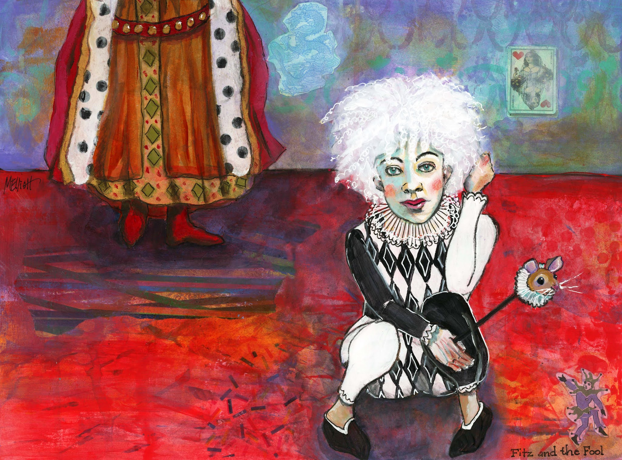
The lesson was loosely based on the harlequins of Picasso, but Maria made them much more colorful and happy, and also incorporated a bunch of collage to give form and texture to the background. I had two things in my mind: One was that I just finished reading the fantasy series by Robin Hobb which features a main character called the Fool, an albino court jester with flyaway white hair dressed all in black and white. The other was that I just started Emma Pettit's class called The Fluid Figure, and there was a reference photo provided for our sketching practice that made me think of the Fool in both expression and pose, huddled up in a squat. All I had to do was create a scenario for them (the Fool is nonbinary).
Early in the books the Fool spends most of the time sitting at the feet of King Shrewd, ruler of the Six Duchies, so I decided to paint a partial figure of the standing king in the background and put them in an environment done in royal colors of red and purple with accents of gold and turquoise. I wanted the Fool to be the central character in the foreground.I wish that I had located the two figures a little closer together, or even overlapping, because there is a lot of rather uninteresting floor that I could have made a lot less wide. It didn't occur to me until I was almost finished that I could have put in some furniture, like a throne....
Oh, well... I did find some fun collage elements—I used black and white polka dotted tissue paper as the ermine lining of the king's cloak, and put some red dots under the flooring just to echo. I had two other patterned tissues, so I threw pieces of those in on the floor as well, then painted over them. But the fun things I found were a dragon, which is a big feature later in the series; a queen of hearts card, which symbolizes Queen Kettricken to me and serves as a painting on the wall; and a tiny picture of a court jester, who is gesturing up from the corner towards my Fool.
This was a giant mess that gradually pulled together after a LOT of work. Gluing down the tissue paper was a major pain—it moved, it ripped, I did it over, and in some cases just gave up. I did some stenciling in the background and then rubbed most of it out or painted over it so it was merely a suggestion of pattern; I initially went around the Fool with Stabilo and then smeared it everywhere when I started painting and had to rub a bunch of it off again and use pen instead; the Fool's marotte (bauble) was an afterthought that I used to fill up some more boring floor space; and I struggled with outlining, with colors, with pretty much everything. But it finally came together and I have decided that it's finished. Unless someone has a suggestion for making it better!
"Fitz and the Fool"—collage, acrylics, acrylic inks, gel pens, Uniball, watercolor pencils, on Fluid 140-lb. coldpress watercolor paper, 12x16 inches.
I forgot (at 2 a.m. when I posted this) that I took in-process photos for once! Here they are:
I started out with a roller and a credit card and a spray bottle and made an Emma Pettit background for my tableau, with red, purple, and gold paints.
Then I added in all my collage elements—the three tissue paper selections, the blue dragon, the Queen of Hearts playing card, and the tiny jester, and drew in my two figures.
And this one shows an early stage of the painting, with some base coats filled in.