08 May 2021

This one's for Davey

Fortunately, I am not alone in my family in my obsession with The Handmaid's Tale (the Hulu series). I've been waiting for it to return for what seems like a very long time, and a couple of weeks ago I went on Hulu only to discover a bunch of one-minute previews from the points of view of each of the characters; my immediate reaction was to tell my ex-first-cousin-once-removed-in-law David, "It's coming!!!"

Now that it's here, I'm so happy I found out that he is immersed in it too, because I have someone to whom I can say, "Can you BELIEVE what happened this episode?" Of course, now it's a matter of waiting each week for the next and the next, unlike when I first discovered it and binged a season at a time. I may just go back to the beginning and watch it all again; it's that good.

David and I were back-and-forthing on Messenger the other day about the show and also about my latest painting, and he said, Hey! you should paint Aunt Lydia! So this one's for him.


"The Aunt"—pencil, Uniball pen, Paul Jackson watercolors, Daler Rowney inks, on Fluid 140-lb. coldpress watercolor paper, approx. 9x12 inches.


06 May 2021

Strange materials, redux

Several people I know use collage in their pieces—some a lot, and some just a subtle piece here and there. I've never had the creative brain for collage—putting together all the pieces in some arrangement that both makes sense and is pleasing—but one thing I liked when I saw it was the use of tissue paper, whether a plain color or with a pattern, in part or all of the background of a painting. So this week I ordered a bunch of different tissue paper patterns (they were on sale at Michael's) and sat down today to experiment.

I'm going to have to ask them what they use to attach it and how they keep it from scrunching and tearing. I tried to stick it down with clear gesso, which some have told me acts just like Mod Podge, but it does not! I put two more coats of the clear gesso over the top and managed to get most of the tissue onto the sheet of watercolor paper. I ended up having to tear away pieces from around the edges on this, so I did my image dead center on a 12x12-inch sheet and trimmed all around when I was done. 

I also need to ask them what they do to make the pattern drop back a little more. I actually put the tissue down right side to the paper so that I got the dim side of the dots, but they are still really prominent. But, I decided to go ahead anyway.

My original plan was to paint a delicate portrait in watercolor over the top, but I realized it wasn't going to be nearly strong enough to fight with those dots. So instead I drew the picture with charcoal and smudged in all the shadows, and then went back in minimally with watercolor trying to keep it to more of a tint than a painting. I regret adding the freckles, even though she had a copious number—I think the portrait was more effective without them. But, oh well.... I almost didn't post this, because I don't think it quite works, but I've been pretty open about my failures here along with my successes, so here it is.

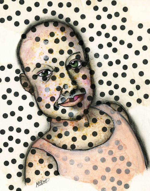
This was a photograph of a four-time cancer survivor, and I was carried away by the sweetness of her expression and the slight smile on her face, despite being bandaged, bald, and in bed. The dots were supposed to be an underlying commentary on her condition, but instead they dominate her, which was not my intent. I feel like anyone with the spirit shining out of this girl's eyes can overcome what is thrown at her.


"Survivor"—tissue paper, clear and white gesso, medium charcoal pencil, watercolors, Signo white gel pen, on Fluid 140-lb. coldpress watercolor paper, about 8x10 inches.

So, I asked everybody and got a variety of answers, including thinned-out acrylic, thinned-out gesso, and white pastels. There were also examples of how it looked depending on what I did. So I used some thinned-out gesso to drop back all the dots in the background, and then dropped out the dots on the figure where she was naturally supposed to be light, while leaving the ones in the dark shadow areas more or less at full intensity. I touched up bits of the charcoal and watercolor here and there to compensate, and here is the new version, "Survivor 2":


I maybe still didn't go far enough, but it's much more accessible now, I think, instead of being totally overwhelmed by the dots. Thanks, everybody (especially Phoebe) for all the good advice! This is why artists need artist friends!


05 May 2021

Rossignol

This is the original guy who served as the model for Lewis Rossignol's class that I viewed yesterday. I always like to change things up by picking a different model (thus Vonnegut), but this guy had SUCH a great face that I couldn't resist. I messed him up a bit—his nose should have been longer and bigger, and it's canting off a little bit to the left! but it's a fair likeness.

I played a bit with a background wash beforehand, and ended up with some ghost circle outlines from ink that I didn't move quickly enough, so I splashed some more ink around at the end, and did some random white circles like Deb Weiers does, so it would look like they were intentional.


"Smoker"—pencil, Uniball, Daler Rowney inks, Signo gel pen, on Fluid 140-lb. coldpress watercolor paper, about 9x12 inches.


04 May 2021

Water soluble

A big issue with those of us who work in both ink and paint is whether the ink will bleed when you put watercolor on top of it. A lot of urban sketchers use fountain pens, and the ink with which they are sold is water soluble, so they switch it out for something that isn't. Or, they develop a style that incorporates the bleed! Some also use dip pens with India ink, and that can be problematic, since that ink will move again after drying, though not as much. Of course "movable" ink can also be an advantage if you want to use it specifically for shading.

I use a Uniball Vision fine-point pen because while it's water soluble while wet, once it dries it is not—or so little as to be virtually undetectable. I like to be able to draw first in pen and then add the watercolor layer without worrying about bleeding, smudging, or the graying out of my colors.

Something I have never done, however, except for shading eyes at the very end, is to purposely use the Uniball's water-soluble tendencies before it has dried. I watched a portrait lesson by Lewis Rossignol, who likewise uses the Uniball, but he comes in with a damp or wet paintbrush before the ink has dried, in order to soften lines, pull out shadows, or emphasize a particularly deep wrinkle. So I decided to try out the technique today on a portrait of Kurt Vonnegut, who has lots of nice wrinkly real estate on his face that can be dealt with interestingly.

I also followed Rossignol's drawing method for the face, which is somewhat similar to the one I always use, although he does more mapping than I do. My habit is just to start with an eye, do the other eye, then move on to the nose and mouth, and then surround it with face—it's easier (I think) than the standard method of drawing an oval for the face and then crosswise lines for eyes, nose and mouth. I draw this way because standard = generic. You can usually tell when somebody uses the oval-and-line method, because their portraits all have a certain similarity one to another. Lewis maps out the face in sections, lightly, with pencil or charcoal, which in some ways works a bit better than my method because it gives you a good chance of getting everything situated properly and in proportion. I will probably pursue this change in the future.

I remembered to take some process photos as I went along. The first is the "map," and the two subsequent are at various stages of the ink-and-smudge process with the Uniball.


I'm almost sorry I added color; my plan was to colorize only the eyes and the lips, but then I added a little pink into his cheeks and eyelids, and when it didn't work by itself I had to keep going. I ended up adding color everywhere, but I didn't go full-on like I usually do.


"KurtHumanist"—pencil, Uniball pen, Daler Rowney inks, Paul Jackson watercolors, on Fluid 140-lb. coldpress watercolor paper, approx. 9x12 inches.


03 May 2021

Crazed

With this image we come to the end of this series, I think. There are more pictures, but some are repetitive of what I've painted before, and besides, six is a nice number for a series—you can hang them in a row, or three and three stacked.

Also, with this I have officially run out of base colors for the skin that are enough different from one another that they will contrast. As it is, the red and purple are way too close to one another, and this yellow one isn't too far off the one that was supposed to be orange.

This is the only one in which I chose to include hands, and they are basically buried in her hair except for the wrists, but I wanted to do at least one to vary the series a tiny bit. I masked this one crookedly on the right edge, so I had to crop it in a little farther to get a straight edge. The framer will not be happy.


"Crazed"—pencil, Uniball, Daler Rowney inks, Paul Jackson watercolors, on Fluid 140-lb. coldpress paper, approx. 6x9 inches.


02 May 2021

Devilish

Continuing my series of the photo-booth woman, who has seemingly infinite expressions and is making all of them in this set of photos! This one was a challenge, with both teeth and tongue out and one eye closed.

I'm running out of base colors (besides natural skin tones!) to paint this girl! I used red on this one because she had such a mischievous expression, but thinned out it reads more as pink, almost too close to the purple one I did before. Still, the total suffusion of the face does give a certain flushed, bad-girl effect.


"Devilish"—pencil, Uniball pen, Daler Rowney inks, Paul Jackson watercolors, Signo white gel pen, on Fluid 140-lb. coldpress watercolor paper, approx. 6x9 inches.