26 March 2021

The Wince

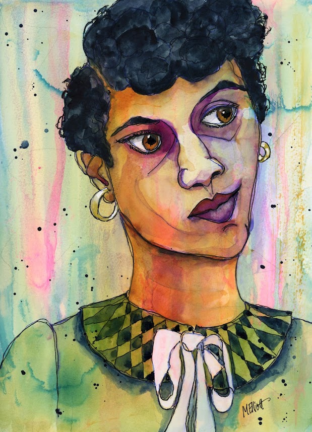
And here is Dorothy Counts, the other party in that integration interaction. I started to call this "cringe," but she never did—she walked with her head high and her shoulders squared, and let it all roll off of her. And as a tall girl, she towered above a lot of it. But in the photo, you can see the slight feeling of panic in her eyes, and the way she holds her head shows just a little wince away from the chaos surrounding her. The dark circles under her eyes probably attest to sleeplessness in dread of these ongoing encounters. I tried to capture that in my painting, but don't know if I quite got it.

This one didn't paint itself nearly as easily as the Grimace boy—I think I was working harder for a likeness—but the colors and attitude did come through fairly quickly. I'd love to see these end up hanging together somewhere.


"Wince"—pen, Uniball, Daler-Rowney inks, Signo gel pen, on Fluid 140-lb. coldpress watercolor paper, 9x12 inches.

25 March 2021

The Grimace

Somebody posted a link on Facebook today to some pictures on Twitter of Dorothy Counts's first day of class as one of four black students who were integrated into a Charlotte, North Carolina high school in 1957. In one of the photos Dorothy is in the foreground, looking grim, and in the background are a bunch of jeering white children. The boy directly behind her has an ugly/stupid look on his face, and the caption reads, "Fifteen-year-old Dorothy Counts sits quietly, while a white student grimaces in rear. Students later threw rocks and sticks at her." I thought about painting her (and may still), but decided instead to capture the face of ignorance and cruelty over her right shoulder.

I purposely did this one fast and loose, because I wanted it to convey a sense of movement and also a bit of distortion. I created the background using the dark colors surrounding them, and even though I was random with the ink, it fell just right to make his face emerge. I drew him directly with a water-soluble blue pen—it was almost like tracing what had already appeared!—and then went back in with my black Uniball to emphasize and change some of the lines.

I didn't do a whole lot of painting on this—some white for the highlights, some purple and indigo for minimal shading, and brown for his eyes and hair, and that was pretty much it. I accentuated the shape of the shirt a little by filling in some indigo, and gave it all a spatter of white. It took me about 90 minutes. I love it when portraits come together like this.


This is "The Grimace"—pencil, pen, Uniball, Daler Rowney inks, Signo gel pen, on Fluid 140-lb. coldpress watercolor paper (UPS arrived from Michael's with my paper!), 9x12 inches.


24 March 2021

Out of control

It seems that my art is being quite dictatorial these days. I apparently have no say over what style I choose to do—the art is telling me what it wants. I set out today to paint a wonky portrait, but without conscious choice my hand decided to do it straight instead. I had even cut out a word to run down my subject's nose to convey my sense of her, but since the portrait insisted on being realistic, I made the word serve the role of her shoulder instead, just so I could include it.

This is my friend Kirsti; I was inspired to paint her because she posted a photo "reveal" today showing that she had let her hair go to its natural color, which is a beautiful smooth mix of white and silver-gray, and which looks fantastic. So I used my gray-tone paper to help with the hair color, and then had to work twice as hard to warm up the facial features against it. It was worth it for the way the white stands out against the toned paper, though.

This may be the closest likeness I have ever gotten to Kirsti. I have painted her multiple times, and some weren't even recognizably her! I don't know what is so challenging, but I may have finally captured a good one. Here are all the others:


And here is the new one:


"Classic"—pencil, Daler Rowney inks, watercolors, Uniball pen, Signo white gel pen, on Strathmore 184-lb. Toned-Gray Mixed Media paper, approx. 8x10 inches.


23 March 2021

Revolution on Facebook

Y'all are used to my wonky portraits by now, courtesy of instruction by the fabulous Deb Weiers. But some artists on Facebook made a big jump this week, when Jenny Manno, who specializes in portraits of long-necked, dewy-eyed girls with rosebud mouths and elaborate hairstyles done in all kinds of super-cool media (of which she is a total master) decided to offer, as the weekly "prompt" on her page, one of her friend Deb's wonky people, challenging her followers to try out a new look. And a bunch of them stepped up and did an amazing job.

One of the elements was to put words on her nose, and many people did profound sayings or comments, or even resorted to poetry. I couldn't find anything to cut up for material except a Roaman's catalog that came in the mail, so mine is less, er, philosophical. The portrait also includes Deb's trademark big lush lips and dreadlocks. I am clarifying here that it's not the artist claiming she's the prettiest, it's the girlish Miss Thing herself who thinks so!

This was fun, and also challenging because I ran out of watercolor paper and had to do this on toned tan mixed media paper, so my color decisions were more difficult, and the ability to blend is a bit compromised by the extremely smooth surface where stuff tends to move around instead of staying where you put it. But I managed it in the end. It also pretty much derailed what I had planned as an industrious day, but hey, in the land of retirement (and Covid), there's always tomorrow to fill!


"Prettiest"—Uniball pen, Daler Rowney inks, watercolor, collage, Signo white gel pen, on Strathmore 184-lb. Toned Tan Mixed Media paper, 9x12 inches.


22 March 2021

Illustration

One thing I miss about my job as a teen librarian is that I got to plan the entire teen summer reading program. The centralized library organization for summer reading club activities always issues a program, but their ideas of what teens will like are either stuck somewhere back in the 1960s or are just too coy and cutesie about current technology that they assume (wrongly) all teens love. So after my first year, I always designed a custom program for my teens, assisted by the other teen librarian. And after we decided what performers, crafts, and activities we would feature, it was my job (well, not really my job, but something I chose to take on) to design and illustrate all the flyers for said activities. And I loved nothing better than to come up with a new logo for the "Book Café" nights, or to make an appropriate drawing to go with the BMX demonstration.


Since leaving the library, I have had few opportunities to make original illustrations for anything, but every once in a while I write a book review for my other blog, The Book Adept, that asks for some kind of visual interpretation. I just finished a book that was (among other things) a psychological exploration of the breakdown of a woman who has kept a secret pent up inside for 16 years, only to have her new marriage trigger her big time. I bought a stencil a while back with all kinds of words on it, and decided this was the perfect opportunity to use it as part of an art piece.

This is Vida Avery, from Lily King's book, The English Teacher. As you can tell from reading "between the lines" of her serene façade, inside she's a hot mess. I didn't have a whole lot to say in the review, partly because I didn't want to give too much away, but I think this illustration will help convey the disconnect between Vida's outsides and her insides.


"Vida"—stencil, gesso, ballpoint pen, Uniball, Daler Rowney inks, watercolors, Signo gel pen, on Strathmore 184-lb. Toned Tan Mixed Media paper, 9x12 inches.

Go to my other blog to read my review and see the illustration in situ; also, take a gander at all the other book reviews to see if you'd like to follow me there as well. I read eclectically, and review most of what I read.



Indeterminate methods

This is one of those that you keep looking at and wondering, Is it finished? Should I stop now? It's mostly because the style shifted a couple of times mid-painting, so I don't know what I want it to express any more. I started out to do a wonky painting today, but once I picked out a model he refused to be wonky because his situation was too serious.

This is a child coal miner from West Virginia, from a black-and-white group shot of boys just up from their shift underground. I don't know what year it was, but it was obviously before unions were formed and child labor laws were enacted. He had such an angry little froggy face that I thought it would be a natural for a wonky, but no, he demanded I paint him straight.


I started out painting sort of like Lobenberg's style from yesterday, but even that seemed too frivolous in some ways (too colorful), and I then reverted to more of a Millind Mulick feel. So the painting became confused and confusing, and I didn't know where else to go with it. He also lost what was left of his childlike quality in the process. Here is where I stopped.


"Miner Boy"—Daler Rowney inks, pencil, Paul Jackson watercolors, on Fluid 140-lb. coldpress paper, 9x12 inches.


21 March 2021

Vibe!

Today's lesson was with David Lobenberg, who has titled his style "California Vibe." It essentially consists of doing an underpainting of loose strokes in essentially primary colors (or variations on same), and then following what you have put down when laying in the more detailed shadows to delineate the face, and finishing up with the necessary detail. It is both loose and exacting, and takes something of an effort to mimic. His brush strokes are more spontaneous and chunky, rather than smooth and blendy like mine (which is part of the style), but I really enjoyed trying this out, and would love to do more of it.

One thing I learned from him (or let's say heard and observed but have not yet incorporated) is the importance of moving your brush in all different directions—not just in the obvious places, like when you're achieving the spiky hair, but also when laying down color into areas. Laying down a stroke, lifting the brush, and not giving in to the impulse to blend or "fix." It gives a spontaneity to the work that saves it from too much deliberate directionality, and keeps you from getting too smooth as well.

This guy's eyes kinda creeped me out—David left them purposely blank and all one color, but I tried to put in pupils where you could just barely see them in the shadow and glare from the sun. I messed up a bit when it came to the T-shirt he's wearing, which should have been left white on the right side—I got too enthusiastic in the beginning stages of the painting and couldn't lift it. But I'm mostly happy with this, and intrigued by the style. I'll probably try a few more of these.


"Spikey"—Pencil and Paul Jackson watercolors on Fluid 140-lb. coldpress watercolor paper, about 8.5x11 inches.