My friend Kirsti, aka @sugarnerd, has turned me on to a new TV binge: The Great British Bake Off (known in the United States as The Great British Baking Show, since "bake-off" is, if you can believe it, a trademark owned by Pillsbury). It's apparently been around since 2010 but, although I have tuned in to a few baking shows, I had never seen it until Kirsti mentioned it and asked if I was watching the new season, so I decided to check it out. It's being carried on Netflix, although the earlier shows aren't available; it apparently starts there with Season 8, which is when BBC quit airing it and it switched over to Channel 4 overseas. It's a bit confusing, because Season 8 is listed on Netflix as Collection 5, and they continue being numbered from there.
It's similar to other baking shows, in that a group of amateur bakers compete against each other in a series of rounds, attempting to impress the two judges with their baking skills. The rounds consist of a "signature" challenge, which features something the person might bake at home for friends and loved ones; a "technical" challenge, which requires enough knowledge and experience on the bakers' part to produce a specific finished product (they all bake the same thing) when given limited instructions; and a "showstopper" challenge, where the bakers are given a specific request (bread, cake, etc.) but within that context must show off their skills and talent, focusing on both excellent flavors and dramatic presentations. At the end of each round (which consists of the first two challenges on a Saturday and the third on the Sunday), one contestant is crowned the week's "star baker," while another is eliminated. The winner of the season is selected from the three contestants who reach the final round.
Kirsti touted it as the perfect "cozy" way to spend an evening of television, and while the subject matter is certainly homey (who doesn't love baking?), the competition produces a high level of anxiety that keeps both contestants and viewers on tenterhooks. I started out thinking I wouldn't continue, but rapidly got hooked on the whole "what happens next?" of it all, and am still watching, two seasons later.
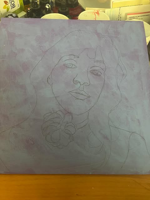
During the second season, both Kirsti and I had a favorite competitor and, after chatting about her on Messenger yesterday, this morning I decided to find a photo and paint her picture. Her name is Kim-Joy Hewlett, and she was one of the runners-up in Season 9 (Collection 6). When I first saw her on the screen, I questioned whether she had done her makeup as some kind of parody and then, realizing she had not, wondered why the production had let it stand! Her cheeks were a bright artificial pink, and she was wearing a heavy coat of sparkly turquoise cream eyeshadow. As the weeks went on she toned down her style just a tad, but still tended to reflect the color of her outfit on her eyelids and, since she wears a lot of yellow, that was usually a marigold shading into orange at the outer corners, with some equally vivid lipstick.
But Kim-Joy's somewhat odd makeup choices were soon eclipsed by her skills; although she sometimes did poorly with the bake itself, her quirky, charming decorations often elevated her from the bottom of the roster to the top three. And her sunny disposition and shy grin likewise endeared her to viewers.
So, here is Kim-Joy, in all her glory, with rosy cheeks and yellow eye shadow (and dark brown hair tipped purple at this time), smiling and showing her dimple for the camera. (Her glasses were, contrary to my sketch, perfectly symmetrical!)
"Kim-Joy"—Uniball pen and watercolor on Bee sketchbook paper, 8x8 inches.