24 July 2026

Nancy

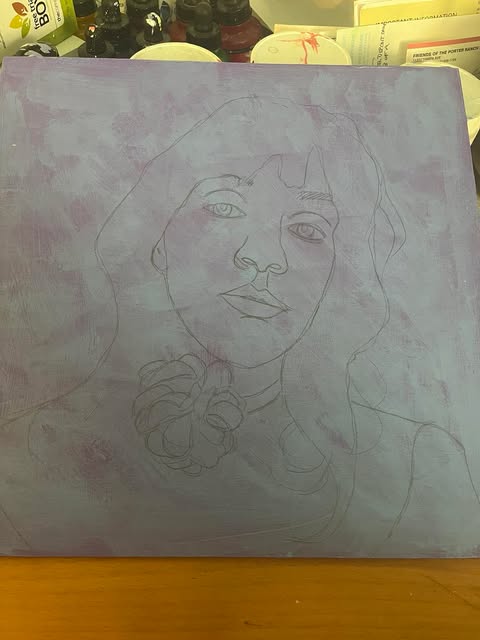
This week I decided, on impulse, to paint a portrait of my cleaning lady, Nancy. I had taken a few photos of her with that in mind a few months back and then forgotten all about it, but it popped into my brain last week and I started prepping the board.

I used a 10x10-inch square cradle board so that I could make it ornamental and "self-framing." I had asked Nancy what were her favorite colors and flowers, and she answered "Roses" and "pink and yellow," so I pulled out a favorite all-over rose stencil pattern. I made the background a pale green, and then did the roses in yellow and pink, with an occasional blob of darker green in between them (even though there are no actual leaves on the stencil). I decided it would be too busy and repetitive to use this stencil on the sides of the cradle board as well, so instead I used a stencil with just leaves.


I chose the leaf-and-flower motif because one of the nice "extra" things that Nancy has been doing for me for the past few months is watering all the plants and shrubs in my yard. She was at first just doing this on Saturday mornings when she comes to clean, but since it's been so hot she's also been showing up on Wednesday or Thursday night after a full day's work elsewhere to make sure my plants don't wilt in the heat. She has often expressed a wistfulness that she doesn't have her own garden (she lives in an apartment) and has mentioned how much she enjoys spending time in mine, so I thought setting her in those surroundings would make for a great theme.

After stenciling, I used a thinned-out shade of Titan pale green to knock back the intensity of both the background and sides, repeating the glaze several times until it felt like it was the proper intensity so that it would show up but not fight with the portrait.

Then I carefully drew Nancy's smiling face onto the background in pencil, and started to paint. I finished fairly rapidly—two afternoon's work—but ended up tweaking the portrait for three more afternoons. I have discovered that I am somewhat blind to flaws if I'm looking directly at the painting, but if I photograph or scan it and put it up on my computer screen, I can immediately see them. So I repeatedly photographed the portrait and put it up next to the original reference photo to analyze the differences. The most challenging bits were her nose, which I redid three times, and her hair, which is a dark brown/black. I wanted to show highlights, but when I used white or gray it just looked like she had gray hair, so I ended up mixing some turquoise into raw umber and that worked pretty well. The mouth and teeth were also challenging and were tweaked multiple times.

I would normally ask for feedback from my artist friends, but in this case I was more concerned with getting as perfect a likeness as possible than with the artistry of it, so I sent a photo of the finished portrait to my cousin, who knows Nancy well, and she said it was good. Then I sent it to my friend Kirsti, forgetting that her husband, Aaron, also knows Nancy, and was gratified when she said that he had seen it and immediately recognized her without prompting or identification.

Today I did a few final passes on some difficult shadows under the neck and then waited for it to dry (a matter of moments in this heat!) and put a coat of satin varnish over everything. And tomorrow, after Nancy is done cleaning, I will be giving it to her, as a thank you for going the extra mile for me and also just for being a stellar individual with an engaging, positive personality who always cheers me up!


Nancy, stencils, pencil, and acrylics on a 10x10" cradle board. Gift.
(The scan is cropped a little horizontally—ordinarily I would scan it in two pieces and put them together, but with this background pattern I couldn't match them properly and gave up!)


07 June 2026

Dancing with Dad

When I made my last post about my "Faces of California" idea, little did I know that within three weeks I'd be in the hospital! I had already started the next painting in the series, but health issues intervened; I ended up with a bad outbreak of cellulitis on both my legs from ankle to knee, jumped through many ridiculous hoops trying to get treatment, and finally ended up hospitalized for five days, followed by about three months of recuperation. Although I came home after the five days, I was still on antibiotics for awhile, and my legs remained blistered and weepy for a long time. I was unable to sit up at the computer or the easel for more than half an hour at a time for about the first five weeks, so I made little to no progress on my painting.

Since then, I have worked on it in small increments, doing the shirt, the skirt, a face, over a period of several weeks. Then I got hung up on the background. I put in some furniture that would typically appear at this kind of occasion, but it was too detailed to be background, and it distracted from the subjects of the painting. I finally, after struggling with various iterations of it for a couple of weeks, asked advice of a friend, who counseled me to paint it out and replace it with a vague background of drapes and lights represented in the blurry distance/background.


I made it as far as restoring the plain yellow background, also redoing the floor in colors that dropped back (went from warmer to cooler tones), and got stuck again. I stared at the painting every single day for about a week, looking for inspiration, and finally concluded that all that was really lacking was bravery, so I finally put in a yellow curtain with white lights. I stared at that for a few more days and absolutely hated it. The background looked amateurish and too literal behind the more painterly figures. The colors (browns and mustard yellow) didn't work. 

I went to three more artist friends for advice. One commented on the layout and I realized she was right—it was too static, and it split the figures exactly in half, a big no-no. One pointed out some subtle colors in the darks and lights that I could add in for more nuance. One shared a video of an art teacher we both follow, and I took a good look at her backgrounds, which were "blurry" rather than being detailed, and substituted amorphous shapes for specific items. I decided to implement all of that. So I painted out everything I had done behind the figures, and then experimented on paper with where and what colors to use before committing it to the actual painting. I considering adding a little stenciling for a tile effect for the floor, but it didn't work, perspective-wise.

Again, I struggled with committing, and finally did the background as it is below, redoing and refining various effects until they worked for me (more or less).

After that, I fiddled with ideas for the cradle-board edges. Because I painted out the background so many times, I didn't do a "wraparound" of what was on the front except for the skirt on the bottom, so I thought that duplicating my success on the Strawberry Fields painting by using stenciling would be a good idea. I went through the ones I owned and tried out a couple on paper but again, nothing was quite right, so I ordered more stencils and waited for them to arrive. I tried a couple of versions and finally ended up doing some roses and leaves in strong colors and then glazing over them with pale pink to make them drop back so they didn't overwhelm the more subtle colors of the painting itself.

This is, without a doubt, the painting that has taken me the longest of any I have done, and I still can't say that I'm completely satisfied with it. I loved the idea, but feel like I haven't pulled off the execution quite as I envisioned it. But after more than four months of fiddling with it, I have decided to call it done and move on! I hope somebody out there likes it.


This painting represents a father-daughter dance at a Latina girl's QuinceaƱera, a traditional, lavish celebration of a rite of passage marking a girl's transition to womanhood on her 15th birthday. "QuinceaƱera: Dancing with Dad" is an acrylic painting of 16x20 inches on a cradle board. I plan to use this self-framing base for the entire "Faces of California" series. It's more expensive by far than buying flat wooden panels, but still more frugal than having to pay for framing—and has interesting possibilities for complementing the painting both esthetically and symbolically.


I can't finish this post without saying thanks to Phoebe, Corinne, Kim, and Emma for both their patience and their good suggestions. I don't often ask advice, but sometimes you need another opinion (or four), and my friends came through for me on this trainwreck. It really helps that they're all amazing artists. Thanks, y'all!


26 January 2026

The faces

In light of what's going on in our country with the persecution of immigrants pretty much regardless of their status, I have become moved to paint some of the faces of Los Angeles.

Los Angeles is one of the most diverse cities in the world, representing more than 140 nationalities. The population is a mosaic of cultures, with no single ethnic group constituting a majority. Although the major ethnic groups are Hispanic/Latino (from Mexico and from South America), White, Asian, Black, and multiracial, the city acts as a hub for diverse communities, including significant Armenian, Filipino, Korean, Ethiopian, and Iranian populations. And each of these ethnicities and cultures brings with it a set of rich traditions, celebrations, foods, clothing and furnishing styles...almost anything you want to know about the people of the world you can find somewhere in Los Angeles. Nearly 40 percent of our residents were born outside of the United States, with more than 224 identified languages spoken in addition to English. Furthermore, 73 percent of the city's workforce are people of color.*

I wanted to include not just nationalities but also be sure to cover socioeconomic classes, genders, etc. And I wanted to share things that are unique and also things that are everyday.


I began last year with my paintings of the Latino woman and man ("Marigolds" and "Skullboy") wearing painted skull faces for Dia de los Muertos, and then ill health and the dark of winter kept me from making much progress. (I like to paint in natural light, which lasts about 90 minutes in my studio between mid-November and mid-January.) But I did some research in the meantime, and discovered David Bacon, a photographer of California field workers who agreed to let me use some of his photos as references for paintings, and I have just completed my first. It fulfills the goal of portraying the everyday, and also brings in gender—I think people may picture men when they think of field workers, but the women are out there too, under the hot sun, doing the backbreaking work that feeds California and significant parts of the States/the world via exports.

I slightly simplified the backdrop of the painting in favor of capturing the details of the two women standing in front of the fields in which they were picking strawberries. The portraits themselves were challenging because of the cast light and shadow, getting the complexions just right, and capturing their expressions. I decided that trying to paint the bandanas protecting their hair with the most common white/black patterns would detract from the faces themselves, so I left them as plain-colored scarves. I love that the one woman is wearing a "Cali" sweatshirt, since the series is all about Californians.

The biggest challenge on this one for me turned out to be the mixing of greens for the plants in the fields! I started out by using whatever greens I already had and then modifying them by adding yellows or blues or white, but they all came out muddy and nothing like what I was picturing. So I went back to basics, after asking some advice from painters better at color mixing than I am, and mixed all my greens from "scratch" using clear yellows and blues, then adding white or a touch of red. I'm still not completely satisfied with them—they don't feel either dark or bright enough for a strawberry field—but they are so much better than where I started that I decided to stop while I was ahead. I then added in miniscule dots of white and red to represent blossoms and berries.

I painted this on a cradle board so that it would need no framing, and I bought strawberry border stencils (two different ones) to use to decorate the sides. When they arrived in the mail, however, they both turned out to be too wide by almost an inch to use as they were configured (as one long, connected vine). So I broke them up into sections and just used "clumps" of leaves/berries/flowers spaced semi-evenly along the four sides. I had a little trouble with one side, but fortunately it was the bottom! So probably no one will ever look at it. Or (more likely) it will keep bugging me until I fix it! Each side is slightly different.


I'm calling this one "Strawberry Field(worker)s" and it's 16x12 inches, painted on cradle board with Golden acrylics.


I had a little trouble putting this together as a scan—my scanner cut off about half an inch at top and bottom and, since I have to scan it in two pieces, the split was right down the middle of the guy in the straw hat in the background, so fixing that wasn't perfect. And the color correction was difficult on this one. But...still better than a photo, I think.

I hope to continue on with this theme for a while with the thought of putting together a show or entering them in a competition.

*Population and nationality statistics from Wikipedia


06 January 2026

First Let's Face It lesson of 2026

 This week the Let's Face It lessons started up, and the first one was a fun one, but done in a medium I don't enjoy and don't own: soft pastels. It's not that I don't admire them, I just don't have the patience, nor do I like having to use fixative on my art! So...I followed the lesson as far as I could (drawing it in vine charcoal, then going over that with a soft-leaded pencil and rubbing the charcoal out afterwards), and then, when I was supposed to continue by putting on layers of soft pastels in various colors, I instead broke out my palette, chose half a dozen colors of acrylic paints, and tried to mimic what our teacher, Toni Burt, did with her pastels. It sort of worked. It's a little too opaque here and there, but I did manage to be more spontaneous than I would with a straight portrait.

We were also supposed to draw someone without resorting to a reference photo, and I intended to, but I couldn't resist using the photo of Toni herself as a model. Maybe I will try another this week, and this time completely wing it.


"ToniLesson1_LFI2026"—vine charcoal, #6 pencil, acrylic paints, marking pens. 9x12 on coldpress watercolor paper.


07 December 2025

My preference for Christmas Eve

 I haven't been able to talk anyone in my family into this, mostly because only a couple of them are real readers like I am , but this would be my ideal way to spend the holiday: Jólabókaflód—the Christmas book flood.

The founding story is here. But basically, the entire population of the country of Iceland buys books for one another as Christmas gifts, then they all open their gifts on Christmas Eve and promptly settle down on the spot to READ the books, accompanied by mugs of hot chocolate.

So yesterday I did a painting to promote the idea.

One bookstore I know of is celebrating this (on December 17th, not on the Eve), but since they are in Cleveland, I won't be able to attend. Anyone want to come over on Christmas Eve bearing a wrapped book and anticipating a quiet evening fueled by hot chocolate?


Uniball pen, watercolor, and Posca pens, 12x9 inches.

12 November 2025

Framing alternatives

I often paint things not considering such practicalities as framing. I have gotten better about taping off a border around my watercolors to provide an edge, but I am particularly bad about thinking these things through when it comes to acrylics. And since my favored surface is a thin birch board, I frequently end up with a "wall-to-wall" picture that might be diminished were some of it to be covered in an edging of frame.

I recently learned that if you paint on a "cradle board" you can eliminate the need for framing and also provide an extra interesting element to your painting. It's sort of the opposite of a shadow box—instead of being concave, where you look into it, it's convex with the flat surface standing away from the wall about 1.75 inches. I used one of these when I painted one of my Roseville-inspired floral still life pictures—I used a stencil to create a textured background, which was then mostly obscured by the subject itself and by a thin translucent layer of paint to knock back the effect and allow the subject to shine. But I then continued the stencil pattern around the four edges, and didn't knock that back, so that it blends with and yet stands out from the painting. I really like the effect.


Unfortunately, I didn't think ahead on my latest two paintings of the female and male celebrators of Dia de los Muertos. I painted them both on thin board, and then afterwards realized that there was, for instance, such a narrow margin of T-shirt neckline below the rebozo on "Marigolds" that it would disappear if framed. Further, I didn't care for the effects of framing on these particular paintings—I liked their starkness on that flat green background. So I decided that a workable solution would be to decorate the edges of a cradle board configuration and then simply glue these pictures to the front of that, thereby giving them a decorative edge and making them stand out from the wall.

Here is the result of the first one; I painted the edges and a small margin of the front of the board in the same paler pink I had used for the background of her rebozo, and then stenciled in the colors of that garment to give her a really bright "halo" of color that will only be seen from an angle, not straight on. I bought some Gorilla-brand wood glue and some small clamps and stuck her down to her "frame."


I'm now waiting for my order of a second cradle board (I only had one in the house) to arrive so I can do the same to "Skull Boy" (with different stencils and colors to complement his picture themes). But this experience will definitely teach me to think ahead; those cradle boards are expensive and therefore better used as intended, rather than simply as background mounts!


27 October 2025

Skull Boy

It all started with that very particular shade of green paint that I created for her backdrop, from mixing Titan Green Pale with about a third of turquoise. After I touched up her background, I had enough left to put a coat on another board, and I like the color so much that I decided another background like that would be good, so I grabbed the next 12x12-inch board in my stack and slathered it with "my" green.

The problem was, I couldn't decide what to paint on it. It's such a particular shade that it needs the right thing; it almost acts as a "green screen" like in special effects, to pump up whatever you paint on that ground and make it pop. So I ultimately decided that she needed a friend, and embarked on research to paint "Skull Boy" to go with "Marigolds."

I ended up using the face (and facepaint) of one guy but the eye color, skintone, and haircut of another. I wanted him to look more Latino, and the initial reference photo was of a very pretty guy with bright blue eyes and collar-length red-gold hair, which didn't quite fit! So I found a more somber lad and stole his brown eyes and brush-cut black-brown hair, and also his old-cream shirt and black velvet jacket bespangled with silver braid.

At first I was a little worried that his facepaint outshone that of "Marigolds," but she has that crown of flowers coupled with the rebozo in bright colors and patterns to give her presence, so I went with a little more elaborate design on his face.

These are really difficult to paint; you have to get the skin color right and then coat it with the white in order for it to really look like a painted face, and however much I love that green, it's a pain to cover up—it shows through pretty much everything except black. So everything has multiple coats. The eyes were also hard to make just the right size and imbue with the perfect expression; at first they were too small, and now they are probably a tad too big, but I'm done messing with them!

I realized that I really don't want to frame these two, particularly her, because the thin rim of her shirt will disappear behind framing, so I have decided I'm going to get 12x12-inch cradle boards, paint the edges with marigolds and other Dia de los Muertos patterns, and glue these two to the fronts of them so that they stand out from the wall and are beautifully free-standing. (If only I had thought to put them on cradle boards in the first place...) That's the next project.

"Skull Boy"—acrylics and Liquitex silver on birch board, 12x12 inches.

11 October 2025

GBBS

 My friend Kirsti, aka @sugarnerd, has turned me on to a new TV binge: The Great British Bake Off (known in the United States as The Great British Baking Show, since "bake-off" is, if you can believe it, a trademark owned by Pillsbury). It's apparently been around since 2010 but, although I have tuned in to a few baking shows, I had never seen it until Kirsti mentioned it and asked if I was watching the new season, so I decided to check it out. It's being carried on Netflix, although the earlier shows aren't available; it apparently starts there with Season 8, which is when BBC quit airing it and it switched over to Channel 4 overseas. It's a bit confusing, because Season 8 is listed on Netflix as Collection 5, and they continue being numbered from there.

It's similar to other baking shows, in that a group of amateur bakers compete against each other in a series of rounds, attempting to impress the two judges with their baking skills. The rounds consist of a "signature" challenge, which features something the person might bake at home for friends and loved ones; a "technical" challenge, which requires enough knowledge and experience on the bakers' part to produce a specific finished product (they all bake the same thing) when given limited instructions; and a "showstopper" challenge, where the bakers are given a specific request (bread, cake, etc.) but within that context must show off their skills and talent, focusing on both excellent flavors and dramatic presentations. At the end of each round (which consists of the first two challenges on a Saturday and the third on the Sunday), one contestant is crowned the week's "star baker," while another is eliminated. The winner of the season is selected from the three contestants who reach the final round.

Kirsti touted it as the perfect "cozy" way to spend an evening of television, and while the subject matter is certainly homey (who doesn't love baking?), the competition produces a high level of anxiety that keeps both contestants and viewers on tenterhooks. I started out thinking I wouldn't continue, but rapidly got hooked on the whole "what happens next?" of it all, and am still watching, two seasons later.

During the second season, both Kirsti and I had a favorite competitor and, after chatting about her on Messenger yesterday, this morning I decided to find a photo and paint her picture. Her name is Kim-Joy Hewlett, and she was one of the runners-up in Season 9 (Collection 6). When I first saw her on the screen, I questioned whether she had done her makeup as some kind of parody and then, realizing she had not, wondered why the production had let it stand! Her cheeks were a bright artificial pink, and she was wearing a heavy coat of sparkly turquoise cream eyeshadow. As the weeks went on she toned down her style just a tad, but still tended to reflect the color of her outfit on her eyelids and, since she wears a lot of yellow, that was usually a marigold shading into orange at the outer corners, with some equally vivid lipstick. 

But Kim-Joy's somewhat odd makeup choices were soon eclipsed by her skills; although she sometimes did poorly with the bake itself, her quirky, charming decorations often elevated her from the bottom of the roster to the top three. And her sunny disposition and shy grin likewise endeared her to viewers.

So, here is Kim-Joy, in all her glory, with rosy cheeks and yellow eye shadow (and dark brown hair tipped purple at this time), smiling and showing her dimple for the camera. (Her glasses were, contrary to my sketch, perfectly symmetrical!)


"Kim-Joy"—Uniball pen and watercolor on Bee sketchbook paper, 8x8 inches.


29 August 2025

Rebozo and Marigolds

I ran across a reference photo of this girl, all made up, dressed up, and adorned with a marigold tiara for Dia de los Muertos, and there was something about the look in her eye and the quaint feel of her smooth hair and crowned head that appealed to me. And of course, I'm all about the color, so I traded in parts of her attire for something brighter and more fanciful by giving her this rebozo (a traditional Mexican scarf) to complete her outfit.

This was a challenging one to paint in some ways, in that there needed to be a face under all the paint that was "right" before the superficial decoration could be added. I repainted the eyes and the mouth a few times before I was satisfied, and then went on to the stark but beautiful "mask" she is wearing.

There were also some challenges with the clothing, because the rebozo is patterned, but there were shadows that had to look natural within the pattern.

Over all, though, this came together fairly easily, over a period of several days. I spent most of the third day just tweaking all the patterns and applying second coats of color over the white or the pink, to make sure it popped. I don't usually pursue photo-realism in paintings (particularly portraits), but this one somehow came out more real looking than usual, I think. Of course, I don't know how I did that, so I'm not sure I can duplicate it! Anyway...


This is "Marigolds," acrylics on a 12x12 thin birch board.


11 July 2025

A different mood

I can't believe it's been six weeks since I last painted anything but a protest sign! I've been preoccupied with other stuff, but that's a long time to go without painting. I have had a couple of backgrounds prepped for a while, but this week I finally settled to something.

I tried again, with this one, to muster up some quality of a Malcolm Liepke painting, but once I finished it, it also felt to me like a painting from a former century, in some ways, with its dark atmospheric background and the more realistic focus on a face and body with less specific and more painterly clothing, so as to draw the eye to the personality.

This is, again, one of my favorite muses, Jenell Del Cid, @duhhcid on Instagram. I immediately fell in love with this pose, with her serious, slightly world-weary expression, all wrapped up in the giant fleece coat. In the portrait it comes off more like fur than it does fleece, but I didn't want to get more specific than this, because I felt it would be too itsy and also detract from the charisma of the model.

The background and the shadows are a mix of Ultramarine Blue Light and Payne's Grey, while the rest is a limited palette of Titan Mars Pale, Pyrrole Red, Titanium White, and some Raw Umber for the hair and eyes. I mixed a little gold into the eyes and highlighted the hair a tiny bit with some Titan Buff. But that's it.

When I was done with all that, something still felt lacking, so I scrubbed in tiny bits of Titan Green Pale, which is a muted celery color, and that gave it the Liepke touch; although it's hard to pick out if you look for it, it's ghosted over parts of both the skin and the fur.


This is "Fuzzy Jenell," acrylic on thin birch board, 12x16 inches.


21 May 2025

Homage to an amazing artist

A while back, I discovered the artist Malcolm Liepke on Instagram (@malcolm_t_liepke), and was mesmerized by his figurative paintings and portraits. His skin tones are luminous, and most of them also incorporate beautiful and various shades of green and blue along with the more traditional cream-and-pink fleshtones. Every time he posts a new one, it becomes my favorite until the next. So I decided I would try to emulate him, while using my own particular signatures (stencils, acrylics) and picked out a reference photo posted by Instagram model @dinoopis to be its subject.

The background is a shade of mushroom, overlaid with a stencil pattern in turquoise, teal, and green and then knocked back with another thinned-out coat of a blue-green mix. I drew the figure, and then looked at Malcolm's pieces for inspiration. I had a false start when I first did all the shadows in shades of red oxide, cobalt violet, and raw umber, as I would normally do, and then tried to incorporate the other colors as well—it looked like a big messy mash-up of two separate people's styles, which indeed it was! So I blocked out all the browns and purples and replaced them with a mix of Payne's Grey and Ultramarine Light, and suddenly the rest of the colors popped out in a completely different way. It also made the hair, which is the only thing left in the red-brown spectrum, stand out, as redheads always should!

I wasn't brave enough, as it turned out, to make as much use of Malcolm's greens and turquoises as I originally intended, but...stages. And admittedly, I can't duplicate his glinting paint and popping white highlights, but that's partly due to medium (acrylics instead of oils) and mostly due to the substrate (birch board). The tradeoff for me is, I like the scrubby blended look you can get by painting on wood with a grain.

The shirt (or dress) she was wearing was black with white polka dots, but it was so folded and creased and gathered by being pushed down off her shoulders that the prospect of painting all those full dots, half dots, and quarter dots, as well as capturing highlights and shadows, became too fussy (and too daunting). So I elected to make her clothing a dramatic dark teal to go with the background shades, and then put in lights by adding Ultramarine Light to the teal, and the shadows by adding Payne's Grey, which also gave it unity with her skin tones.

The pose, with the tilted-up chin, and the configuration of her hand were challenging, but I think I mostly captured it. This is "Warm and Cool"—stencils and acrylics on thin birch board, 12x16 inches. (I don't love this title, so if you have a better suggestion, put one forth!)


This is the same model that I used for my "Surf the World" painting back in 2022. I still have a follow-up painting I want to do to go with that one, but it's a tall canvas (full-length standing figure) and I can't do it at my desk, so it may have to wait for an easel, which could be a while (nowhere to put it at the moment).


22 April 2025

Tweaking an older work

I painted this figurative work in December of 2021, on spec for a potential client (who ended up not buying it after a lot of hemming and hawing). It was from an old photo of the client’s aunt and uncle-in-law, and she wanted it “in the style of Michael Carson”; I tried my best, but I didn’t quite get it. But I did duplicate the heavy light/shadow contrast that he goes for in his paintings, and I also captured their likenesses fairly well, given that I was working from an old, slightly blurred, colorized black-and-white photo. It was unfortunate that I got them a little high on the canvas so that his head is cut off a little, and I got their heads a bit too large for their bodies, but hey—it was my first figurative portrait in acrylic on canvas with two people in it, so...there.

In the photo, the belt on her dress is covered in white fabric, and for three years that white belt has bugged me. I initially liked it as another light point other than their faces, but after the painting sat in my studio staring at me for a while, I ultimately felt the eye was drawn too much to this insignificant detail. So, when I wanted to do some painting today but felt defeated when I looked at starting a whole new work, I decided instead to fix the belt. I made it a color to recede a bit into the dress, and gave it a gold metallic belt buckle to go with the gold in other parts of the painting, and I think it fits in a lot better. I also used the opportunity to add a few extra gathers in the dress and some strategic bits of shadow here and there.

I’m still sad the client didn’t like it, but maybe someday someone else will say, Hey, that looks like an old family portrait, it would go perfectly in my library! and I will sell it. Until then, Aunt Johnny and her George will keep staring down at me.


"AuntieUnc," acrylic on canvas, 18x24 inches. Available!

29 March 2025

Mustering defiance


I have been feeling the need to paint a new rabble-rouser for our current situation. I sold my painting "Keep Going" to someone who herself needed some encouragement and said the painting invoked her gumption, so I wanted to create a new image for myself. Given that I can't march like I used to, this is what I can do. Maybe I will offer her on a T-shirt for people who feel this message.

I looked for reference photos of women with raised fists and expressions of anger, determination, some kind of intense engagement. Although the one I used was quite supermodelish, I think I managed to transform her into a more authentic image by the choices I made in my painting with style and colors.

I went through quite a number of changes on this one. The T-shirt in the photo was white, but I didn't want it drawing focus from the face and fist, so I dialed it back with color but then gave it some pattern (a stencil, in case you were wondering—no, I am incapable of painting stars that perfectly or evenly!) just for added detail. I put in the lettering at the top but then the big empty space below it felt awkward, so I also used the stripes from my flag stencil to fill it in and give more nuance. I had to repaint the jacket sleeve a couple of times because, in the reference photo, both the jacket and the background were red, a red so similar that it was hard to distinguish foreground from background; but with the help of my painter friend Corinne I figured it out.

Her eyes were a bit squintier than this, and her mouth not at quite this angle, but I'm letting it be, because if I fuss too much, I inevitably make it worse! 

I pondered for a while whether the message should be "save our" or "take back our," but concluded that at this point, a lot has slipped away, and I also liked the thought that we could revert to the pure form originally invoked by the Constitution rather than simply salvaging what we have had recently, which hasn't felt ideal even before the fascists took over. It's eye-opening to read comments from all over the world and realize that many viewed American politics as a totally corrupt shit-show long before that became apparent to us. We obviously haven't been paying enough attention for all the decades since the gates were opened to so many devious people with destructive ideas (for everyone but them). But we're paying attention now.


I'm calling this "Blue in the Face" because that's how I'm feeling right now—screaming until I am blue in the face, and who is listening? This is a pastel drawing followed by acrylic paints on a 12x16-inch thin birch board. (Note: My scanner cuts off almost 1/2 inch on either side. The borders aren't this tight.)


08 March 2025

Just because

This one isn't for any lesson, I just painted it because I kept coming back to the photograph wanting to paint it! I was going to turn it into something uniquely mine by making her a Raggedy Ann doll with a blue-and-white checked dress and white collar (which would actually be consistent with Jenell's love of costume and dress-up), but when it came down to it I wasn't feeling that, so instead I went with dark and unobtrusive for the shirt (in the reference photo she was wearing a cream-colored sweater) so that her face would really stand out amongst all the red and burgundy and purple.

This whole thing came together deceptively easily—I spent a couple of hours on Thursday and again on Friday, and thought I had finished it last night—but when I got up this morning and looked at it, I saw that I had somehow managed to skew the mouth so it was too straight, too far to the right, and not lined up properly with the other features, and the nose was slightly off its proper angle as well. I showed it to my friend Corinne and she gave it a pass, but I knew it would bug me if I left it, so I fixed the nose (that was a tiny correction) and then painted over the mouth, let that dry, and started in to replace it.

Four mouths later...I kid you not. For some reason, getting the correct angle and the proper formation of the lips and the proportion of left to right required by the tilt of the head was simply impossible for my brain to comprehend. I finally ended up with something that worked okay for me—better than it had been before in terms of fitting with the rest of the face—but it's still not as similar to the original as I was hoping.

It is, however, a fairly good likeness of Jenell over all, and I'm happy with the simple yet crazy red hair and the way the rest of it fades back, so I'm calling it done!


"Raggedy Jenell"—chalk and acrylics on thin birch board, 12x12 inches.

28 February 2025

Petitt Special

This week's lesson was with my beloved friend and mentor Emma Petitt, a three-quarter-length figure with hands, using stylized patterning. Emma always makes it look and sound so easy—"Just give a little sweep of your brush here," "Splodge it on, make it chunky, don't focus on likeness or perfection," and so on, spit-spot-done. Yeah, right, Emma. This thing took me more than seven hours, and it's not even close to what I wanted it to be, but...it was good practice for me to try some different techniques, whether successful or not in this particular painting, so I'm calling it finished.

Emma is famous for her huge feet, outsize legs, and spidery long fingers (in her paintings, not on her own body! Ha!). I didn't go quite as far as I should have with the fingers, with the result that instead of looking purposefully elongated and distorted, they just look kinda wrong. She also almost never paints features on her women, preferring to leave the face a blank so that people focus on the other fanciful parts of their physique and clothing, but I find blank faces a little creepy sometimes, so I added one on mine. (Also, I liked the looks of the reference model and wanted to duplicate some of her characteristics.)

The spontaneity of this, adding in the lemons and leaves wherever they felt necessary while changing the style of dress and substituting headgear, was a useful exercise for me, as was painting around things to put in both the background and the ground color of the dress. I know that I tend to be way too literal with duplicating every bit of the reference photo when I paint, so departing radically from that was good, even if I was following Emma's lead and not doing it strictly on my own.

I did substitute lemons for oranges in mine, mostly because my lemons are all ripe and falling off the tree in my back yard right now, which kept them in the forefront of my brain, but also because I ran out of orange paint while doing the underpainting (a combination of orange and violet) but still had several shades of yellow and gold in my palette.

I also didn't use the same proportions, as I didn't have a canvas as large or as long and narrow as the one Emma used. But I still managed to capture most of the figure.

Here is the reference photo, just for purposes of comparison, since seeing it showcases how Emma starts with an idea but then radically departs from the inspiration photo.

This is "Lemon Dressing"—pencil and acrylics on a thin birch board, 12x16 inches.  Note that this is cropped a little due to the size of my scanner bed—there's a little more blue space at the top above the arm, and more of the cut-off lemons on either side as well.


01 February 2025

Another pose

No matter what source material I look at these days, I seem drawn back to various personalities and poses created by Jenell Del Cid, perhaps because she oh-so-accommodatingly does lots of fun photo layouts with creative wardrobe and makeup choices almost every day on her Instagram page, inspiring me to keep painting her.

This one is from a photo I saved a while back, and I was all set to use it when someone else in my LFI class did a rather perfect painting from it and stopped me in my tracks. But this week, after looking fruitlessly through a bunch of other ideas and not feeling inspired by them, I decided to come back to this one. After all, when we all do the lessons on LFI, there are about 2K of us painting from the exact same reference photo, so why should I let one painting deter me from making my own? Also, Louise Thorpe and I have somewhat different styles, so mine will be my own expression according to my peculiar choices.

That said, you could characterize this as a follow-up to the first week's lesson from Kara, given that that lesson inspired me to try to continue painting more loosely, with more painterly "chunks" left to stand on their own instead of being obsessively and seamlessly blended into everything around them. I believe this is improving my paintings, and am quite pleased with this one, although I struggled a bit with the likeness.


(Sometimes my favorite part of a painting is one of the stages, like this one in which she is starting to appear like a ghost out of the background.)

I got the eyes a little too large and wide-open—Jenell's are a bit more languorous in the photo—but I do love their direct gaze. I had fun with color in this one too, doing the highlights in her dark hair in an intense turquoise instead of a lighter shade of the hair color. And the background worked for me too—I started out with Cobalt Violet, but it was too dark, so I moved to a Light Violet, with Light Ultramarine glazed over it in discernible strokes and then some white at the end to give a cloudy effect.

The hardest part of this entire painting was that damn flower around her neck—I struggle with accurately duplicating things with this many disparate parts, and also with conveying the texture or material from which they are made. I know that sounds crazy, given that most people have more difficulty with portraiture than with anything; but I have had a lot of practice these past five years, and that part is beginning to be second nature.


"Jenell with Flower," pencil and acrylics on thin birch board, 12x12 inches.

07 January 2025

LFI lesson #1 of 2025, with Kara

 This week's first lesson in Let's Face It 2025 was with Kara Bullock, owner/artist of Kara Bullock Art School, physically based in Tustin, California, but the online source of almost all my art instruction since just before the pandemic commenced. The Let's Face It class is a year-long intensive of portrait-painting instruction, one lesson per week (sometimes two, if there are bonus lessons) with different portrait artists in many media. I tend to stick to my two of choice (watercolor or acrylics), and do the lessons from my own perspective, but I nonetheless learn a lot by watching and listening to other painters as they share their methods.

Kara paints with much more spontaneity and much less blending than I do, which is something to which I have aspired ("be more painterly" is a constant refrain in my head), so it's always fun to see if I can emulate her methods. I don't, however, enjoy painting from the same reference as the other couple thousand people taking the class, so I tend to look for one with a similar vibe and then use the methodology to create my own piece. So this week, even though I did like the reference photo she chose, I found one with the same upturned eyes on the Instagram of the incomparable model @duhhcid, Jenell Del Cid, whose portrait I have painted half a dozen times now and who is one of my favorite models.

Kara works with an underpainting (she usually uses Burnt Umber Light), so I decided to do one too, but I used Red Oxide instead, because I wanted something warmer. It initially made me a bit crazy, because everything I painted over the top looked too light and bleached out against the relatively dark surface; but I kept working, and I ended up really happy with the glow it gave to the entire painting. It warmed up the skintones, kept the hair from looking flat, and made a wonderful undertone for the background color, which is a combination of Ultramarine Blue, Titan Green Pale, and a tiny bit of Naples yellow.


Here is Jenell in all her attitudinous, messy-haired glory. Thanks, Kara, for a great lesson! "Messy Jenell," acrylics on thin birch board, 12x12 inches.

05 January 2025

Redoing (improving?)

I painted a portrait back in 2022 and had all kinds of trouble with it. Pictured in a sepia-toned daguerreotype was a romantic young woman with one hand pressed to her chest, but the hand as pictured in the reference photo wasn't attractive. Since my ambition at the time was a realistic, accurate portrayal, I painted it as is; but it was both ugly and unconvincing, despite being just like the photo. I then went online and found a photo with another hand pressed to another chest, and I painted out the original and subbed in the new one. It looked better, but I was never satisfied with it. It just didn't seem to "rest" where it was placed, and felt like an afterthought—not my goal! The more I looked at it, the more it felt like a zombie arm attached at an awkward angle.

I also disliked the background I had created. She was pale with dark hair, and in the original she was against that dark backdrop, but I didn't want her hair to disappear into that. So I made a background using a rather raucous shade of green overlaid with a rose pattern stenciled in pale yellow. As soon as I had done it, I felt that it fought with the portrait for attention and regretted my choices, but I didn't believe I could paint over the background because of the stenciling texture. Also, at that time I was all about finishing up and moving on to the next something, so I left it be. I even put it up for sale in my Etsy store, but had no takers

This past week I was inspired by my artist friend Phoebe, who doesn't hesitate, if she decides she is dissatisfied with something she has painted, to give it a complete makeover. Sometimes I think what she has done is a transformative improvement, while other times I liked it better before she started—but I have to admire the courage with which she jumps in to radically alter something she has created. One of the things I've been talking about lately is to be braver and also less precious about my work, so I took another look at this painting and decided to see if I couldn't make it better/more satisfying.

First, I mixed a medium pink with some Payne's Grey to create a mid-value pinkish-violet color, and painted over the green/yellow stenciled background. That color still seemed a little intense, so next I glazed over it using some of my new favorite Golden color, Titan Green Pale, which is a barely-there green reminiscent of celery. I liked that, but it felt too light to me, so I decided to use some Cobalt Violet to see if I could, using a dryish stencil brush, just hit the tops of the painted-over stenciling to get a gentle echo of the tight pattern of roses.

I don't think I quite succeeded in recovering discernible roses, but I did get a nice dappled darker violet texture over the surface of the rest, and I decided it would work.

I then turned my attention to the figure. First I mixed up some Naples Yellow and white to cover the part of the arm pressed against her dress, which was about that color; and then I mixed some Titan Mars Pale to cover the hand where it lay across her chest and squeezed out some Red Oxide to cover the hand where it crossed the ribbon trim. I had to do two coats of all of these to get rid of the hand and arm, and then I pulled up the original photo and tried to paint and shade the dress the way it appeared in the reference, but sans arm. I shaded things with some Raw Umber and a little Cobalt Violet. Finally, I went back into the face and hair and made them just a tad more dramatic. Although there isn't a lot of shadow in the reference photo, I decided it could use a little extra oomph.

Here is my girl Rose, fixed for the third and hopefully final time. I think she works better now; what do you think?


"Rose Renewed"—acrylics on thin birch board, 12x15 inches.


18 December 2024

Roseville collection

I decided I wanted to do another in the Roseville vase/flowers series, but this time with a much smaller vase. So instead of using a 12x16-inch board, I went with a 12x12 cradle board. I knew I wanted to use my tiny Columbine vase in the blue-green shades, and to fill it with blue Plumbago from the bush in my front yard, but I wasn't sure what else I wanted to include.

Going with those themes, I thought about background and stenciling, went through my collection, and ended up painting the cradle board a warmish mushroom brown color as a ground (Raw Umber + White + Titan Green Pale). Then I stenciled flowers and leaves in tight patterns all over the face of the cradle board in shades of turquoise, light Ultramarine blue, Titan Buff, and Prussian blue. I gave that 10 minutes to dry, and then glazed over all of it with Titan Green Pale, a barely-there celery shade, to back off the strong colors of the stenciling and mute the mushroom background as well. This time I was going for more of an overall wallpaper effect.


Upon consideration, I decided I would also stencil the edges of the cradle board with the floral theme in the same colors, but would not glaze over them, allowing them to be a more distinctive iteration of the pattern as a sort of frame to the whole. That was a bit challenging—I had to hold the cradle board at an angle, while holding the stencil in place with the same hand and pouncing over the stencil with the other hand. I had one side that didn't turn out too successfully, so I figured I'd just put that one on the bottom! In the end I glazed the four sides as well, just to tone down and blend the colors together, although I left them a bit stronger than the treatment for the background itself, which I glazed over twice.

I'm afraid I have seen the best of the plumbago for the season, and there was very little left by the time I finally got around to cutting it (also, my pruning-mad gardener has been at work!), so I added in a few small white roses to fill out the bouquet. The columbine on the face of this vase is less yellow and more cream-white, so that seemed to work.

I always take a photo of the vase of flowers I'm planning to paint, because the flowers deteriorate daily once they are cut, even well supplied with water and in the cool temperature inside my house (no heater yet), so I need the static reference. I'm especially glad of that this time: When I got up the next morning after I cut the flowers and put them in the vase, the plumbago had already wilted and folded in on itself, so I was especially reliant on my photo to make the painting.

I suffered a fair amount of frustration getting ready to paint this: I first tried drawing with pencil, but it didn't show up over the busy background, so then I had the idea of doing a tracing using pan pastels. I printed the photo at the size I wanted to work, applied dark gray pan pastel to the back of it, and then taped it to the cradle board and penciled firmly over the picture outlines. But when I took the picture off, the tracing hardly showed at all! I wiped it clean and tried with a bright orange color, and that was even worse. White pan pastel didn't work either. I finally went back to the pencil, and made do, but this one was more reliant on eye-balling pretty much everything but the shape of the vase and a few flowers and leaves that managed to stand out against the background. It ultimately turned out okay, but I spent a lot more time than usual being fussy and adding more details as I went.

Ironically with these paintings, it always seems to be the surface (table top or whatever) and the shadow that are the most challenging parts of all, even though you would think you could just slap them down in 15 minutes or so. I painted and repainted this surface, going darker, then glazing lighter again, until I got it to a color and texture that read against the background without being too obtrusive; and then I redid the shadow about eight times, introducing more raw umber and prussian blue as I went and moderating it with a little of the Titan Green Pale.


This one is really about the textures, and I'm happy with the amount of show-through on the background and also with the more painterly, slightly less precise vase and flowers. The subtle colors worked just the way I wanted them to, and the cradle board, with the sides showing the pattern, will be beautiful when I hang it on a wall. I may have to keep this one for myself!

"Plumbago Columbine," stencil, pencil, and acrylics on wooden cradle board, 12x12 inches.


30 November 2024

She Can Fly!

One of my goals this coming year is to expand from simple shoulders-up portraits with an occasional hand in the picture to partial- or full-figure paintings. Of course, the plan included the idea that by now I would have cleared out my studio to make room for an easel on which I could paint much larger pieces, because doing full-figure means you either work smaller on the same size canvas, or keep working at the size you like, and expand to a bigger background. But...my studio is NOT cleared out, and I don't have room for my easel, so I decided I'd get a jump-start on the year by trying one at my typical size, which is 12x16 inches. And not to be timid about it, the reference I chose has not one but three people in it. They're children, but still...three! And they're not tiny children, they're probably 11 or 12 years old, so, yeah.

I found the photo online of a whole group of girls watching an older girl do something that was, to them, amazing, and someone caught them all with their mouths open and expressions of shock or surprise on their faces. The person doing the demonstration wasn't in the picture, so one could only speculate, but the girls are dressed like either dance pupils or gymnasts, and the photo was labeled "She Can Fly!" I cropped out all but three of the girls, picking the ones with different stances, heights, hairstyles, and body types to get as much variation as possible. (Here on the right is the rest of the photo that was cropped out.)

I chose to paint them as ballet students, so I tried to give the vague background the feel of a dance studio without getting too picky. I also gave them all the quintessential pale pink tights and black leotards worn by little ballet girls everywhere. This immediately became a challenge, because in the photo the girls are bare-legged, and some of their outfits are not one-piece black leotards but two-piece shorts-and-tank combos. Oh, and just to up the challenge, the reference photo was in black and white, so there was a lot to extrapolate.

I first made the mistake of painting their legs just as they appeared, but that made them look bare-legged, so I went back and glazed over all the shading with another couple of thin coats of Titan Mars Pale (sort of a skin-tone pink made by Golden) to get the legs to look like they were covered in fabric. The problem is, all the girls are also caucasian, so their actual skin tones would likewise be pinkish. I tried to give a bit of nuance, both by adding some Naples Yellow to the mix and by going strong with the shadows in Cobalt Violet and accentuating their reddened cheeks. I also decided to give a little variation to them by only painting one of the three as blonde (even though all three had light hair), making the middle one a "ginger" and the one on the right a brunette. I felt like since they were identically dressed and had extremely similar coloration, that was the only way to distinguish them.

Although I discovered with my last painting that I prefer working on thin birch board (with the bit of texture it provides) rather than on slick, ultra-smooth artist's panel, I might have done better to use the latter on this painting since the smaller you work, the harder it is to paint the details, and that bit of wood grain meant some imprecision. And since the reference photo was also quite blurry, getting things right became even more of a challenge—particularly those open mouths. It was hard to tell from the fuzzy photo whether there was actually tongue showing or not, and I repainted both the stretched lips and the interior of the mouths several times over on each of the girls.

My final challenges were environmental: The hydrolics in my desk chair are beginning to give up the ghost, and keep dropping to a level at which my knees are actively uncomfortable after just a short period of sitting; but I couldn't paint for long in one day anyway, because of the low winter light. I only have one working artificial light source in my studio at the moment (all the plugs are behind big furniture and thus hard to rearrange), and the afternoon light coming through the window has been significantly diminished both by the time change and by the season. Basically, I only have good light from about 1:00 to about 3:30, and that's if it's sunny outside rather than overcast. So this painting has taken me an inordinate amount of time to finish, because every time I'd get going, the light would go away.

Basically, rather than call this "She Can Fly," I should have titled it "Exercise in Frustration." But I'll stick with the more positive message.


Pencil, gesso, and acrylics on thin birch board, 12x16 inches.