11 January 2015

More assignments

This week's Sketchbook Skool class is with the charming Koosje Koene. I enjoy listening to her talk and seeing her sketchbooks, but the lessons for the week were rather slight:

1. Pick something simple and draw it with colored pencils;

2. Go outside and paint "on site" in public so you get used to ignoring people while you paint en plein air. 

I actually haven't used colored pencils before, so that one was a good exercise for me. I didn't have any regular colored pencils, but I did have four colors (red, blue, yellow, and green) of watercolor pencils that I haven't gotten around to trying out yet, so I used those instead. Here is a tomato:


Colored pencil is kind of a pain! You have to build and build and build to get the combination of colors and the coverage you want, and I found my result rather unsatisfactory: My tomato looks more like an apple, because the texture of the page gave it that grainy look, whereas a tomato is smooth smooth smooth. I have to admit that I vastly prefer my watercolors--swoosh, swish, and you have some nice even color. But the pencils are good discipline, and when I see what people like young adult author Maggie Stiefvater (who is also a fine artist!) do with them, it inspires me to try a few more.

I have drawn and/or painted outside around other people more than a few times, so this one wasn't so scary for me. It was a bit rainy today in SoCal, so I took myself out to breakfast at the Lakeside Cafe--it's a place I've been meaning to try for years, and since they have a covered patio that looks out over a small manmade lake and the Los Encinos Adobe, I thought it would be the ideal place to sit inside while drawing the outside, and it was.

The adobe is rather unimpressive--honestly, it looks like a refurbished Motel 6, if there were parking places (instead of the charming little lake) in front of the lined-up doors and windows! So after I drew it and finished my coffee, I went across to the other side and drew the Lakeside Cafe from the perspective of the adobe! I didn't like that drawing as much--I had perspective problems--so I only watercolored the one.


I haven't much experience with painting water, so the lake came out messy and not very water-like, especially because I put the water in from memory after I got home. I'd like to go back there sometime when I can really take my time, set up in the park, and do a "real" painting (no ink, and on watercolor paper) to explore painting water on site.


I'm hoping next week's lesson is a little more challenging. But regardless, it's getting me to draw and paint, and that was the point!


07 January 2015

Wednesday...

A few more drawings from my week's documentation…

Tuesday night's 10-12 Book Club read Winger, by Andrew Smith. It was a controversial choice, provoked a lot of discussion, and received ratings ranging from 10 out of 10 to 2 out of 10 to "I refuse to read this book!" Here's yesterday's cover of the cover:


This morning it was a perfect sunny 72 degrees out on this California "winter" day, so I spent some time in the yard, watering and sketching. I'm not great with the foliage (getting impatient and short-handing it and then faking it with some paint to cover up my deficient drawing skills), so I purposely didn't add color to this one:


Maybe I will later.

I worked 12-9 today because we had a rehearsal for our upcoming Readers' Theater program (NOT So Happily After, some retold fairy tales by Roald Dahl and Ron Koertge), so on my dinner break beforehand I went to Wahoo's for a burrito and did a little drawing while waiting for my food to come. I painted it after I got home. I was trying for a particular look for the blue linoleum table top, but it didn't really work out, so it's kind of smudgy. And I haven't got the hang of spatter yet, so it went everywhere on my desk except where I was aiming it. I hope it looks like hot sauce and not like arterial spray!


Anyway, that's my week so far. More to come...


04 January 2015

Sunday Farmers' Market

Going to the O.N.E.generation Encino Farmers' Market at Victory and Louise on Sunday mornings has become a tradition for me this past year or so. I buy a chocolate croissant from my favorite Scottish baker, pick up a glass of fresh-squeezed orange juice, and stock up on produce for the week--greens, berries, tomatoes, broccoli, eggplant, whatever. Sometimes I buy some homemade cheese as a treat, or one perfect artichoke, or a previously unfamiliar vegetable from the Japanese farmer, with instructions for cooking it. My last stop is always one particular flower vendor, who always has inexpensive and unusual bunches of my favorites. I put together something scented (stock, sweet william), something beautifully colored (gerbera daisies), and something showy and long-lasting (alstroemeria), and take it home to make a giant bouquet for the top of my piano, where it pleases my eye all week.

Each and every time I go to the farmers' market, I think to myself, Gee, why didn't I bring my sketchbook so I could draw all of this? Sometimes I take photos of some of the brightly colored offerings, thinking I will paint them later...but so far I haven't.

Today, I took my sketchbook, and instead of bringing my croissant and juice home, I sat in the patio area where food vendors set up around folding tables and chairs, and I sketched. It was really fun, and I can't believe I have put it off for so long. This is the reason I signed up for Sketchbook Skool--to give me a reason (or an excuse) to take the time to draw. I wanted to stay even longer than I did, but I go back to work tomorrow and things like the necessity of clean clothes and a tidier house sent me home. I did spend some extra time once I got there to watercolor my drawings.


I started this drawing from the top left down, and after I put in the lady hipster, and fatally drew the table in front of her (pen, you know, so no erasing), I realized that there wasn't enough vertical space to place her husband and baby where they belonged--so they appear to be somewhat embedded in the table instead of sitting a foot higher behind it! I do like the palm trees.


I was happier with this one--this was a view of one of the merchants from behind the scenes, since that section of the market backs up to the open area with the tables. I like the variety of people I captured, and I love drawing the wickie-ups (tent tops).

My favorite part of the morning? There is a really talented busker who works the market every Sunday--he's probably my age or older, and my theory is that he's a vet, because he has one metal leg. He plays guitar really well and sings musically, usually a variety of songs from "my" era--the '70s--including the Beatles, Crosby, Stills & Nash, etc. This morning, though, he surprised us all with a skillful acoustic rendition of "Hit Me Baby One More Time." Move over, Britney Spears!


Day two: Breakfast out, and a selfie

Our next assignment for Sketchbook Skool is simply to carry around our sketchbook and pen and document our week! To draw stuff that comes across our attention in ordinary, everyday life and make a visual record.

I decided my big sketchbook was too unwieldy to carry around for the next six weeks, so I went to the art store and treated myself to a smaller one (9x9), and then went out to breakfast. An old standard--Du-par's coffee shop--has opened up in a new location--Encino (where John O'Groats used to be), so I decided to try it out. Nice surroundings, and the usual basic coffee shop food. I got a two-person table by a window with good light, so I sat and drew for a while.


I drew with a Micron #8, and then put in the shading with Tombow pens. They make more of a hard edge than I wanted (I'm used to manipulating watercolor), but were fun to use. Some wonky shapes here, but that's what you get with contour drawing.

Later that same day…

Since I have been sick, my brain has been on autopilot, and I woke up today to realize that I hadn't sent any thank you notes for Christmas gifts. I decided that I would use my need for documentary drawings as incentive, so the first thing I drew was a picture of me (using a selfie photo as template), wearing my new ear muffs that my cousin Carol Sue gave me. I hate hat head but also dislike cold ears, so these work great. Thanks, Cos!


This is fun! More later…

02 January 2015

Embarking on a new year

I really want to create a habit of drawing and painting this year. I say this every year, but this year I did something about it: I signed up for "Beginnings," the first course of Sketchbook Skool, created by Danny Gregory and Koosje Koene.

It's a six-week course, with a new lesson (and a new teacher) beginning every Friday, starting with today! Since I'm home sick from work, and can't do much that involves more than sitting still (two weeks and counting of a flu/cold that has been unbelievably persistent and debilitating!), I decided to jump in and start the lesson today.

Danny shared images from his own sketchbook, and then did a demo painting in which he selected something that was meaningful to him (his son's shoes, spattered with paint, because he is an artist/painter) and drew, painted, and captioned. Then he encouraged us to go and do likewise, and to share our results. Here is my first sketch journal entry:


My mom died in 2010. She was a collector of beautiful things. What I liked, though, was that she didn't just put them in glass cases to look at, she used them. Now I have some of her things at home, including this group of salt and pepper shakers.

She would have a dinner party for 12, and use her best dishes, most beautiful glassware, linen, etc., but then she would accent the table with little random unmatching things like these shakers, orphan saucers as relish dishes, beautiful odds and ends that she loved, and it transformed the table into something special.

I liked painting these--the shapes and angles and curves were fun to draw, and I enjoy using a lot of color. I kind of wish I hadn't put the pink wash over the type, but when it was just plain black and white, sitting under the shelf, it didn't seem connected to the rest of the piece. I'll have to figure a better way of incorporating text into my drawings.

It was good to be forced to think about something that had meaning, figure out what that meaning was, and then share it visually and verbally in a way that might connect with others.

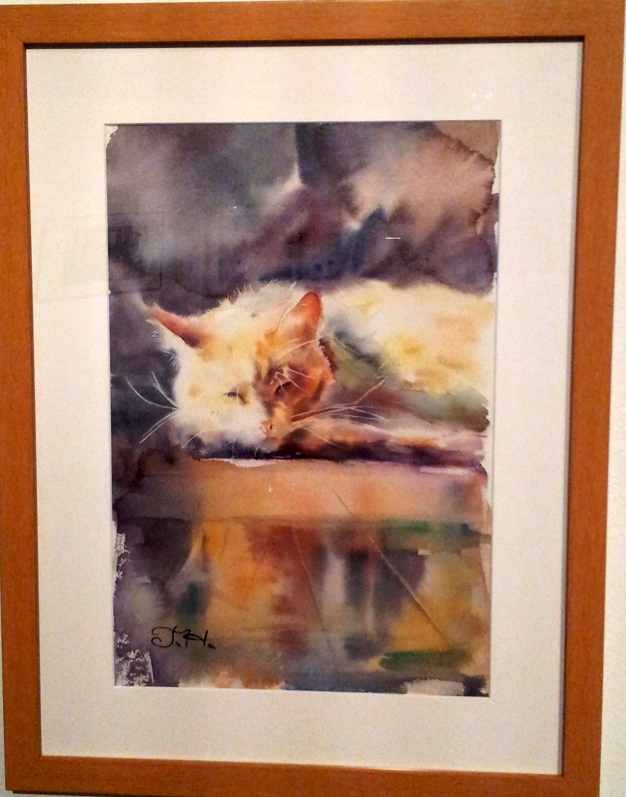
Our next assignment is to document our week in our sketchbook, from the cat asleep on the windowsill to the leftover half-eaten sandwich, so I'm hopeful of having more to share soon!

16 December 2014

Watercolor West 2014

I made it to the Watercolor West exhibit at the City of Brea Art Gallery in the nick of time--it went up October 11, and came down December 14, and I saw it on the very last day!

The exhibit included entries from all over the world, and was juried by Judy Morris AWS NWS (with whom I took a workshop this summer!). She commented that what she looked for was paintings that "make me say to myself, 'I wish I had painted that one!'" I certainly identified with THAT statement! What a lot of talent there was in this room of 100 artists!


There were awards from First Place ($2,000) to individual bequest awards ($150), as well as a lot of "merchandise awards" from various organizations. As usual, I agreed with some of the choices and found other paintings with no award among the most appealing in the show. I'll share a few of both here.

Please note that I am putting in attributions to the artists, and I hope that none of the readers of this blog will abuse these artists' trust by using their art in any way. Featuring them here is purely an additional homage, and for the benefit of those who don't live in California, because they're just too good to miss.

I also apologize for the quality and cropping of some of the photos, as well as some unfortunate reflections of the room behind me in their glass. That's the one downside to watercolor--you have to protect its surface!

Here is first place, by Robin St. Louis, and it's characterized by her interesting technique of putting an edging of light around each of her figures to halo them and make them pop from the background. I'm not sure it's my favorite, but it's definitely a beautiful work of saturated color, texture, and light.

"Marketing Majors "(26x38), Robin St. Louis

Here are two that I loved: One received an award, the other didn't, but the subject matter and the rendering of both is wonderful. 

"Still Waiting Too" (20x24), Cristine Weatherby
 
"Stephan" (18x12), Tatsiana Harbacheuskaya


This one should be on the cover of a Dick Francis novel! Love the motion, the immediacy, the simple background that lets the subject matter shine.

"Home Stretch" (12x15.75), Deborah Friedman


I was bowled over by the light and shadow, the dry brush technique, and the placement of the red accents in this painting:

"Commuters in Detroit" (18x25), Yuki Hall


These two, although by different artists, shared to an extraordinary degree the look and feel of a color woodcut by Gustave Baumann. I'd love to have a discussion with them about their technique--the flat colors and the palette were so distinctive.

"Nine Bicycles" (19x29), Kris Parins

"The Blacksmith" (22x15), Mark McDermott


And speaking of a gorgeous palette, the warmth of the sun, the background, and the fruits in this were stunning--you could almost warm your hands at this painting!

"Persimmons at Sunrise #2" (16x22), Linda Erfle


As I have said before, I'm not usually a fan of uber-realism, but I have to share two paintings here that were stunning in their  technical proficiency (and also pleasing to the eye!):

"Pitcher and Persimmons (30x22), Chris Krupinski

"Nutcracker Sweet" (22x30), Cindy Brabec-King

I couldn't pick a favorite from among the paintings in this show to save my life...but here are a couple of final paintings that embody what watercolor is all about--light. Direct light, reflected light, the contrast of light and shadow, but always, mostly, light!

"The Church of San Pietro" (22x30), Dan Burt

"Oporto Fishermen" (29.5x21.5), Stephen E. Walters

I hope you have enjoyed this little 12-painting retrospective. There were many more incredibly special pieces in this show, but these were the ones that caught my eye (and made it onto my phone camera). If you'd like to see the entire show, you can mail $20 to Jim Salchak, 18220 S. Hoffman Ave., Cerritos, CA 90703-2612 and obtain a copy of the catalog!


15 December 2014

Eileen McCullough Demo

I almost missed Watercolor West! I signed up for two demo sessions this year at the City of Brea art gallery, and didn't go to the first one because I wasn't feeling well; and then I forgot all about it. Luckily, I got a reminder email earlier this week that I was signed up for today's demo session, because today was the last day the show was up! So I bailed on the two Christmas parties to which I had been invited (sorry for being antisocial), and opted for a day out with art instead.

I didn't get to spend a lot of time in the gallery, because the demo was four hours, from 1-5, and the gallery was only open for five today, but I did manage two half-hour sessions in the gallery, partly on our break and partly afterwards, and snapped some photos. But first…the demo.

I went to see Eileen McCullough, a plein air watercolor artist who paints scenes of the coast from Long Beach to Laguna. I went because of this painting below that she entered in last year's Watercolor West--it reminded me so much of the painting style of the California School of watercolorists from the 1920s to '50s such as Rex Brandt, Emil Kosa, Millard Sheets, etc. (There is an excellent website that gives full biographies and examples of the work of the California School here.) It's so beautifully loose but with a definite plan of execution and a gorgeously rich color palette. I'm so glad I attended this--I learned a lot, and was amazed by her technique.


She started out as a commercial artist, designing a variety of things from a boys' t-shirt line to Christmas displays and banners for malls, all while working three days a week as a waitress to give her a baseline income. Just six years ago, with her husband's encouragement, she finally decided to make art full-time, and began selling her paintings.

She sketches and does preliminary paintings plein air, and then does the finished paintings from the spare bedroom of her house, painting the same image over and over again, from different angles, with different color schemes, until she gets a painting she likes. She works very fast--she says she paints daily from about 11 a.m. to about 5 p.m., and typically completes two full-sheet paintings each day. She is "not a sketchbook person," but makes vague sketches with markers, pencil, and monochrome paint to size/scale on location, then takes reference photos to help her complete the painting at home. She will make multiple sketches on tracing paper until she refines it to something she likes, taping it over the on-location sketch and using graphite paper to transfer it later; although she says she does less of this as she has become a more confident draw-er.

One of the paintings she brought with her...
Her approach to materials is refreshing after all the esoteric formulas, brands, and techniques I have seen from others. She uses #2 HB pencils that she buys a box at a time from Staples, rather than fancy pencils from the art store. She buys Scotch brand masking tape in 2-inch rolls in bulk from Home Depot. She uses Arches 140-lb. cold press paper, because although she has tried other kinds and weights, she prefers the familiarity. She uses Graham paints, all transparents, because she likes their consistency. She paints on both sides of her paper (a habit from when she was broke and couldn't afford much), so if you buy a painting from her, chances are you will receive two! She uses brushes she buys at Michael's, and buys them for how they feel in her hand and lay down paint, not for their content, composition, or water-loading capacity.

She sketches and practices her line work a lot before painting. She draws quickly, almost a gesture drawing, and breaks up her lines. She doesn't like frisket or resist--she prefers to cut masking tape with an exacto to the size and shape she needs.

The demo painting she completed while we watched...
The most radical departure from other watercolorists is that she almost exclusively uses a flat brush! She lays in large areas with a big flat flexible 1.5-inch sable brush, and uses smaller flat brushes as well, both on the flat and on the edge. I was amazed to see what effects she produced with the flat brush, and can't wait to try it. I used flat brushes when I painted in acrylic, but the general wisdom with watercolor is a round brush that holds a lot of water, so I never use flat ones now. But she uses intense color without a huge amount of water, and purposely works on a slant so that she knows when she is getting too wet with her paints, because they run down the page! She also works mostly standing up, at a high desk, with a stool behind her to lean against if she gets tired, saying she likes the freedom that standing gives her arm.

The demo painting she didn't complete…which shows some of her underlying scheme.
Her palette is pretty simple--she mixes two or three colors, and goes into her drawing almost randomly with color, painting areas and patterns rather than things, and jumping around the page as impulse takes her and as she spots something she wants to do. She seems fearless about grabbing paint and slapping it in with a turn of the wrist. (She also flicks color on with her brush or a toothbrush as she goes, rather than using that as a final effect.) She does paintings in two or three layers, but doesn't go from light to dark--she works it all simultaneously, going in with full color in mid tones to darks, while saving her whites for sparkle and light. After the first layer of laying in shapes, she may go back with her pencil after it dries, to further define or refine her drawing to give her guidance for the next layer.

She believes that all the drawing over and over gives you an advantage, because at a certain point you know the image and can stop looking at your reference photo or even at your preliminary sketch and just paint the painting. She believes this process is what has made her progress from copying a realistic scene to making a painting.

There was a lot more about specific colors she likes, mixing, layering of washes, and so on, but I won't detail all that here. Let me just say it was a great experience to watch her work, and opened my eyes to some new possibilities!

Here is the painting she entered in this year's show.

Tomorrow…my faves from the show!