18 November 2021

Challenges

The thing I enjoy most is finding a reference photo that challenges me—an odd perspective or angle, extremes in light and shadow, quirky expression, or whatever. I picked this one because of the hands, the mouth, and the task of making it look like somebody was home behind those sunglasses. I've been contemplating it for a couple of days, and finally decided to jump in.

I can't say I'm completely satisfied—the hands were difficult, the way they are bunched up, and look distorted to my eyes. They are especially interesting because on one hand she is sticking out her pinky finger like she's holding a cup of tea, while on the other she is sticking out her index finger instead, so they are opposite but it was hard to make them look that way. I think I got the pinky too large/long and the index finger too short/small, and it doesn't help that I started drawing about two inches farther to the left than I should have if I were going to include that entire right hand, so there's that. I'm still not the best at placement!

I feel I did better on both the eyes and the mouth; but what I'm really happy with on this is the use of the background colors to determine a lot of the foreground colors, without having them blend into one another too much. I introduced a few random colors that didn't appear in the background, such as a light olive green in some of her skintones and the pale raw sienna that I combined with other colors for some shadows; it got a little muddy, but mostly I think it worked. I'm also happy with the hair color—I love a redhead!

I introduced some outlining with a black Stabilo All to selected areas, not outlining everything but using it to emphasize certain things; and then I went back in with a damp brush and activated some of it so that it would make parts (like the sunglasses) pop.

Despite the placement error that put the hand partly out of frame, I do enjoy painting portraits in which the person seems to be looking in from another room, rather than being the central focus.


"Glamour Glasses"—pencil, acrylic paints, and Stabilo All on Fluid 140-lb. coldpress watercolor paper, 16x12 inches.

12 November 2021

The Mighty Quinn

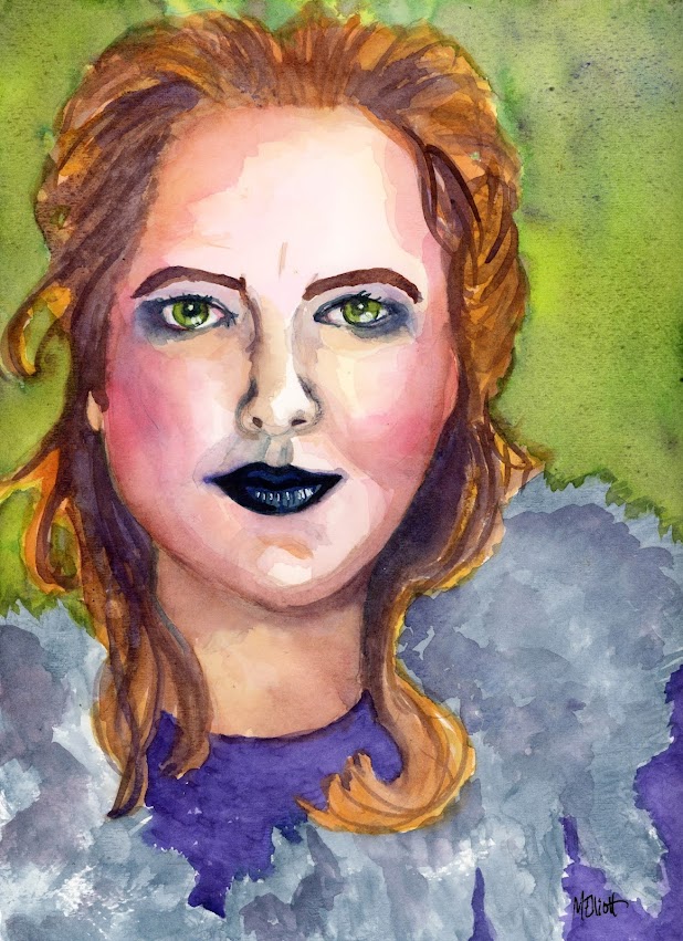
No, this isn't Quinn the Eskimo, although her fur wrap might lead you to think so. This is Quinn the Cleveland bookseller. I previously "immortalized" her by painting a sweet moment between her and her dog, Cha Cha, but over the course of time I have discovered that Quinn is a mighty advocate for the downtrodden, in addition to being a poet, a storyteller, a deep thinker about ethics and equity, and a lover of costumery, for both her and her "supervisor," who owns more tutus than any little canine could wear in one lifetime. And despite some health and immune system issues, she has ridden out the pandemic by using grant money to employ a crew of 15 remote workers, taking them off the jobless roles and teaching them to catalog books. In short, Quinn is a badass.

At some point someone sufficiently recognized that as to do a photo shoot of an intense and somewhat barbaric-looking Quinn dressed in furs and staring out from the depths of the forest; I decided today to try taking that image into watercolor with the looser method I have lately cultivated, and here is the result. My only regret is that she had a cool nature-themed "fascinator" on her head, but I drew her too large on the page to have room to fit it in. I have to remember to use bigger paper than I think I will need!


"Mighty Quinn"—pencil and Paul Jackson watercolors on 140-lb. Strathmore coldpress watercolor paper, 9x12 inches.

06 November 2021

Random

This is not the painting I was planning for today! I had a particular vision and, after prepping a piece of paper with a rough coat of white gesso, I opened up my reference folder on my desktop and started clicking through photos, looking for the perfect face to work with my plan, which entailed inclusion of a chrysanthemum and some collage.

Then I came across this model, who I painted a year or so ago, and I thought to myself, Hm, she would be cool in acrylic, especially because she has some intriguing shadows and colors in her face, and suddenly there was a whole new plan.

Here is the old painting, in watercolor (or maybe it was acrylic inks?). I painted her "straight," and then decided to futz around with Stabilo to make a "halo" around her, and with an Elegant Writer for the background. I may have thrown some salt in there, too?

So far all my acrylic paintings have followed the formula I learned from Emma Pettit, which is to create a colorful background first and then paint over it, so that I start with whites and move through to darks; but with this one, I started with a white background, which involved some reverse thinking. When I finally got done with the figure, I decided that I did need a color in the background, and chose the lavender to make both the shadows and the contrasting colors pop. I was intentional about the direction of the paint, which all radiates out from her head and allowed me to use my flat brush to give a soft edge to the peach fuzz hair she has on her head; I'm not sure whether I should give it another coat, since it's kinda sketchy looking. I'll think about it and come back later.

I did a better job last time of capturing the slightly exotic tilt of her eyes—they are a little too big and round this time—but otherwise I am happier with the likeness; the nose isn't too long as it was before, and the entire head and face are in better proportion. So I guess I have learned something about facial structure, at any rate!


Here is "Bald Girl #2"—white gesso underpainting, charcoal drawing, acrylic paints, and a little bit of Stabilo here and there. 9x12 on 140-lb. coldpress Strathmore paper.

05 November 2021

Fitting it in

Between doing annoying (but apparently necessary according to the Franchise Tax Board!) back taxes and coping with plumbing problems, I haven't been able to take the time to focus on making a painting these past few days. I split my time between searching for paperwork and plunging the kitchen sink, calling people for errant W4s, trying to understand the questions in TurboTax, boiling water to dump down the sink in the hopes it would loosen whatever was clogging things up...not conducive at all to creativity. But after yesterday's debacle with the initial plumber I contacted (he showed up three hours late and then didn't have a pipe wrench with him!), followed by seeking out a legitimate guy and getting him to come look at the problem and give me a quote, I also had to spend today waiting for him to arrive and then trying not to hover while he did the work.

I hesitated to start something at first, but then decided that I could at least lay down the base drawing and then maybe, once he arrived and started dismantling the pipes, I would have time to make the painting (also preventing me from hovering). This plan proved doable (although I did the second half of the painting after he left, he was so quick!).

I decided to go back to a "loose" watercolor style—the kind I refined through taking Fiona Di Pinto's mini lesson on Etchr—but this time with a reference photo chosen by me, and in richer tones and colors. Her pose turned out looking a bit awkward, since in the photo she is leaning forward with her forearms crossed on a table but in this format I only had room to show her shoulders and upper arms. I should have either drawn smaller or used larger paper! But I'm mostly happy with the bloominess around her features and the intensity of her gaze. Her hair was much darker than this, but I ran out of my dark sepia and had to mix ultramarine and burnt sienna to get this lighter shade of brown.


"Ella"—pencil and Paul Jackson watercolors on Strathmore 140-lb. coldpress watercolor paper, 9x12 inches.

30 October 2021

Wrapping up the prompts

Today's gardening prompt from they_draw.com was "zinnias," and I just happen to have a long border of zinnias up against one wall of my yard, beginning to fade a bit but still quite colorful and full.

That particular wall has been completely obscured by my neighbor's vine—it was planted to crawl up the wall on their side about 15 years ago, and has now grown up and over to carpet my side with dense leafiness, dark in the shadows and bright where the sun strikes it at the top. I'm thrilled—apart from the look of it, which I love, it's probably the only thing still holding up that section of wall, which was installed in 1948 and has become increasingly wobbly over the years as it has survived several large earthquakes. My dad had to shore up the portion of the wall on the other side of the yard with a couple of posts after the Northridge quake, but the vine on this side kept everything standing nicely.

I was going to just pick a handful of zinnias, stick them in an attractive vase, and paint a watercolor still life; but after my experience on Tuesday with the Van Gogh immersive experience, I had the impulse to try painting a landscape with acrylics, which I have yet to do since taking them up this year. So I taped off a piece of watercolor paper and gave it a shot.

I'm actually pretty happy with it—the hedge-covered wall has a nice solidity enlivened by its highlights, and the zinnias feel authentic. The tree in my neighbor's yard that peeks over the wall was initially too prominent as a mere background, so I washed over it with a blue-white glaze to back it down, and now it feels like about the right intensity. The brown at the bottom is the color of my lawn after a mostly rainless summer, but it provides a nice space to throw in a few shadows from the overhanging bits of zinnia border.


"Zinnia Border"—Vincent it's not, but I thank him for the inspiration to try, and it makes for a big finish for the month's prompts. Acrylics on Fluid 140-lb. coldpress watercolor paper, 16x12 inches.
28 October 2021

Tiny lesson doodles

A lot of groups are putting little mini live sessions online as part of their offerings lately, and I attended two in the past two days. I didn't do any major work as a result of them, but I did take good notes and will get back into them later.

The first was with Salli and Nate of they_draw.com, also responsible for illustratorsforhire. I joined their "Illustrators' Circle," which includes lots of draw-alongs and contests and other features. Yesterday we did a draw-along called "Abstraction Distraction—Inserting abstraction into your drawing practice." The idea is a five-step process that consists basically of thinking of an event, a place, or an experience, and making shapes that bring it back to you, in kind of a quilt-like assemblage, with an evocative color palette. Salli gave a few examples of some she had done, and I took a couple of screenshots:


The first is about a weekend in Miami, while the second is Salli's take on the winter solstice. You can see how the color palette in the first, and the curving and square lines, evoke the whole atmosphere of Miami, while the second has some specific references (moon, stars, trees, village) that, along with the colors, nicely reproduce the feel of the longest night.

This whole idea/process really appeals to me, and I plan to try some with color and shapes soon. All I had in front of me during the draw-along (without scrambling to drag stuff out) was my sketchbook and the Uniball I was using to take notes, so I did a doodle of my checkerboard herb garden, attempting to make basic shapes and lines that would convey plants without actually drawing stems and leaves. Here are my "Abstract Herbs."


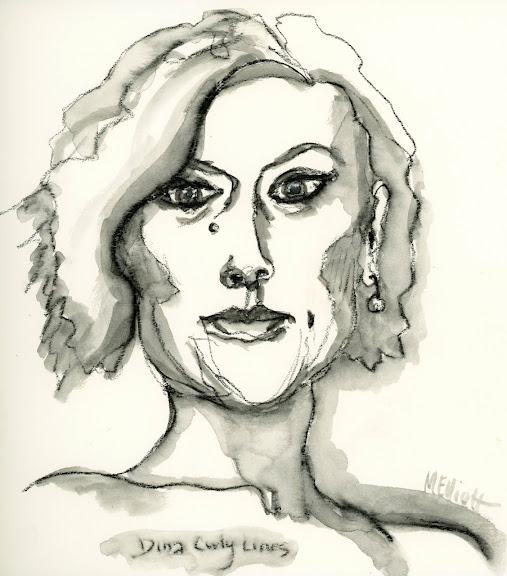
Today's lesson was to play with line to make "curly" faces, which is to say a mostly continuous contour drawing of a face where all your lines are moving and defining the contours without lifting your pencil much, and varying the weight of the line for emphasis.

The teacher, Dina Wakley, used a Stabilo All pencil and then, since those are water-soluble, went back in with a wet brush to use the medium for shading. She also did a bunch of messy finger-painting with white acrylic paint mixed in, which appealed less to me, but I did enjoy doing the portrait and then using the wetted pencil to make the contours, and will, again, practice this more. Here is my version of a "Curly Face."
 

No impressive art made, but some interesting techniques to play with—a nice use of a morning hour in the studio!


25 October 2021

Phillis

As part of the upcoming Let's Face It 2022, Kara Bullock Studios is providing a series of live, short how-to lessons from various artists. Today's was a portrait with Angela Kennedy. I liked the look of the methods she was using, but didn't want to use yet another old-fashioned Gibson Girl as the reference, so I decided to use the technique to make a portrait of Phillis Wheatley, enslaved person and one of the best-known poets in 19th-century America.

Phillis was seized from Senegal, West Africa, at about the age of seven and, due to her frail appearance, was spared from shipment to the Southern colonies. Instead, she was purchased by John and Susan Wheatley, a prominent Boston tailor and his wife, as a domestic. The Wheatleys soon discovered that Phillis was a precocious child, and they and their children taught her to read and write. In 1770, at about the age of 16, she wrote An Elegiac Poem, on the Death of that Celebrated Divine, and Eminent Servant of Jesus Christ, the Reverend and Learned George Whitefield, which was published in conjunction with Ebenezer Pemberton's funeral sermon for Whitefield in London in 1771, and the poem brought her international renown.

By the time she was 18, Wheatley had gathered a collection of 28 poems for which she, with the help of Mrs. Wheatley, ran advertisements for subscribers in Boston newspapers in February 1772. When the colonists were apparently unwilling to support literature by an African, she and the Wheatleys turned in frustration to London for a publisher and, in 1773, the first edition of Poems on Various Subjects, Religious and Moral, the first volume of poetry by an African American published in modern times, was released by book publisher Archibald Bell.

Sadly, though she continued to write poetry throughout her life, her subsequent history was not a happy one. She was manumitted shortly before the death of Mrs. Wheatley and married a free black, John Peters; but both the general economy and specific hardships visited upon free blacks, who were unable to compete with whites in a stringent job market, led to a life of increasing hardship. Although she continued to write her poems and to keep up a correspondence with some of the great figures she had met in her early career, she ended sick and destitute, unable to convince anyone to publish a second volume of her poetry. She died in 1784; her poems were published two years later.


This portrait was drawn and shaded with a hard charcoal pencil, and then painted over with a coat of Daler Rowney acrylic ink in burnt umber, which was then selectively blotted and thinned out with water. After that dried a bit, I went back in with the ink and did some subtle shading of the darkest areas; after the whole was dried, I added some more charcoal, both black and white, just to make certain areas pop a little more. I'm not great with either charcoal or pencil, being too impatient to ever learn proper shading techniques when I could instead just paint the thing! But it was fun to explore it again after many years. It would have been better with a slightly softer charcoal pencil.

"Phillis"—charcoal, acrylic ink on 140-lb. Fluid coldpress watercolor paper, 9x12 inches.