I don't know if Mr. Johnson or his friends and family would recognize him from this--hard to get facial details when working at a small size--but I had fun painting it. And horses are hard! They have so many bumps and concavities, they make human portraiture look easy by comparison. I'd like to try a few more.
05 March 2012
Dark Horse
I don't know if Mr. Johnson or his friends and family would recognize him from this--hard to get facial details when working at a small size--but I had fun painting it. And horses are hard! They have so many bumps and concavities, they make human portraiture look easy by comparison. I'd like to try a few more.
07 January 2012
#113--Draw or paint a fence
I am lucky enough to live close to a park with a (manmade) lake, with a path that goes all the way around, and I go there on the weekends to walk. I'm also lucky (or smart?) enough to live in California, where I can do this pretty much all year round--it was in the 60s today, the 70s yesterday. Here is someone else enjoying the lovely weather while looking out over the lake.
I really liked the hard light and shadow on the fence. The water was less successful--too streaky. The trees look more watery than the water! I had to scan this in two pieces and match it up, so there's a bit of a line.
Quick sketching
I have resolved to bring art into every day this year, so when I went to the salon to get my hair color "refreshed" today, I took along a sketchbook and made a quick, three-minute sketch (with a very soft pencil I had in my purse) of one of the hairdressers taking a break and texting someone while talking to the receptionist. I tried to grab a couple more sketches while I was there, but unluckily chose hairdressers each time who were just finishing up with their clients, so I only caught the head of one and the legs and back of the other before they moved to another location, so this was the only semi-complete sketch. Drawing is not my favorite thing--I'm too impatient to get to the painting--but after seeing some of the miraculous colored pencil creations of artists on Every Day Matters, I've decided I need to go back to basics and do some drawing too. EDM Challenge #129--draw people doing something.
01 January 2012
Talisman
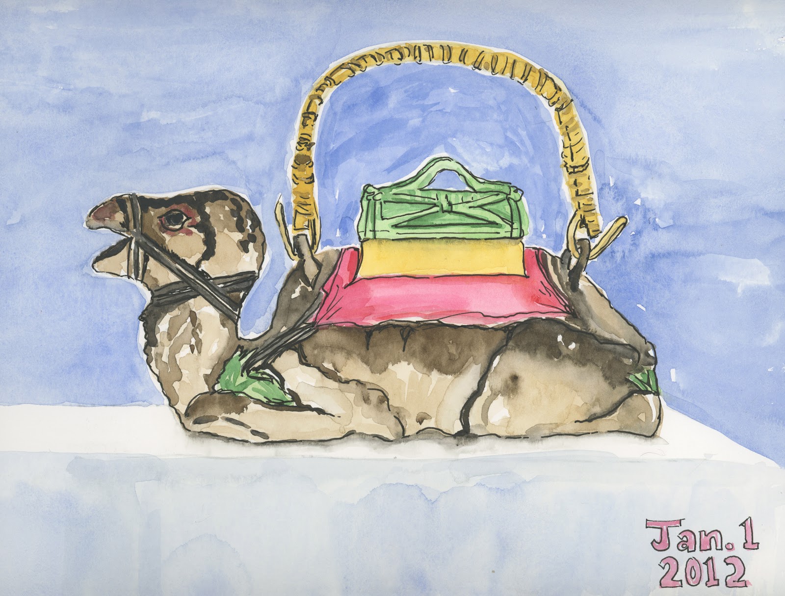
My mom, Bernice Spencer Wilmeth, died on April 15, 2010, and my dad, Joe Crawford Wilmeth, followed her on April 10 of 2011. I am an only child, but I have a cousin who has been close family all my life. For the past seven months, my cousin Carol Sue and I worked every other weekend to clean out their house. It was quite a task, because my mom loved clothes, antiques, china and glassware (not to mention her hobbies of sewing, painting, quilting, flower arranging, bargello...), while my dad had been in the Air Force for 25 years, and then a builder for 35 years, and neither of them ever got rid of anything.
Carol Sue said to me at one point that she could probably have gotten through everything in the house in two or three weeks on her own, but that she was afraid she would get rid of something that she didn't see the value of but that I might want. This picture is proof of that.
This is a very kitschy camel teapot, ceramic with a bamboo handle, that sat on top of my parents' refrigerator; CS would have relegated it to the garage sale pile, and was astounded when I said "I want that!" and packed it to go home with me. I didn't really understand myself why I wanted it; it's not big enough to make a satisfactory pot of tea, and it doesn't "go" with anything in my house. But when I got home and unpacked the box of kitchen things, I took it out, washed it, and placed it on top of my own refrigerator, and it was as if something loosened inside my chest. I realized that the camel sitting there somehow signaled to me that this was home, and even though I have lived in and loved my house for 30 years, the camel tied it to all the homes I had shared with my family, because it sat in that spot in every one. So, I decided to paint it today, to note that I am starting the new year without my parents, but that symbols and memories connect us forever.
Here is a photo of the camel in its spot; the B&W xerox is of my parents and me when I was in grade school, posing for the church directory.
One observation of a technical nature: Has anyone besides me noticed how difficult it is to make a good painting of someone else's art? It's easy to draw something functional--a mug, a coffee pot--or something natural--a tree, a flower--and make it into art, but drawing something that was someone else's creation--like this camel, which is a shape sculpted by someone and then painted with his or her own particular concept in mind--feels unnatural or derivative, and somehow never turns out feeling like your own art.
24 December 2011
Merry Christmas, Karen--the process
This is the one I ended up painting for my cousin Karen for Christmas. She has recently started a vegetable garden installation business, so I did something evocative of that.
I've never done this before when I was working on a painting, but since this one had so much detail in it and I had to stop in between layers to let them dry, I decided to document my watercolor process. It made me feel a little disjointed, since I usually work without thinking about why I'm doing what I'm doing and in what order, but it was good to see the steps and realize why I sometimes mess things up by not thinking through what I need to do before putting brush to paper.
I didn't think of documenting until I'd already laid down the first layer, so the raw drawing isn't featured, but here's the rest. I took a photo every time I had to stop for things to dry. This is the undercoat. The tiles are gold, and the wood is dark brown, so I washed everything with the pale gold except for the Italian parsley, which I gave a light coat of green, and the seed packets, which all had white backgrounds. I could have washed the pot gold too, since it was darker, but I was afraid of mixing up my drawing lines.
I put in some darks, here, and the things that were more of a flat color (as opposed to something shaded and nuanced). I apologize for the quality of this photo and the next one--for some reason my cell phone camera shot these two small and the others much larger. Oh, well--too late now!
Continuing on with the seed packets, getting the details added...
Pretty much finished with the packets here, starting to paint the pot and the trowel. The trowel was difficult, because it was a really old one, so rather than looking like new painted wood and metallic blade, it all looked one color--dirty bare wood and dirty/rusty blade. I tried to keep a few highlights where the original metal shone through, but wasn't too successful at that.
I added the background wash for the two strips of wood here--the one along the back and the one on the same level as the tile. I'm not sure that one reads as upright and the other as flat--maybe it will be better when the painting is done. This piece of furniture is a wonderful old British washstand that I inherited from my mom. It's been in my dining room for just a couple of months now, and I decided it would be fun to include it in a painting.
Here's where I went for all the detail in the tile, and I kept working it for quite awhile. It's shiny, there is some shadow, and there is an illusion that the flat tile has white grout while the vertical tile has dark grout, so it's pretty challenging. I also had to do those decorative tiles in the background--I tried not to go too crazy, just giving the sense of them instead of perfect detail, because they are, after all, BACKGROUND. Looking at paintings as photographs is quite humbling sometimes--it looks good on paper to me, when my eye goes from one detail to another, but the photo gives an overview and I can see that the way I have painted the tiles makes them look uneven, like the surface is rippling a bit!
And here below is the finished piece (scanned, not photographed with my cell phone, so pretty accurate). I put in the wood grain, and went for the darks. I left the parsley until last and put in lots of mediums and darks, and then did shadows under everything.
I'm off to the framer's Saturday morning to get it framed (ideally) or at least matted nicely, so I can wrap it up for my cousin Karen to open on Christmas. Nothing like waiting until the last possible minute! But...that's the way it goes when A. you work full time, and B. you're indecisive!
Thanks for looking...
Christmas Practice
I posted this before, and then had to take it down. I forgot I had blogged here about painting a picture for Karen for Christmas, and when I posted the pictures of the new Teen Scene, I sent the url to Karen so she could see the photos, and then her sister Heidi reminded me that Karen's secret Santa Pal (and her gift) would be revealed if she looked at the blog, so I deleted this post in a hurry.
Anyway, this was my initial idea of a garden painting for Karen, but then her other sister, Kirsten, said it should have to do with vegetables, so I did the painting in my next post (parsley, seed packets and a trowel) instead. But this one was good practice!
22 December 2011
Teen Scene is here!
Our new teen area at the Burbank Central Library is open! Not officially--we'll be having an open house to show it off the second week of January--but it's all ready for teens to use. A few of them have already, although since school is out for the holidays, it's kind of a ghost town around here. Here are pictures:
![]() |
| The view from outside the section, with the new sign above. That's my office, at the far end. |
![]() |
| This sign welcomes the teens and lets others know restrictions of use for the area. |
Subscribe to:
Posts (Atom)