Every Day in July's challenge today was "stones." My mind immediately went to stepping stones, so I went looking for a photo that was as close as I could get to what I was picturing in my head; I have trouble drawing just from imagination, and need something concrete to step off from, pun intended.
I documented this one in three stages: drawing, partial painting, finished painting. Here is the drawing:
And here is the partial painting:
One of the reasons for the pause between steps two and three (pun not intended) was that I was working on this on my lovely shaded back patio, and the gardener arrived with his noisy tools and created a wind full of grass clippings. Not good for watercolor!
The other reason is that I am terrified of painting water, so I thought if I could document this before I inevitably messed up the water, at least I'd have part of a satisfying piece of art!
I did not, however, mess up the water. I am actually really happy with this water! I feel like I found the perfect balance between hard strokes that show ripples with soft blending that shows calm water and depths. I like the shadows around the stones, and I like the reflections. I left enough blue to echo the sky. The yellow reflection is of something that is outside my picture (in the original, larger photo, there was a big yellow tree), so I suppose it's a little anomalous, but I like that too. Altogether, a happy experiment!
13 July 2015
12 July 2015
One simple, one fussy
Teen summer reading club is taking it out of me. It's great fun, but oh so tiring. So I haven't been painting much. But I did manage a quick one on Friday morning before I had to go to work, to fulfill Every Day in July's prompt for "horsing around." I had saved a photo of a girl and her horse sharing a quiet moment, so I grabbed a sepia-colored Tombow marker off the desk and did a sketch. Since Tombows are not waterproof, I was then able to take a small wet brush and just pull out some color for both tint and shadow. Not the best drawing, but…practice.
Sunday's prompt was "fall." People interpreted it in various ways--everything from sky-diving out of a plane to autumn foliage, and even the "fall" of Adam and Eve. (!) I wasn't sure what to choose, but I haven't drawn any book illustrations lately, so I searched Goodreads for books with the word "fall" in the title and was reminded of this new one from Ally Carter, the first of a new series set on "Embassy Row" in London. I liked her book Heist Society a lot (and of course the Gallagher Girls series), so I figure I'll read this one in the near future. So in the interest of multi-tasking, here's an illustration of that book with a background of buildings from Embassy Row. Once I read the book, I can review it for the teen blog, and use this as the illustration to go with the review! "Fall." Done.
It became a little more elaborate than I planned--I was just going to do a silhouette of the buildings, sort of a vague washy thing, but I started drawing those little cornices and it got busy.
9x9, LePen and watercolor.
Sunday's prompt was "fall." People interpreted it in various ways--everything from sky-diving out of a plane to autumn foliage, and even the "fall" of Adam and Eve. (!) I wasn't sure what to choose, but I haven't drawn any book illustrations lately, so I searched Goodreads for books with the word "fall" in the title and was reminded of this new one from Ally Carter, the first of a new series set on "Embassy Row" in London. I liked her book Heist Society a lot (and of course the Gallagher Girls series), so I figure I'll read this one in the near future. So in the interest of multi-tasking, here's an illustration of that book with a background of buildings from Embassy Row. Once I read the book, I can review it for the teen blog, and use this as the illustration to go with the review! "Fall." Done.
It became a little more elaborate than I planned--I was just going to do a silhouette of the buildings, sort of a vague washy thing, but I started drawing those little cornices and it got busy.
9x9, LePen and watercolor.
05 July 2015
July continues
I managed two prompts from the "Every Day in July" list this weekend:
"SUMMERTIME," which initially presented too many choices, but resolved itself after I got back from the produce stand and realized that all I had bought was stone fruit!
I wanted this one to be quick and "juicy," but it crossed the line into messy because I didn't have any patience to wait before moving to the next area/color. Can't do that, especially on sketchbook paper. Watercolor paper is a little more forgiving because the paint doesn't sit on the surface of the sheet.
"YUCK! (something that icks you out)" was the next day's prompt. I am squeamish about very few things--bugs don't "bug" me much, snakes are fine as long as we keep our distance from one another, and although the sight, sound, and smell of someone losing their lunch is probably the ultimate gross-out for me, who wants to paint that?! (or look at it)
But finally, in the observation of my little world, I realized the one thing to which I have a positive aversion: CLEANING. (Isn't English strange? that a negative association is a positive aversion?)
My mother and my ex-husband were both clean freaks, which may be part of the reason why I dislike doing dishes, I don't like to dust or vacuum or sweep, and I absolutely loathe cleaning the bathroom. (There are so many better things to occupy my time: painting, for instance! Reading. Sleeping.) So I did this nice picture of cleaning tools and materials, which mostly remain pristine in the cupboard. (I need a cleaning lady. Any offers?)
Those of you who think I'm crazy, the ones who feel an effervescent joy overtake you when you smell furniture polish, or who can't think of anything better than the pleasure of giving something a good scrubbing, can feel free to use your Photoshop tool to erase the word "Yuck!" and revel in this sketch for a different reason!
"SUMMERTIME," which initially presented too many choices, but resolved itself after I got back from the produce stand and realized that all I had bought was stone fruit!
I wanted this one to be quick and "juicy," but it crossed the line into messy because I didn't have any patience to wait before moving to the next area/color. Can't do that, especially on sketchbook paper. Watercolor paper is a little more forgiving because the paint doesn't sit on the surface of the sheet.
"YUCK! (something that icks you out)" was the next day's prompt. I am squeamish about very few things--bugs don't "bug" me much, snakes are fine as long as we keep our distance from one another, and although the sight, sound, and smell of someone losing their lunch is probably the ultimate gross-out for me, who wants to paint that?! (or look at it)
But finally, in the observation of my little world, I realized the one thing to which I have a positive aversion: CLEANING. (Isn't English strange? that a negative association is a positive aversion?)
My mother and my ex-husband were both clean freaks, which may be part of the reason why I dislike doing dishes, I don't like to dust or vacuum or sweep, and I absolutely loathe cleaning the bathroom. (There are so many better things to occupy my time: painting, for instance! Reading. Sleeping.) So I did this nice picture of cleaning tools and materials, which mostly remain pristine in the cupboard. (I need a cleaning lady. Any offers?)
Those of you who think I'm crazy, the ones who feel an effervescent joy overtake you when you smell furniture polish, or who can't think of anything better than the pleasure of giving something a good scrubbing, can feel free to use your Photoshop tool to erase the word "Yuck!" and revel in this sketch for a different reason!
03 July 2015
Every day in July
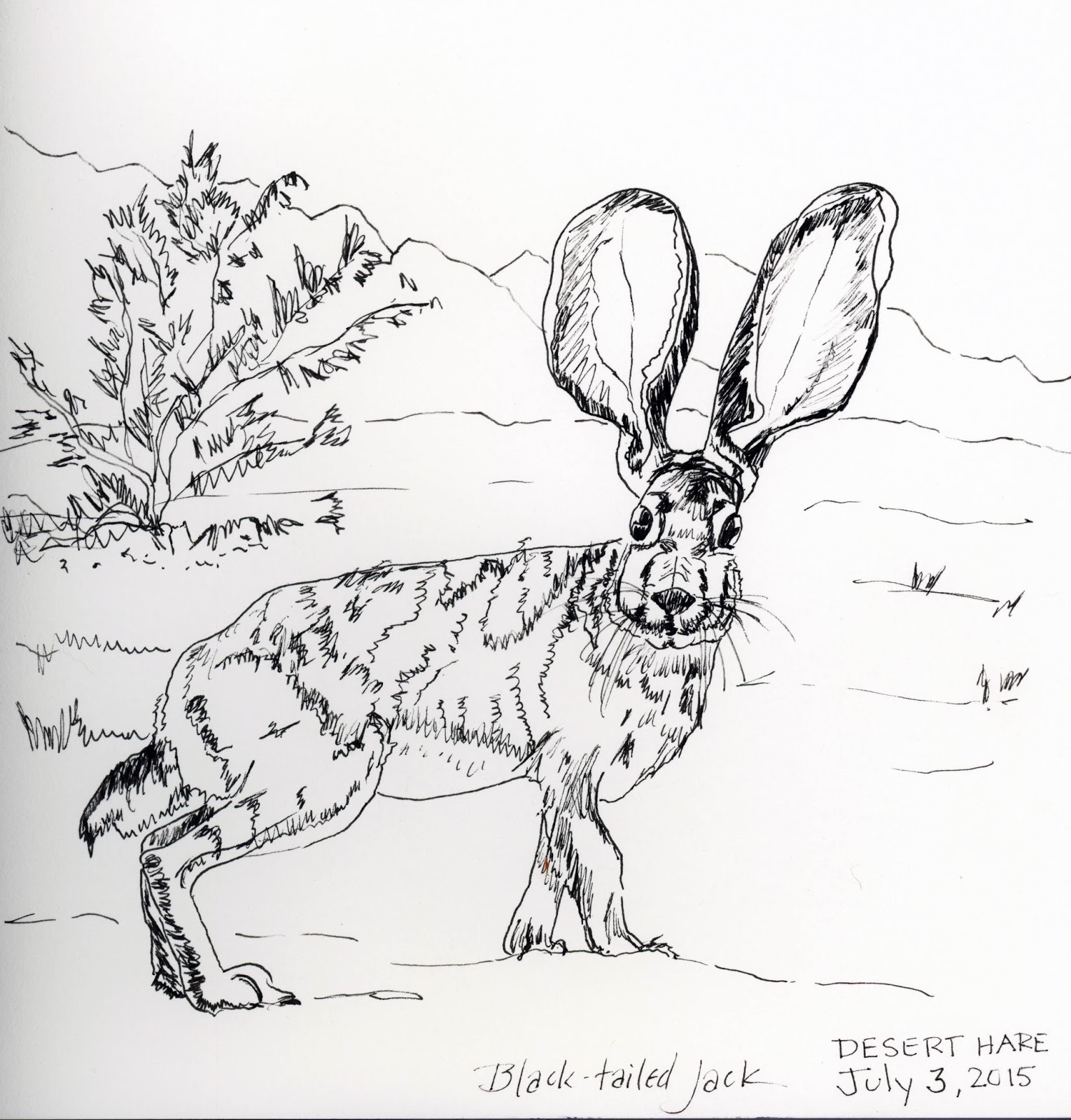
It's Day 3 already, and I missed doing days one and two. The prompt today was "desert life," so I decided to do a drawing of a desert hare, otherwise known as a black-tailed jackrabbit.
I usually draw a minimalist, contour drawing with pen and then supply the details with paint, but this time I decided to concentrate on making the drawing more complete. I was going to post that; but then I just couldn't resist painting those gigantic, translucent, apricot-colored ears because they're so spectacular. So here is my drawing...
…and my painting:
For this subject (something with fur), I probably should have done my drawing in pale pencil so that there would be no hard edges when I went to paint fur, but…hindsight. I am in awe of people who have both the skill and the patience to draw wildlife and reproduce with pen or pencil each individual hair. That's not me! But I still admire them greatly.
01 July 2015
Reading is my religion
The last prompt for Every Day in June, for June 30th, was "religious icons, imagery." That one stumped me for a while, because those of you who know me will know that I am not religious, and that even if I were, iconography is a foreign concept, since I was raised in a Fundamentalist Christian church to believe that making images of religious figures was blasphemy! But I'm never one to shy away from blasphemy these days, so I started thinking about the concept: If I had a religion, what would it be? The conclusion I drew was that READING is my religion. So if reading is my religion, who are the religious figures who represent that faith to me? Authors!
But which one to pick? In the end, I went with a YA author with lots of iconography. One of the reasons I chose to portray "Saint Mags," or Maggie Stiefvater as she is known to everyone else, is that she is a person who lives large, and who is easily represented by the things in her life. I didn't include a few of them in the picture, for sheer lack of room and time, but in addition to being a fine writer of young adult fiction, she is also an artist (she just drew and is issuing a line of tarot cards based on her Raven Boys series), a musician (she plays multiple instruments and writes music), a wife and a parent to two children (Thing One and Thing Two, as she refers to them on Facebook), a one-time race car driver, and a keeper of many furry friends.
It also didn't hurt that her most recent YA book is called Sinner--I loved the juxtaposition of that book cover with the portrayal of her as Saint Mags.
So here is my post for June 30th--I didn't manage to do more than half the prompts this month, but I feel like at least I'm going out with a bang!
The raven is for Raven Boys; the 1973 Camaro is one of her beloved collection of muscle cars; the landscape reflects Virginia, where she lives; she cohabits with a herd of miniature silky fainting goats; this is her typical mode of dress (except for the halo); and Sinner is her latest novel. And this is a proper painting size, at 12x16. It took me about two hours to draw, and about six hours to paint (with breaks for drying…and reading, of course).
I'm not entirely happy with the coloration on the face and hands…but she IS an exceedingly pale person! I'm not sure her friends would recognize her from this portrait, but I hope so. That's what the iconography was for in all the old paintings--if you saw arrows in the chest, you knew it was St. Sebastian, even it it wasn't a good likeness. Personally, I prefer miniature fainting goats.
All hail READING.
But which one to pick? In the end, I went with a YA author with lots of iconography. One of the reasons I chose to portray "Saint Mags," or Maggie Stiefvater as she is known to everyone else, is that she is a person who lives large, and who is easily represented by the things in her life. I didn't include a few of them in the picture, for sheer lack of room and time, but in addition to being a fine writer of young adult fiction, she is also an artist (she just drew and is issuing a line of tarot cards based on her Raven Boys series), a musician (she plays multiple instruments and writes music), a wife and a parent to two children (Thing One and Thing Two, as she refers to them on Facebook), a one-time race car driver, and a keeper of many furry friends.
It also didn't hurt that her most recent YA book is called Sinner--I loved the juxtaposition of that book cover with the portrayal of her as Saint Mags.
So here is my post for June 30th--I didn't manage to do more than half the prompts this month, but I feel like at least I'm going out with a bang!
The raven is for Raven Boys; the 1973 Camaro is one of her beloved collection of muscle cars; the landscape reflects Virginia, where she lives; she cohabits with a herd of miniature silky fainting goats; this is her typical mode of dress (except for the halo); and Sinner is her latest novel. And this is a proper painting size, at 12x16. It took me about two hours to draw, and about six hours to paint (with breaks for drying…and reading, of course).
I'm not entirely happy with the coloration on the face and hands…but she IS an exceedingly pale person! I'm not sure her friends would recognize her from this portrait, but I hope so. That's what the iconography was for in all the old paintings--if you saw arrows in the chest, you knew it was St. Sebastian, even it it wasn't a good likeness. Personally, I prefer miniature fainting goats.
All hail READING.
27 June 2015
Recent miscellany
Anarda and I and the teens went on our Sketchcrawl around Burbank on Tuesday morning, so here are a few of my drawings…not the best I've ever done, and not quite finished in some instances, but considering I was simultaneously in charge of 22 teenagers and THEIR sketching experience…
I started doing a color demo for the teens with my teeny tiny Altoids tin palette of colors, but we got moved on by some electrical workers who needed to open up a panel in the sidewalk right under where we were sitting, so I had to finish this one later.
Didn't quite get the scale of this right--wanted to fit the entire marquee into my page. Oh well…
I had lunch yesterday afternoon at LEMONADE in Studio City, and came away with a drawing of…Granville. Well, I was on the patio at Lemonade and Granville was directly across the street. Doesn't seem fair that there's no drawing of the place I actually lunched. I guess I'll have to lunch at Granville next time and draw Lemonade!
The tower is kind of tipsy, because I was so focused on the lettering that I drew the tower in segments around it afterwards, but since I was a bit tipsy myself the last time I was at Granville, it seems only fitting.
This was a hard one--Anarda commented later that it probably wasn't the best place to start our sketch crawl, but it was first on the route.
I started doing a color demo for the teens with my teeny tiny Altoids tin palette of colors, but we got moved on by some electrical workers who needed to open up a panel in the sidewalk right under where we were sitting, so I had to finish this one later.
Didn't quite get the scale of this right--wanted to fit the entire marquee into my page. Oh well…
This one wasn't a great likeness, but I was so intrigued by the morning light reproducing the giant shadow of the palm tree on the white wall that I did a (rare for me) pencil sketch. I'd like to paint this sometime and do it justice. I took a reference photo just in case.
Later that same week...
The tower is kind of tipsy, because I was so focused on the lettering that I drew the tower in segments around it afterwards, but since I was a bit tipsy myself the last time I was at Granville, it seems only fitting.
The color palette on the restaurant was kind of boring to paint--all browns, grays, and blacks. Lemonade will be more fun!
And now…back to Every Day in June, before it becomes July! I'll post something later…
If you would like to see some of the kids' drawings from the sketchcrawl, you can go to the library's Facebook page for teens: Burbank Public Library Teen Page.
21 June 2015
EDiJ: "Wash"
For EDiJ "Wash," I found a photograph of some laundry hung out on one of those circular washing lines. I've always wanted to have one of those. I don't know why they are so much more alluring than the two poles with lines strung between them that I have in my own back yard--maybe it's because they spin, and the clothes seem like they can enjoy a carousel ride while drying.
Anyway, I was going to do the usual for the Every Day in June challenge, which was to draw the scene as accurately as possible with my pen, and then watercolor it. But I have lately found myself becoming bored by that routine. I'm not a big fan of drawing, first of all--I'm all about the painting--so I get impatient sometimes and short-change the drawing in order to jump into the COLOR. So this time I decided I'd go backwards and do the exact opposite. Some Facebook artist friends work that way, and I have thought of trying it myself.
I went to the art store yesterday to pick up some supplies for an event at work, and indulged myself with some Micron pens in colors--blue, red, sepia. So I decided to paint this "freehand" first, in basic blocks of color, and then go back in with the pens to define the details and have a little fun.
Painting without drawing first made me have to pay more attention to the negative space, particularly the whites. Since the clotheslines are white, I had to paint around them with the green background or the colors of the clothes. I wasn't too successful in some instances, but I figured the pen would save all, afterwards.
So here is the rough painting…
And here it is after the addition of the pen detailing.
Conclusion? I don't think I have the knack of this yet--some parts are overworked while others aren't detailed enough--but it could be something fun to play with until I do!
Subscribe to:
Posts (Atom)