30 August 2021

My first portrait commission

I met my friend Cathleen on Zoom for lunch last week, and was showing her some of my recent portraits. Cathleen is a pretty low-key person (she was head of the children's department at the library for many years, which means cultivating zen-like calm in the face of daily chaos), so I was quite surprised when she sent me a picture the next day and said "Can I commission you to paint a portrait of me from this photo? My mom always loved this." I said, Sure! and proceeded to overwhelm her with samples of all my different styles, from "straight" to "wonky," and watercolor, inks, acrylics? She simply said, I will leave the style up to you, but don't paint that busy blouse I'm wearing! I was grateful for that (it was busy, a paisley in multiple colors!), but I loved the pastels featured in the blouse, so I decided, since they suited her coloring as well, to use the blouse colors as the basis for the entire portrait.

She was also posed in front of bookshelves, so I asked if she wanted those in the background, but she said no, do something more generic. But, since she is a librarian, I couldn't get the books out of my head, so I did a little trick that I hoped would suggest the faint outlines of bookshelf-like structure: I taped down some narrow sections with 3/4-inch white artist's tape, rolled on the background with a brayer in four of the colors featured in the blouse I wasn't planning to paint, then took off the tape and rolled over those white areas again, so they showed, but faintly. Deciding to do this sent me in the direction of painting this portrait in acrylic, since I'd have to do something different with a completely transparent background in watercolor.

At this point I departed from the Emma-inspired process used for the underpainting, because I didn't want charcoal showing through on this, so I drew the image in pencil, then roughed in the lightest lights and graduated around the face to the darkest darks. I initially got her eyes a little too big and her nose way too narrow and had to repaint both; I made her hair too wide, and had to cover some up; and her chin was too pointy and had to round out a bit. But once I got those details squared away, I was able, I think, to get a pretty good likeness, and I outlined selectively, afterwards, with a brown Stabilo All pencil.

I picked up the pale blue of her eyes with a plain turquoise shirt, leaving some of the background to show through to give it a nice fadeout quality towards the bottom, and used the lavender from the background, mixed with a little raw sienna, for the shadows. Her peachy complexion is Titan Mars Pale (Golden paints) combined with a little Naples Yellow, some Amsterdam raw sienna, orange, and carmine...I mixed and overpainted a LOT.

The eyeglasses were the final project, with much attention given to where the highlights were landing on the glass.


"Cathleen"—acrylics, pencil, Stabilo All, on Fluid 140-lb. coldpress watercolor paper, 12x16 inches. Sold!

This portrait, beginning to end, probably took me about seven hours! I think that's the longest I've ever worked on one, which directly reflects my nerves over getting it right. I sent Cathleen a photo, and her response was, "I love it! Pack it up, it's done." So I guess I did good!


26 August 2021

Addendum to #34

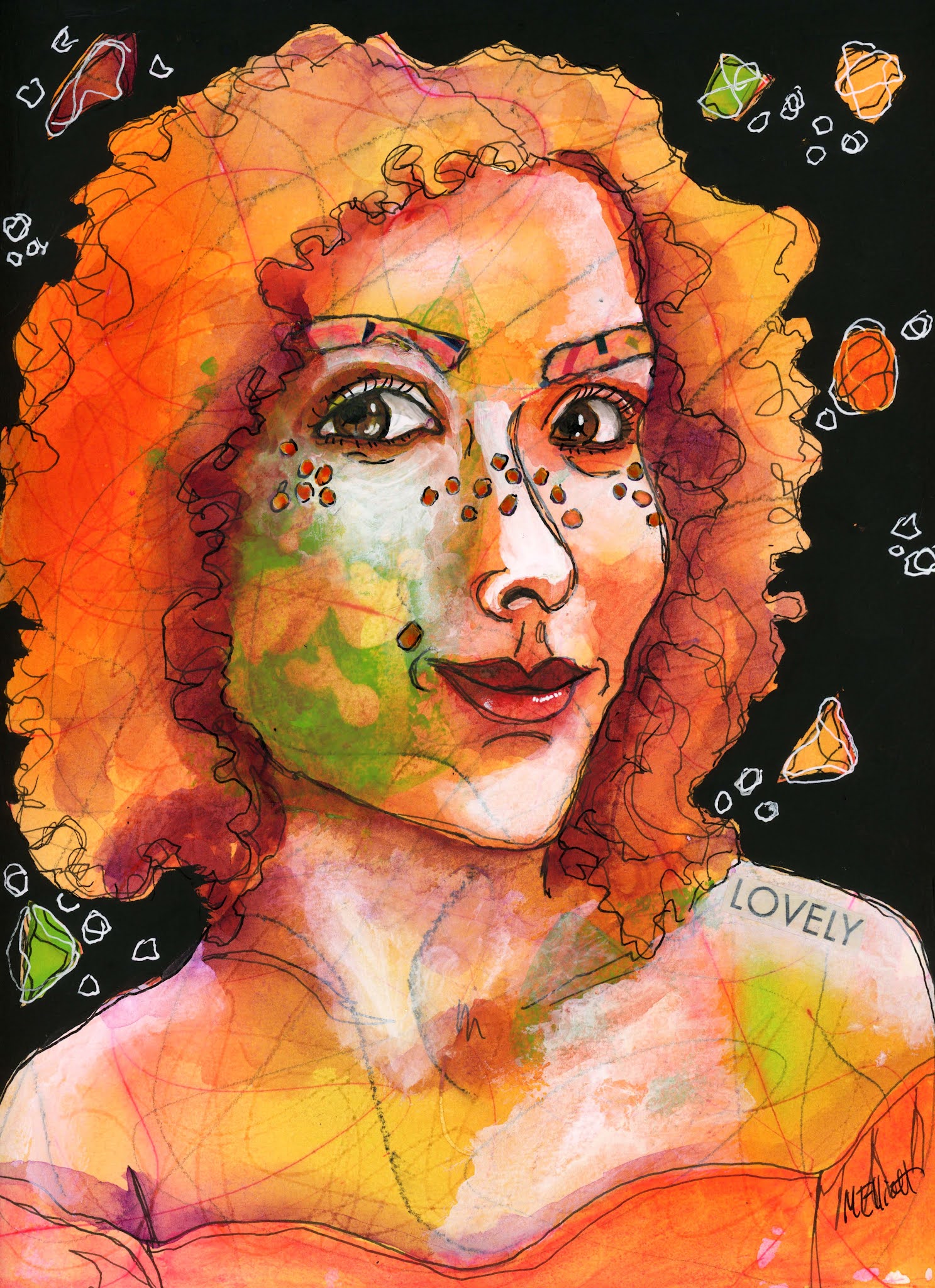
My doe-eyed guy gazed out at me all day, looking more and more pathetic, until I decided tonight about 10:00 that what he needed was a lovely lady to keep him company and shore up his sensitive personality.

I repeated some of Deb's lesson, but did some of my preliminary mark-making with a soluble red pen so that the paper would have a faint pink tint here and there. I laid down acrylic inks in orange, pink, and lime green, and also used green acrylic to make the cheek smudge. She is a pale redheaded beauty, so I whitened her cheeks, forehead, nose, and shoulders with white gesso. I gave her some tissue paper eyebrows to go with his, and some purple freckles, although they were meant to be lighter and more transparent, so I added some white scribbles to brighten them a bit. She has some odd background shapes to go with his, so that they look like they are occupying the same "universe." I had big fun!

She's prettier and less wonky than he is, but that's okay—it will buck him up to have a gorgeous girl on his arm.


"Rooney"—pencil, charcoal, red pen, acrylic inks, Uniball pen, collage, white and black gesso, white gel pen, on Fluid 140-lb. coldpress watercolor paper, 9x12 inches.


23 August 2021

LFI #34

 This week was an unexpected treat—Deb Weiers was our teacher, so I got to go back in time to the beginning of my portrait journey, when I signed up for Wonky Friends and Critters in August of 2019, the class that led me to branch out both abstractly and color-wise and start to find my own style(s).

Rather than do my own thing, I went cheerfully back to basics, making pencil and charcoal marks on the page, running an eraser through them, throwing on some water and Daler Rowney inks to make a background, then running the other end of a paintbrush through the wet paint to make more pattern.

Then we added some acrylic paint, took some off again with random water drops, swooshed it around with a credit card, and started the image making.

Deb loves collage, and saves old drawings, from which she makes prints and cuts out features to add in, so she started out gluing on a collage eye. I don't have a printer and didn't want to cut up an original (mostly because everything is painted on heavy watercolor paper and would stick up too much from the surface), so that's where we first diverged.


Then she showed us her so-called reference photo (I say "so-called" because her stuff never actually looks like the person, it's just taking-off point), and that sent me off on a different trajectory. I loved the slightly surprised, doe-eyed look of this guy (I think she got him from a photo gallery of convicts!) and decided that my piece would be a somewhat faithful portrait. I did collage his eyebrows with some fun striped tissue paper, and also collaged some commentary on his nose. I also skipped his tiny, thin-lipped mouth for Deb's scrubbed-on one (you drop some red acrylic and then swipe across it with a credit card to see what you get), but over all, I think I still caught a likeness. Do you think his mother would recognize him?

Deb always shades with India ink, but I never have gotten the hang of how to do it fast enough not to leave hard lines, so I subbed in some Daler Rowney Payne's Grey instead—I think it gives him a softer look.

Here he is:


"Sensitive"—Pencil, charcoal, Daler Rowney acrylic inks, white and black gesso, Uniball pen, white gel pen, on Fluid 140-lb. coldpress paper, 9x12 inches.

What fun it was to return to this expressive style—thanks for the lesson, Deb!

By the way, here's Deb's result—she IS the mistress of fun and funky ornamentation!


© 2021 DEB WEIERS


17 August 2021

LFI #33

Our lesson this week was from the sweet and soulful artist Meg Yates, who always invests her breath, imagination, and sometimes a quality of spirituality or nature (or both) in her art. She took separate elements of a girl with a candle, a full moon, and an owl, and put them together in one composition, painting them wet on wet in thinned-out acrylic paints.

I liked the idea, but I didn't care much for the reference photos. The way the owl loomed over the girl's shoulder felt ominous to me, and I wasn't wild about the candle element either. So I went online looking for pictures of girls/women in which they have some relationship to a bird—my preferences were to either stick with the owl, or find one with a raven or crow. I found a lot of material, but I felt that the one I chose echoed somewhat the layout and feeling of Meg's original, although the woman is cradling the owl like a friend or companion, rather than it serving as a spirit animal. It's more of a Maid Marian vibe.

I didn't see any point in using acrylics and then thinning them out to act like watercolors; why not just paint in watercolor? But for this one I chose a third option, which was to go back to my Daler Rowney acrylic inks, which I love for their liquidity as well as the intensity of their colors.

I put a wash on the sheet first and dripped on a couple colors of green as well as some raw sienna and some "red earth" color. After that dried, I drew my images in pencil and painted them, but only selectively—I wanted the background "nature" colors to show through, particularly on the girl's skin and clothing. I almost left the original background, but it was all too much of one value, so I painted over it with a thin watery layer of Payne's Grey ink, and I think the dark punches up the figures nicely.

I'm not quite thrilled with her one hand, but it's not horrible, so I'm going with it. The fingers in the picture were a little more bent to wrap around the back of the owl. I wish I had worked smaller and left a tiny border around the outside for framing, but oh well.


"La Chouette"—pencil, Daler Rowney acrylic inks, Unibal pen, white Signo gel pen, on Fluid 140-lb. coldpress watercolor paper, 9x12 inches.

13 August 2021

A Fluid Figure Exercise

Today's exercise draws on Emma Pettit's Fluid Figures class, but the model isn't the usual pretty girl: This is Little Head Fred, Emma's dog. She posted a photo of him, remarking that he was doing his impression of a kangaroo with his crazy long back legs, and I immediately remarked that he looked like one of Emma's exercises in extreme perspective, where the model's head is tiny and the rest of the body parts come out at the viewer until all you can see is two big feet at the "front" (bottom) of the picture. So I decided to use Fred as my model and make a little surprise for Emma.

I have to remember NOT to do any re-outlining with the Stabilo until I am absolutely sure I'm done painting in the background—as I put in the pillows, I kept nicking the outline of the dog and pulling a bunch of black streakies out into my paint. But otherwise, this one went pretty smoothly. I used fairly accurate colors for Fred, but tried to be painterly, and made the background colorful, as we do for these paintings.

I hope Emma likes him.


"Little Head Fred"—acrylics, charcoal, Stabilo, on Fluid 140-lb. coldpress watercolor paper, 9x12 inches.

11 August 2021

LFI#32


I didn't think I was going to do this week's Let's Face It 2021 assignment; I did watch the lesson, but it was so crazy complicated that no one could possibly follow it. I'm all for being spontaneous and changing your plan as you go along, but when it's a lesson that a bunch of people are supposed to mimic, it's bound to be frustrating for some students.

However...I love Maria Pace-Wynters's work a lot, and by the time I had finished watching her paint the thing, I had come up with my own variation.

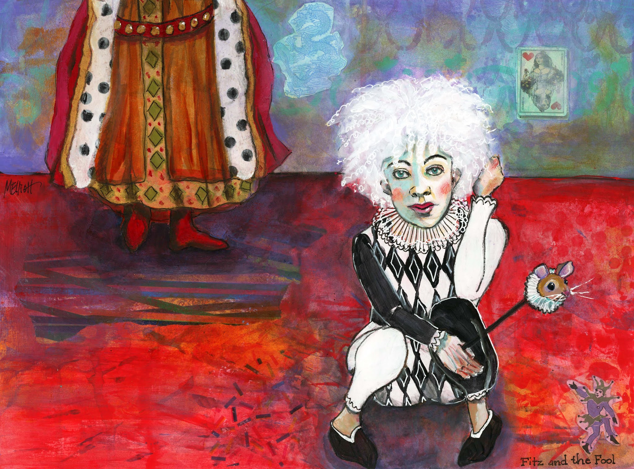
The lesson was loosely based on the harlequins of Picasso, but Maria made them much more colorful and happy, and also incorporated a bunch of collage to give form and texture to the background. I had two things in my mind: One was that I just finished reading the fantasy series by Robin Hobb which features a main character called the Fool, an albino court jester with flyaway white hair dressed all in black and white. The other was that I just started Emma Pettit's class called The Fluid Figure, and there was a reference photo provided for our sketching practice that made me think of the Fool in both expression and pose, huddled up in a squat. All I had to do was create a scenario for them (the Fool is nonbinary).

Early in the books the Fool spends most of the time sitting at the feet of King Shrewd, ruler of the Six Duchies, so I decided to paint a partial figure of the standing king in the background and put them in an environment done in royal colors of red and purple with accents of gold and turquoise. I wanted the Fool to be the central character in the foreground.I wish that I had located the two figures a little closer together, or even overlapping, because there is a lot of rather uninteresting floor that I could have made a lot less wide. It didn't occur to me until I was almost finished that I could have put in some furniture, like a throne....

Oh, well... I did find some fun collage elements—I used black and white polka dotted tissue paper as the ermine lining of the king's cloak, and put some red dots under the flooring just to echo. I had two other patterned tissues, so I threw pieces of those in on the floor as well, then painted over them. But the fun things I found were a dragon, which is a big feature later in the series; a queen of hearts card, which symbolizes Queen Kettricken to me and serves as a painting on the wall; and a tiny picture of a court jester, who is gesturing up from the corner towards my Fool.

This was a giant mess that gradually pulled together after a LOT of work. Gluing down the tissue paper was a major pain—it moved, it ripped, I did it over, and in some cases just gave up. I did some stenciling in the background and then rubbed most of it out or painted over it so it was merely a suggestion of pattern; I initially went around the Fool with Stabilo and then smeared it everywhere when I started painting and had to rub a bunch of it off again and use pen instead; the Fool's marotte (bauble) was an afterthought that I used to fill up some more boring floor space; and I struggled with outlining, with colors, with pretty much everything. But it finally came together and I have decided that it's finished. Unless someone has a suggestion for making it better!

"Fitz and the Fool"—collage, acrylics, acrylic inks, gel pens, Uniball, watercolor pencils, on Fluid 140-lb. coldpress watercolor paper, 12x16 inches.

I forgot (at 2 a.m. when I posted this) that I took in-process photos for once! Here they are:


I started out with a roller and a credit card and a spray bottle and made an Emma Pettit background for my tableau, with red, purple, and gold paints.


Then I added in all my collage elements—the three tissue paper selections, the blue dragon, the Queen of Hearts playing card, and the tiny jester, and drew in my two figures.


And this one shows an early stage of the painting, with some base coats filled in.


07 August 2021

LFI #31, Modified

I didn't initially plan to do this week's lesson for Let's Face It 2021 with Jenny Manno, for several reasons: First, she was doing the whole thing using pan pastels, and I neither own them nor wish to acquire facility with yet another medium—moving from watercolors to acrylics is plenty right now, thanks! and second, I feel inundated by the wide-faced, big-eyed, button-nosed, luscious-lipped, long-necked baby doll girls that are a Manno trademark. Don't get me wrong—they obviously have their appeal—but Jenny has such a huge following who all do her three weekly challenges that my Facebook feed is overwhelmed with them. Finally, my goal as a portraitist is always to find a likeness.

It's interesting to me that Emma Petitt, whose work I am currently following, also shies away from trying to capture a specific likeness in favor of making a more universal female image; Emma still accentuates things like bone structure and planes of the face, but doesn't look at her model as an individual (usually).

Jenny has a wonderful facility for putting together colors, and that's what intrigued me about her project this week, particularly the underpainting. I love the effect of having a base color peeking out from underneath everything on the page, but have never tried  that, and this seemed like a good project to undertake to practice that method. So I decided to do it, but using an actual model whose likeness I attempted to convey, and also doing the whole thing in acrylics rather than the pan pastels.

The model just happened to be a reference photo provided by Jenny a week or two ago, and she was one that not many people painted, which suited me, as well as being a redhead!

I started out by simply mixing up a light blue from cobalt and white gesso (I'm out of white paint!) and coating the entire page. Jenny didn't do it that way, but I thought it would be much easier to cover that with acrylics than to go in between each flower and stem to put it in afterwards.

My design is of necessity not quite as graphic and congruent as was Jenny's; she used the long neck of her girl to provide insets for flowers; additionally, the "skyline" formed by the model's updo and the top flowers is a pleasing detail that I don't achieve in the same way with my model's messy loose hair. In fact, the recognition of the graphic quality of Jenny's design is making me think maybe I shouldn't have attempted the combination of a more realistic portrait with the stylized quality of the surrounding "shrubbery"—but that's what experimentation is all about, right?

I'm including a process picture, just for the fun of it, since this was a different method to how I have worked before. It shows the blue background plus the preliminary painting of the model before I added all the shrubbery.

I have a much harder time achieving a likeness with acrylic than I do with my watercolors, particularly the fine work around the eyes and mouth. I caught something of the quality of this girl, but she isn't nearly as delicately pretty; and freckles in acrylic are beyond me! Perhaps Emma has the right idea and I should stick to exact likenesses in watercolor but go for a more general look in acrylics.

I'm also still not used to the acrylics regarding blending. I don't want to blend excessively like I do in watercolor, and yet the chunks of color here and there are distracting to me. Right at this point I feel like I'm either too blendy or not blendy enough!

I would seriously like to try painting one like an early Kara Bullock, or the way Mark Lague paints his landscapes, which is to say, individual square brush strokes stacked up all over the canvas until they convey an approximate blurry vision of the object.

Anyway, here is my redhead with poppies. Quite different to what Jenny did, but definitely inspired and guided by hers. I wish I had left more of the blue background showing—in the end, I covered it too enthusiastically.


"Redhead with Poppies"—acrylic, gesso, charcoal, Stabilo, on Fluid 140-lb watercolor paper, 9x12 inches.