06 February 2023

This week's lesson

I haven't done three or four lessons in a row for Let's Face It 2023 because they were in pencil or charcoal or pan pastels, none of which do I enjoy. But this week was a little painting with a full figure and a bunch of pattern fun, so I decided to get back in the habit of spending my Monday afternoon on art.

I ended up with something quite different from the instructor's piece, for several reasons: She used a gelli plate to print her background onto the paper, and I don't own one or know how to use it (though it looks like fun and I might have to acquire one); and since I had to change the background completely, the rest sort of followed naturally.

Her suggestion for those without a gelli plate was to use a brayer to put some colors on the paper and then to incorporate stenciling or rubber stamping to give texture and interest. So I pulled out my liquid acrylics (I only own five colors) and dripped them all over the page, and then went to work with my brayer. Because I had only used small drops of the paint, and because I was doing it all at once instead of layering, I achieved an interesting effect of overlapping ovals and circles and swashes that immediately looked to me like a mid-century modern pattern, especially in the colors I had inadvertently used. So I went through my stencils and found some geometric things and pounced them on over the colors, using white paint. They didn't stand out a lot, but interrupted the pattern enough to be seen here and there, and also the white shows through paint put on top of it, which is fun for extra texture later.

Given this background, I decided that instead of the overstuffed red velvet couch the instructor had incorporated, I would look for a sofa from the '50s, and pose my sleeping model on that instead. Since it wasn't quite as cushy/smooshy, I had to find a different pose, which I did from Wikimedia Commons, plus brace her up with some strategically placed cushions. The model was nude, but I decided to dress her, initially planning for a dress but somehow ending up with a tank and shorts. She also had short hair, but because the instructor's model had long luscious locks, I went that way too. My last idea was to add in a prototypical lamp from the era, again incorporating the colors I had been using. I threw in a little gold gilt paint here and there, but it's hard to see unless you tip the page.

It's certainly not great art, nor one of my best pieces, but it was something different and I had fun messing with it all afternoon. And I can check off this week's lesson as done!


"Mid-Century Slumber"—pencil and acrylics on coldpress watercolor paper, 16x12 inches.


03 February 2023

Fixit ticket

Sometimes a painting keeps nagging you long after you have "decided" that it's finished. It can be anything—as small as one necessary highlight that somehow didn't get added, to a major restructuring of a face or a figure—but every time you pass it sitting there on your desk, it cries out to you, "I'm not right and you know it!" (This is yet another good reason for being a tidy person who puts her paintings away in a file drawer!)

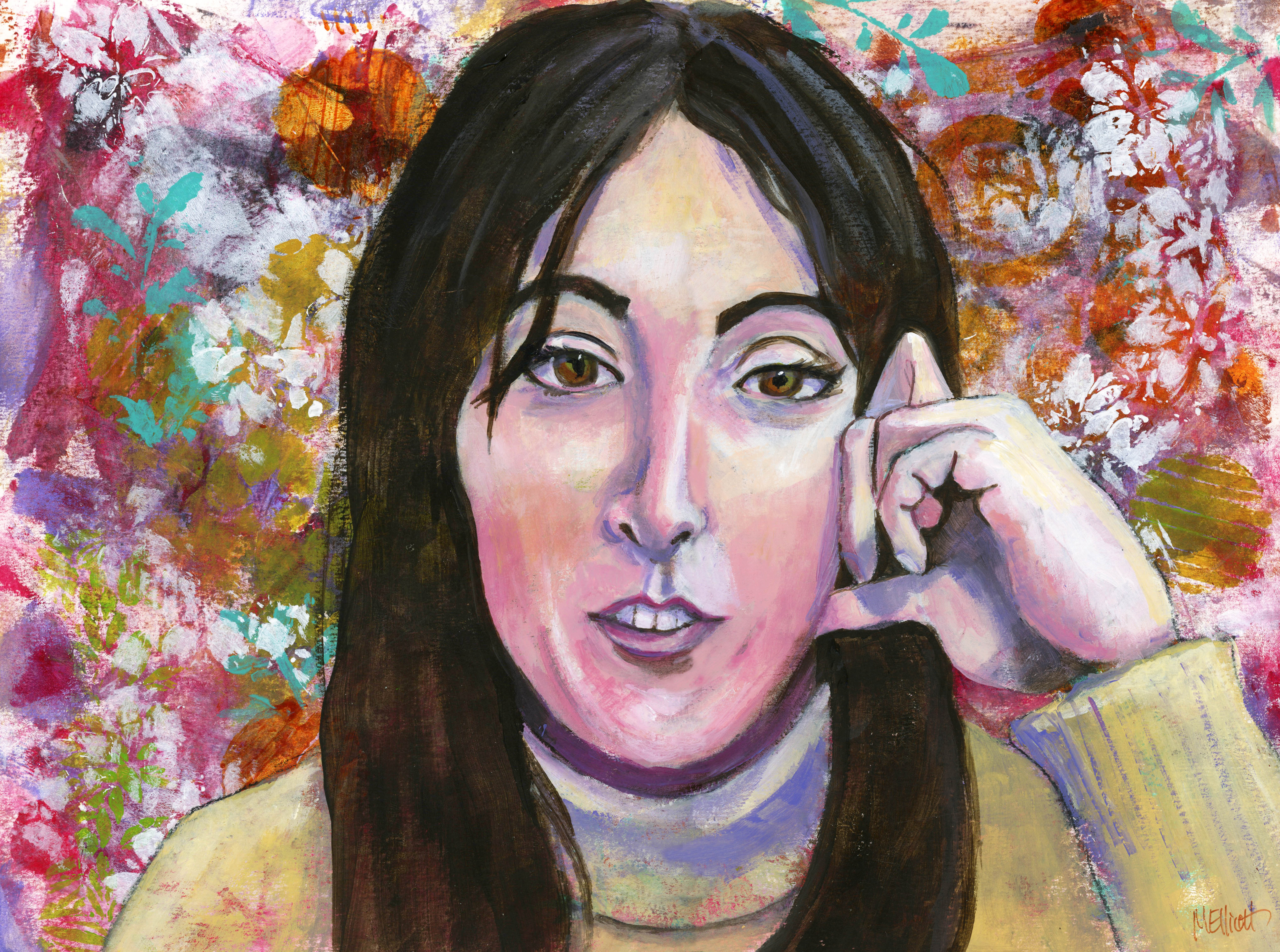
I felt like painting today, but didn't have any big inspiration or even a general subject in mind; cue the nagging. The image of my Facebook friend, artist Flo Lee, was sitting right there staring accusingly at me, demanding I pay attention. So I went back into my reference photos and pulled up onto my computer screen the photo (screenshot) from which I had painted the picture, and then opened and put up the digital (scanned) image of the painting right next to it, and it became glaringly obvious what needed to happen.

Her nose in the painting was a little too long (which I wasn't going to fix, that would be a row of dominos resulting in a brand new painting), but the appearance of length was greatly exacerbated by the fact that I had painted the bridge, the tip, and the nostrils (i.e., almost the whole nose) way too narrowly compared to the one sitting on Flo's face. Likewise,  although she does have a small mouth, it's not nearly as tiny and pursed-up as the one I painted for her, and looked more relaxed in the photo; and there was something about the teeth....

So, I squeezed out onto my palette the half-dozen colors I would need to do repairs, turned on some '70s rock, and went about fixing Miss Flo Lee. I realized, while I was at it, that I had also given one eye too exotic a slant in my attempt to mimic her eyeliner, so I fixed that while I was at it.

Most people will probably look at this and say "Didn't we see this same painting a couple of weeks ago?" and not notice any material change. But I noticed, and if it hadn't happened I would know, so now it has. It's still not perfect (her nose is also a little crooked), but at least she's not shouting at me any more!


22 January 2023

Mixed instructors!

I had a bunch of leftover paint on my palette the other day, and of course heard the voice of Emma Pettit in my head, saying "Don't waste paint!" So I made a background, and then pondered what to do with it. First, I applied some stencils, bringing in some more (brighter) colors, and then I decided to paint a picture of another mentor, Flo Lee. So this is Flo, in (sort of) the style of Emma!

This was a tough one—Flo is a unique-looking individual, and I kept getting the face too wide, the nose too low (I think it still is, a little), and her tiny little mouth is challenging to paint as well, especially (as in this screen grab reference) when it's open with teeth showing. I ended up making the bridge of her nose too narrow and the mouth too tiny, but the shapes are close enough that I'm not going to mess with it at the moment. I may come back to it.

To add some additional challenge, I chose to include her hand. Gotta get over the fear and practice hands sometime. I hope she forgives me for this effort!


"Flo Lee"—charcoal drawing, acrylic painting, over scrumbled acrylic background with stencils on Canson Aquarelle watercolor paper, 16x12 inches.

17 January 2023

Lesson #2: Pearl

We had our second lesson last week (yes, I'm behind) with Cyndy Ross, and it was lengthy and futzy and mostly pretty fun.

Her style is quite painterly, which is to say, she lets the brushstrokes stand without too much blending, which is foreign to my usual technique, and in fact I didn't end up fulfilling the assignment in the way she taught it, but I did capture a lot of the underpainting techniques and I think those made mine a better painting, even if it wasn't quite the one it was supposed to be.

Cyndy provided a three-quarter view of herself as reference; some people painted her, while others did a self portrait, but I didn't want to do either one, so I distracted myself by scrolling through Facebook and came upon a video someone had posted of Dinah Shore and Pearl Bailey singing a duet. I was so taken with the personality and good will shining out of Pearl that I decided she would be my model.

For once in my life I remembered to take in-process photos as I went along, mostly because there were SO many steps that I wanted to remember them! So I will put them all here and try to describe what went on.

First step: Gesso a board sloppily (i.e., don't worry about total cover), then put scratchy marks in the gesso before it dries. Then put a coat of clear over that.


Second step: Draw your image on the board. I used charcoal because I didn't have the graphite crayon Cyndy used.

Third step: Spritz your charcoal with water and scrub in the darks and features.


Fourth step: Paint in various colors to start distinguishing lights and darks.

Fifth step: Paint over the whole thing with red. Just because.


Sixth step: Block in your darks and lights.

Seventh step: Add some turquoise to the background, for show-through later.


Eighth step: Paint over your background with white, allowing the other colors to shine through, and scratch in some marks and some writing while the white is still wet, so you get more texture.

Ninth step: Add some colors to the surface, just for fun. I added gold and turquoise.

And after that...I started actually working on the portrait itself and forgot to take any in-process photos! Which is too bad, because it might have helped me stay looser and more painterly like I was supposed to. Instead (although it's a lot more scrumbly than my usual), I did way too much blending and ended up with a smoother image than the assignment called for. But—I love the textured background, and it does really make Pearl pop! I did manage to leave the body and neck a little more spontaneous, and I like that red showing through.

I finished this at 7:00, ate dinner and watched some TV, and came back to scan the final portrait. I put the scan up on the screen next to the reference photo, did a double take (so to speak), and ended up spending another 90 minutes reshaping the nose and the face (too wide on the left, too narrow on the right) and completely repainting the ear. Sometimes you just can't see it until it's in digital form. If I had looked earlier at my in-process photos, I might have caught the problems before the end, but...I didn't. After the second scan I could still see some tweakable bits, but decided to let it go. It's close.

I'm calling this after a quote (whose words I scratched into the background layers): "The sweetest joy, the wildest woe is love." Judging by her effervescent personality, I imagine she knew what she was talking about.


"Pearl, Joy and Woe"—Charcoal and acrylics on thin birch board, 12x12 inches.


10 January 2023

Stripes, hands, underpainting

The first lesson of the year from Let's Face It 2023 is chock full of stuff to learn. First of all, I'm working big—an 18x24-inch canvas—because the subject matter just seemed to call for it (and Kara Bullock's example is even larger). Second, we're doing Kara's signature method, which is to do an underpainting in Burnt Umber Light, and then paint over it with just black and white paint, letting some of the burnt umber show through. Third, we're doing stripes, and hands, neither of which is so easy.

I chose not to do the reference photo Kara used (her charming and photogenic cousin), not because I don't like her as a model but because I want to end up with something different than a copy that looks like everyone else's piece. I found a girl I really liked, but instead of a striped shirt she was wearing a strapless dress, and instead of having her hands up around her face or in her hair, they were below the margin of the photo. Undaunted, I then went online, found a girl with her arms crossed, wearing a boat-neck raglan-sleeved striped shirt (I just had to pick the hardest one to duplicate), posed at more or less the same angle as my model, and grafted the shirt and the one arm that would naturally appear within the proportions of this picture onto my own reference photo. I think it works okay, although the body feels a little small in comparison to the head!

There are lots of steps to this project—first we gessoed the canvas to give it some texture, and then we put a thinned-out coat of the Burnt Umber Light all over the canvas, leaving white showing through here and there. After that came the drawing of the subject (I used a grid of white charcoal), which I made using a Sanguine conté pencil so it would match with the undercoat.


Next came the underpainting of the subject herself in the burnt umber, using it to specify the darks and shadows of the portrait; there are some issues here that I will deal with in the final painting (the nose is not quite right, nor is the top of the head/hair, and I could hardly see the hand), but this gives a kind of map to follow with the darks and lights.

After the underpainting was done, I departed a bit from Kara's instruction method. She had us using the "Fluid" version of acrylics, which come in a bottle and are more like poster paint, while I generally use what's known as heavy-body acrylics, the thick ones from the tubes. I had always wanted to try the fluid acrylics, but discovered that, contrary to expectation, I didn't like them at all. I thought it would be more like working with watercolors, but instead I just felt out of control with them, and didn't like either the consistency or the level of opacity. So I switched back to my tube acrylics and went on to paint the picture using my own techniques.

Because my model was in a warm light in which her shadows looked similar to the burnt umber, I kept some of that in the picture to model the face, rather than going straight black and white. I'm such a color junkie that it's hard for me not to revert to color—any color—when I work. I actually meant to retain more, and I also intended for this picture to be much more "painterly" than it turned out to be—she is more smooth and blended than I had planned. But I am generally fairly happy with this, given what a struggle it was for me to paint in values rather than in colors.


"Stripes"—Conté pencil and acrylics on canvas, 18x24 inches.


03 January 2023

Morph

The question, when studying with art teachers, is when their lessons in combination with your own style morph into something new and you arrive at a painting where you decide to cease giving them partial credit for your achievement. I don't think I'm quite there yet, although most might say this painting is my own. I took inspiration from Flo Lee's (@florenceleeandco) method of using the ground within the portrait. This is a weird iteration of that, though, because rather than picking a ground color and leaving it in the face, I picked a face color and used it for the ground!

This reference photo (actually her artist's head shot) of Maria Pace Wynters (@mariapacesynters) was so sweet and endearing that the minute I saw it, I wanted to paint from it. Apart from her wonderful expression, the thing I love about it is how perfectly pink and yellow and white she is, with those wonderful touches of Sienna, so I decided to make her background almost the same color as her skin so that her face would emerge from it in the same organic way that Flo Lee's people emerge from (or are submerged in?) her backgrounds.

I used the palest of tints for this entire picture—Titan Mars Pale (the primary color), Titan Violet Pale, and Naples Yellow (and lots of white, of course)—and introduced darks via Burnt Sienna, Raw Umber, and Cobalt Violet Hue. There is a tiny bit of Payne's Grey in the darks between the hands and chin and for the pupils of the eyes, but otherwise this is all warm colors. I even drew the picture with a Sanguine-colored conté crayon, rather than the usual charcoal, pencil, or pen.

I painted the face yesterday, and it came together exactly as I anticipated, with no major challenges—I got the face shape and the features on first try, and the painting was so fun, to just take that background color and either darken it a bit with a mix of pink and orange, or lighten it with white, introducing a bit of the Cobalt Violet and some Burnt Sienna for the shadows, mixed liberally with the pastels so they are scarcely a few shades darker. Her bleached-blonde hair was fun to paint too.

Today I assayed the paintbrushes, her shirt, and the hands, and spent the entire afternoon (five hours!) swearing at all of them as I went over and over them, trying to bring them up to the standards of the face. With the shirt, I finally gave up and left it purposely vague; the most I was hoping for by the end was that it wouldn't distract too much from her face. I really wish, in retrospect, that I had refrained from filling it in, and left it as a few lines and splashes of color the way Flo does—and I may go back and paint over it to do just that (but not today!).

The hands I am still not happy with, but after an extra hour of fussing with a stroke here,  a line there, a little more shadow immediately erased for a little less shadow, I am giving up and saying "best I can do." So this is a bit more of a mixed bag than I thought it would be yesterday after I got the face down, but I'm mostly happy with it.

I hope Maria doesn't mind my taking her as a subject!


Maria PW"—conté crayon and acrylics on thin birch board, 12x12 inches.

30 December 2022

Bonus lesson

Kara Bullock Studios, purveyors of great art classes including Let's Face It every year for the past eight, kindly provided a series of 10 bonus lessons as a Christmas gift for their students and, although intended only to last through Christmas Day, yielded to pleading by those of us too busy to take advantage before then and left them up the rest of this week. I finally got around to watching one of them Tuesday and yesterday, and last night I painted the background for the one that occupied most of my day today, following Holly Beals's lesson on figures and collage.

I had, for almost the first time, an experience that apparently my peers in the class have had all too frequently—I posted a question today: "Does anybody here ever start a painting whose subject you initially found compelling, only to lose interest halfway through?" The 25 answers I received were unanimously in the affirmative, the most disturbing one to me being "I have about 40 paintings you can finish off!" I now count myself lucky that this is practically the first time this has happened to me; perhaps it is luck, or perhaps I generally only choose subjects that don't disappoint...or perhaps I need to be more challenged?

That was certainly an element in this one. First of all, it was working small, in the sense that usually when I use an 11x14 board, it gets filled up by one big head, while today I was painting a scene that included two complete figures plus substantial background. I dislike working small, especially when I am painting with acrylics, because I am not the best at manipulating small brushes to get precise strokes, and get easily frustrated by what I'm picturing versus what emerges on my board.

Second, I chose to find my own reference photo instead of copying the one Holly used, but although I liked the scene, it had several challenges not included in Holly's—way more background and full figures instead of partial; plus the view was from the front instead of from the rear, so I had to deal with faces; and then there were the perspective issues, which I am notorious for avoiding because I am so bad at them. I had pinky-purple brick walls with angles, a turquoise metal pleated door set back between the walls, a platform for the figures to sit on, and people whose heads were much further away than their feet, which loom larger in the foreground. I think the "disinterest" may have been a thin disguise for dismay at having to confront all these in one picture!

Having said ALL of that...I am somewhat pleased with the outcome. The faces are not up to my standards, and a couple of the hands look distressingly paw-like, but I like the textures and colors and contrasts I achieved, and I managed to stay somewhat loose and painterly, which was part of the lesson.

Although I planned to include some collage, ultimately I chose not to fiddle with it. Unless the collage fits integrally into the picture, it seems to me such an artificial kind of thing, and this was no exception; I could choose to rip and tear some bricks, or I could just give an impression of them with paint, and I went with the paint. Part of the problem, also, is that I don't have very many nice collage elements from which to choose, so there's that.

Anyway, enough with the talking. This is on cradleboard, another new experience, and this one I liked. You carry elements of the painting around to the edges of your one-inch-deep board, and you have a finished box you can hang on the wall without a frame. I will be doing more of that!

I'm calling it "Break." It's acrylics on cradleboard, 14x11 inches (plus wraparound).