
 |
| Tombow water-soluble pen, in a sepia tone. |
 |
| Black permanent pen. |
 |
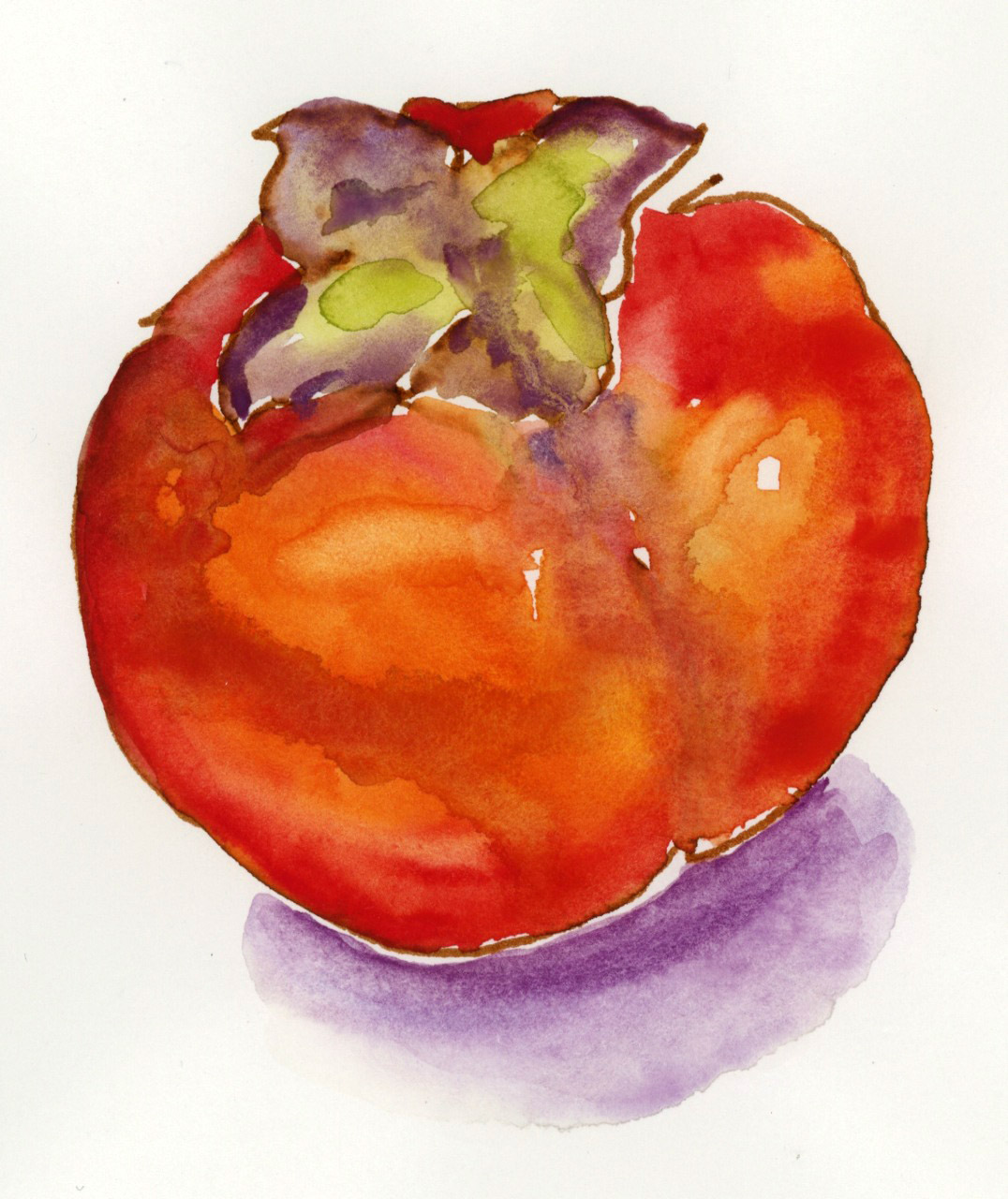
| Pencil. |
After that exercise, Brenda passed out pieces of Canson Mi Teintes pastel paper, so we could see what it was like to paint in watercolor on a tinted background. We all enjoyed the look but disliked the lack of control on the pastel paper, which has a linen-like texture that made it hard to move the paint. We had much longer to do this exercise--15 minutes to draw and 30 minutes to paint--but it wasn't one of my better efforts. I think I prefer to put in a background wash, if a tint is what I'm after. (Or, maybe I just need to get better at controlling my paint and brush!)

Our after-lunch project was creating vignette paintings. "Vignette" is defined by the dictionary as "an unbordered picture that shades off gradually into the surrounding paper," or "any small, endearing scene, view, picture, etc.; a small, illustrative sketch." This is a great format to use when filling your sketchbook, either with ideas for finished paintings, or just for its own sake. Brenda has some guidelines for making them; she prefers they follow a cruciform format. The definition of "cruciform" is "shaped like a cross," but she was quick to point out that it says "like A cross," not "like THE Cross," which is an important distinction. Her meaning is that there is a strong vertical and a strong horizontal, and that the picture: A. has nothing in the four corners; and B. touches the edges of its framing box in at least one place, and preferably more, to carry the eye beyond the frame, thus rendering the sketch more dynamic. Here is my example, for which we had 45 minutes:

Four corners blank, all defining different shapes; strong horizontals (fence crossbars and foliage), strong verticals (fence post and hollyhock), touching all around. Had a few continuity problems with foreground and background, and the greens could have had more variation, but the hollyhocks were fun, and I remembered to put some reflected color under the "eaves" on the fencepost.
I also learned a lot of information today about watercolor paints (opaque vs. transparent), painting en plein air (and what to pack in your bag to bring with you), and doing value sketches, but I'm too tired to go into any more detail tonight! Those will be for another post...
Tomorrow: Day Three!
P.S. Montrose is the cutest town EVER.
No comments:
Post a Comment