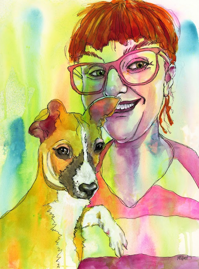
That's not to say it was entirely successful—for some reason I find Emma particularly hard to capture and even though each element related properly to the others, it somehow didn't become a sum of its parts in the way I would have liked. (And don't get me started on the teeth/mouth, I redid it about six times and should have left the first version!) I had a similar challenge when it came to capturing Pippin; both of their faces turned out too wide and not long enough.
I did have fun deciding where to put in "regular" color and where to let the background either show through or dictate the colors I used.
Anyway, it's not the result for which I was hoping, but it's not so bad I can't show it to people (I don't think?).
"Emma and Pippin"—Daler Rowney inks and watercolors on 140-lb. Fluid coldpress watercolor paper, 12x16 inches.
Here are my process pics:


No comments:
Post a Comment