

04 January 2014
Window in France
A small vignette from one of the many reference photos I took in several picturesque villages in France. I drew and painted this while watching TV, which could explain the very odd perspective! Oh well, just fooling around to keep my hand in, no big deal. Faber Castell sepia pen and watercolor.


03 January 2014
Casual contour
Watching TV with my cat…
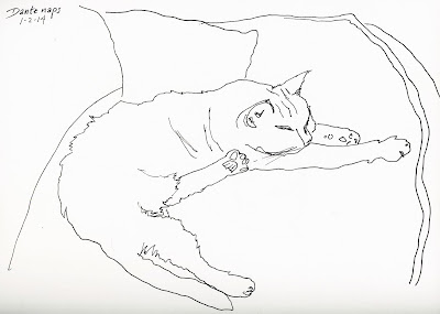
And making little book sketches to go with my next blog post for the library…


And making little book sketches to go with my next blog post for the library…

That is one lopsided hunchbacked teapot!
01 January 2014
Drawing from France
I went back and had a look at some reference photos, tonight, from my trip to France last October, and decided to do a little more drawing on the first day of the new year. This is a street in a village called Saint Loup Lamairé. Several of the guest artists at Bandouille have painted this particular view; and I think I would prefer painting it to drawing it, since you can do the side of a building in one stroke of the brush instead of a bunch of shading with the side of the pencil! Maybe I'll give it a try.


But first I think I need to go back and review Bixxy's perspective lessons…what was it, Bix? Elbows down, knees up?
Drawing first
I can't decide whether I am lazy, fearful or impatient. The fact is, I don't enjoy drawing. Or rather, I like drawing mostly as an end to painting, rather than as an accomplishment in and of itself. I can do it; but because it's not something to which I aspire to improve except as it supports my watercolor, I neglect it, so I do it fairly badly. And like most people, what I fear I avoid. But really, the better your drawing skills, the more your painting benefits. So I'm going to do it more.
Here's one I did today. I want to do a series of paintings to go with a book I enjoy, and today I went looking around the internet for somebody who looks like the somebody I want to paint. This guy might do--we'll see.

You can see that I hung in there for the interesting parts and then got scritchy-scratchy with the outlying bits. Also, now that I look at it in scan form I see that one of his eyes is waaaay higher than the other. Oh well…practice. Practice, practice, practice. Until it becomes a practice.
Here's one I did today. I want to do a series of paintings to go with a book I enjoy, and today I went looking around the internet for somebody who looks like the somebody I want to paint. This guy might do--we'll see.

You can see that I hung in there for the interesting parts and then got scritchy-scratchy with the outlying bits. Also, now that I look at it in scan form I see that one of his eyes is waaaay higher than the other. Oh well…practice. Practice, practice, practice. Until it becomes a practice.
15 December 2013
Callipepla californica
I said in my last post that I wanted to try painting another bird, but I didn't anticipate how soon. My friend Cindy had her 60th birthday today, and as well as being born (?) and raised in California, she also works for the California State Library, so I decided that a painting of the California state bird might be an appropriate birthday gift. Unfortunately, I ended up having to miss her party, so she has yet to receive it, but since she doesn't read my blog (that I know of!), I decided to go ahead and post it. Hope this isn't a spoiler!

The California Quail is a handsome, round soccer ball of a bird with a rich blue-gray breast, intricately scaled underparts, and a curious, forward-drooping, comma-shaped topknot. Its stiffly accented Chi-ca-go call is a common sound of the chaparral and other brushy areas of California and the Northwest. Often seen scratching at the ground in large groups or dashing forward on blurred legs, California Quail are common but unobtrusive. They usually travel in groups called coveys. Their flight is explosive but lasts just long enough to reach cover.
This was a fun, though complex, bird to paint. I love his bright eye and cheerful goofy head plume, and his beautiful, subtle colors. The "intricately scaled underparts" were a challenge, and I have to say that I phoned in the detail a bit, but I think the feeling of the feather pattern is conveyed. I overworked the background, but when do I not? Someday I'll learn to let things be instead of going in just one more time!
A final note (no pun intended): While the quail's call does have three syllables, I wonder whether some homesick transplanted Illinois ornithologist decided that "Chicago" is what this guy is saying--I sure don't hear that! See if you do: Here is a link to the various sounds the quail makes.
03 December 2013
Carduelis
I just finished reading Donna Tartt's highly anticipated new book, The Goldfinch. I seem to keep happening upon these art-related novels without intending to--this one is based on a story about the 350-year-old painting of the same name by Carel Fabritius, currently on loan as part of a Dutch Masterworks exhibit at the Frick Collection in New York City, loaned by the Royal Picture Gallery Mauritshuis in The Hague, the Netherlands.

It's a beautiful little gem of a painting, with that simultaneous depth and light given such skilled life by the Dutch masters. Tragically, it's one of the few surviving paintings by Fabritius, who died at age 32 in an explosion of a gunpowder magazine in Delft, taking nearly all his work with him.
My ambition, after dwelling so lovingly on the painting through the words of Tartt, is to see it in person some day; but the other emotion her story evoked in me was the desire to paint a European goldfinch (Carduelis carduelis) of my own.
No, I'm not aspiring to duplicate, or to set myself and my puny skills up against a master like Fabritius--that would be laughable. But one of the things I have discovered, in the pursuit of my short and part-time avocation, is that to paint something is to really see it, to take in, take it apart, put it back together again, and forever know it in a more intense and personal way, and this is what I wanted to do.

So, here is my Carduelis. Not very gold at all, compared to the American variety, but bright, colorful and endearing in his own right. The only other bird I have ever painted was a raven, and the task of conveying feathers, some of which are soft down while others are spiky, stiff and strong, is challenging. I really enjoyed making this little painting, and I think I will try a few more birds in the future.
You can read my review of The Goldfinch on the Burbank Library Blog at this link.
16 November 2013
Picturing the characters in a book
Today I "worked" from home--I read the book club book for my 6+7 Book Club on Tuesday night. We are reading Kiki Strike: Inside the Shadow City, by Kirsten Miller, about a group of "butt-kicking girl superspies out to save Manhattan" from an evil conspiracy. The description of the main character includes pale, ice-blue eyes and distinctive white hair, and every time I looked at the cover of the paperback version, I winced at the photo of the admittedly pretty but decidedly regular blonde girl the publisher / cover designer chose to depict Kiki. To me, the author's description indicated Kiki was albino, or lacking any melanin in her skin and hair, something like model Nastya Zhidkova . . .

only of course tougher and way less pouty. So tonight I decided to do my own version. Here it is--"Kiki Strike in Central Park," in the snow, wearing her black hoodie, hands on hips, displaying her slightly challenging stare . . .

Here are the two book covers--the hardcover version (left) with the cartoon Kiki obviously more true to the book than the paperback one (right).


Subscribe to:
Posts (Atom)