07 December 2021

Last LFI2021

It's been quite a year, doing Let's Face It 2021, and now it's over! I haven't done all of the lessons (maybe half?), partly because some were charcoal or pencil only, which didn't interest me, and partly because I got distracted by other classes and went off on those tangents for a good part of the year. But it was worth it, even doing just 25 of the 49 lessons, and I have signed up for 2022. I have also signed up for Paint Your Heart and Soul 2022, likewise a year-long class, so that I can choose whether to do one or the other or both lessons per week and discover yet more teachers with whom I would love to study! And of course I have a few leftover lessons from more in-depth classes that I need to go back and complete, and a few I haven't even looked at yet, and a couple of commissions... I think 2022 will be another busy art year!

Anyway, our last lesson this week for LFI 2021 was with Danielle Mack, and was an exercise to paint two women together in one frame, supposedly combining them from separate, individual photos. I didn't exactly adhere to that plan, because I was reading a review this morning of the new Paul Verhoeven film, Benedetta, and when I saw the picture of the two nuns, one peeking from behind the shoulder of the other, I had to paint them. Danielle was making a statement about woman power, and I'm not sure these lesbian nuns fit the description, but they were definitely risk-takers, given that it was the 17th century!

I did fulfill the assignment as far as drawing and watercolor went, and I abstained from adding any additional mixed media details with the exception of the rosary, for which I used my silver gel pen. But otherwise all watercolor, and mostly done with my loose and sloppy brush, somewhat in the mode of Fiona di Pinto, putting in the darks first and coming back in with the lighter colors. I'm pretty happy with it, although as usual I forgot to allow for borders. The faces are a little long, compared to the originals, but not horribly out of proportion. I just failed to get the slightly up-tilted chin on the front nun. Otherwise, not bad.


"Benedetta"—pencil and watercolor on Fluid coldpress watercolor paper, 12x9 inches.


06 December 2021

The beauty of substrate

Ever since taking Emma Pettit's class, I am super conscious of paint usage. Her continuing mantra throughout her painting process is "Don't waste paint!" to the point where she will say, "Just take whatever is left on your brush and scrub it over the surface to give you some nice texture—use it all up!"

So, when I finished a painting session on the recent large figure portrait of Johnny and George and had a bunch of colors left sitting on my palette, instead of balling up the page and throwing it out, I got out a 9x12 piece of watercolor paper and my brayer (roller) and made a background (substrate) to use for a future painting.

The problem with these backgrounds Emma teaches is that sometimes they are so pretty that you don't want to cover them up! I didn't expect the combination of Naples Yellow, Burnt Sienna, Lemon Yellow, and a little bit of Payne's Grey to mix so agreeably, but when I was done, I thought Ooh! What can I paint on this without covering it all up?

My solution was to impose an image taken from a black-and-white photo, and only paint the lights and darks, leaving the substrate to show through for all the neutral parts.

I'm not sure whether I feel like this is a success; for one thing, since the light was coming from behind her, the biggest highlight in the entire photo was the neck, which is always an awkward place to put such definitive white strokes and leave them unblended! It probably would have been better painted in inks or watercolor, but I wasn't sure I could even do that, over the top of an acrylic background, so...white and Payne's Grey acrylics, and a dark blue Stabilo All pencil for a few defining strokes.


"Substrate Woman," 9x12 inches.

And then, of course, I had white and Payne's Grey left over, so now I have a new substrate...

04 December 2021

It's done...I think?

Once I got started painting on this project, it seemed like I couldn't put down the brush. I did 2.5 hours the first afternoon and then had to get out of the chair, stretch, and move around a bit; but after dinner and a couple hours of TV, I found myself distracted from what I was watching, and thinking about what I would do next on the painting. So I went and did two more hours before bed! Same story the day after, and this morning I got up and put in the bulk of the background.

It's not exactly what I was planning...but I think it works. I put in a wall-like structure to anchor the bottom without being too specific, and the rest of it feels to me like an out-of-focus rolling moor in the background. I had fun fuzzing out their hair so that it felt like it moved into the background a tiny bit, and invading her arm with some faintly foliage-like shapes.

Ironically, the thing I was least worried about—capturing their likenesses—came out the best. I was going for a light-and-shadow sort of abstract effect, but they still look like themselves, I think.

Here is a colorized version of the black-and-white photo:

I started out making his shirt dark green, but quickly realized that it would be way too much green if I was going to mimic the background foliage in any way, so it became shades of raw umber instead. I love how umber mixes with other colors to give you various shades, from mushroom to rust.

I knew I wanted her dress to be pale blue, but I wanted to give it a little pizzazz, so it has some turquoise in the mix with the cobalt and white, and although her belt didn't look this white in the b&w version, I liked it as another counterpoint to pick up the light, along with their faces and arms.

I kind of wanted to paint those feet in the bobby socks, but the "client" specified a three-quarter view rather than the whole length of the figures, so that's what I did. I do wish I had started a little lower on the canvas so there was some air above his head; and their heads feel a little big for their bodies, too. But over all, I'm pretty happy with my first foray into full-figure, double-figure, and in acrylic!


These are "George and Aunt Johnny," pencil and acrylics on canvas, 18x24 inches.    

We'll see what Aunt Johnny's niece has to say about it. My friend Phoebe likes it, and that's more than enough for me!


02 December 2021

Getting my nerve up

Today I finally went back to my first real "canvas" painting, which is also my first with full figure, and actually with two of them. I ended up imposing a grid over the photo and then duplicating it on the canvas so as to locate everything properly, although the proportions were not identical and I fear that the vertical boxes on the painting will be a bit elongated. But since I am not going for an entirely literal portrait but rather doing a more abstract study of light and shadow, I don't think there will be any harm done.

So far, I have put in the preliminary drawing, which has already gone through multiple changes and I'm sure will evolve further as I get out the paintbrushes. In fact, just the act of photographing it and looking at the photo shows me where I need to make adjustments—funny how different things look once they're in a still shot.

I'm a little nervous about the whole thing, but it's also exciting to try something new. I'm taking a lunch break and then breaking out the paints.

Oh, and as a bonus...a rare photo of the uncooperative model Gidget, in her perch on the patio in front of my prolific lemon tree.


20 November 2021

A new substrate

I did an interesting lesson with Deanna Strachan-Wilson of LFI2022 (a preview bonus session) today. I thought I knew most of the permutations of working with watercolor, but Deanna introduced me to a new idea—using some form of partial "resist" to slow down and loosen up the application.

We used toned mixed-media paper, and put a thinned-out coat of gesso on it. Yes, gesso, as the base for a watercolor. Considering the frustrations I have had with gesso as an undercoating for acrylic inks, I would have said no thanks, but her watercolors are soft and hazy, a little smeary, and completely appealing, and I wanted to learn, so I went along.

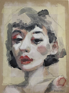
This is an example of Deanna's.
(She's also doing some kind of
thing with masking tape, but
we didn't do that part.)
The effect of the gesso is to make the watercolor at least partially bead up on the surface and be slow to dry. So you can blob it on all over the place, and still go back with a damp, clean brush to push it around, remove some, smooth it out into the creases of the gesso, and finally let it dry while sitting on the surface, and thus get all kinds of soft, fun effects.

You do have to have patience to let each layer dry, once you get it where you want it, before trying to apply the next; with normal watercolor paper, the color is going to sink in and be immovable pretty quickly, but with the gesso running interference, it's a gradual and kind of random process. But once you start layering it up, you get some beautiful soft shadows using just a few colors; Deanna encouraged us to also be vague about such outlines and structures as hair and clothing, and indicate rather than define.

The other thing that makes her faces pop is going back in with the gesso after to brighten up all the whites, which stand out beautifully on the toned paper and vague background. And you can sort of push the gesso into the color and blend them.

I don't think I would choose this as my preferred method; I enjoy too many other techniques to be exclusive. But I will certain try this again and see what I can do with it!

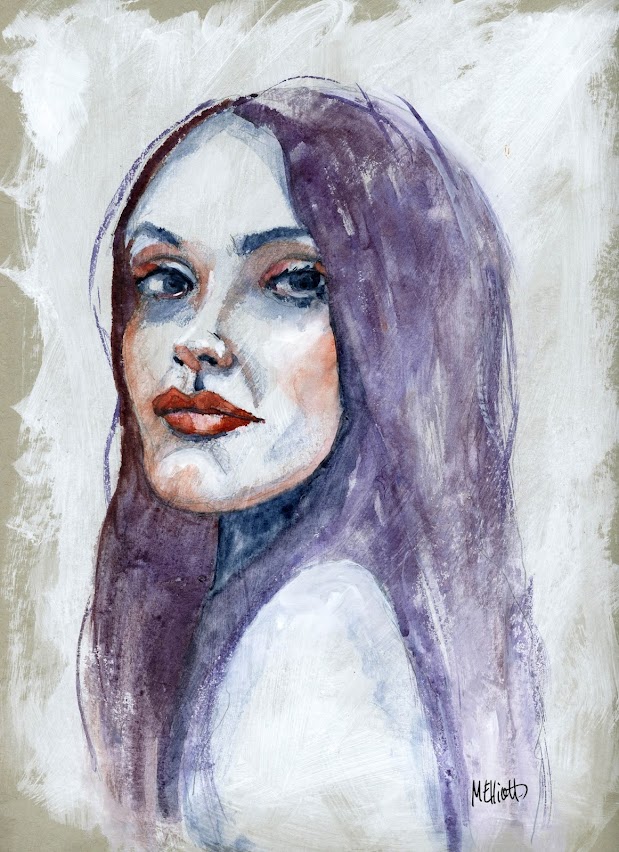
I picked my own reference photo from which to work, so it wouldn't be a duplicate of everyone else's. This is...


"Dani"—gesso, pencil, and watercolor on Strathmore toned gray 184-lb. mixed media paper, 9x12 inches.


Canvas

I finally got up my nerve to start a canvas this week; up to now, I've been painting all these acrylics on watercolor paper. But this one is a sort of commission; I was intrigued by the project and told the person whose reference photo it is that I would attempt to do it in the style we both admired and, if she likes it, she can buy it from me. If not, hopefully someone else will want it. Or, it will have simply been a good experiment.

The subjects are 3/4 figures of a man and woman standing outdoors in front of foliage. But the objective is not a realistic portrait—the photo is black and white and the contrasts (light and shadow) in it are extreme. We agreed that I would try to paint it sort of in the style of artist Michael Carson. This means the background will be color blocks that suggest rather than specifically convey the atmosphere, and a figure (or two in this case) made up of contrasts, with likeness not being as important as mood.

I got a bit literal with my color blocks on this, since I wanted to have both a light and a dark green and a khaki color for the foliage, some blue for the sky, some orange/yellow for sunlight, etc., and they are way too discrete and solid. But I have taken the initial step of going over them with a thinned-out mix of Naples yellow/green (a sort of green-tinted pale cream color) mixed with a little Cobalt blue and thinned out with Acrylic medium. I did one coat and let it dry, and will probably go back in with more, and then add some dry-brush paint for a "scumbled" effect in certain areas.

Also, once the two figures are in, they will cover up about 85 percent of the background, and then I can play around with whatever remains around the edges, until it is "edgier," ha ha.

Anyway, here are a couple of shots of my prep work so far:

The raw background squares...


The glaze...


And with the first layer of the "knock-back" color applied...


More to come as this progresses...


18 November 2021

Challenges

The thing I enjoy most is finding a reference photo that challenges me—an odd perspective or angle, extremes in light and shadow, quirky expression, or whatever. I picked this one because of the hands, the mouth, and the task of making it look like somebody was home behind those sunglasses. I've been contemplating it for a couple of days, and finally decided to jump in.

I can't say I'm completely satisfied—the hands were difficult, the way they are bunched up, and look distorted to my eyes. They are especially interesting because on one hand she is sticking out her pinky finger like she's holding a cup of tea, while on the other she is sticking out her index finger instead, so they are opposite but it was hard to make them look that way. I think I got the pinky too large/long and the index finger too short/small, and it doesn't help that I started drawing about two inches farther to the left than I should have if I were going to include that entire right hand, so there's that. I'm still not the best at placement!

I feel I did better on both the eyes and the mouth; but what I'm really happy with on this is the use of the background colors to determine a lot of the foreground colors, without having them blend into one another too much. I introduced a few random colors that didn't appear in the background, such as a light olive green in some of her skintones and the pale raw sienna that I combined with other colors for some shadows; it got a little muddy, but mostly I think it worked. I'm also happy with the hair color—I love a redhead!

I introduced some outlining with a black Stabilo All to selected areas, not outlining everything but using it to emphasize certain things; and then I went back in with a damp brush and activated some of it so that it would make parts (like the sunglasses) pop.

Despite the placement error that put the hand partly out of frame, I do enjoy painting portraits in which the person seems to be looking in from another room, rather than being the central focus.


"Glamour Glasses"—pencil, acrylic paints, and Stabilo All on Fluid 140-lb. coldpress watercolor paper, 16x12 inches.