25 March 2023

Evolving work

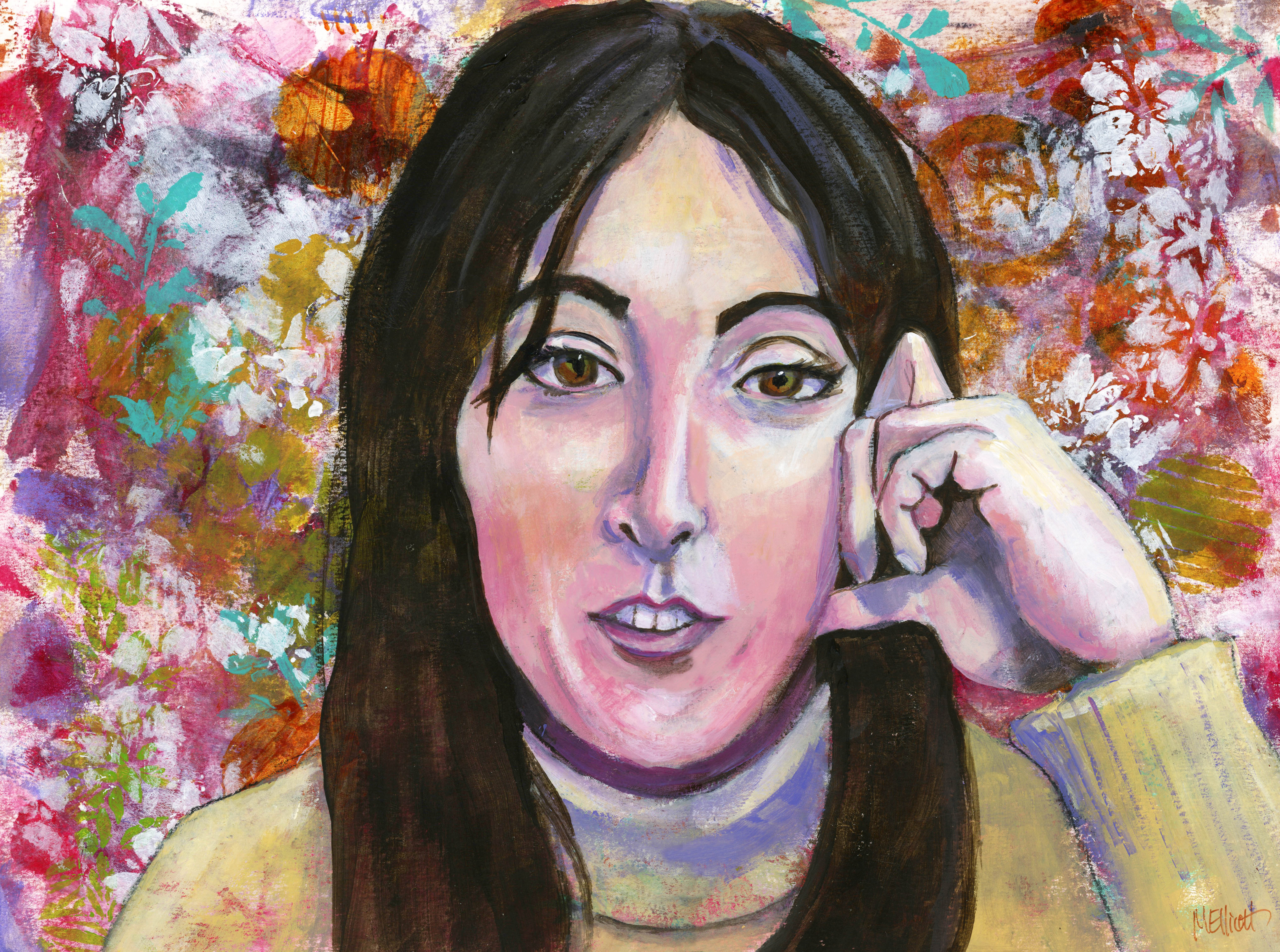
This didn't turn out quite as I had envisioned it. My initial plan, after gessoing a board, was to paint it in acrylic; then I decided it would be better in watercolor. When I actually began painting, I had thought to do it in a more cartoon-y style and make it more like a Deb Weiers-inspired painting, with a colorful ink background and a wonky quality. But after the ink dried and I started to draw, I found myself making it mostly realistic so, despite the double black line and wonky colors, it became a more traditional rendering.

That's not to say it was entirely successful—for some reason I find Emma particularly hard to capture and even though each element related properly to the others, it somehow didn't become a sum of its parts in the way I would have liked. (And don't get me started on the teeth/mouth, I redid it about six times and should have left the first version!) I had a similar challenge when it came to capturing Pippin; both of their faces turned out too wide and not long enough.

I did have fun deciding where to put in "regular" color and where to let the background either show through or dictate the colors I used.

Anyway, it's not the result for which I was hoping, but it's not so bad I can't show it to people (I don't think?).


"Emma and Pippin"—Daler Rowney inks and watercolors on 140-lb. Fluid coldpress watercolor paper, 12x16 inches.

Here are my process pics:


14 March 2023

Reverting to style

I haven't been painting much (or at all) lately, and I don't know quite why. Some of it is that my legs are giving me trouble, so sitting for long periods isn't good; but if I can sit to watch TV or scroll Facebook, I can sit to paint, so that's not really much of an excuse. I just haven't felt moved to do much. I think maybe the rainy weather has been one component getting me down; although I'm not out in it, the darkness of the day does get to me after a while.

Anyway, I had this reference photo I liked, of Jenell del Cid looking crazed or freaked out or something, not sure what, except that the whites of her eyes were definitely a component! So I decided to journey back to 2019 when I took the class with Deb Weiers that got me started on portrait-mania, and do Jenell's slightly goofy expression in the bright colors of Daler Rowney inks in non-realistic colors.

Although I managed to draw her with a fair amount of accuracy in terms of the shape of her eyes, nose, and mouth and their relation to one another, I completely lost the head-tilt that made the expression more extreme, so she merely looks a little startled, as opposed to the crazed vibe for which I was aiming. I don't know how I managed to actually tilt her head in the opposite direction and yet keep her face shape and all the features in synch, but I did. (This is one of those times when one simple angled pencil line would have made a big difference!)

Anyway, I somewhat made up for the lack of extreme emotion with the neon colors I used to paint her; I started out with pencil marks all over the page, just for some interest and texture, and then followed up with spatter, spray, and wash in pink and orange. I let that dry, and then did the drawing with a Uniball pen. I had forgotten how much I like Deb's technique of double line everywhere, so I did that. I took some white gesso and put in some highlights on the forehead, brow line, cheekbones, nose, and chin, and also filled in the whites of her eyes. Then I painted in the face, using the pink and orange and accenting with shades of turquoise and Prussian blue, and then later with a little Payne's Grey. Her eyes are brown; I did Deb's effect of star lines coming out from the pupils, and put in highlights on those and her nose and lips with a white Signo pen.

I played around with some texture on her scarf by adding lines, put some darker shading into the hair and under her chin, backed off the fluorescent lime green of her jacket with a wash of Payne's, and intensified the background with another wash of pink. Last touch was a double-line border around it all.

I considered some trademark stuff of Deb's, like circles around the eyes, or an extended lip line, or even some random spots here and there, but ultimately decided I liked her as a simpler, less wonky but still distinctive character.


"Startled"—Daler Rowney inks, Uniball pen, gesso, on Fluid 140-lb. coldpress watercolor paper, 9x12 inches.


01 March 2023

Olivia #2

For an assignment two weeks ago, I chose to paint Olivia, a photo reference I had used before, for another class, in another medium.

The assignment on this one was to draw her in pencil, then wash over the whole thing with acrylic inks, and mess with the background in various ways—salt, splashes of water, and so on. I did the pencil drawing, but then decided to diverge from the assignment by using stencils in the background, so I applied them using white gesso. You can't see them at all when it's white on white, but then when you wash over them with the ink, the stenciling partially resists the color wash and shows up lighter against a darker background of ink soaked into paper.

I like the effect, but I messed up a bit on this, because I wasn't careful enough with my stenciling and so got some in the hair area on one side, where I didn't want it. So the hair didn't come out quite like I had planned.

In Angela Kennedy's version, the hair went straight up, as if the model was underwater and her hair was floating. I decided to send mine to the side instead, as if she's standing in a high wind.

The ink effect I achieved was quite subdued, because instead of using an ink color foreign to human faces (purple in Angela's case), I used a flesh-toned ink. It was so pale that I went over the background surrounding the face with a darker brown ink, to provide at least some contrast, and blend better with the hair. Then the rest of the picture was accomplished by painting with a high-water-volume brush in watercolor.

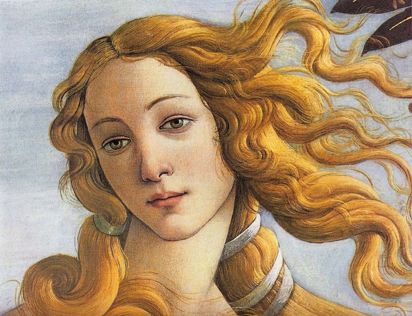
It didn't occur to me, but a friend of mine said she looks like the woman in The Birth of Venus, by Botticelli, and although I initially scoffed, I do see the resemblance. She's 9x12 on Fluid 140-lb. watercolor paper.

I painted Olivia a few years back, for a different class (Emma Pettit's) in a different medium (acrylic). It's sharper and more defined; I like the softness of this one, but I loved the intruding background and rust-colored shadows on that one.


(Botticelli on the left, my acrylic of Olivia on the right.)

I didn't feel like blogging at the time I painted this, but since I haven't been painting since then, I thought I'd toss it up here with some words about the process. Hoping to do another painting soon.


06 February 2023

This week's lesson

I haven't done three or four lessons in a row for Let's Face It 2023 because they were in pencil or charcoal or pan pastels, none of which do I enjoy. But this week was a little painting with a full figure and a bunch of pattern fun, so I decided to get back in the habit of spending my Monday afternoon on art.

I ended up with something quite different from the instructor's piece, for several reasons: She used a gelli plate to print her background onto the paper, and I don't own one or know how to use it (though it looks like fun and I might have to acquire one); and since I had to change the background completely, the rest sort of followed naturally.

Her suggestion for those without a gelli plate was to use a brayer to put some colors on the paper and then to incorporate stenciling or rubber stamping to give texture and interest. So I pulled out my liquid acrylics (I only own five colors) and dripped them all over the page, and then went to work with my brayer. Because I had only used small drops of the paint, and because I was doing it all at once instead of layering, I achieved an interesting effect of overlapping ovals and circles and swashes that immediately looked to me like a mid-century modern pattern, especially in the colors I had inadvertently used. So I went through my stencils and found some geometric things and pounced them on over the colors, using white paint. They didn't stand out a lot, but interrupted the pattern enough to be seen here and there, and also the white shows through paint put on top of it, which is fun for extra texture later.

Given this background, I decided that instead of the overstuffed red velvet couch the instructor had incorporated, I would look for a sofa from the '50s, and pose my sleeping model on that instead. Since it wasn't quite as cushy/smooshy, I had to find a different pose, which I did from Wikimedia Commons, plus brace her up with some strategically placed cushions. The model was nude, but I decided to dress her, initially planning for a dress but somehow ending up with a tank and shorts. She also had short hair, but because the instructor's model had long luscious locks, I went that way too. My last idea was to add in a prototypical lamp from the era, again incorporating the colors I had been using. I threw in a little gold gilt paint here and there, but it's hard to see unless you tip the page.

It's certainly not great art, nor one of my best pieces, but it was something different and I had fun messing with it all afternoon. And I can check off this week's lesson as done!


"Mid-Century Slumber"—pencil and acrylics on coldpress watercolor paper, 16x12 inches.


03 February 2023

Fixit ticket

Sometimes a painting keeps nagging you long after you have "decided" that it's finished. It can be anything—as small as one necessary highlight that somehow didn't get added, to a major restructuring of a face or a figure—but every time you pass it sitting there on your desk, it cries out to you, "I'm not right and you know it!" (This is yet another good reason for being a tidy person who puts her paintings away in a file drawer!)

I felt like painting today, but didn't have any big inspiration or even a general subject in mind; cue the nagging. The image of my Facebook friend, artist Flo Lee, was sitting right there staring accusingly at me, demanding I pay attention. So I went back into my reference photos and pulled up onto my computer screen the photo (screenshot) from which I had painted the picture, and then opened and put up the digital (scanned) image of the painting right next to it, and it became glaringly obvious what needed to happen.

Her nose in the painting was a little too long (which I wasn't going to fix, that would be a row of dominos resulting in a brand new painting), but the appearance of length was greatly exacerbated by the fact that I had painted the bridge, the tip, and the nostrils (i.e., almost the whole nose) way too narrowly compared to the one sitting on Flo's face. Likewise,  although she does have a small mouth, it's not nearly as tiny and pursed-up as the one I painted for her, and looked more relaxed in the photo; and there was something about the teeth....

So, I squeezed out onto my palette the half-dozen colors I would need to do repairs, turned on some '70s rock, and went about fixing Miss Flo Lee. I realized, while I was at it, that I had also given one eye too exotic a slant in my attempt to mimic her eyeliner, so I fixed that while I was at it.

Most people will probably look at this and say "Didn't we see this same painting a couple of weeks ago?" and not notice any material change. But I noticed, and if it hadn't happened I would know, so now it has. It's still not perfect (her nose is also a little crooked), but at least she's not shouting at me any more!


22 January 2023

Mixed instructors!

I had a bunch of leftover paint on my palette the other day, and of course heard the voice of Emma Pettit in my head, saying "Don't waste paint!" So I made a background, and then pondered what to do with it. First, I applied some stencils, bringing in some more (brighter) colors, and then I decided to paint a picture of another mentor, Flo Lee. So this is Flo, in (sort of) the style of Emma!

This was a tough one—Flo is a unique-looking individual, and I kept getting the face too wide, the nose too low (I think it still is, a little), and her tiny little mouth is challenging to paint as well, especially (as in this screen grab reference) when it's open with teeth showing. I ended up making the bridge of her nose too narrow and the mouth too tiny, but the shapes are close enough that I'm not going to mess with it at the moment. I may come back to it.

To add some additional challenge, I chose to include her hand. Gotta get over the fear and practice hands sometime. I hope she forgives me for this effort!


"Flo Lee"—charcoal drawing, acrylic painting, over scrumbled acrylic background with stencils on Canson Aquarelle watercolor paper, 16x12 inches.

17 January 2023

Lesson #2: Pearl

We had our second lesson last week (yes, I'm behind) with Cyndy Ross, and it was lengthy and futzy and mostly pretty fun.

Her style is quite painterly, which is to say, she lets the brushstrokes stand without too much blending, which is foreign to my usual technique, and in fact I didn't end up fulfilling the assignment in the way she taught it, but I did capture a lot of the underpainting techniques and I think those made mine a better painting, even if it wasn't quite the one it was supposed to be.

Cyndy provided a three-quarter view of herself as reference; some people painted her, while others did a self portrait, but I didn't want to do either one, so I distracted myself by scrolling through Facebook and came upon a video someone had posted of Dinah Shore and Pearl Bailey singing a duet. I was so taken with the personality and good will shining out of Pearl that I decided she would be my model.

For once in my life I remembered to take in-process photos as I went along, mostly because there were SO many steps that I wanted to remember them! So I will put them all here and try to describe what went on.

First step: Gesso a board sloppily (i.e., don't worry about total cover), then put scratchy marks in the gesso before it dries. Then put a coat of clear over that.


Second step: Draw your image on the board. I used charcoal because I didn't have the graphite crayon Cyndy used.

Third step: Spritz your charcoal with water and scrub in the darks and features.


Fourth step: Paint in various colors to start distinguishing lights and darks.

Fifth step: Paint over the whole thing with red. Just because.


Sixth step: Block in your darks and lights.

Seventh step: Add some turquoise to the background, for show-through later.


Eighth step: Paint over your background with white, allowing the other colors to shine through, and scratch in some marks and some writing while the white is still wet, so you get more texture.

Ninth step: Add some colors to the surface, just for fun. I added gold and turquoise.

And after that...I started actually working on the portrait itself and forgot to take any in-process photos! Which is too bad, because it might have helped me stay looser and more painterly like I was supposed to. Instead (although it's a lot more scrumbly than my usual), I did way too much blending and ended up with a smoother image than the assignment called for. But—I love the textured background, and it does really make Pearl pop! I did manage to leave the body and neck a little more spontaneous, and I like that red showing through.

I finished this at 7:00, ate dinner and watched some TV, and came back to scan the final portrait. I put the scan up on the screen next to the reference photo, did a double take (so to speak), and ended up spending another 90 minutes reshaping the nose and the face (too wide on the left, too narrow on the right) and completely repainting the ear. Sometimes you just can't see it until it's in digital form. If I had looked earlier at my in-process photos, I might have caught the problems before the end, but...I didn't. After the second scan I could still see some tweakable bits, but decided to let it go. It's close.

I'm calling this after a quote (whose words I scratched into the background layers): "The sweetest joy, the wildest woe is love." Judging by her effervescent personality, I imagine she knew what she was talking about.


"Pearl, Joy and Woe"—Charcoal and acrylics on thin birch board, 12x12 inches.