18 November 2023

Another Venus

I keep coming across these models who remind me of the Botticelli Venus. The previous two were these:


The left one is in acrylic with a stencil background on thin birch board, while the right one was done on paper using Daler Rowney inks for the background, skin, and dress, with watercolors incorporated for the features. And today, I did another, again using the Daler Rowney inks as the base, but mixing them to get a much pinker tone. I washed the paper with water and then squeezed eye droppers full of Flesh Tint and Fluorescent Rose inks and painted the entire page by combining them and adding water until I got it to the proper tones. Then I used the Daler Rowney Red Earth for the hair (mostly), and painted in the shading and details with watercolors.

There's a lot of pencil showing in this one, because I kept redrawing it to get the hands right. They were really difficult! So the outlines are not terribly solid in some places, but I feel like I conveyed the pose fairly well. The only problem with using the inks as base is that it's hard to save whites—the back of her shoulder, the top of her arm, and the left side of her face were much lighter in the photo. But I do love the variation on flesh and pink tones I managed to create.

I drew this about eight days ago and just today found the time, energy, and concentration to paint her. Not great output lately!


"Venus Variation"—Daler Rowney inks and watercolors on 140-lb. Fluid coldpress paper, 12x16 inches.


02 November 2023

Style switching

This one was big fun! The week's LFI 2023 lesson was with Kara Bullock her ownself, and I got to try painting loosely, with a big brush, and backwards to whatever I usually do. I wasn't sure I could pull it off, but I actually enjoyed it and was fairly pleased with my result, considering that it was completely foreign territory.

That probably sounds funny to a non-painter, because after all, you're using the same materials you always do, and how different can the application be? But it is, significantly.

I draw a fairly intricate base portrait before I ever start a painting, while Kara roughs things in, using a grid to get the outlines in the right places, and then sketches an outline with a brush and some burnt umber liquid acrylic. I do the base color first and sometimes the highlights, and then add the darks, whereas Kara starts by putting in the darks so she can see her "map" for the portrait. I premix colors specifically, while she tries out different colors and tones and paints over them if she doesn't like them. I blend a lot, while she lets things be a little more raw and strokey (this part I didn't quite pull off). And her objective isn't a perfect likeness, it's a pleasing painting, while I am still pretty hung up on getting that resemblance down.

This was a really limited palette, with a few mixed colors, and I like the dramatic contrasts she encouraged (the reference photo was much more monochromatic). It was also a pretty quick painting to pull off, taking me under two hours start to finish (and I could have—and maybe should have—stopped even sooner!). I'll try some more like this.

I should note that the background wasn't part of the "Kara experience," but was rather a sheet on which I used leftover colors to make a substrate per Emma Petitt's admonishment not to waste paint!


There was no name listed on the photo, so I called her "Ingrid"—pencil, Stabilo, and acrylics on Fluid 140-lb. watercolor paper, 9x12 inches.

22 October 2023

My favorite model

I was excited when I checked out the lesson for yesterday, the 21st, and discovered that the reference photo was of my favorite model, Jenell Del Cid. I was not so excited by the time I had redrawn her not one but three times, going so far as to superimpose my drawing over the top of the reference photo to try to figure out where I was going wrong.

I'm quite pleased with the delicacy of the painting and some of the effects; I liked Lee Grest's soft approach and the way she worked from dark to light and then went back in to strengthen certain areas of the portrait. But what stymied me, weirdly, was the likeness. It was a challenging pose, looking up and over her shoulder as she is, and that's the only way I can account for not being able to get it to look that much like Jenell. The other portraits of her I have done have been face on, or nearly so, and came out very like her, in my opinion, but I'm not sure one of her friends or followers would see this and say "Oh, look, it's Jenell!" It's a portrait of a pretty woman, but the likeness isn't exact.


"Sy2123_Jenell", pencil and watercolor on Strathmore 140-lb. coldpress, 9x12 inches.

Here are some of the others I have painted of Jenell, just for comparison:


12, 16, and 17

As you can tell, I'm not keeping up very well with the daily paintings, but I did a few more this past week so I thought I'd post them.

This first, Shannon, was under the tutelage of Ellie Kerr-Smiley, and I wasn't particularly satisfied with it. It had some challenges: First of all, the angle of the face (I'm terrible with profiles), and second, the flowers, which I haven't the patience to master.


Next we have Amelia, painting with Elena Mahoney Sánchez, who was a crazy exercise in extreme uplighting (not to mention some interesting makeup choices that I haven't seen since the '70s), and then Tom, also painted with Elena using an interesting red and green color palette.


Amelia made me kinda crazy but turned out to be weirdly wonderful, while Tom was a great exercise in using alternate colors to reality and also leaving parts of the painting untouched in order to spotlight other parts.

I'm definitely learning some stuff doing this, even if it's not been a daily process.


11 October 2023

Day 11

I made an oops with the date yesterday, which was the 10th, so today is actually Day 11. This model is from Day 9; I loved how weird she is with her strange chiffon clothing and flower-pot hat and her sadsack expression, but I didn't love what the artist-in-residence on Sketchy decided to do with it—she focused on the background and clothing colors and painted the face and hair all in black and white—so I did my own rendering instead, maximizing the pinks and purples and browns but letting her keep her black hair (for which I used Payne's Grey, because I don't like stark black in watercolor!).

I just found out that the model's name is Emily (the photographer is Judith), but I see her being happier going through life as a Roxane, or maybe a Lilith? Emily is Jane Austen. This gal is more Daphne du Maurier from Don't Look Now. Anyway, I had fun with her, and decided to forego the giant flowers in the background for a faint stencil pattern of diamond shapes reminiscent of harlequin, which is how she comes across to me. I painted them on in white gesso; my intention was to then use a deep color, maybe an ultramarine, to make them pop, but instead I switched off and coated the background with a layer of metallic gold medium. I like the resulting color all right, but it didn't  do justice to the stencil pattern, which is barely discernible in person and not at all in the scan! But this is how we learn...


"Sy1123_Emily"—pencil, watercolor, gesso, a little Uniball pen, and stencil on 90-lb. Strathmore coldpress, 9x12 inches.

10 October 2023

Day 10

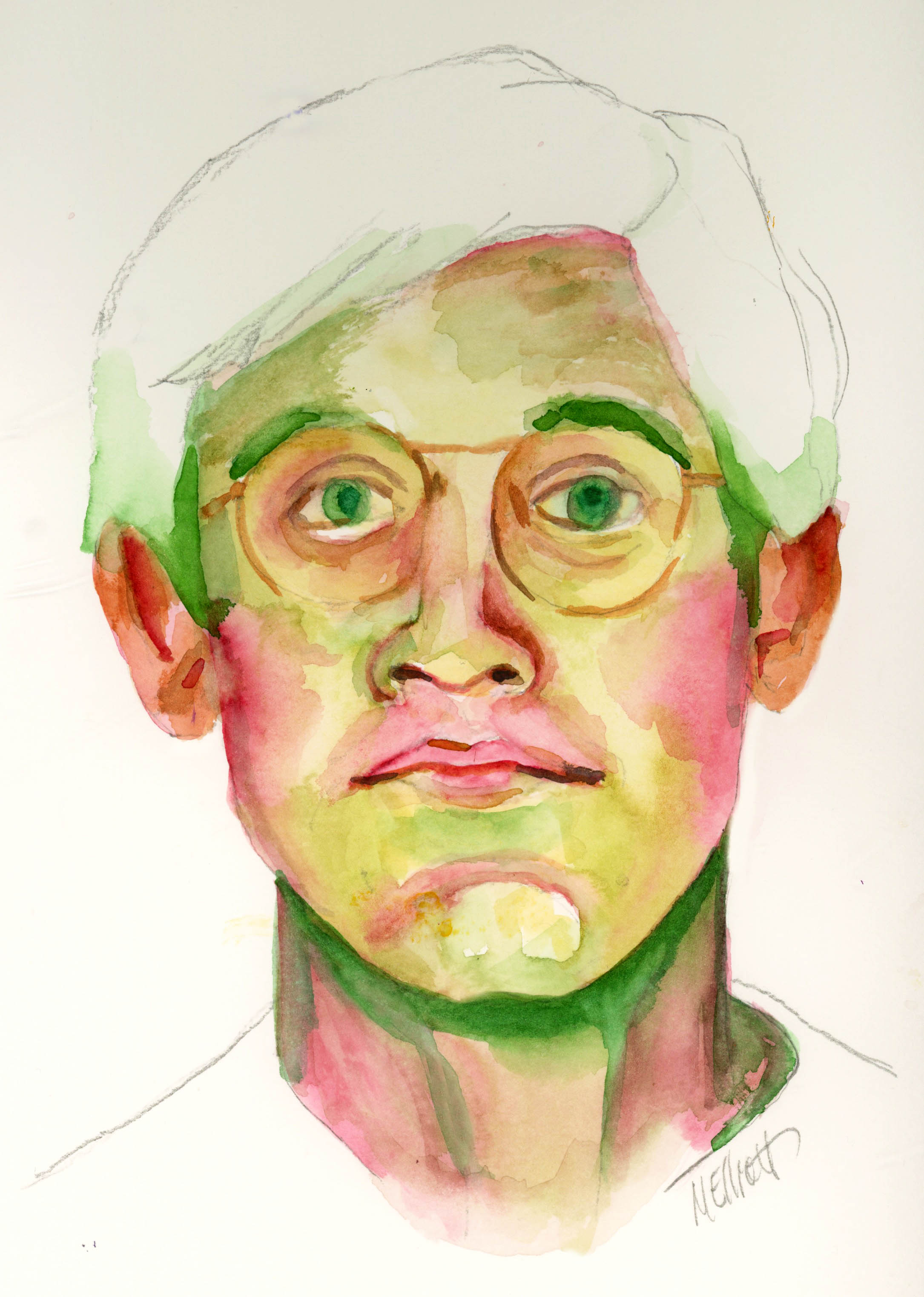
I finally got back to the "drawing board," i.e., making a new portrait painting from Sktchy. I had a health "oops" that set me back about a week in the excellent recovery I've been having lately (read all about it here), and haven't felt up to painting, but today's symptoms are much milder, and I needed to pass the time until I had my healthcare visitor—yes, they're back—so this is Day 10, even though this is the model from Day 8. I loved her quizzical, upward-gazing expression, and the somewhat casual but nonetheless calculated way the artist, Wayne Smith, painted her, so I gave it a shot myself.

The downlighting was fun, and I liked the pastel palette with just hints of stronger color here and there. I didn't quite capture her fey quality, but I daresay Bronwyn would be able to recognize herself from this portrait, so it's all good.


"Sy1123_Bronwyn"—Pencil and Paul Jackson watercolors on 140-lb. Fluid coldpress, 8x11 inches.

06 October 2023

Day 6

This is the model/lesson from Day 4, but since I'm doing it on the 6th, we'll call it that. I don't think I'm going to catch up with the previous couple, but will go onward and do as many as I can. I'm letting myself pick and choose, because some of the models and methods simply don't appeal. Maybe that's not kosher, but I don't care!

I liked this one because it was a young boy, and children are notoriously harder to paint than are adults, since their faces are still in different proportion. I can't explain exactly what I mean by that, but if you have tried it, you will know.

Dritan Duro is another loose painter, somewhat wet in wet, which is not my usual style, but I feel like my rendering of his lesson was fairly successful—at least more so than my last blurry effort! I liked the challenge of keeping the light on the side of the face and the hair—I had to forcibly make myself stop instead of painting it in. It looks a fair bit like the child, though from a little more extreme angle than the photo, somehow. A good exercise.


"Sy623_Jess"—pencil and watercolor, on 140-lb. Fluid coldpress, approx. 8x11.5 inches.