06 November 2024

Before the Deluge

Today, I kept thinking of that song by Jackson Browne to which I used to sing along in my naive youth. I called this post by that name because yesterday, before the deluge, before the disaster, the crash, the collapse of hope, I was still enjoying painting this still life of flowers in a vase from my Roseville collection.

The Roseville pattern here is "Columbine," which came in earth-tones like this one and also in blue-greens (I have a smaller vase with that color combo). The roses and asters and stalks of lavender are from what's left of my garden.

I would just like to say that roses are perhaps the hardest flowers to paint, with the possible exception of peonies, and although you wouldn't know it to look at them, I slaved over these for quite a long time! Asters are so much simpler, as is lavender.

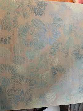
I struggled with whether or not to add a "base" (a table-top, a longer shadow) under/behind the vase, but I really liked how the stencils were showing through the glaze of paint, so I made a smaller shadow than would probably be cast, but at least it "grounds" the vase.

"Columbine and Asters"—stencils, pencil, and acrylics on thin birch board, 12x16 inches.

Some of them were dreamers
And some of them were fools
Who were making plans and thinking of the future
With the energy of the innocent
They were gathering the tools
They would need to make their journey back to nature
While the sand slipped through the opening
And their hands reached for the gold ring
With their hearts they turned to each other's hearts for refuge
In the troubled years that came before the deluge.


03 November 2024

Revenge Art

Today, as part of a "Let's Face It 2025" prequel, there was a fun lesson with Deanna Strachan-Wilson, collaging a Dia de los Muertos character. We prepped a black ground on a toned tan background, and then we were supposed to find an old painting we could cut up and use as the basis for our character. I pulled out my big stack of portrait faces and found one that was perfect for this exercise. It was painted in bright-colored inks in Deb Weiers-style, so it was a good base image, but there was another reason...

This woman is a writer and internet personality whose portrait I painted before I ever met her, simply because I found her face both beautiful and intriguing. Then, by a quirk of fate, I invited her to speak at a class I was teaching, and she misrepresented herself, lied by omission, maligned me, and continued to make rude and denigrating remarks afterwards on Twitter that riled up my class about something that wasn't true, garnering me the first bad evaluation I had ever had in my teaching career. So today, I was happy to give her black-ringed eyes, chalk white cheeks, and skull teeth. She doesn't really deserve the crown of flowers, but that's part of the costume, so I grudgingly glued them on.

I'm going to call this exercise a symbolic burying of my ire and my bad experience once and for all.


"La Cabrona," pen, watercolor, gesso, acrylic, collage papers, on tan cardboard, 9x12 inches.


12 October 2024

A new still life

In addition to my collection of 20th Century American pottery, I also have accumulated many wall pockets over the years. A wall pocket is a vase that is flat on one side, with a hole pierced in it somewhere at the top for hanging, and you mount it on the wall and put flowers in it (if it's still waterproof—I have a couple that aren't, and dribble water down the wall if you try to use them!). My mom found some in antique stores and got me started looking for them, and then my collection far outpaced hers; when she died, I added most of hers to mine, with the result that I have about about 21 currently hanging on various walls of my house and another 35-40 in a cabinet, waiting to be hung up or swapped out. Some are Roseville or McCoy or Weller, but many of them are of Japanese origin from the 1950s-70s and are shiny ceramic in bright colors.

One of my favorites of these is a red poppy, featuring a large flower, a bud, and some stems and leaves in a stylized design. I have it hanging thematically on one small strip of living room wall next to a botanical print of poppies in a cheap IKEA frame. I love the wall pocket, but am bored with the botanical print after all these years, so I decided to make a poppy painting of my own to hang up next to it. (Or I may have to hang the pocket above the painting, because the painting is wider than the botanical print.)

I decided to use another of my Roseville vases to hold the poppies. Since it's not poppy season right now, I found a photo of some poppies in a plain glass vase, and "put them" in my Roseville one instead. This pattern is called "Bushberry," and I like it a lot, for its colors, its shape, and its whimsical adornments and "elbow" handles. Floral paintings are really supposed to be all about the flowers, but the vase fights for all the attention in this one.

I made a substrate as I have done for the past two florals by painting a board in a couple of complementary colors, stenciling it in some of the colors I intended to use in the painting, and then glazing over the stencils to drop them back so they're barely there but still give texture. In this painting I also made a more defined surface on which to "sit" the vase, although I left it vague enough that it could be wood or maybe just a painted surface.

I struggled with the background a lot this time, and went over it again and again, trying different things. I ultimately ended up liking the way the yellows go from dark gold to light yellow gold to a haze or glow before transitioning into the blue at the top. Since the poppies would be red, I decided to go with a primary color theme of red-yellow-blue, varying it a bit for the vase and adding green there and for the flower stems.

This was one of those that started out frustrating, turned ugly, and took three days of painting and re-painting all the elements to get it to a point where it suddenly gelled. I think I like it; we'll see if that lasts or if I decide to go back in!


"BushPoppies"—gesso, acrylic, stencils, pencil, matte medium, on thin birch board, 12x16 inches.

08 October 2024

Goofing off

I started a new still life yesterday, but I'm so unhappy with almost every aspect of it that I didn't want to work on it today! So instead I'm responding to a total stranger's request.

I miss getting snail mail. I'm old enough that that used to be the only way we got birthday greetings, and I always had a whole shelf of birthday cards every October 4th, but these days the cards are few and far between; people post a greeting (some basic, some more festive) on Facebook and that's an end to it. So when I saw this request on Instagram (@colesjuliana1),
I decided to do it.

An artist who herself paints all things "pirate" as a recurring theme in her mixed-media work is turning 61 on October 17th, and said that all she wanted for her birthday was 61 pirate postcards, but she wasn't sure she had that many friends to fulfill her wish. I immediately related, so today I made a birthday greeting for Julianna Coles for her 61st birthday. Happy Birthday, Matey!

(I also happen to know three other people whose birthday is on October 17th, so maybe I'll get more ambitious and make postcards for them as well, now that I've made the one...)


"HB Matey"—pencil, watercolor, Uniball pen, gold Signo, computr printout,
on 140-lb. Fabriano watercolor paper, 5x7 inches (for mailing purposes).


22 September 2024

The original in this palette

The portrait of Emma was a preview of the palette for this piece; and the "similar subject" is a vase of flowers. I'm still having inspiration from still life, and this time it occurred to me to include a piece from my beloved pottery collection, which is mostly Roseville, with a few pieces from McCoy and other early 20th century American pottery houses. This one is Roseville in the "Baneda" pattern, and a particular favorite of mine, both for the colors and design and for the shape. (If you are interested to see the many patterns produced by the Roseville pottery house over the decades between 1900-1950, Just Art Pottery has done a nice summary here.)

I clumped out to the backyard flower bed a couple of days ago and cut a handful of zinnias and one cluster of three little white roses, adding some lemon verbena from my herb garden for greenery/interest, and made an arrangement I thought it would be fun to paint.


I decided to continue creating a substrate made up of a few swooshed-on colors as a base layer, following up by using various stencils to create a leafy floral pattern. I chose shades that complemented the colors of the zinnias, which created a strong pattern, so after it was all dry, I knocked it back with a glaze of Titan Mars Pale, which is a light pink with a fleshy tint to it that I frequently use for skin tone on caucasian people.

The rendering of the vase is a lot more realistic than is the bouquet of flowers, so I'm not sure they go as well together as did the sunflowers and swashy shiny vase in my last painting. I tried putting a dividing line on this one, for table surface vs. background like I did in that painting, but it just didn't look right, so I wiped it off before it could dry and then just did a graduated fade of a pale, celery green over the surface of the bottom half of the painting, letting it merge organically with the original pink above the flowers. I also purposely left the stenciling a bit more visible on this one, because I liked how it went with and sort of extended the shapes from the branches of lemon verbena.

I needed to ground the vase somehow so it wasn't floating in the space, so I put in the cast shadow in Chromium Oxide Green, also glazed. (I'm not sure it's enough, but...I can't think what else to do.) I found it interesting that glazing over the two light colors with just the slightest shade of darker green made the underlying stenciling pop back out! Unexpected stuff happens.

I kind of wish I had sanded the board a bit after painting the first layer, because it would have made the rendering of the foliage more realistic (the roughness of the board makes that difficult to accomplish), but hey, there's always something.


This is "Baneda Vase with Zinnias," pencil and acrylics (and stenciling) on thin birch board, 12x16 inches. (The scanner cut off a bit on each side, the leaves aren't that close to the border.)

21 September 2024

Similar subject, new palette

It seems I wasn't done with my break from portraits (or so I thought), so on Wednesday I painted a new substrate on a birch board, on Thursday I stenciled it, and on Friday I glazed over that, and did the preliminary drawing of the still life I was going to paint. But in the process, something happened that caused me to create another work.

My new palette was primarily shades of pink, and as usual I squeezed out way too much paint for the job. My teacher Emma Petitt is always commanding, "Don't waste paint!" so after finishing my substrate, I pulled out a reference photo and some watercolor paper and used the pinks to paint the underlayer of a face. On Thursday there were some colors left over from the stenciling, so I used them to create a background behind the portrait. Today I glazed over that and squeezed out tiny dabs of the five colors I needed to complete the portrait, and here she is: Emma, being goofy!


"Goofy Emma"—Pencil, acrylics, and stencils, on coldpress watercolor paper, 9x12 inches.

11 September 2024

A break? or...

I have been painting portraits now for four years almost exclusively. In the first year or two I also kept up with other stuff, working in a sketchbook and doing illustration challenges (primarily food and urban sketching), but once I enrolled in Let's Face It in, what was it, 2021? I focused exclusively on portraits and didn't deviate.

Imagine my surprise, therefore, when during the past two weeks I actually had more than a truncated impulse to paint something else. I started doing a substrate thinking it would be for a portrait, but found my inner vision picturing something else on the board, so I went looking for reference photos and made that happen.


The substrate evolved from lessons with Emma Petitt and Michael Carson—spreading around a group of somehow related colors and then stenciling over them. In this case, I chose colors that worked with my subject matter, then stenciled on top with contrasting colors, and then, after painting the picture itself, chose to almost obscure all the original background work with washes or glazes. Some of the shapes and images are still faintly there, and the mix of colors supports the primary colors of the picture, but without fighting for attention.

I was inspired to paint sunflowers by Russell, a new friend on Facebook who apparently grows a wide variety of them and posts daily pictures. So I went looking for a reference photo that would work with my already created background, and tried to keep the whole thing spontaneous and soft-looking like a Carson portrait.


This is "Vase of Sun," acrylics and stenciling on thin birch board, 12x16 inches. I don't know if it will be merely a break from painting portraits, or if I'm on a new tangent. We'll see!

29 August 2024

Flapper anguish

My FB friend Dana has been posting a reference photo every month and challenging whoever is interested to paint it. I looked at this month's a few times, and every time I looked at that headdress I thought, Nope! But...I kept being drawn back to this photo, because what fascinated me was not the elaborate headdress but the look in her eyes and the exceedingly unkempt, worried eyebrows! It was such an anomaly, because she is dressed in this elaborate bejeweled dress, necklace, and tiara thingie, and has obviously taken some pains to wave her hair and apply makeup, and yet...those eyebrows! Maybe they just didn't pluck in those days? And the way she has them scrunched up gives her an air of anguish so at odds with the rest of her garb that it made me want to paint her.

I decided, therefore, to skip the headdress or whatever you would call it, and just give her a simple band that would hold back her hair but wouldn't distract from the expression on her face.

I was fairly happy with the face; but I made the dress too pale and the beads too dark, and then smudged them when I tried to muck with the necklace to de-emphasize its darkness, so this is a bit of a mess. But...it's been too many days since I painted, and I needed to fall back into it a bit, so Dana, here's what you get for August!


"Flapper Girl," pencil and watercolor on coldpress Fabriano, 9x12 inches.


18 August 2024

Partner painting

I painted her, so of course I have to paint him! It was hard to find a photo of Governor Tim Walz without an open-mouthed toothy smile, but I finally managed to do so. I didn't want to have to do teeth again, after the Kamala portrait—the teeth were the biggest issue for many viewers, and I must admit that when you draw in pen, you still need to stop and think about suggesting rather than drawing every line, to get a better effect.


"Tim Walz" is drawn with Uniball pen and painted in watercolor on 140-lb. Fabriano coldpress, 9x12 inches.

11 August 2024

Iconic women

Well, my villain didn't go over so well with the fan base, so I decided to paint someone that at least 60 percent of them would like a whole lot better.

I drew this freehand in pen, and it's not quite the perfect likeness I was attempting. Her face is a little longer than this, a little thinner, with a slightly higher forehead and a slightly longer chin. But I think I did capture a certain something about the smiling eyes and cheerful cheeks. The teeth? Not so much.


"Comma-La," Uniball pen and watercolor on Fabriano 140-lb. coldpress paper, 9.12 inches.

04 August 2024

Villains

I had thought about painting a portrait of somebody pretty today (maybe Kamala?), but...somebody on one of the political pages I follow posted a collection of Trump's "guys" with a caption saying that they all look like Batman villains, and I found myself agreeing! So here is Roger Stone in his fedora and dark glasses, doing a very good impression of somebody of which Gotham City would like to be rid!

I got the glasses lenses a little bit too close together, so it made him more beady-eyed than he is in real life...but, villain!


"Batman Villain Stone"—Daler Rowney inks, Uniball pen, white gesso, watercolor, India ink, 9x12 inches on coldpress Fabriano watercolor paper.

02 August 2024

Another mug shot

I wasn't going to paint today, but I couldn't resist this guy's baby face and black eye, so here he is. Same process as the previous two days. I like his pouty mouth and wacky hair.


"Baby Face"—pencil, Uniball pen, Daler Rowney inks, gesso, watercolor, on 9x12 coldpress Fabriano watercolor paper.

01 August 2024

More criminals

This one didn't come labeled with a name, but she'd been arrested by the Cincinnati police, so I decided to call her Cindy. So, "CinCin" for short, hee hee.

More Deb Weiers method: Pencil squiggles, Daler Rowney ink-wash, Uniball pen drawing, and then "decor" made with Posca pens, gesso, watercolors, and India ink. I didn't see anything I wanted to collage on here, so I got funky with her hair instead, just for a point of interest, and gave her a stripey shirt too. I was planning on a black background like the other one, but I didn't want to cover up all the pretty colors, so...no black.

I'm not completely happy with her glasses—they were clear, so you could actually kind of see her eyebrows through them, but it was hard to convey that with the gesso I used to paint them, so it doesn't quite translate. But the best feature of her face was that arched eyebrow on her mug shot, so I had to put it in. Also, her nose is way too long, but I think it contributes to the final effect, so...pfht!


"CinCin"—9x12 inches on Fabriano paper, materials listed above.

Here's the original:


31 July 2024

Nostalgia

Today, for some reason, an old piece I had painted during LFI 2021 popped into my head. I have since sold it, so I only have the .jpg of it to remind myself, but I felt a sense of nostalgia for that playful style I learned from Deb Weiers, first in a class with her and then with Lesson #34 in 2021, so I decided to do another. For that one, she started with a reference photo of a guy in a vintage mug shot, so I looked for another and repeated the experience to a certain extent.

This is a fun and complex process of building up from nothing to a whole lot of something. First, pencil and charcoal marks on the paper; then a wash of three Daler Rowney inks, pooled together to cross and blend, and then more marks made with the wrong end of a paintbrush into the ink.

Then the drawing: Deb doesn't stick to her reference photo in any real way, but I like a little more realistic rendering, so I drew the face in Uniball pen, and then went in and highlighted with white gesso and shaded with India ink. Following that was some collage for the guy's bushy eyebrows, and then the addition of color for the lips and hair. Finally, the image is completed with acrylic paint for the jacket and Posca pen for the shirt stripes.

And then I followed Deb's lead and used black gesso on the background (leaving out some fun shapes in color to float in the background), to make the figure really pop. A few finishing tweaks—some freckles, some linework on the lips and on the background shapes—and it's time to add a signature.

The hair got too dark—I should have thought ahead and kept the color to pure yellow and orange at that end of the paper. I could have painted over it with white gesso and then redone the color, but I have had variable success painting over the top of gesso, so I decided to leave it be.

Although I did adhere more closely to the original image than Deb did, this piece is a reminder that being playful and adding details that are pleasing to the entire design without worrying unduly about likeness is a good thing to do occasionally! Sometimes portraiture can get really precious, but unless you're painting someone as a commission and they have to be recognizable to the relative who's paying the bill, why be so rigid?


This is Walter Smith, who was arrested and booked for breaking and entering. "WalterB&E," in all the above-named materials, on 140-lb. Fabriano paper, 9x12 inches.

29 July 2024

Inspiration combo

I looked at a few things today and combined them to make this piece. A few weeks ago, Angela Kennedy did a lesson for LFI2024 with a redheaded model and a background filled with painted leaves. And on July 1st, Dana Primrose Bloede posted a reference photo that was her challenge for a July portrait. Since there's only one more day left, I thought I'd better get on that! 

I had initially planned to paint this in acrylics on a board, but I didn't feel like getting into all that today and decided instead to do a version of what I had thought of for that project in watercolor.

Rather than painting Angela's leaves, I used a stencil to give a feeling of seaweed in the background, and instead of doing a straight portrait of the model with chiseled cheekbones and pouty lips that Dana supplied, I decided to turn her into a mermaid.

After I made the drawing in Uniball pen, I painted a watery background, and then gave an undercoat of green to my mermaid. After that all dried, I added the stenciling and then painted over the green in various skin and shadow tones to model the planes and shadows of her face, hand, and shoulders. Like Angela's lesson, I decided to do her hair as a block of blended color rather than trying to make it look realistic by separating it into strands, and I think that suits the style of the rest of the painting.

The green skin gave me a throwback memory to an Orion, one of the alien characters on the original Star Trek. But once I got the overtones on and put the seaweed in the background, I feel like the whole mermaid thing came together.


This is Uniball pen and Paul Jackson watercolors on Fabriano 140-lb. paper, 9x12, and I'm calling her "Marina."


28 July 2024

Angles

 Our Let's Face It 2024 assignment for last week was painting someone from a difficult angle. The teacher used a different reference photo, and painted something very colorful in oils; I chose to steal a reference photo from another student who, like me, wanted to do her own thing, and paint it in watercolor in an almost monochromatic way, using only yellows and browns with a bit of pink and purple thrown in as accent. I actually washed the entire page first with Naples Yellow, blotting off a few highlights and the whites of the eyes, so it would have a unifying color.

This was a tough one to paint, and I overworked the chin and under-chin area to the point where my paper (some Fabriano I am trying out) started to fray! I captured a fair likeness otherwise, but that chin-to-neck transition still bothers me.


This is 9x12 inches, using my Paul Jackson watercolors on Fabriano 140-lb. 25% cotton paper. I called it "Up Your Nose."

18 July 2024

A redhead and her best friend

When I saw the photo, I couldn't resist trying to paint this little redhead and her cat buddy. And although I don't think I quite did them justice, I'm glad I tried it, for the variety of challenges it presented. I'm pretty happy with the faces, less happy with the cat body, which admittedly disintegrated into an amorphous blob in the reference photo, not giving me much help. But the warm colors of the child contrasted with the cooler colors of the cat were fun to do, and I hope the subject of the photo doesn't mind my borrowing it.

This is pencil and watercolor on Fluid 140-lb. coldpress paper,
12x12 inches, and it's called "JSBnKitteh."

03 July 2024

Venting

I have been so beside myself with rage and frustration for the past 48 hours since the "Supreme Six" made a travesty of the branches of government by handing over the very extraordinary powers to the office of the President that the founding fathers worked so hard to exclude from that person that I needed to find some way to work out the anger. The worst of it is that we all know that immunity is only given to cover the lawless and depraved acts of their sociopath of a candidate and that any attempt to use this so-called autonomy by the Democratic holder of the office would be a booby trap of epic proportions, even if that person could imagine using that immunity for self-interest or the partisan interests of his party, which he would not. It is truly unbelievable what they have been able to "accomplish" in the name of fascism and domination over a nation that does not espouse their views and does not want them as our rulers or arbitrators, simply by relying on our moral compass.

At first I thought to do a portrait of the three justices who stood strong, united in horrified dissent, and I may still do that at some point, but what I really wanted was to wreak my revenge on the six who betrayed us. And while working on it gave me some degree of satisfaction and relief, it is such a deadly serious subject that I couldn't do what I really wanted, which was to caricature them in a Deb Weiers-like portrait, as I have previously done with others from that side of the aisle. They look all too attractive and lifelike to satisfy my frustration. But I did manage to surround them with words of condemnation, revelation, and disgust, so there's that.

Here are the Supreme Six, or the Six of January Six, since their objective was to follow through on the intent of that day.

(Can I just say that I am particularly, overwhelmingly disgusted that a woman would choose to stand with these corrupt assholes against the interests of her gender? That I find the hardest to understand or digest.)


Uniball, acrylic ink, and watercolor, 16x12 inches on Fluid 140-lb. coldpress.

My intention was to parody them as I did the former architects of our destruction—McConnell, Cruz, and Graham—or a couple of hate-filled MAGA fanatics that I captured as they "protested" the good acts of the Democratic Party and let their own priorities be known.


Marking time

 I haven't felt too inspired lately, so I've been marking time by picking up on the projects of others and redoing them to suit myself. They haven't completely done that, but at least they have kept my hand in. This girl was a portrait that someone published on a Facebook page, asking for help with the likeness (a person new to portraits) and I decided that she was sufficiently arresting that I wanted to paint her myself.


The second is a challenge being put out there by Dana Primrose Bloede—she's posting one copyright-free image a month and asking people to paint the portrait and share. None of them have names on them, so I called him "This Guy." I enjoyed the darks and lights on this one, but I'm not a big fan of painting men's facial hair!

They are both 9x12 inches, painted on 90-lb. paper I bought for watercolor workshops, so not quite as clean as they would have been on Fluid.


05 June 2024

Departure

I was reminded this week that I used to do drawings/paintings of all kinds of things, from recipe ingredients to flowers to street scenes, in my sketchbook, but that since I took up portraits, that's all I have painted for a few years now. And, well, although they are still my first love, it is possible to get a little stale no matter what your subject matter. So when I saw a photo of Lynn's hollyhocks on Facebook this week and remembered having painted them once before, I decided to do a new painting of that subject, with nary a face to be seen.


This is pencil and watercolor on 90-lb. Strathmore watercolor paper, 9x12 (including a 1/2-inch border all around). It's good to keep your skills up with other subject matter occasionally!

Here are my other hollyhock paintings—one done in France in 2013, the other done from a photo in 2019 as part of the 30x challenge.


02 June 2024

Canine Cutie

Today's watercolor and Uniball sketch is Marlie J. Dogg, the bookstore manager and all-around potentate in the household of L.S. Quinn, Executive Director of The Reading Room CLE in Cleveland Ohio, aka Galinda Upland (don't ask me!).

Marlie has ruled that roost for several years now as the worthy successor of Cha-Cha the Beloved, and I have signally failed thus far in my duty to memorialize her in art. So today, here she is in all her heavily ironic glory, giving us a slightly jaundiced grin and a wink from the comfort of her car bed (which I took the liberty of rendering in color instead of sticking to its rather dull charcoal). I know she is a highly discerning critic, but humbly hope she will be at least satisfied, if not flattered by, this fond portrait.


Drawn in Uniball pen and embellished with Paul Jackson signature watercolors on 90-lb. Strathmore watercolor paper, @ 9x12 inches. All Hail Mighty Marlie.

27 May 2024

Quick Regency portrait

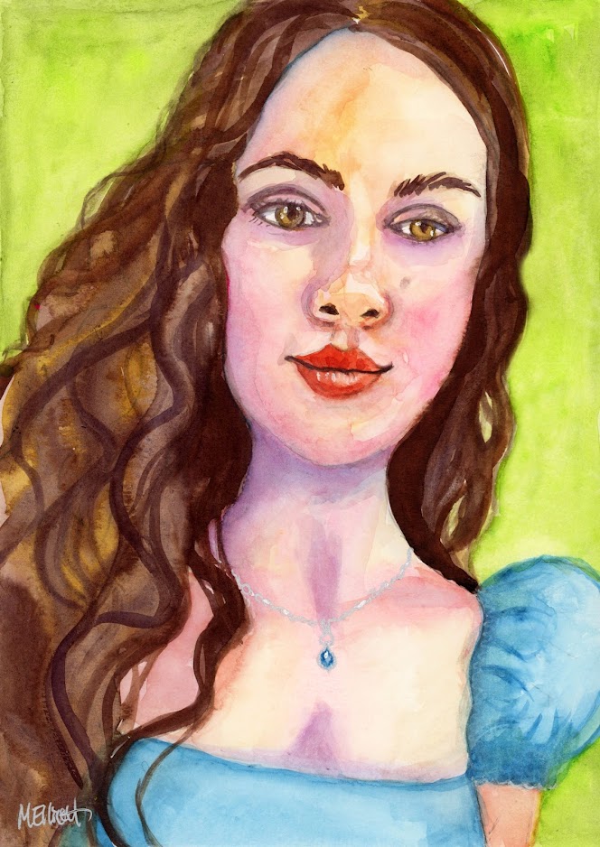
There was a woman on the "Dull Women" Facebook page who had such the look of Regency England about her that I couldn't resist painting her and altering her wardrobe to fit in with that era (what little of it that shows). A delicate Bridgerton beauty with pillowy lips and gorgeous flowing curls who was just crying out to be memorialized. She has unusual eyes—golden, with long thin pupils. I actually made them rounder than they were in the photo, because she looked alien when I painted them exactly as they were!


Anyway, this is Abbey, in pencil and watercolors, with a little silver Signo pen to make her necklace. I painted it on cheap watercolor paper that I use for my beginning classes, because it was the only thing immediately to hand (I have a block of Fluid somewhere, but...), so the background buckled a little when I gave it a second coat. But it was good to do it just to keep my hand in.

17 May 2024

Mixed media muddle

I haven't been doing many of the Let's Face It 2024 assignments; I have to pace myself with the painting these days, and if I have an idea of mine that I want to carry out, I do that instead of someone else's. But I love Maria Pace-Wynters's work, and wanted to try her crazy mixed media portrait for myself, so even though I'm a couple of weeks late, I sat down today and applied myself.

It was difficult for me on several levels. First of all, I've never been a person to use things like collage or pens or pastels creatively and, as I have mentioned before, I draw for the sake of starting a painting, not because I love it. Maria loves to draw, and you can see it in all the tiny details she incorporates into her pieces. She also loves to layer and layer and layer, with paint, ink, pastels, pens, you name it, and I didn't have more than half of the things she was using, so I had to compensate with other stuff. 

I ended up with something that I didn't hate, but I don't love it either. Some parts stand out too much and others not enough, and my collage choices are clumsy and don't necessarily work (either materials or colors). And not having the right media meant that I ended up with a muddier result. It was fun (and challenging and frustrating) to try something different, and if I did this about 10 more times I might make something I really liked! But...I doubt that I will. Still, I'm glad I did this one.

She's called Hannah, because I used the face (though nothing else) from a woman named Hannah in my "Dull Women" Facebook group.


"Hannah"—acrylic inks, watercolors, acrylic paints, Uniball pen, Posca pen, gold metallic medium, Signo gel pen, colored pencils, and paper collage pieces, on 140-lb. Fluid coldpress paper, 9x12 inches.


02 May 2024

El Naddaha

El Naddaha, "the caller," is a siren that haunts the Nile in Egypt. She is described as a tall, slender, beautiful woman with white—some say transparent—skin and long flowing hair. She calls to a man by his name in her soft, sweet, hypnotic voice, and lures him to his doom in the river. No man called by her can resist, and none survive their encounter.

I found a reference photo I loved for both its color and ambiance and also its interesting angle/perspective, and have been wanting to paint this for awhile, as a sort of companion piece to my "Nereid" portrait. Both the mood and the story are a bit darker than that one; I used similar colors for the background, but layered them more richly and did a finishing glaze of thin lime green to unite the entire picture—background, hair, and skin—to maximize the impression that she is submerged in water except for her face. This was one of those backgrounds that I was initially loathe to paint over, because I really liked how it turned out; but you have to sacrifice one thing sometimes to achieve another.

I'm not entirely satisfied with the white parts around her neck and chest that are supposed to signify a slight disturbance in the light on the water, but after reworking them several times, I decided to let them be. Perhaps I will revisit in a few days, when I can look at it more objectively.

When I initially saw the photo I thought of Ophelia of Shakespeare fame, but didn't like the passive nature of her story, so I looked for another with which to identify my portrait and found the ominous Egyptian legend recounted above.


The "Caller" is acrylic, with layered stencils for the background, on thin birch board, and is 16x12 inches.

05 April 2024

LFI assignment...

As usual, that's a "sort of." The painting was supposed to be done in oils, but I don't use that medium. So I decided to do a watercolor. The assignment was someone looking down and slightly to the side, so, in other words, a more difficult pose. The teacher did a self portrait, but I had been watching a charming movie (Marilyn Hotchkiss' Ballroom Dancing and Charm School) on Prime, and was fascinated with the facial expressions of the actor Robert Carlyle. (You might know him better from The Full Monty, way back when.) So I switched from watching it on my TV to viewing it online so I could take a series of screenshots of him in various attitudes, and I managed to capture this one of him looking down in approximately the attitude we were supposed to capture for our assignment.

This is vastly overworked, and the colors are more intense than perhaps they should be in some areas, but I really tried to capture the shapes of the shadows and highlights rather than focusing specifically on the face itself. I don't know that I caught it, but I gave it my best shot.


"Frank" (the character's name)—pencil and watercolor on 140-lb. Fluid coldpress watercolor paper, 9x12 inches.

31 March 2024

Beautiful substrates

The definition of a substrate in art is "a foundational or base material on which another material is applied or mounted." But the definition in biology is what I like to think of when creating one: "The surface or material on or from which an organism lives, grows, or obtains its nourishment." In other words, applying that one to art means that your figure in the forefront is growing organically from out of its background.

My mentor for creating substrates was and probably always will be Emma Petitt. She is the one who taught me to use a roller to apply random strokes of a variety of color to my ground, allowing them to cover, reveal, or blend with one another to create something special; and then, over the top of that (which can be plenty all by itself) I also discovered the joys of applying stencil images to highlight colors, shapes, and styles in service of the image I intend to paint over them.

I haven't done one of these in a while, being content instead to use more stark, one-color grounds in order to focus all the attention on the figure. But in some cases the rich background "grows" the figure from within it, and I'm hoping that's the impression this portrait ends up giving.

I call it "Nereid," which in Greek mythology is a kind of nymph, a female spirit of sea waters. In this one she has just burst from the water and is shaking her head, scattering drops everywhere as she sheds the excess.

I had some tough decisions to make on this one. I am not experienced in painting water, so although I initially considered painting a pool around the lower part of her, I was sufficiently in love with my substrate in order not to want to mess it up with something that might not look as realistic as I would have liked; I will practice that on some other painting without as much invested. I also couldn't decide, initially, whether I should paint her in much paler shades of white and cream with bluish/greenish highlights, like a fish that emerged from the deep. But I ultimately decided that nereids probably spend a bit of time in shallow waters or preening on rocks like the Little Mermaid, so I kept her in mostly realistic tones.

The light was interesting in this one, because it was sort of top down from right to left, so she has highlights and darks on both sides of her body. The perspective was also a challenge, with that upturned chin and nose, hidden forehead, and weirdly angled ear. Finally, I think i reworked that hand about five times, having trouble getting all the fingers the correct lengths and shapes and applying the highlights correctly. But I'm done...I think!


"Nereid"—pencil, acrylics, and stenciling on thin birch board, 12x16 inches.


11 March 2024

More in the theme

Continuing very loosely with the same theme (goddesses? mythological characters? yeah, something like that), and with the same size and medium, I did go outside the color palette on this one, although there is still a tiny bit of each of the colors (Cobalt Orchid, Light Ultramarine, Red Oxide) in this one. But my primary objective was to use this beautiful and subtle Titan Green Pale from Golden Acrylics as a background for a goddess of equally subtle coloring: Ngame, the West African moon goddess. Ngame created the heavenly bodies and brought life and soul into every living thing with her beams. She is known as the White Goddess, according to Robert Graves, and is also considered a muse, a patroness of creative inspiration, so it seemed appropriate to make a painting of her!

As my model I chose someone I have painted once before, the beautiful Diandra Forrest. I first cast her (in watercolor with an acrylic background) as Akata Witch from Nnedi Okorafor's book, back in 2022, but for that painting I used a much younger reference photo (the character in the book is 14). But for Ngame I chose a mature photo, although I still went with the free-flowing shock of hair rather than the short cut or the long braids she sometimes wears.

I started out uniformly pale and then integrated subtle bits of all the colors, one by one, into the painting. As an albino person Diandra's skin tone is a very particular tint: It's not pink, not olive, but rather a distinctive shade of creamy white, with underlying green, blue, and lavender tones, and the shadows look brown, rather than gray. It's both fun and challenging to paint.

I enjoyed playing with a new tool to get her hair just right: I had ordered some plastic scrapers meant to be used with Gelli plates that one of my Let's Face It teachers had recommended for making stripes or patterns in oil paint, and I used one of them to "scumble" the colors together and put some texture into her soft cloud of hair.

The green is an unusual color to use for background when depicting a moon goddess in front of the full moon (one automatically thinks black, deep blue, gray, or sunset colors), but there is that moment just before dusk when the sky isn't quite blue or gray when you might see this shade in it, and I decided it was okay to accentuate that a bit. I did try glazing over it with light ultramarine, but it didn't really work, so I wiped off most of it, just leaving some to be the darker shadows on the surface of the moon.

I thought about adding some gold medium onto the moon, like I did in my last few portraits (as halos), but decided it would take away from the primary focus (Ngame), so I left it off.


"Ngame"—acrylics on thin birch board, 12x16 inches.

(Note: My scanner cut off a bit of the top left corner and also a tiny strip of her shoulder on the right—the original doesn't have the moon falling off the page up there quite as much, and also shows more of her arm. I have to do these in two pieces and put them together in Photoshop Elements, since my scanner bed is 9x12 and these are 12x16.)


03 March 2024

Sort of a theme?

I continued this week with using the same color palette and with exploring mythological themes for a new painting. I had a vague recollection of reading one worldview in which the Moon is a Triple Goddess, with the waxing (growing) moon being the maiden, the full moon as the mother, and the waning moon representing the crone. Although I wasn't entirely comfortable with the symbology—are middle-aged women only worthwhile if they are mothers? and are crones really "waning" or diminished in some way? I think not. Nevertheless, the idea, preoccupied as I was last week by the maiden portrait of Proserpine, stuck in my head, and then I came across a reference photo that seemed like a cross between a goddess and a saint, subject of the portrait I painted before that one (Saint Side-Eye), so I decided I could take this vague legend and make something fun from it, even if I disagreed with its characterizations.

The result is this woman in the full flush of the middle of her life, cheerfully giving a blessing. I dressed her in the red oxide color I've been using, thinking of a Blood Moon, and gave her a necklace that harks back to an early witchy symbol for the three-part goddess. And then, just for fun, I also gave her a halo of sorts. (I thought about hanging a blood moon in the upper left corner, but finally decided it was too literal, and maybe also overkill. But...?)

The painting went smoothly until I got to the decorative bits. I did an undercoat of the red oxide on the necklace before putting on the gold metallic acrylic medium, because in the painting of Saint Side-Eye I liked the effect of the red peering through the gold, and I thought it would go nicely with her dress; but for some reason it was harder to get the gold to cover the red here. It also looked flat, which was perfect for the saint's halo but not for a necklace, so I ended up giving it some highlights and dark edges with regular paint.

I didn't want to undercoat the halo red first, because it would be too stark against the light ultramarine background, so I went in directly with the gold paint over the blue, but it didn't work at all. Then I decided to put a film of white paint over it, but that just killed the glow. So I coated it again with the gold over the white, but that was splotchy and looked like she had made herself a homemade halo out of a paper plate or something. So I went back in with the blue background color and, instead of an unbroken perfect halo, I did a sort of "rays" effect with alternating blue and gold, so that it became an extension of her blond hair. I'm not completely happy with it, but I think it works okay.

The only other element with which I had a problem was her gaze. In the reference photo it is a direct look at the viewer, but no matter how conscientiously I tried to duplicate it, I couldn't get her to look at me! I have noted this problem before, and still haven't figured it out. I would have liked the portrait much better if I could have achieved it here, though, as she had such a friendly, cheerful, intimate glance.


This is "Selene"—acrylics and gold medium on thin birch board, 12x16 inches.


13 February 2024

Old medium, new technique

Lat week's LFI2024 lesson was with watercolorist Unyime Edet, and it was an adventure in using a familiar medium in an unfamiliar manner. First and foremost, he paints with a flat brush, which I have never done in watercolor—the general approved method for watercolor is round, with a point. Second, he paints the darks first, layering up to the light instead of starting light and adding in the darks in layers. It's challenging to save the whites when you work like this, but it also gives dramatic contrasts. I also liked that he noted the actual colors you use don't matter, it's more about capturing the values, dark to light. I follosed his lead in using a deep purple for the darks, and I think it worked well.

The reference photo he used for the lesson didn't appeal to me that much, so I decided to be my usual impudent self and paint the teacher instead. This is my rendition of Unyime, using his flat-brush technique and starting with the darkest darks on the left side of his face. I lost some of the whites and lights I wanted to save, but overall I was surprised at how effective it can be to paint with a flat brush, defining planes rather than blending. I didn't do his technique justice, but I made a start on it, and his was a fun image to capture.


"Unyime"—pencil and watercolor on coldpress watercolor paper, 9x12 inches.

08 February 2024

Classical imagining

In my leisure reading this past week was a reference to Persephone (in the Greek) or Proserpina (Roman), the ostensible reason for seasons on Earth. Since seasons are much on my mind (my heater still doesn't work and it's COLD in this house), I dwelt a little longer on the legend than I normally would, and it inspired a portrait. Since the color palette in my last one was so successful, I thought it would be fun to use similar tones in this one, perhaps creating a series. They don't really go together that much, given that the subject in the last one had dark, warm, rich skin tones and is portrayed as a saint, and the subject for this one is about as pale as a white girl can get and comes from Greek/Roman myth; but I used the eggplant color (Cobalt Orchid) from Saint Side-eye's shirt as the background here, and picked up the rust color (Red Oxide) from the saint's background in this one's hair and the fruit in her hands.

Lest you have forgotten the legend, Hades, lord of the underworld, has a crush on Earth Mother Demeter's daughter, Persephone, and kidnaps her. Demeter loses her shit and quits minding the climate, with the result that things on earth die and freeze—generally not so great for the populace. So her daddy, Zeus, tells Hades to return their daughter, but because she ate some pomegranate seeds while downstairs, Hades is able to enforce at least a partial stay with him every year. During those four months when she is being queen in the underworld, Demeter mourns and the earth experiences winter; when she returns topside, temps warm, flowers bloom, the ground produces a bountiful harvest, and Mommy is happy. A little more dramatic story than Punxsutawney Phil, and vastly more paintable!

Although most of the classical pictures portray her as more mature, wearing formal dress and a diadem, she is always described as a maiden and, as the story goes, she is "playing" in a field of flowers with her nymph buddies when Hades makes off with her. So I chose to paint her as a young, fresh-faced girl—sweet, but maybe a little awkward and not quite a woman yet. She traditionally has either blonde or red hair and blue eyes, so the color scheme I had chosen worked for the hair. Rather than a fancy dress with a jeweled bodice, as she usually wears, I put her in a simple shift the color of a Luna moth to signify spring; she is holding the pomegranate that was her downfall.

For some reason, this is one of the hardest portraits I have painted to date. Part of the reason is that because I am working in a familiar size and format (12x16) but portraying most of her torso, everything was a little smaller than I usually work (facial features in particular), but that doesn't entirely account for the difficulty. I think I just didn't know where exactly I was going with this one, so it simply took longer and required some decisions that I ended up taking back. The narcissus is "her" flower, so I thought I'd paint one tucked into her headband, but I knew it was a mistake the minute it was finished—it completely drew focus from her face and the fruit in her hands, which are the dual points of the entire portrait. So I sanded it with some fine sandpaper to take off the raised paint and restored it to flowerless simplicity.

I think that deep orchid color works great to signify that she's in the underworld, and the white and light blue highlights on the dress and headband make her glow.


"Prosperpina"—acrylics on thin birch board, 12x16 inches. (I prefer this name, in the end, to Persephone, because when I was a kid I read it out loud literally as "Percy-fone" and was embarrassed when I found out I was wrong!)


31 January 2024

Let's Face It lesson...kinda

This week's Let's Face It 2024 lesson was with the adorable Misty Segura-Bowers. She did it in oil, but those of us who prefer acrylic were encouraged to use that. I picked a fairly limited palette, though not as limited as Misty's, and followed basic procedure, but ended up changing the final product a bit. I used my own reference photo instead of hers, and rather than making it 12x12, mine is 12x16, because I wanted the opportunity to isolate the space around the head from the space around the body so I could have some fun with it.

I have painted from this specific reference before, in my Deb Weiers-inspired phase back two years ago right after I took her class, but that was a whole different kind of fun from this one!

Misty used Cadmium red as her base and then did a thin overlayer of raw umber, but I had just bought an enticing color called Red Oxide, which came out a few shades darker, so I painted my background with that. (I also don't like using Cadmium colors, even though they say the level is so low in paint that it's not toxic. Why risk it?)

Misty used a grid and sketched in the figure upside down with raw umber, filling in sections as she went; I don't really like working with a grid (it's a pain to remove it when you're done using it), so I did a rough outline trace using white pan pastel, and then free-handed the rest.

This was a challenging portrait in many ways. Painting a darker complexion on top of a very dark background meant it was hard for me to see the contrasts, so I kept getting things either too light or too dark and having to color-correct. In doing so, I lost some of the spontaneity of my earlier marks. The best part of the portrait may be her shirt, because I painted that quickly and using broad strokes, without fussing too much with blending or defining.

Her bald head was also difficult, because part of the darker shadows on the back-side of her head are actually a faint fuzz of hair growing in; but I didn't want to get itsy with that, so I made it smooth. I had a few false starts, too, with how light the lightest lights should be against the rest, and using what color; I started out with more of a Naples yellow, but it didn't look right, so I switched over to Titan Mars Pale, mixed with a little burnt umber. The darkest darks in this thing were supposed to be raw umber, but I discovered I was out (how did I let myself run out of that essential color?!), so I mixed the burnt umber with some Cobalt violet and a teensy bit of Payne's gray and made do. All of this was made more subjective because the reference photo is in black and white! (Misty's was, too, and I thought I should play by that rule on mine, even though it was a different model.)

The gold halo is a Liquitex metallic medium. I really wanted to add this, but I'm not sure whether I thus ruined the painting. I did like the simplicity of it before, but I had this idea of giving it an iconographic feel, so I went for it. Parenthetically, someday I would like to try gold leaf instead. I used gold leaf way "back in the day" (i.e., in the misty past of my 20s) when I did illumination and rubrication on calligraphy manuscripts, but I have only ever used it in tiny bits (on ornamental capitals and borders) and on paper; doing large areas on a board will, I think, be another challenge. I aspire to doing something more interesting than this flat circle—more along the lines of the awesome Stephanie Rew!


Anyway, here she is. I named her Saint Side-eye. Golden acrylics and metallic medium on thin birch board, 12x16 inches.


25 January 2024

Afternoon play

Wanted to make some art today but didn't have anything special in mind, so I went browsing through photos I have saved in my reference folder and found one of the admin on a Facebook page to which I belong (Lymphedema Warriors). I loved the goofy wide-eyed stare and the wispy hair (although I didn't really do the hair justice). I did a quick double-line ink drawing freehand and then added watercolor. Took me about an hour or so. The right eye is a little too small for the rest of the face, and a little close in to the nose, but hey, freehand, people!


"Bec F."—Uniball pen and watercolors on 140-lb. coldpress, 9x12 inches.

20 January 2024

New media

I am generally resistant to new media (and also old media!), preferring to hone my skills in my two preferred "genres," watercolor and acrylic. Even though I can do stuff with pencil, charcoal, markers, or what-have-you, I'm not a fan; I get impatient having to shade with a pencil using a tiny little point (or even the side of the lead) when I can do it in a few strokes with a paintbrush and enjoy the effect more. But after last week's Let's Face It assignment using pan pastels, I was persuaded by instructor Mika Denny's comment that likened using them with an applicator as closely akin to painting, and ordered some implements and a few colors to try.

The assignment called for a base of tinted paper, and I know I have some tan and maybe some gray Canson Mi-Teintes lying around somewhere, but it's at the bottom of an archaeological layer of art supplies, printer boxes, and books, and there is a slim chance of finding it without more work than I wanted to put in, so instead I started by coating a piece of watercolor paper with a thin transparent wash of Payne's Gray to serve as my base, and messed about on social media while letting it dry. Unfortunately, it dried so light that the white pan pastel didn't even show up against it, so I tried again using ultramarine. It kind of defeats the purpose of the black-white-gray dynamic that was intended, but I did feel like the blue went with my model's expression, so there's that.

The whites and lights showed up much better on the blue background, while still giving a subdued effect to this moody abstracted gaze that Christa Forrest was wearing while waiting for her taped demo to begin. Christa has been one of our instructors for multiple Let's Face It years, and I have actually painted her once before, but that was a bright, cheery watercolor using intense Daler Rowney inks, and I really wanted to try conveying a different mood this time with the pan pastels.

My finished product is not near as sophisticated, detailed, or precise as the one demonstrated by Mika. Although I ordered the pastels, the applicators, and the tips, I didn't get a blending stump, and the black and white charcoal pencils I used (because I already had them) are pretty soft and messy, so I couldn't get the fine details around the eyes that she achieved in her demo. There's also a weird thing going on with that shadow on the side of her face—I think I messed with it too much when I brought color into the face. But...now I can say that I gave the pan pastels a shot, and although it's probably not a medium I will use much, I can see the appeal, particularly the softness of blending you are able to achieve when using the applicators and sponge tips rather than just pencils.

Here's the finished product: Christa in pan pastels on a watercolor background, 12x9 inches on coldpress watercolor paper.